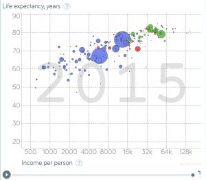
 With health care in the news, let’s take a look at the knowledge that can be gained by using Gapminder. For example, the graph here is life expectancy vs income per person for 2015, with the bubbles representing population size of the country. Can you guess the bubble for the U.S.? Go to the graph on Gapminder to find out. As a bonus their is a play button so that the graph will scroll from 1800 to 2015. You will also find a number of tools to change the graph and create others. All the data used by the Gapminder graphs is located on their data page.
Tags data source health income statistics
About Thomas J. Pfaff
Check Also
Is the world using less fossil fuels?
Nope. Wind and solar energy have increased, but so have coal, natural gas, and oil. …