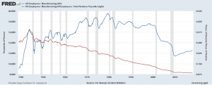
 We can answer this question by using FRED. The accompanying graph was created with FRED’s graphing tool (see below for a quick tutorial on creating this graph), which creates an interactive graph that can be downloaded along with the data. The blue line represents total manufacturing jobs, which consistently decreases during a recession (gray bands). Manufacturing jobs peaked in 1979 at just below 20 million and now stand at about 12.5 million. The red line provides another perspective and represents the percent of manufacturing jobs relative to all employment. In the 1940s manufacturing represented almost 40% of all employment. It has been decreasing ever since and today it is down to around 8.5%.
How to create the graph: Start by searching FRED for manufacturing employment. You should get this. On the upper right click edit graph and then add line (second button on top). Search employment and click on All Employees: Total Nonfarm Payrolls. Add the data series. Go to format (third button across the top) and click right under y-axis position for LINE 2. Now go to edit line 2 (first button across the top). Under customize data search manufacturing. Click All Employees: Manufacturing. In formula type b/a. Now click add next to All Employees: Manufacturing. This does it. FRED offers a powerful tool.