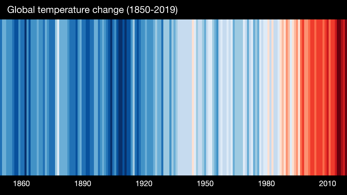
The image here from ShowYourStripes has a vertical strip representing global average temperature anomalies from 1850 to 2019 where darker blue is cooler and darker red is warmer. This graphic style, warming stripes, is credited to Ed Hawkins. The ShowYourStripes page has similar graphics for different regions.
On the Climate Central page 2020 Mets Unite (6/17/2020) there are warming stripes for states and slected cities that can be downloaded.