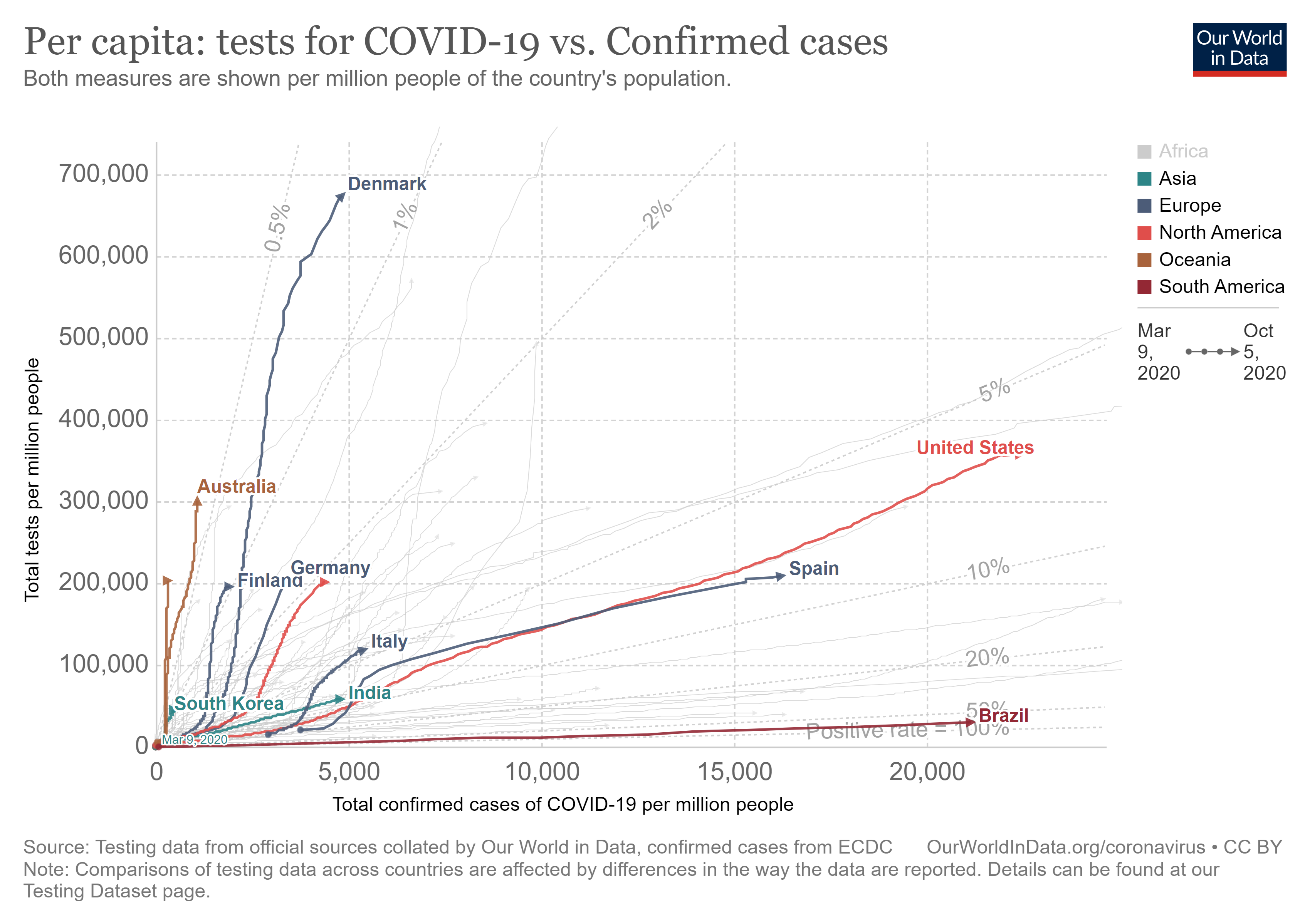
 Our World in Data has an interactive graph that plots covid confirmed cases by tests both per million people and including an element of time. Copied here is one example with the U.S. and other selected countries. The paths for each country is from Jan 21 to Oct 5. So, for example, while the U.S. has increased testing (going up along the y-axis) it has also had an increase in the confirmed cases (moving to the right along the x-axis). In the end the test positive rate has been fairly stable around 6-7%. Explore this graph by comparing other countries. As always, Our World in Data makes the data available.
Tags charts and graphs data source
About Thomas J. Pfaff
Check Also
How do vaccination rate differ?
The Pew article Increasing Public Criticism, Confusion Over COVID-19 Response in U.S. by Alec Tyson …