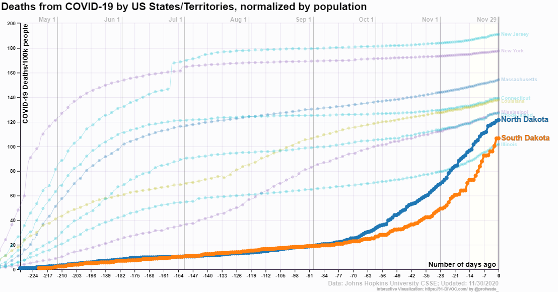
 The 91-DIVOC page An interactive visualization of the exponential spread of COVID-19 has excellent visualizations of state level data along with world data. For example, the graph downloaded from their visualization here is the top 10 states for deaths per 100,000 (day 0 is 11/30/2020). You might find it surprising the the Dakotas are in the top 10. The visualizations allow the user to select numerous categories and highlight selected elements. Each visualization has a csv link to download the data.
Tags data source
About Thomas J. Pfaff
Check Also
How do vaccination rate differ?
The Pew article Increasing Public Criticism, Confusion Over COVID-19 Response in U.S. by Alec Tyson …