The August 2021 global surface temperature was 0.90°C (1.62°F) above the 20th century average of 15.6°C (60.1°F). This was the sixth warmest August on record. Nine of the 10 warmest Augusts have occurred since 2009. August of 1998 still ranks among the 10 warmest on record. August 2021 was also the 45th consecutive August and the 440th consecutive month with temperatures, at least nominally, above the 20th century average.
And for land only:
Averaged as a whole, the global land-only surface had a near-record high August temperature at 1.34°C (2.41°F) above average, which is only 0.04°C (0.07°F) less than the record-warm August set in 2016. This was mainly driven by the very warm land-only surface temperatures across the Northern Hemisphere, which had its warmest August on record at +1.44°C (+2.59°F). This value surpassed the previous record set in 2016 by 0.04°C (0.07°F).
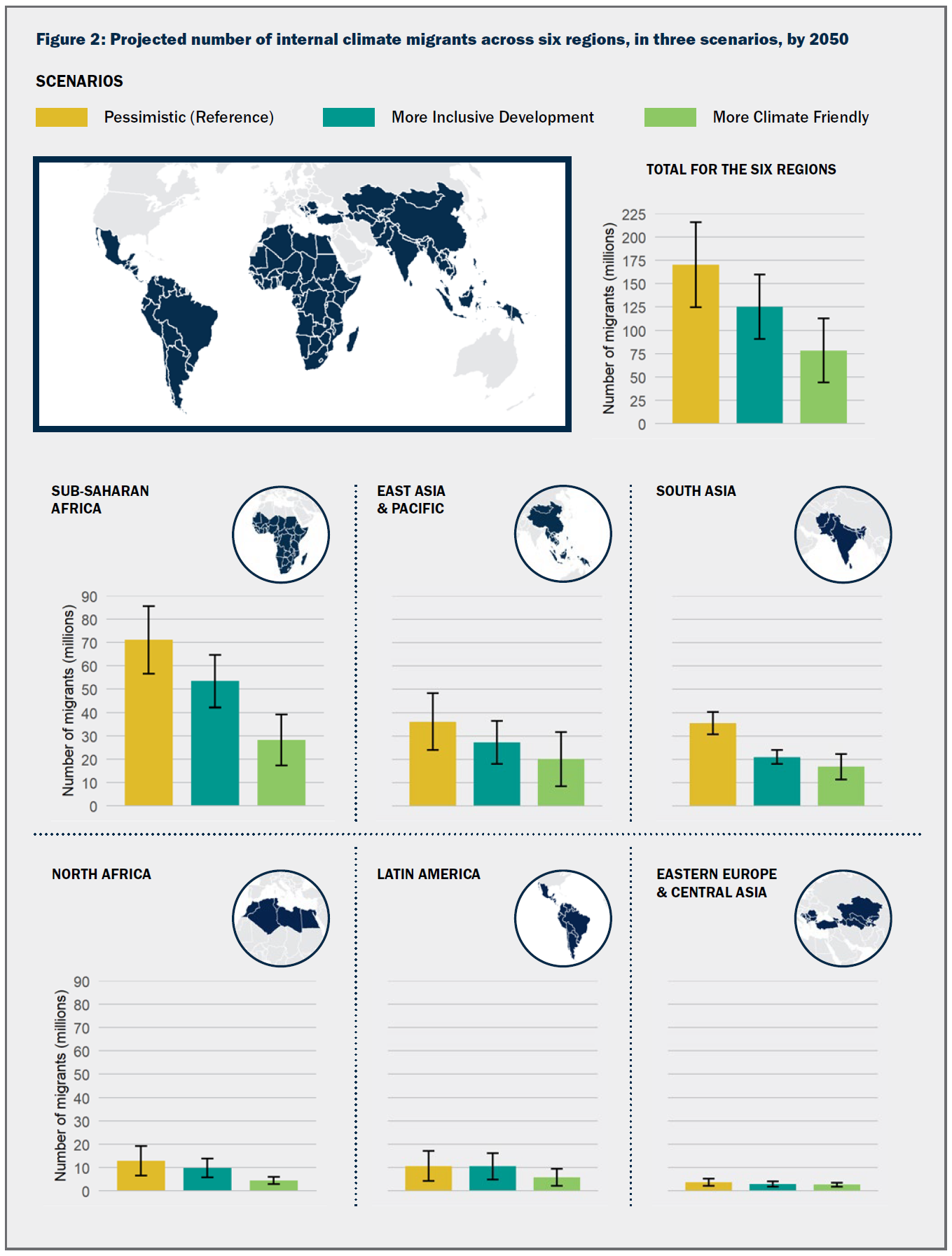
This sequel to the Groundswell report includes projections and analysis of internal climate migration for three new regions: East Asia and the Pacific, North Africa, and Eastern Europe and Central Asia. Qualitative analyses of climate-related mobility in countries of the Mashreq and in Small Island Developing States (SIDS) are also provided. This new report builds on the scenario-based modeling approach of the previous Groundswell report from 2018, which covered Sub-Saharan Africa, South Asia, and Latin America. The two reports’ combined findings provide, for the first time, a global picture of the potential scale of internal climate migration across the six regions, allowing for a better understanding of how slow-onset climate change impacts, population dynamics, and development contexts shape mobility trends.
Key projection:
Over 216 million people could move within their countries by 2050 across six regions,
The report discusses their modeling (there is more than this) :
Both Groundswell reports use the same modeling approach, which allows for direct comparison of results and for aggregation to derive the global figure for internal climate migration. They take a scenario-based approach and implement a modified form of a gravity model to isolate the projected portion of future changes in spatial population distribution that can be attributed to slow-onset climate factors up to 2050. The Spotlight discusses the key innovations and scope of the modeling approach.
Quiz question for a class: Is the 216 million people a lot or a little?
About two months ago I had the post How low is Lake Mead? The graph in the post was the yearly minimum end of month elevation. In this post we have a closer look at the end of month elevation since 2011. The last month in the data is July 2021, which is a record low following the previous record low in June 2021. In the previous post I mentioned that this really should be given in some per capita format. I’ll add that presumably the decrease in the volume of water is not linear with the lake elevation. Data here.
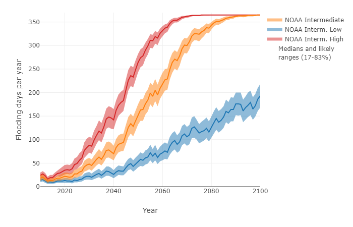
The graph below shows the number of days per year that sea level in Kings Point, NY is projected to exceed 60 cm above MHHW.
Sea level rise will increase the likelihood of tidal flooding. NASA has posted a tool, Flooding Days Projection Tool, to help understand how much tidal flooding may increase. There is a drop down menu for numerous locations in the U.S. For example, the graph here is for Kings Point, NY. Along with the value of the data there are calculus terms in the post:
These projections are based on unique, location-specific relationships between annual mean sea level, the top 1% of astronomical tides in each year, and annual counts of threshold exceedances.
An interesting and essential feature of these graphs is that the number of flooding days per year does not necessarily increase smoothly in time. In most cases, there are inflection points where the frequency of flooding days increases rapidly, which may be useful when establishing planning horizons. In many locations around the United States and its territories, there are sharp inflection points around the mid-2030s that are related to the interaction between accelerating sea level rise due to climate change and a long-term, 18.6-year cycle in the amplitude of astronomical tides.
And discussions of probabilistic modeling:
The purpose of this tool is to produce probablistic projections of flood frequency in the future that provide information about the full range of possibilities for a given year, including the potential for the occasional—yet inevitable—severe years. The projections leverage the predictability inherent in certain contributions (e.g., tidal amplitude and climate-change-induced sea level rise) and use statistical methods to account for everything else. The projections are probabilistic, because rather than producing a single, most-likely number of flooding days for a future year, these projections produce a range of plausible numbers with probabilities assigned to each possibility or range of possibilities.
All in all this is a great resources for math classrooms.
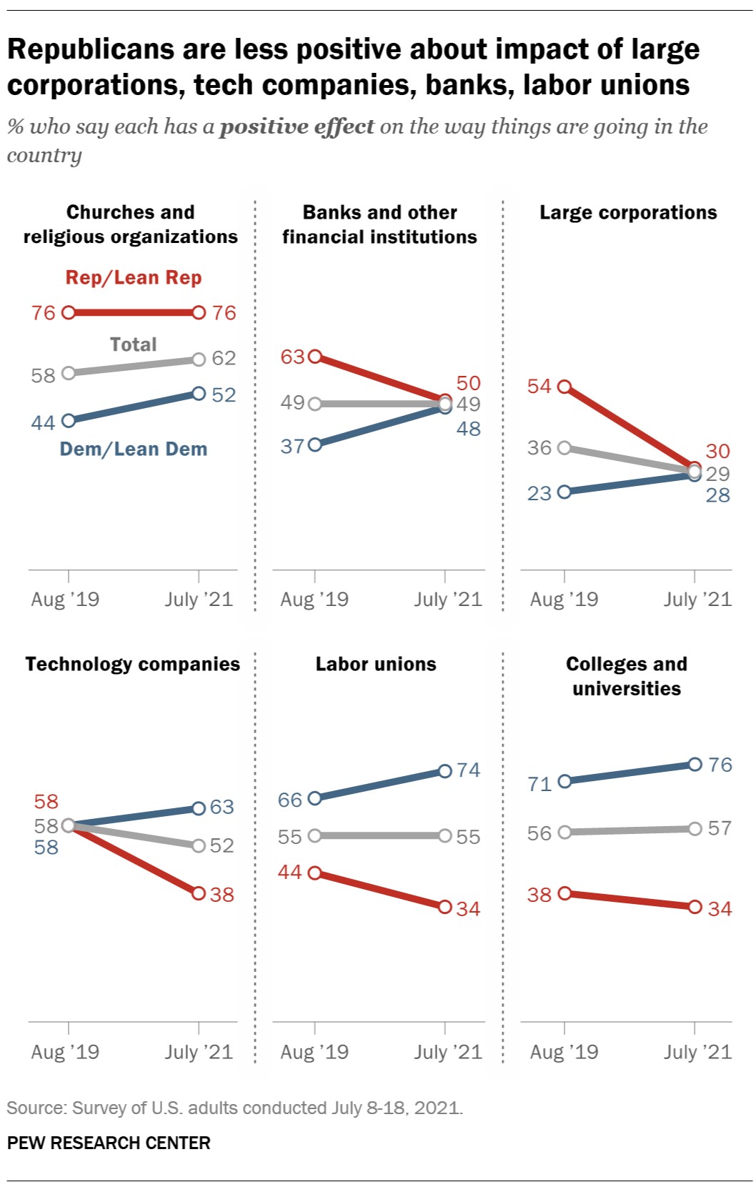
The Pew article Republicans increasingly critical of several major U.S. institutions, including big corporations and banks by Ted Van Green (8/20/2021) includes the chart copied here. The charts show clearly that republicans are more critical than in 2019, but it would seem that gaps are more concerning. Republicans are more critical of banks and corporations than two years ago but that puts them right around democrats. In other instances viewpoints are diverging. The 76 to 34 positive viewpoint difference on college and universities seems concerning and from the article:
The survey finds that partisan differences extend to views of K-12 public schools: 77% of Democrats say they have a positive effect, compared with 42% of Republicans. A 57% majority of Republicans, including nearly two-thirds of conservative Republicans (65%), say public elementary and secondary schools have a negative effect.
Discussion of the data as well as the reporting of the data and ramifications of the results would seem to fit into many a course. Pew has a methodology section and the data.
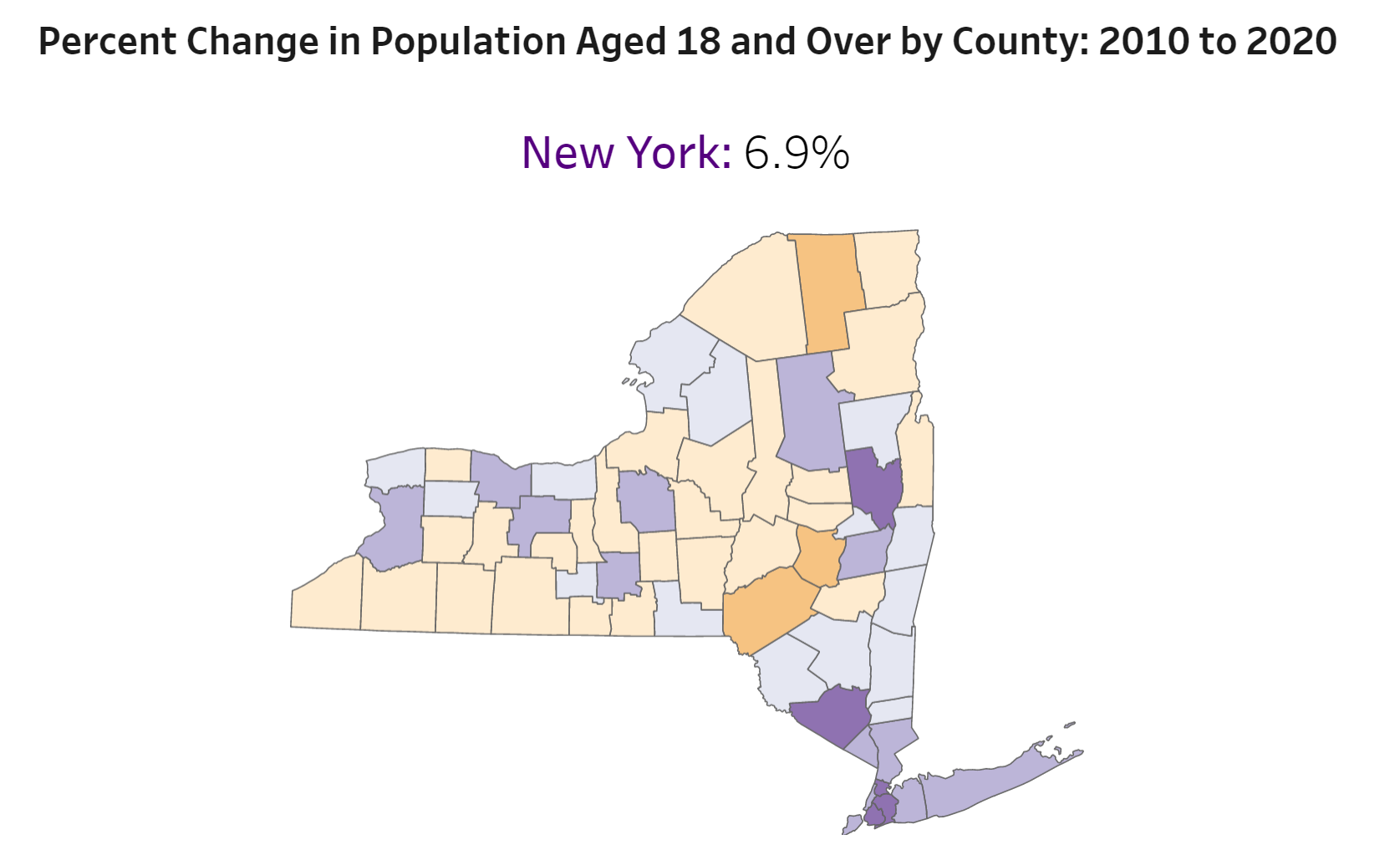
The US Census Bureau page State-by-State Visualizations of Key Demographic Trends from the 2020 Census. The page has tiles for each state that brings you to a page with numerous tables and graphics. For example, copied here is the map of NYS with change in the age of the population. On the page this is interactive where you can scroll over each county for details. Lots of interesting information.
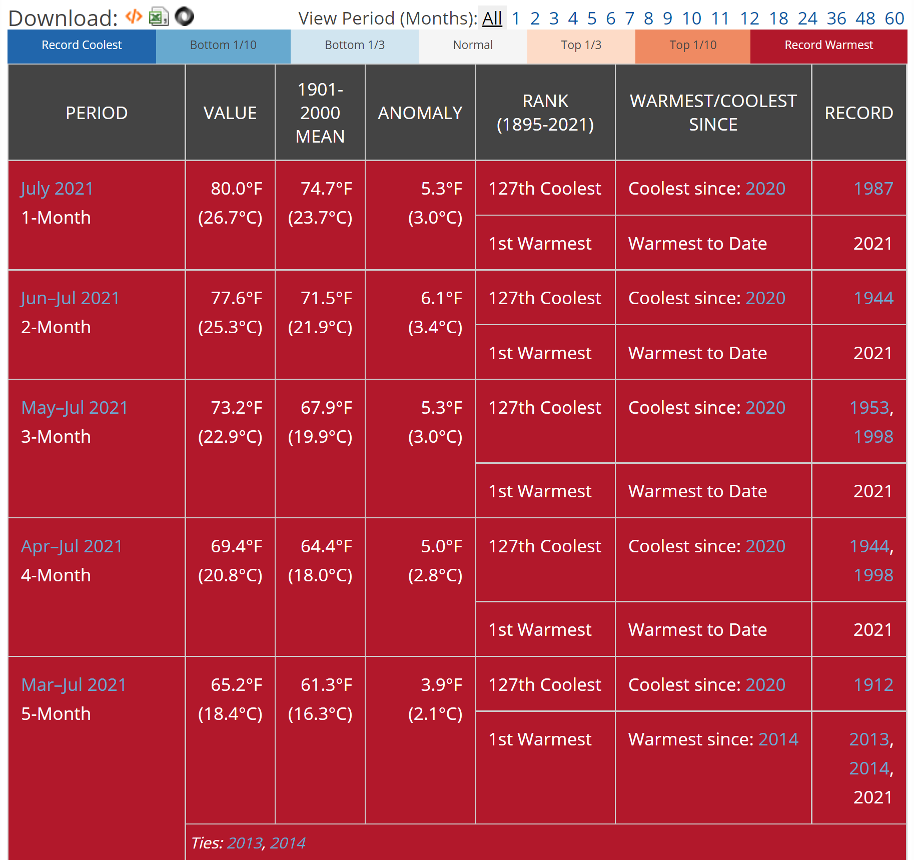
Have you wondered if your state just had the hottest, driest, wettest, etc. month? You can get this information from NOAA’s Statewide Ranking page. For example, the graphic here is for California for July 2021. The output will provide ranking information for 1-12, 18, 24, 36, 48, and 60-month time periods. The 1, 2, 3, 4, and 5 month periods ending in July 2021 have been the hottest on record going back 127 years. The page allows users to select a state and various periods. Each output also has a link to the data. An overview and definitions of these ranking is given on the Climatological Rankings page.
In our August 2021 Short-Term Energy Outlook (STEO), we forecast that U.S. natural gas exports will exceed natural gas imports by an average of 11.0 billion cubic feet per day (Bcf/d) in 2021, or almost 50% more than the 2020 average of 7.5 Bcf/d. Increases in liquefied natural gas (LNG) exports and in pipeline exports to Mexico are driving this growth in U.S. natural gas exports. For the first time since U.S. LNG exports from the Lower 48 states began in 2016, annual LNG exports are expected to outpace pipeline exports—by an estimated 0.6 Bcf/d—this year.
We roughly export 10-15 billion cubic feet per day of natural gas. Is this a good idea from a sustainability perspective or national security perspective?
As a whole, the July 2021 global surface temperature was the highest for July since global records began in 1880 at 0.93°C (1.67°F) above the 20th-century average of 15.8°C (60.4°F). This value surpassed the previous record set in 2016 (and subsequently matched in 2019 and 2020) by only 0.01°C (0.02°F). Because July is the warmest month of the year from a climatological perspective, July 2021 was more likely than not the warmest month on record for the globe since 1880. Nine of the 10 warmest Julys have occurred since 2010, with the last seven Julys (2015-2021) being the seven warmest Julys on record.
The data is available at the top of the page under Additional Resources.
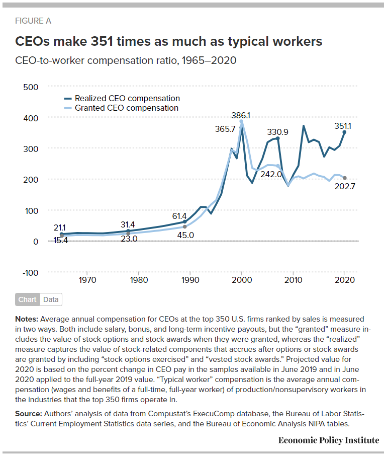
Did CEOs take a pay hit like many workers did during the pandemic? The article CEO pay has skyrocketed 1,322% since 1978 by Lawrence Mishel and Jori Kandra (8/10/2021) suggests CEOs did just fine last year. Their chart shows that realized CEO compensation grew during 2020 compared to the average worker.
Details on the metric:
We focus on the average compensation of CEOs at the 350 largest publicly owned U.S. firms (i.e., firms that sell stock on the open market) by revenue. Our source of data is the S&P ExecuComp database for the years 1992 to 2020 and survey data published by the Wall Street Journal for selected years back to 1965. We maintain the sample size of 350 firms each year when using the ExecuComp data.
The realized measure of compensation includes the value of stock options as realized (i.e., exercised), capturing the change from when the options were granted to when the CEO invokes the options, usually after the stock price has risen and the options values have increased. The realized compensation measure also values stock awards at their value when vested (usually three years after being granted), capturing any change in the stock price as well as additional stock awards provided as part of a performance award.
The granted measure of compensation values stock options and restricted stock awards by their “fair value” when granted (Compustat estimates of the fair value of options and stock awards as granted determined using the Black Scholes model).
Well maybe CEO pay just went down less than worker pay and that is why the ratio went up. In table 1, realized pay for 2019 is $20,351,000 with 2020 projected as $24,194,00. There are other graphs in the article and data available for download.
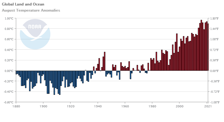 From NOAA’s Global Climate Report – August 2021: