How do U.S. adults view the economy?

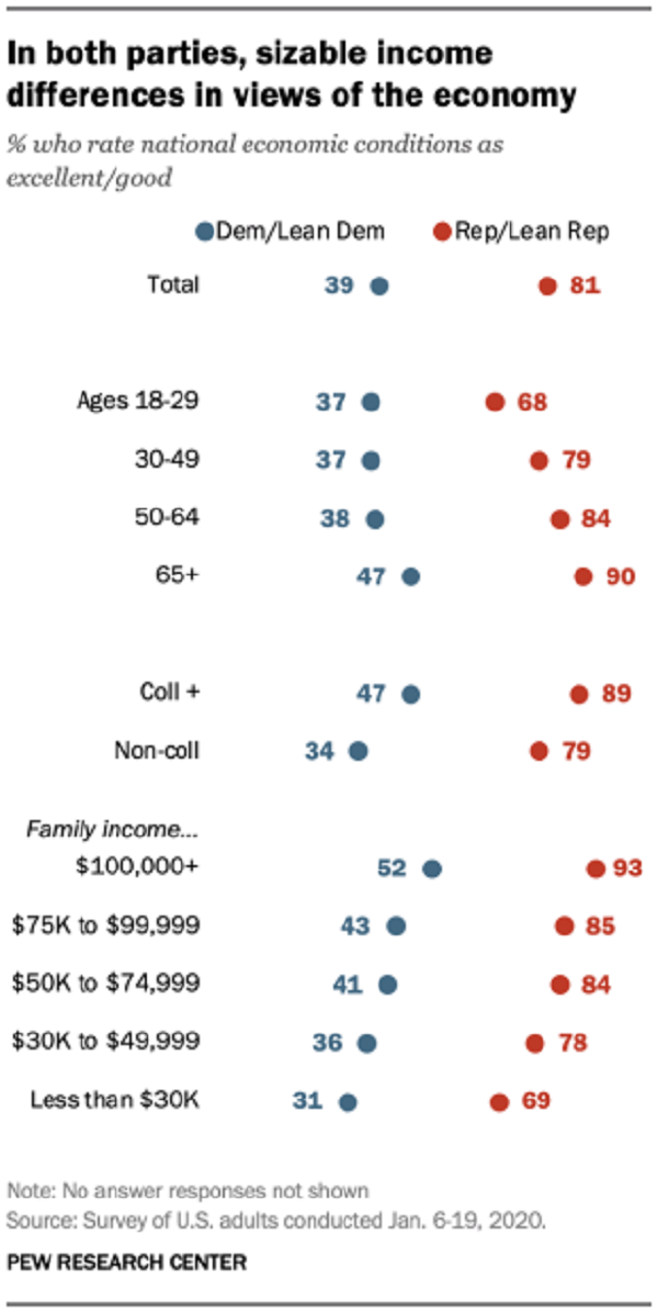
The Pew report  Views of Nation’s Economy Remain Positive, Sharply Divided by Partisanship (2/7/2020) provides the answer:

Currently, 81% of Republicans and Republican-leaning independents say the economy is excellent or good. These views have changed only modestly over the past two years. But between November 2016 (just before Trump’s victory in the presidential election) and March 2017 the share of Republicans with a positive view of the economy approximately doubled, from 18% to 37%. And by November 2018, they had doubled again, to 75%.

By contrast, Democrats’ assessments of economic conditions have changed only modestly since before Trump took office. Currently, 39% of Democrats and Democratic leaners say conditions are excellent or good. In November 2016, 46% had a positive impression of the economy.

The graph here is one of five in the report. The methodology section has more details and could be used in a statistics course.


How accurate are climate models?

The NASA Vital Signs of the Planet post Study Confirms Climate Models are Getting Future Warming Projection Right by Alan Buis (1/9/2020) reports

In a study accepted for publication in the journal Geophysical Research Letters, a research team led by Zeke Hausfather of the University of California, Berkeley, conducted a systematic evaluation of the performance of past climate models. The team compared 17 increasingly sophisticated model projections of global average temperature developed between 1970 and 2007, including some originally developed by NASA, with actual changes in global temperature observed through the end of 2017. The observational temperature data came from multiple sources, including NASA’s Goddard Institute for Space Studies Surface Temperature Analysis (GISTEMP) time series, an estimate of global surface temperature change.

The results: 10 of the model projections closely matched observations. Moreover, after accounting for differences between modeled and actual changes in atmospheric carbon dioxide and other factors that drive climate, the number increased to 14. The authors found no evidence that the climate models evaluated either systematically overestimated or underestimated warming over the period of their projections.

There are links to NASA data and graphs at the bottom of the post.

How hot was 2019?

From the NOAA Global Climate Report – Annual 2019:

The year 2019 was the second warmest year in the 140-year record, with a global land and ocean surface temperature departure from average of +0.95°C (+1.71°F). This value is only 0.04°C (0.07°F) less than the record high value of +0.99°C (+1.78°F) set in 2016 and 0.02°C (0.04°F) higher than the now third highest value set in 2015 (+0.93°C / +1.67°F). The five warmest years in the 1880–2019 record have all occurred since 2015, …

The report contains summaries by region and has abundance of quantitative information such as:

North America was the only continent that did not have an annual temperature that ranked among its three highest on record. Overall, North America’s temperature was 0.90°C (1.62°F) above the 1910–2000 average, marking the 14th warmest year in the 110-year continental record. The yearly temperature for North America has increased at an average rate of 0.13°C (0.23°F) per decade since 1910; however, the average rate of increase is more than twice as great (+0.29°C / +0.52°F per decade) since 1981.

The graphic here is from NASA, NOAA Analyses Reveal 2019 Second Warmest Year on Record (1/15/2020). Time series data can be obtained from Climate at a Glance Global Time Series.


How important is eating local in the carbon footprint of food?

The Our World in Data post You want to reduce the carbon footprint of your food? Focus on what you eat, not whether your food is local by Hannah Ritchie (1/24/2020) provides the graph copied here. From the article:

As I have shown before, food production is responsible for one-quarter of the world’s greenhouse gas emissions.

Overall, animal-based foods tend to have a higher footprint than plant-based. Lamb and cheese both emit more than 20 kilograms CO2-equivalents per kilogram. Poultry and pork have lower footprints but are still higher than most plant-based foods, at 6 and 7 kg CO2-equivalents, respectively.

Transport is a small contributor to emissions. For most food products, it accounts for less than 10%, and it’s much smaller for the largest GHG emitters. In beef from beef herds, it’s 0.5%.

The article itself doesn’t have data, but there are links to related Our World in Data posts about food with data.

Who ranks countries by levels of perceived corruption?

Transparency International has a yearly corruption perceptions index. The graph here is for 2019 (high score – lighter colors – clean, low score – darker colors – corrupt).

The Corruption Perceptions Index ranks 180 countries and territories by their perceived levels of public sector corruption, according to experts and business people. This year’s analysis shows corruption is more pervasive in countries where big money can flow freely into electoral campaigns and where governments listen only to the voices of wealthy or well-connected individuals.

At the bottom of the page is a link to download an extensive data set including a timeseries from 2012 – 2019.  Each country has a designated region and so one could compare corruptions by region in a stats course.


Can we make a better refrigerator?

The Scientific American article A Simple Twist of Thermodynamics Could Lead to Greener Refrigeration by Sophie Bushwick (1/21/2020) reports about the Science paper Torsional refrigeration by twisted, coiled, and supercoiled fibers by Run Wang et. el. (10/11/2019), which is behind a paywall (the graph here is from that paper). From the Scientific American article:

For another example, picture a rubber band, which is made up of a bundle of fibers. In the early 19th century, researchers found that pulling one makes it feel warmer. This effect happens because stretching the rubber band aligns the fibers more neatly, with less disorder. For this decrease in entropy to occur, the object has to pull in energy, in the form of heat, from its surroundings. When the tension is released, the entropy increases again, and the band cools down.

From the abstract of the Science paper:

Refrigerators using entropy changes during cycles of stretching or hydrostatic compression of a solid are possible alternatives to the vapor-compression fridges found in homes. We show that high cooling results from twist changes for twisted, coiled, or supercoiled fibers, including those of natural rubber, nickel titanium, and polyethylene fishing line.

The Scientific American article has a couple of interesting animations. The Science paper is technical. I’m not sure how to use any of this in a math classroom. I’m posting this because it is really interesting.

Looking for Climate Curriculum Materials?

If you are looking for teaching tools or lessons plans related to climate change then check out TROP ICSU.

The TROP ICSU project collects and curates educational resources for teachers and self-learners to learn about Climate Change. The quality of life of future generations is largely dependent on the quality of education that we impart to today’s students.

The goal is not to introduce Climate Education as a stand-alone topic, but to integrate it with the core curriculum of Science, Mathematics, and Social Sciences.

The photo here is a snapshot of their lesson plans page.

How has child mortality changed?

The article in Nature, Mapping 123 million neonatal, infant, and child deaths between 2000 and 2017, by Burstein et. el (10/16/2019), provides a detailed analysis of under 5 child mortality (U5mr).

The goal of mortality-reduction efforts is ultimately to prevent premature deaths, and not just to reduce mortality rates. Across the countries studied here, there were 3.5 million (41%) fewer deaths of children under 5 in 2017 than in 2000 (5.0 million compared to 8.5 million). At the national level, the largest number of child deaths in 2017 occurred in India (1.04 (0.98–1.10) million), Nigeria (0.79 (0.65–0.96) million), Pakistan (0.34 (0.27–0.41) million) and the Democratic Republic of the Congo (0.25 (0.21–0.31) million) (Fig. 3a).

The main article has four figure, but the supplementary materials contain another ~50 graphs, many of them spatial.

What are American’s view on economic inequality?

The PEW article Most Americans Say There Is Too Much Economic Inequality in the U.S., but Fewer Than Half Call it a Top Priority by Juliana Menasce Horowitz, Ruth Igielnik, and Rakesh Kochhar (1/9/2020)  is a thorough review of income and wealth inequality, as well as American’s views of inequality.  For example, the graph copied here shows the responses to if there is too much economic inequality by political affiliation.  A few highlights from the article:

From 1970 to 2018, the share of aggregate income going to middle-class households fell from 62% to 43%. Over the same period, the share held by upper-income households increased from 29% to 48%. The share flowing to lower-income households inched down from 10% in 1970 to 9% in 2018.

As of 2016, the latest year for which data are available, the typical American family had a net worth of $101,800, still less than what it held in 1998.

While a majority of Republicans overall (60%) say that people’s different choices in life contribute a great deal to economic inequality, lower-income Republicans (46%) are significantly less likely than Republicans with middle (63%) or higher (74%) incomes to say this.

There are numerous graphs in the article and a methodology section which points to the data sources.

What are EPI’s top charts of 2019?

To find the top charts of 2019 according to EPI see their Top charts of 2019 post.  The graph here is #5 on their list.

The figure shows that the real value of the federal minimum wage has dropped 17% since 2009 and 31% since 1968. A full-time worker earning the federal minimum wage today has about $6,800 less per year to spend on food, rent, and other essentials than did his or her counterpart 50 years ago.

There are 13 charts in all with data and links to the original article (for some charts you have to go to the original article to get the data).