Which glaciers may be gone by 2050?

The UNESCO press release, UNESCO finds that some iconic World Heritage glaciers will disappear by 2050 by François Wibaux (11/3/2022) provides a list of glaciers likely to be gone by 2050. For example,

According to available data, glaciers in all World Heritage sites in Africa will very likely be gone by 2050, incl. Kilimanjaro National Park and Mount Kenya

Glaciers in Yellowstone National Park (United States of America) – very likely to disappear by 2050

Glaciers in Yosemite National Park (United States of America) – very likely to disappear by 2050

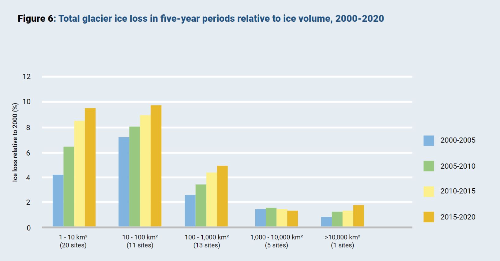
The graph here is from the full report (link in the press release) which also contains some useful tables of data. A quote  speaking calculus in the press release:

But a new study by UNESCO, in partnership with IUCN, shows these glaciers have been retreating at an accelerated rate since 2000 due to CO2 emissions, which are warming temperatures. They are currently losing 58 billion tons of ice every year – equivalent to the combined annual water use of France and Spain– and are responsible for nearly 5% of observed global sea-level rise.

Why does this all matter:

Half of humanity depends directly or indirectly on glaciers as their water source for domestic use, agriculture, and power. Glaciers are also pillars of biodiversity, feeding many ecosystems.

Who views violent crime as voting issue?

In the past I’ve posted about pew surveys presenting very split opinions by the D and the R teams. Today we have an interesting one within the D team in the Pew article Violent crime is a key midterm voting issue, but what does the data say? by John  Gramlich (10/31/2022). Key quote:

Differences by race are especially pronounced among Democratic registered voters. While 82% of Black Democratic voters say violent crime is very important to their vote this year, only a third of White Democratic voters say the same.

There are a couple of graphs in the article and plenty of quantitative information. What is particularly nice is the discussion about views on violent crime and some disconnects. The article does a great job of discussion possible reasons for this disconnect.


Whose top 1% does best?

How we answer this questions depends on what we mean by best and the comparison group. For today we’ll look at the share of income by the top 1% and compare mostly western Europe countries. The graph here is from the world income database. It is good to be in the top 1% in the U.S. where they take home home 19% of the countries income in 2021. China is next at 14%. Note that this is a statement of the share of income and not what the income is.

The link will take you to the page where the graph is from. There is also a map colored by ranges of income by the top 1% and if you click on the country in the map it is added to the time series. The U.S. just missed the top color of 19-31% (I’m assuming it starts at greater than 19). Try to guess the countries in the top category and which one is tops at 31%. There is also a link to download the data, as well as other indicators to choose from.

Is the ozone hole improving?

Some good news today. NOAA has an update on the Antarctic ozone hole in the article Antarctic ozone hole slightly smaller in 2022 (10/26/2022).

The hole in the ozone layer — the portion of the stratosphere that protects our planet from the sun’s ultraviolet rays — is continuing to decrease. The hole over Antarctica had an average area of 8.91 million square miles (23.2 million square kilometers). That measurement is slightly smaller than the extent of 8.99 million square miles (23.3 million square kilometers) reached last year, and well below the average seen in 2006 when the hole size peaked.

And

“Over time, steady progress is being made and the hole is getting smaller,” said Paul Newman, chief scientist for Earth Sciences at NASA’s Goddard Space Flight Center. “We see some wavering as weather changes and other factors make the numbers wiggle slightly from day to day and week to week. But overall, we see it decreasing through the last two decades. Eliminating ozone-depleting substances through the Montreal Protocol is shrinking the hole.”

Ozone hole data can be found at NASA Ozone Watch and there is a project on the Calculus Projects page.

Does ENSO impact global temperature?

If you pay attention to my monthly global temperature updates you might get the impression that global warming has slowed or even stopped. One key variable here is the ENSO (El Niño – Southern Oscillation). The graph here is from NOAA’s Monthly Temperature Anomalies Versus El Niño | September 2022 Global Climate Report:

Several observations are apparent in the figure. First, nearly every month since the late 1970s has been above the 20th century average, and has generally warmed through the period. Second, El Niño-like conditions (those months in red) tend to be warmer than neighboring periods, and La Niña-like conditions (blue) tend to be cooler. Third, protracted El Niño-like episodes tend to warm through the event, while La Niña-like episodes tend to cool through the event. Fourth, and finally, there are exceptions to all of the above points.

We haven’t had an El Niño event since 2018-2019 and have been in a La Niña period for quite some time. We have generally been warmer over the last year than all but the last two El Niño events. Fear not, we’ll set records again when the next El Niño comes around. BTW, this a great graph which shows how adding a third variable by way of color reveals important information.

How hot was Sept 2022?

From NOAA’s September 2022 Global Climate Report:

The September 2022 global surface temperature departure tied September 2021 as the fifth highest for September in the 143-year record at 0.88°C (1.58°F) above the 20th century average of 15.0°C (59.0°F). The ten warmest Septembers on record have all occurred since 2012. September 2022 also marked the 46th consecutive September and the 453rd consecutive month with temperatures, at least nominally, above the 20th century average.

A few highlights:

North America had its warmest September on record, surpassing the previous record set in 2019 by 0.30°C (0.54°F). The Caribbean Islands region had its sixth-warmest September on record.

Hong Kong had an especially warm and sunny September, where the average temperature, mean maximum temperature, and mean minimum temperature were each the second highest on record for the month.

After an unusually cool summer, Greenland experienced record-breaking temperatures for September at multiple stations along the west coast, making for an exceptionally warm September. In Paamiut and Qaqortoq, this month’s average temperature exceeded any of the three previous summer temperature averages.

Times series data is available on the page.

What is Climate Mapping for Resilience and Adaptation?

From CMRA:

Climate Mapping for Resilience and Adaptation (CMRA) integrates information from across the federal government to help people consider their local exposure to climate-related hazards. People working in community organizations or for local, Tribal, state, or Federal governments can use the site to help them develop equitable climate resilience plans to protect people, property, and infrastructure. The site also points users to Federal grant funds for climate resilience projects, including those available through the Bipartisan Infrastructure Law.

The CMRA site has a nice interactive tool to explore current climate-related hazards. The screen shot here is what you see if you click on Wildfire. There are also categories for extreme heat, drought, inland flooding, and coastal flooding. This is basically a one stop shopping for current disasters. Each category has a source so you can track down data.


What is the CEO-to-worker compensation ratio?

The Economic Policy Institute article CEO pay has skyrocketed 1,460% since 1978 by Josh Bivens and Jori Kandra (10/2/2022) include the chart here. Definitions first:

The realized measure of compensation includes the value of stock options as realized (i.e., exercised), capturing the change from when the options were granted to when the CEO invokes the options, usually after the stock price has risen and the options values have increased.

The granted measure of compensation values stock options and restricted stock awards by their “fair value” when granted. (Compustat estimates of the fair value of options and stock awards as granted are determined using the Black-Scholes model.)

CEO’s are doing better than the mere top 0.1%:

Over the last three decades, compensation grew far faster for CEOs than it did for other very highly paid workers (the top 0.1%, or those earning more than 99.9% of wage earners). CEO compensation in 2020 (the latest year for which data on top wage earners are available) was 6.88 times as high as wages of the top 0.1% of wage earners, a ratio 3.7 points greater than the 3.18-to-1 average CEO-to-top-0.1% ratio over the 1947–1979 period.

One outlier (he has the money to buy twitter I guess):

In 2021, Elon Musk (CEO of Tesla Motors) exercised $23.5 billion worth of stock options that would have expired in 2022. Under our “realized” methodology, this would have made his pay almost 1,000 times that of the average large-company CEO. Including him in our sample would have resulted in an increase of CEO pay in 2021 relative to 2020 of over 300% (the “average” for the sample would have been just under $100 million).

Because inclusion of this extreme outlier would have made this year’s numbers incomparable with previous years’ numbers, we opted to exclude Tesla and Musk from our sample entirely.

The article is excellent not just because of all the other graphs and access to data but they thoroughly explain their methodology.


Which political side is losing more?

According to the pew article Growing share of Americans say their side in politics has been losing more often than winning by Ted Van Green (10/3/2022) overall 72% feel their side is losing more. There are, of course, differences by party:

 Today, about eight-in-ten Republicans and Republican-leaning independents (81%) say they feel that their side is losing more often than winning politically, up from 74% who said this in 2021. In February 2020, with President Donald Trump in the White House, just 29% of Republicans said their side was losing more often than winning, while 69% said it was mostly winning.

This makes some sense. When you control the presidency you are winning more. Yet,

Still, two-thirds of Democrats and Democratic leaners (66%) say their side is losing more than winning, up from 60% in 2021.

In early 2020, and at earlier points in Trump’s presidency, much larger majorities of Democrats said they felt like their side was losing more than winning. For example, 80% of Democrats said this in February 2020.

Controlling the white house doesn’t seem to be helping the Dems. How sustainable is a society if majorities always think they are losing?

As always, pew has a methodology section which can be used in a stats class.


Are wildlife populations improving?

According to the Our World in Data article Wild mammals are making a comeback in Europe thanks to conservation efforts by Hannah Ritchie (9/27/2022) many mammal populations have increased as the chart shows.  The Eurasian beaver is thrilled:

The Eurasian beaver has made the most remarkable recovery. It’s estimated to have increased 167-fold, on average. There were likely only a few thousand beavers left in Europe in first half of the 20th century. Today there are more than 1.2 million.

Obtaining these estimate is a challenge and interesting:

For example, the result for Eurasian beavers is based on studies of 98 different populations. The grey wolf is based on 86 studies. For the Iberian lynx, high-quality time series were only available for 7 populations.

This means, for example, that the value of 16,705% for the Eurasian beaver means that there was, on average, a 16,705% increase in the numbers of beavers in each of the 98 populations that were included in this study. This does not mean that there was a 16,705% increase in all populations. Nor can we say that there was this level of increase for Eurasian beavers as a whole because we do not know the change in unmonitored populations, and the number of beavers in different populations will be different.

From a QL perspective it would be nice if the available data included the starting population size. It is also worth noting.

There are more than 250 European mammal species, so the ones that we covered here represent just 10% of the continent’s mammals. The fact that these species are doing well does not mean that all species are.

This article seems like it could be the basis for many projects.