How hot was Feb 2021?

From NOAA’s Global Climate Report – February 2021:

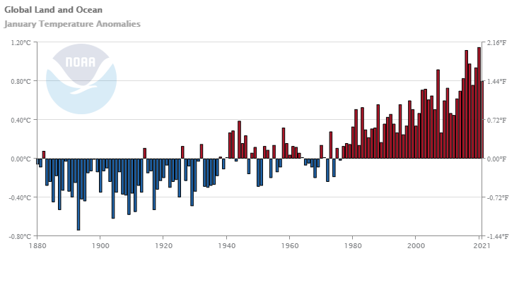
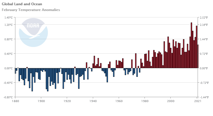
Averaged as a whole, the February 2021 global land and ocean surface temperature was 0.65°C (1.17°F) above the 20th century average—the smallest February temperature departure since 2014. However, compared to all Februaries in the 142-year record, this was the 16th warmest February on record.

Some context:

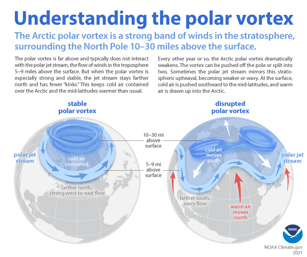
During the month, La Niña continued to be present across the tropical Pacific Ocean during February, helping dampen the global temperatures. Meanwhile, a strong negative Arctic Oscillation (AO) was also present during the first half of the month. Similar to the ENSO affecting global temperatures, the AO can influence weather patterns across the mid-latitudes. In a negative AO phase, the jet stream weakens and meanders, creating larger troughs and ridges. This allows really cold Arctic air to reach the mid-latitudes. Across the U.S., a trough over the central U.S. combined with a ridge over northern Canada to produce a Rex block, which is a blocking pattern that disrupts the jet stream and leads to more prolonged weather patterns. The AO on February 10–11 was -5.3, which essentially ties February 5, 1978 and February 13, 1969 for the lowest February value on record. They were also among the lowest 35 values for any day of the year (>99.9 percentile). By February 26, it had rebounded to +2.7 (97th percentile). The February mean AO was -1.2.

The time series data is available in the links in the additional resources box near the top of the article.

Is there a polar vortex climate change connection?

When the Arctic polar vortex is especially strong and stable (left globe), it encourages the polar jet stream, down in the troposphere, to shift northward. The coldest polar air stays in the Arctic. When the vortex weakens, shifts, or splits (right globe), the polar jet stream often becomes extremely wavy, allowing warm air to flood into the Arctic and polar air to sink down into the mid-latitudes. NOAA Climate.gov graphic, adapted from original by NOAA.gov.


The climate.gov article Understanding the Arctic polar vortex by Rebecca Lindsey (3/5/2021) is a complete primer on the polar vortex, jet stream, and what we know (and don’t) abut the connection to climate change.

According to NOAA stratosphere expert Amy Butler, people often confuse the polar vortex with the polar jet stream, but the two are in completely separate layers of the atmosphere. The polar jet stream occurs in the troposphere, at altitudes between 5-9 miles above the surface. It marks the boundary between surface air masses, separating warmer, mid-latitude air and colder, polar air. It’s the polar jet stream that plays such a big role in our day-to-day winter weather in the mid-latitudes, not the polar vortex.

Any relationships to climate change is unclear, for example:

The uncertainty due to a relatively short history of observations isn’t the only reason experts can’t dismiss the possibility that something could be up with polar vortex. Some climate model experiments do predict that continued warming will lead to a weakening of the polar vortex. “It’s true that when you run some high-resolution climate models, with a realistic stratosphere, and a realistic sea ice layer, and you reduce sea ice cover, these models predict that the polar vortex gets weaker,” Butler said. And some studies combining models and observations have shown a connection between low sea ice extent in the Barents and Kara Seas of the eastern Arctic, sudden stratospheric warming events, and cold winters in North America.

At the same time, other model simulations predict that warming and sea ice loss will lead to a stronger polar vortex. Part of the reason for the disagreement is that the impact of Arctic surface warming and sea ice loss on the atmospheric waves that can disrupt the polar vortex is very sensitive to exactly where and when the sea ice loss occurs, and that hasn’t been consistent across model simulations.

No data in this article but there are some useful graphs, such as the one copied here, and the article is just generally interesting.

Why did wages grow in 2020?

The EPI article, Wages grew in 2020 because the bottom fell out of the low-wage labor market, by Elise Gould and Jori Kandra (2/24/2021) provides insights into changes in the labor market this past year. Key find:

Wages grew largely because more than 80% of the 9.6 million net jobs lost in 2020 were jobs held by wage earners in the bottom 25% of the wage distribution. The exit of 7.9 million low-wage workers from the workforce, coupled with the addition of 1.5 million jobs in the top half of the wage distribution, skewed average wages upward.

There are seven graphs or tables in the article with the associated data. The last two graphs are of the same type as the one copied here but for the 2000 and 2008 recessions, respectively.

How much wind power was installed in 2020?

From the eia article The United States installed more wind turbine capacity in 2020 than in any other year by Richard Bowers and Owen Comstock (3/32021):

In both 2019 and 2020, project developers in the United States installed more wind power capacity than any other generating technology. According to data recently published by the U.S. Energy Information Administration (EIA) in its Preliminary Monthly Electric Generator Inventory, annual wind turbine capacity additions in the United States set a record in 2020, totaling 14.2 gigawatts (GW) and surpassing the previous record of 13.2 GW added in 2012. After this record year for wind turbine capacity additions, total wind turbine capacity in the United States is now 118 GW.

There are two other graphs in the article and an answer to the question of which state generates the most wind power. There are also links to the data.

What did the 116th Congress do more of?

From the Pew article, Though not especially productive in passing bills, the 116th Congress set new marks for social media use, by Aaron Smith and Sono Shah (1/25/2021):

Voting members of the 116th Congress collectively produced more than 2.2 million tweets and Facebook posts in 2019 and 2020. That means the median member of Congress produced more than 3,000 posts across their profiles on the two social media platforms during this span.

The 3000 sound like a lot but amounts to only about 8 posts a day and I have to imagine that some of it is done by aides.

There are two other charts in the article and a detailed methodology section. There is also a link to a related article which includes the number of laws passed from the 101st through 116th congress.

How should we measure COVID-19 deaths?

As we try to quantify the deaths by COVID-19 we need to measure it correctly. For example, deaths should be normalized to population size. Beyond that, we should really look at excessive mortality, that is mortality above what we might see without COVID-19. Some causes of deaths have decreased over the last year.  Our World in Data does just this on their Excess mortality during the Coronavirus pandemic (COVID-19) page. Not only do they  provide interactive graphs, such as the one copied here but also an explanation of the methodology.

A measure that is more comparable across countries is the P-score, which calculates excess mortality as the percentage difference between the number of deaths in 2020–2021 and the average number of deaths in the same period — week or month — over the years 2015–2019.

While the P-score is a useful measure, it too has limitations. For example, the five-year average death count might be a relatively crude measure of expected deaths because it does not account for trends in mortality or population size. To learn about other measures of excess mortality and their strengths and limitations, see our article with John Muellbauer and Janine Aron.

Note that the graph has times were for, say Italy, deaths were twice what would normally be expected, but at other times actually negative. As always Our World in Data provides the data and other graphics.

What is the connection between wildfires and climate change?

The NASA article The Climate Connections of a Record Fire Year in the U.S. West by Alan Buis (2/22/2021) provides a wildfire and climate summary. A few quotes:

Another factor driving changes in U.S. Western wildfires is a greater availability of fuel. Drier air stresses vegetation, making forests more susceptible to severe wildfires, while droughts are creating more dead fuel.

“Climate affects how long, how hot and how dry fire seasons are,” she said. “As climate warms, we’re seeing a long-term drying and warming of both air and vegetation.”

Yet another factor driving changes in Western U.S. wildfires is a greater number of ignition sources, both natural and human-caused.

There are other graphs in the article and a link to the paper that produced the graph copied here.

How do we model ocean plastic flow?

The Ocean Cleanup article Forecasting Ocean Plastic Around The GLOBE: A Deep Dive Into Modeling The Garbage Patches by Axel Peytavin (2/12/2021) provides an excellent overview of modeling the movement of plastic to the main garbage patches in the oceans.

We are now ready to delve into the core of the dispersion model: . It revolves around a central differential equation that integrates all phenomena at stake to give an estimate of a particle velocity, or the plastic’s speed through water. Basically, our methods calculate the particle’s velocity at a given time with a formula and use it to estimate where the particle will be a few minutes later. We repeat this process over a long period of time to get a series of positions, i.e., a trajectory of where the plastic goes.

Interesting data storage needs:

As this process has to be repeated over years, the datasets containing wind and speeds all around the globe can take up a lot of space. For instance, the LLC4320 global circulation model uses no less than 5 petabytes of data to be stored. At The Ocean Cleanup, we often use HYCOM data for currents (illustrated below), and GFS for the wind; and our datasets require at least 1.5 terabytes to be stored.

There is an equation and animated graphs.

As an aside here is a page with interesting marine mammal facts: Expert Guide to the Most Interesting Marine Mammals on the Planet.


How hot was Jan 2021?

For NOAA’s Global Climate Report – January 2021:

The January 2021 global land and ocean surface temperature was 0.80°C (1.44°F) above the 20th century average and ranked as the seventh warmest January in the 142-year global records. January 2021 also marked the 45th consecutive January and the 433rd consecutive month with temperatures, at least nominally, above the 20th-century average.

Only 7th warmest but

The year began with a La Niña episode in the tropical Pacific Ocean that started in August 2020. The El Niño-Southern Oscillation (ENSO) can affect global temperatures. La Niña tends to cool global temperatures slightly, while El Niño tends to boost global temperatures. With a slightly cool start to the year, there is only a 2.9% chance of 2021 ending as the warmest year on record. However, there is an over 99% chance of the year ranking among the 10 warmest years on record.

and

According to NCEI’s regional analysis, North America, as a whole, had its second warmest January on record, with a temperature departure from average of +3.96°C (+7.13°F). This was only 0.10°C (0.18°F) shy of tying the record warm January set in 2006.

and

As a whole, about 5.93% of the world’s surface had a record-warm January temperature–the third highest January percentage since records began in 1951. Only Januarys of 2016 (15.73%) and 2020 (7.05%) had a higher percentage of record warm January temperatures. Meanwhile, much of northern Asia was at least 2.0°C (3.6°F) colder than average, in stark contrast to most of 2020, when the region was well above average.

As always the report is worth reading and the data in the graph is available.

What are U.S. predicted energy CO2 emissions?

The eia article EIA’s AEO2021 shows U.S. energy-related CO2 emissions rising after the mid-2030s by Perry Lindstrom and Kevin Nakolan (2/11/2021) provides the graph copied here.

EIA projects that U.S. energy-related CO2 emissions will increase in the latter years of the projection as a result of increasing economic growth that leads to growing industrial energy requirements. EIA projects energy use in transportation will increase as vehicle fuel efficiency plateaus in the mid-2020s and becomes outweighed by increases in vehicle travel demand.

There are links to data in the article.