Who posts C-19 data?

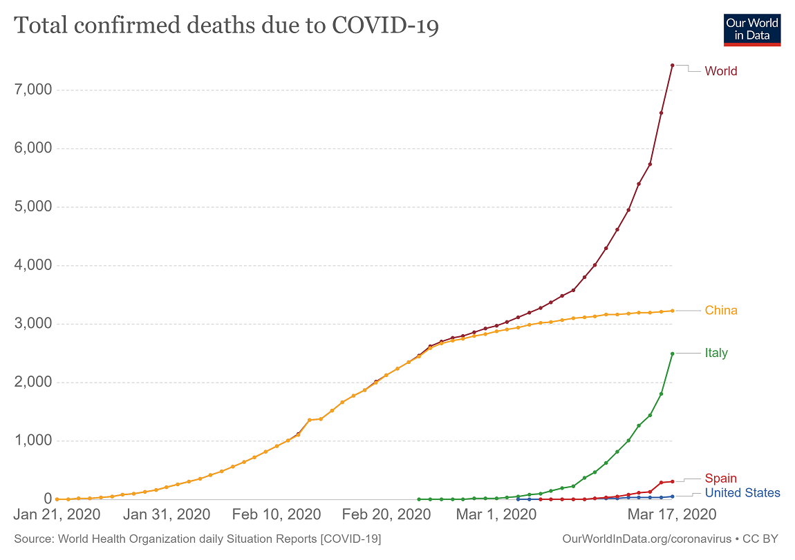
If you are looking for COVID-19 data there are two good resources. The first is the Our World in Data Cornonavirus page by Max Roser, Hannah Ritchie, and Esteban Ortiz-Ospina. They have a number of interactive graphs, such as the one copied here where you can select countries to view, that are updated daily.

The second source is the GitHub page CSSEGISandData maintained at Johns Hopkins. They have three csv files that are updated daily which are confirmed, deaths, and recovered. The data is maintained down to the county level is some places.

What does it mean to “flatten the curve”?

The New York Times article How Much Worse the Coronavirus Could Get, in Charts by Nicholas Kristof and  Stuart A. Thompson (3/13/2020) has a great interactive set of graphs that illustrate the importance of flattening the curve. The graphs start with the one copied here.

What’s at stake in this coronavirus pandemic? How many Americans can become infected? How many might die?

The answers depend on the actions we take — and, crucially, on when we take them. Working with infectious disease epidemiologists, we developed this interactive tool that lets you see what may lie ahead in the United States and how much of a difference it could make if officials act quickly.

One of the interesting features is that the user can drag a bar which is the date interventions begin and see how the curve changes.

How is spring changing?

Climate Central has put together their 2020 Spring Package (2/2/2020) with information and a selection of city graphs. For example

Analyzing average spring temperatures since 1970, the top increases occurred in the Southwestwhere spring is the fastest warming season. Reno, Nev. topped the list with an increase of 7.2°F, followed by Las Vegas, Nev. (6.4°F), El Paso, Texas (5.8°F), and Tucson (5.8°F). In general, 81% (197) of the 242 cities analyzed warmed by at least 1°F over the past fifty years. 

There are four different graph selections for spring: Average Temperature, Days Above Normal, Last Freeze, and a National Map. For the first three you can select from various cities. For example, I chose the graph for last freeze for Duluth, MN, which shows that on average the last freeze is occurring almost two weeks sooner.

The graphs are set up for easy download but there isn’t corresponding data. A previous post How much have fall nighttime temperatures risen? provides details on how to obtain this type of data.

How have counties grown since the great recession?

The Washington Center for Equitable Growth article New measure of county-level GDP gives insight into local-level U.S. economic growth by Raksha Kopparam (12/16/2019) provides the map copied here.

Making GDP a more useful metric may require peeling it apart and looking at the data more closely. On December 12, the U.S. Department of Commerce’s Bureau of Economic Analysis released a new measure of economic growth that does just this—Local Area Gross Domestic Product. LAGDP is an estimate of GDP at the county level between the years of 2001—2018. This measure allows policymakers and economists alike to examine local-level economic conditions and responses to economic shocks and recovery.

The new data measurement shows that private-sector industries across the nation have experienced growth since the end of the Great Recession in mid-2009, yet most of this growth is concentrated in the West Coast states and parts of the Midwest.

The article has three other maps two of which are growth based on the tech sectors and manufacturing. Each graph has a url citation for the data.


How did minimum wage increases impact wage growth?

This graph from the EPI post Low-wage workers saw the biggest wage growth in sates that increased their minimum wage between 2018 and 2019 by Elise Gould (3/4/2020) answers part of the question. It is worth noting that:

Strong wage growth at the 10th percentile is not simply due to stronger overall wage growth in those states.

Between 2018 and 2019, the median and 80th percentile wage in states with minimum wage changes increased 0.7% and 1.5%, respectively, while they increased 2.1% and 2.4%, respectively, in non-changing states.

There are three other graphs in the article and each has a link to data.

What’s New at sustainabilitymath?

In a follow up to last week’s graph, I have added a demographic graph of New York State, which provides the number of students in each grade in the 2017-2018 school year by race. The hover information includes percentages for each group. The data comes from the National Center for Education Statistics Elementary/Secondary Information System (ELSi). The link will take you to various table generators and it is easy enough to get data for your state and even data at the district level is available.

Isn’t the sun causing global warming?

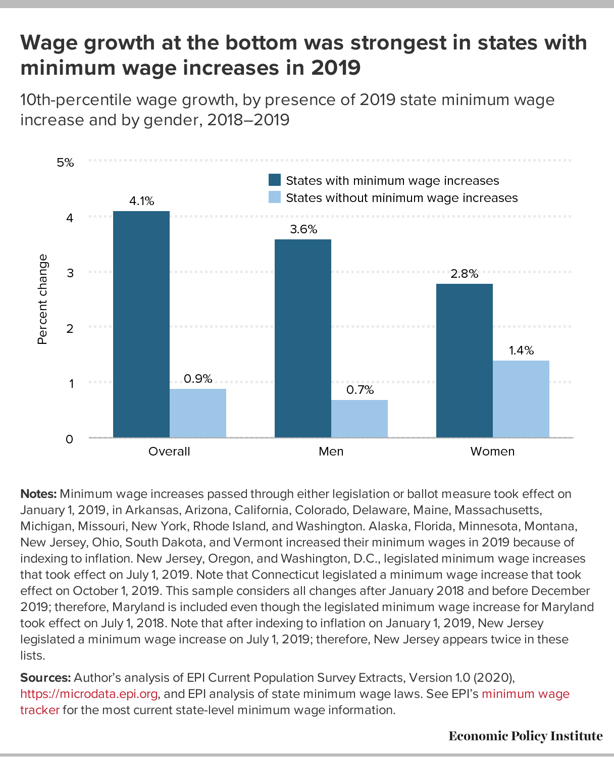
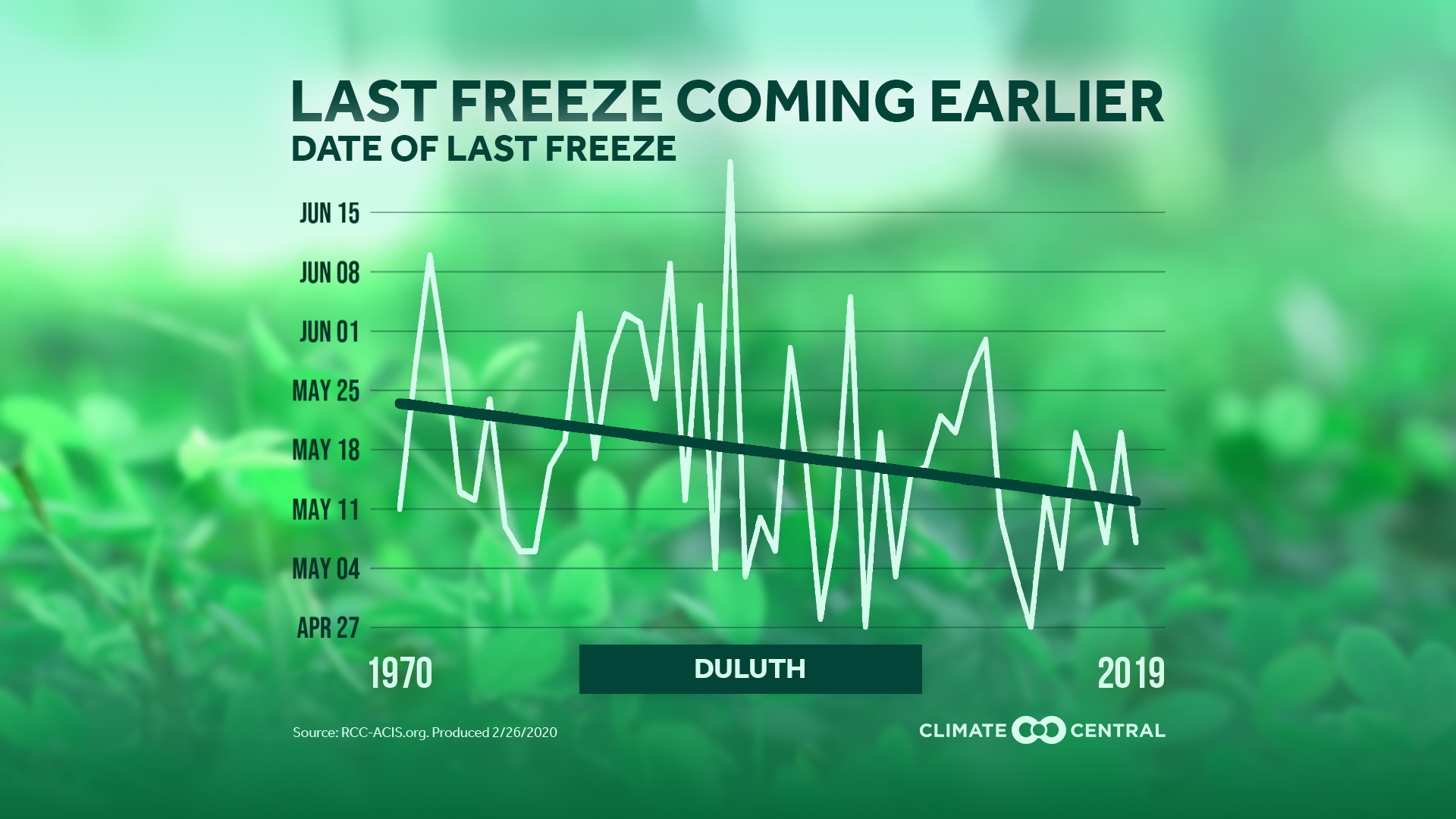
No, as can be easily seen by the graphic here copied from the NASA article There is No Impending ‘Mini Ice Age’ (2/13/2020). At the same time we won’t be seeing an ice age anytime soon:

This is called a “Grand Solar Minimum,” and the last time this happened, it coincided with a period called the “Little Ice Age” (a period of extremely low solar activity from approximately AD 1650 to 1715 in the Northern Hemisphere, when a combination of cooling from volcanic aerosols and low solar activity produced lower surface temperatures).

Even if a Grand Solar Minimum were to last a century, global temperatures would continue to warm. Because more factors than just variations in the Sun’s output change global temperatures on Earth, the most dominant of those today being the warming coming from human-induced greenhouse gas emissions.

The article has another time series of solar irradiance with a source.

How much has spring snow cover changed?

This graph shows average area covered by snow in the Northern Hemisphere during March and April as the difference from the 1981-2010 average.

The Climate.gov article Climate Change: Spring Snow Cover by LuAnn Dahlman and Rebecca Lindsey (2/14/2020) provides the answer as seen in their graph here.

This change is another example of a feedback loop.

About one-third of Earth’s land surface is covered by snow for some part of the year. The bright white covering affects global conditions by reflecting solar energy away from surfaces that would otherwise absorb it. Therefore, the earlier decrease in snow cover increases the amount of sunlight absorbed by Earth, and in turn, surface temperatures.

The article includes the data for the graph shown here.

Who is in high-poverty schools?

The EPI article Schools are still segregated, and black children are paying a price by Emma García (2/12/2020) provides an overview of inequities in secondary schools. Figure B in the article is copied here and speaks clearly to issues of inequality by race. There is also a political perspective that the percentages hide. According to Table 2 on the Census Bureau page School Enrollment in the United States: October 2018 – Detailed tables, there were 1,214,00 13 and 14 year old black students and 6,058,000 white students. (Note 13 and 14 years of age is approximately 8th grade and the Census Bureau is 2018 data while the EPI graph here is 2017. ) What this means is that there are 1,214,000*0.724=878,936 black eighth graders in high-poverty schools and 6,058,000*0.313=1,896,154 white eighth graders in high-poverty schools, or over twice as many white student in high-poverty schools.

The EPI article has a total of four graphs with available data.