Who produces the most air travel CO2 emissions?

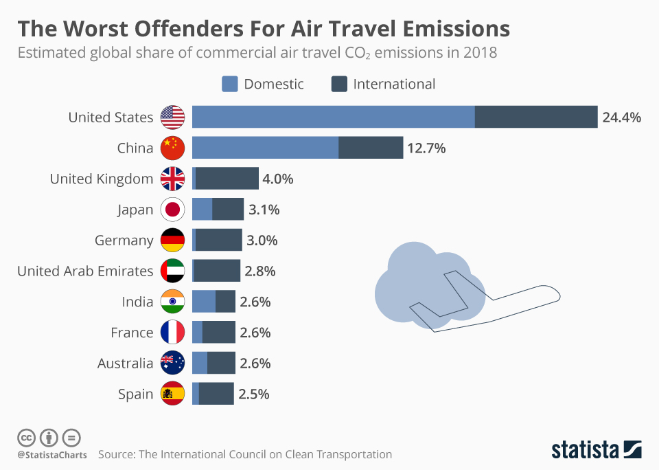
The statista post The Worst Offenders For Air Travel Emissions by Niall McCarthy (10/22/2019) produced the chart here. The post notes

The 12 percent of Americans who make more than six round trips by air each year are actually responsible for two-thirds of all U.S. air travel and therefore two-thirds of all its emissions. Each of those travelers emits over 3 tons of CO2 per year and if everyone else in the world flew like them, global oil consumption would rise 150 percent while CO2 from fossil fuel use would go up 60 percent. As over half of the population does not generally fly, the U.S. ranks 11th in emissions per capita from flying.

The post references the icct report CO2 emission from commercial aviation, 2018. It notes

CO2 emissions from all commercial operations in 2018 totaled 918 million metric tons—2.4% of global CO2 emissions from fossil fuel use. Using aviation industry values, there has been a 32% increase in emissions over the past five years.

At the bottom of the icct report there is a link to spreadsheet data with air travel emissions data by country.


What’s the difference between consumption and production CO2 emissions?

The Our World in Data article How do CO2 emissions compare when adjusted for trade by Hannah Ritchie (10/7/2019) answers the question.

To calculate consumption-based emissions we need to track which goods are traded across the world, and whenever a good was imported we need to include all CO2 emissions that were emitted in the production of that good, and vice versa to subtract all CO2 emissions that were emitted in the production of goods that were exported.

Consumption-based emissions reflect the consumption and lifestyle choices of a country’s citizens.

The map copied here show consumption CO2 emissions per capita. As some countries consume more than they produce this this may be a more accurate way to compare CO2 emissions.

We see that the consumption-based emissions of the US are higher than production: In 2016 the two values were 5.7 billion versus 5.3 billion tonnes – a difference of 8%. This tells us that more CO2 is emitted in the production of the goods that Americans import than in those products Americans export.

The opposite is true for China: its consumption-based emissions are 14% lower than its production-based emissions. On a per capita basis, the respective measures are 6.9 and 6.2 tonnes per person in 2016. A difference, but smaller than what many expect.

The article has seven charts with data including time series data.

How hot was September 2019?

From the NOAA Global Climate Report – September 2019:

The average global land and ocean surface temperature for September 2019 was 0.95°C (1.71°F) above the 20th century average and tied 2015 as the highest September temperature departure from average since global records began in 1880.

The Northern Hemisphere, as a whole, also had its warmest September on record at +1.24°C (2.23°F) above the 20th century average, surpassing the previous record set in 2016 by +0.03°C (+0.05°F). The five warmest Northern Hemisphere land and ocean surface temperature have occurred since 2015.

So far for 2019:

Each of the first nine months of the year had a global land and ocean temperature departure from average that ranked among the five warmest for their respective months. This gave way to the second warmest January–September in the 140-year record at 0.94°C (1.69°F) above the 20th century average.

Global time series data for September.

Northern Hemisphere time series data for September.


How do food systems differ between rich and poor countries?

The World Bank post The high price of healthy food and the low price of unhealthy food by Derke Headey and Harold Alderman (7/23/19) explores the connection between food systems and wealth in a country, along with the impacts. For example, their graph here show a correlation between stunting in children and the caloric price of milk.

The metric we use to analyze the global food system from a consumer perspective is the “relative caloric price” of a given food. Take eggs, for example: how expensive is an egg calorie in Niger compared to the most important staple foods in that country? Egg calories in Niger are 23.3 times as expensive as a calorie from a staple food, such as rice or corn. In contrast, egg calories in the US are just 1.6 times as expensive as staple food calories.

The big picture:

Hence the problem in less developed countries is that poor people also live in poor food systems: nutrient-dense foods like eggs, milk, fruits and vegetables can be very expensive in these countries, making it much harder to diversify away from nutrient-sparse staple foods like rice, corn and bread. The problem in more developed countries is rather different: unhealthy calories have simply become a very affordable option. In the US, for example, calories from soft drinks are just 1.9 times as expensive as staple food calories and require no preparation time.


What 5 states had the highest mortality rates?

The CDC data brief, Mortality Patterns Between Five States with Highest Death Rates and Five States with Lowest Death Rates: United States, 2017 by Jiaquan Xu, M.D. (9/5/2019), provides the  graph here of death rates by age (pay attention to the log scale on the x-axis). The five states with the lowest age-adjusted death rates: California, Connecticut, Hawaii, Minnesota, and New York. The highest: Alabama, Kentucky, Mississippi, Oklahoma, and West Virginia.  By gender:

Among males, the average death rate for the states with the highest rates (1,094.3) was 48% higher than that for the states with the lowest rates (741.2).

Among females, the average death rate for the states with the highest rates (785.7) was 49% higher than that for the states with the lowest rates (526.4).

For Hispanics:

The rate for Hispanic persons was 27% lower (374.6 compared with 509.7) for the states with highest rates than for the states with the lowest rates.

There are four graph each with links to the data.

Can a simulation help us understand the value of vaccinations?

This animated video by Robert Rhode demonstrates the idea of herd immunity. In short, if enough people in a population are vaccinated then that can protect those that can’t get vaccinated due to say age or illness. This can be used in a probability or QL course.

Which country is most responsible for atmospheric CO2?

The our world in data post, Who has contributed most to global CO2 emissions? by Hannah Ritchie (10/1/2019) provides this chart of cumulative CO2 emissions from 1751 to 2017 by region and country.

Since 1751 the world has emitted over 1.5 trillion tonnes of CO2.1 To reach our climate goal of limiting average temperature rise to 2°C, the world needs to urgently reduce emissions. One common argument is that those countries which have added most to the CO2 in our atmosphere – contributing most to the problem today – should take on the greatest responsibility in tackling it.

The article has three other interactive graph, with data, to explore CO2 emissions by country over time, although none of them consider per capita emissions.

What is the distribution of people by age and race?

The Pew article, The most common age among whites in U.S. is 58, more than double that of racial and ethnic minorities by katherine Schaeffer (7/30/19) provides this graph of the distribution of age by race.

Whites had a median age of 44, meaning that if you lined up all whites in the U.S. from youngest to oldest, the person in the middle would be 44 years old. This compares with a median age of just 31 for minorities and 38 for the U.S. population overall.

U.S. Hispanics were also a notably youthful group, with a median age of 30. As a separate Pew Research Center report noted, Latinos have long been one of the nation’s youngest racial or ethnic groups, dating back to at least 1980.

The demographic differences leads to questions about studies that compare variables by race. If they don’t adjust for these differences they may be inaccurate. In general, a random sample of people will end up with an older cohort for whites and some variables are correlated with age.

How much energy will we use in the future?

The EIA article EIA projects nearly 50% increase in world energy usage by 2050, led by growth in Asia by ARi Kahan (9/24/2019) provides regional energy consumption projections by decade through 2050.  The report includes six other graphs including sources of energy.

With the rapid growth of electricity generation, renewables—including solar, wind, and hydroelectric power—are the fastest-growing energy source between 2018 and 2050, surpassing petroleum and other liquids to become the most used energy source in the Reference case. Worldwide renewable energy consumption increases by 3.1% per year between 2018 and 2050, compared with 0.6% annual growth in petroleum and other liquids, 0.4% growth in coal, and 1.1% annual growth in natural gas consumption.

The eia projects that even with the rapid growth of renewables they will only make up 28% of energy production. There are links to the data.

How is the white working class share of the population changing?

The St. Louis Federal Reserve Bank post The White Working Class: National Trends, Then and Now by Bill Emmons, Ana Kent, and Lowell Ricketts (9/24/2019) looks at the share of the U.S. population for Non-Hispanic White and Hispanic or Minority Race (< 4 year degree) and Non-Hispanic White and Hispanic or Minority Race (at least 4 year degree).

Both the white working class’ share and its absolute numbers are shrinking. In fact, our projections indicate that the white working class will be a minority group by 2034.3 Several trends may help to explain this group’s decline. For example, the shares and numbers of white four-year college graduates (i.e., white grads) and nonwhites are increasing.4

Of course, the shrinking absolute numbers of the white working class also contribute. Other researchers have convincingly argued that increases in “deaths of despair”—including alcohol, drug and other opioid-related deaths, and suicides—have hit middle-aged whites with less than a bachelor’s degree particularly hard.5

The article includes four graphs similar to the one copied here but for the four regions of the U.S. one of which the white working class is no longer the largest group. There are also links to the data.