Tag Archives: calculus

What are the enrolled/employment trends of young adults?

The graph here is from the EPI article Class of 2023: Young adults are graduating into a strong labor market by Elise Gould, Jori Kandra, and Katehrine deCourcy (5/3/2023). They note:

Over the last 40 years, employment among young people has declined by about 7 percentage points while enrollment in school has increased by about 13 percentage points, as shown in Figure B.

These are true statements but do they accurately reflect the trends? Not really, but they clarify this a paragraph later:

Between 1986 and 2012, young people increased their enrollment in high school, college, or university by 19 percentage points from 36% to 55%. Enrollment softened a bit in 2013, then mostly held steady, softening slightly again in the pandemic. As of March 2023, 51.8% of young adults are enrolled in school.

The article is worth reading and there are three other graphs. All the graph have a data link.


How fast are seas rising?

The NASA post NASA Uses 30-Year Satellite Record to Track and Project Rising Seas (3/17/2023) has this to say (with calculus language):

Since satellites began observing sea surface height in 1993 with the U.S.-French TOPEX/Poseidon mission, the average global sea level has increased by 3.6 inches (9.1 centimeters), according to NASA’s Sea Level Change science team. The annual rate of rise – or how quickly sea level rise is happening – that researchers expect to see has also increased from 0.08 inches (0.20 centimeters) per year in 1993 to 0.17 inches (0.44 centimeters) per year in 2022. Based on the long-term satellite measurements, the projected rate of sea level rise will hit 0.26 inches (0.66 centimeters) per year by 2050.

Interesting fact in the article:

The 2022 increase was less than the expected annual rate because of a mild La Niña. During years with an especially strong La Niña climate pattern, average global sea level can even temporarily drop because weather patterns shift in a way that leads to more rainfall over land instead of the ocean.

NASA Sea Level page with data.


What is the most recent PIP (poverty and inequity platform) update?

The World Bank article March 2023 global poverty update from the World Bank: the challenge of estimating poverty in the pandemic (3/29/2023) reports on poverty updates:

Global poverty estimates were updated today on the Poverty and Inequality Platform (PIP). This update includes new regional poverty aggregates in 2020 and 2021 for Latin America and the Caribbean, and in 2020 for Europe and Central Asia, and the group of advanced countries. These are the regions for which we now have sufficient survey data available during the COVID-19 pandemic. In total, 113 new country-years have been added, bringing the total number of surveys to more than 2,100.

The summary with calculus terms:

It is still the case that global poverty has been falling since the 1990s, and at a slower rate since 2014 (World Bank 2022). Extreme poverty has been falling in all regions, except the Middle East and North Africa due to conflict and fragility (World Bank 2020). Roughly 60% of the world’s extreme poor in 2019 lived in Sub-Saharan Africa alone, while 81% of the global poor at the poverty line of $3.6.

The PIP itself is a page worth exploring. It doesn’t look like much but if you start clicking you’ll find there is much to discover. Try the calculator on the bottom right of the graph or trying clicking a country.

Which state grew the fastest in 2022?

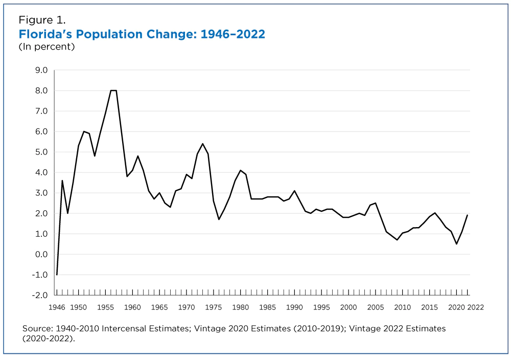
You probably looked at the graph already and know the answer, Florida. The graph is from the Census Bureau article New Florida Estimates Show Nation’s Third-Largest State Reaching Historic Milestone by Marc Perry, Luke Rogers and Kristie Wilder (12/22/2022). This leaves us with more questions than answers, which we’ll get to. First,

After decades of rapid population increase, Florida now is the nation’s fastest-growing state for the first time since 1957, according to the U.S. Census Bureau’s Vintage 2022 population estimates released today.

Florida’s population increased by 1.9% to 22,244,823 between 2021 and 2022, surpassing Idaho, the previous year’s fastest-growing state.

Florida wins by percent but did Florida add the most population?

Increasing by 470,708 people since July 2021, Texas was the largest-gaining state in the nation, reaching a total population of 30,029,572. By crossing the 30-million-population threshold this past year, Texas joins California as the only states with a resident population above 30 million. Growth in Texas last year was fueled by gains from all three components: net domestic migration (230,961), net international migration (118,614), and natural increase (118,159).

Florida was the fastest-growing state in 2022, with an annual population increase of 1.9%, resulting in a total resident population of 22,244,823.

If Florida grew by 1.9% and was the fastest, what was the U.S. growth?

After a historically low rate of change between 2020 and 2021, the U.S. resident population increased by 0.4%, or 1,256,003, to 333,287,557 in 2022, according to the U.S. Census Bureau’s Vintage 2022 national and state population estimates and components of change released today.

The last two quotes are from the Census Bureau press release Growth in U.S. Population Shows Early Indication of Recovery Amid COVID-19 Pandemic (12/22/2022). Plenty of QL uses for these articles and you can follow the link in the last quote for data.
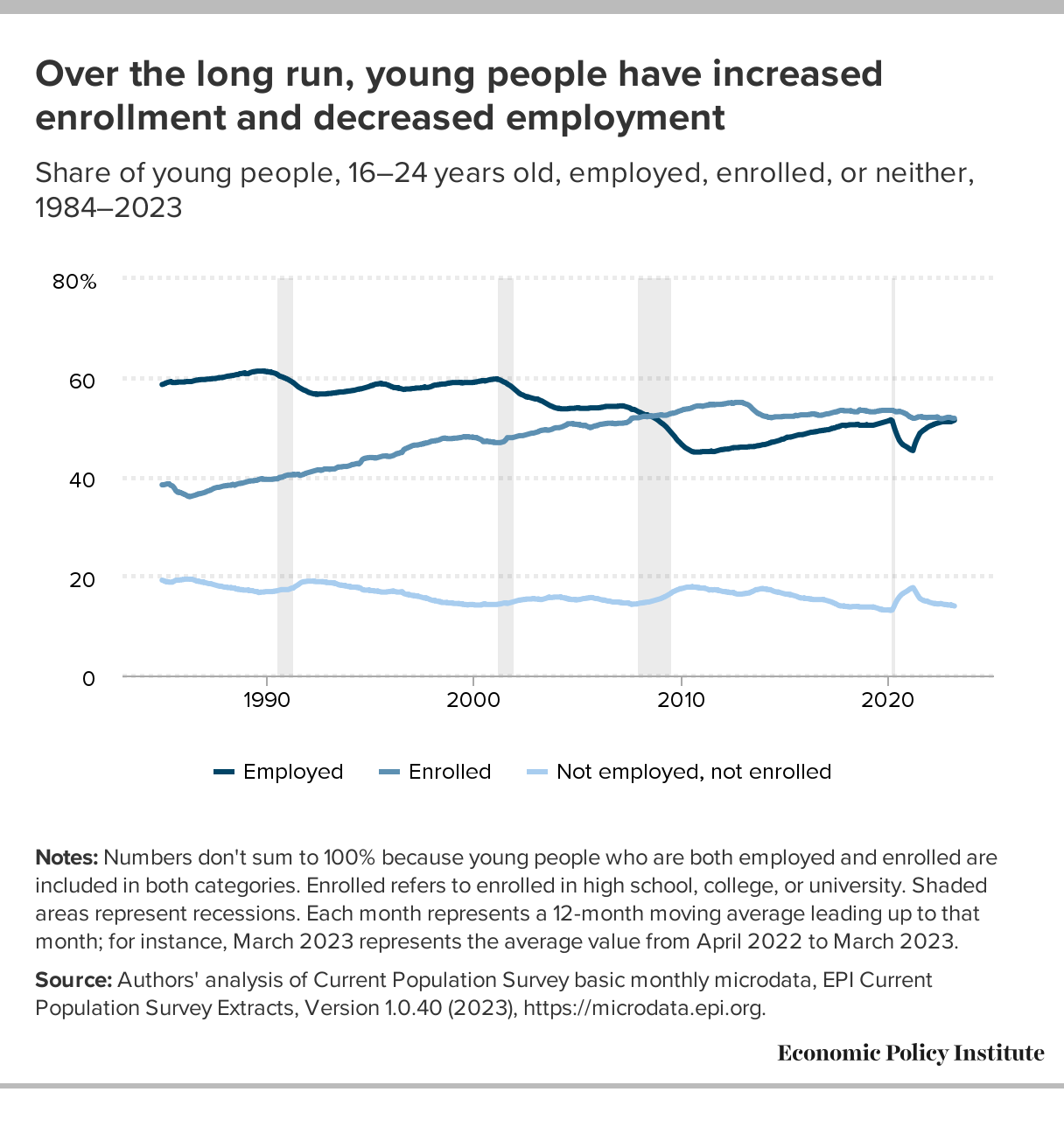
What should we know about oil markets?

The World Bank blog post Oil prices remain volatile amid demand pessimism and constrained supply  by Peter Nagle and Kaltrina Temaj (12/16/2022) is a overview of the oil market. There are seven graphs but one, U.S. strategic reserves, caught my attention and is copied here.

The United States and other OECD countries have released large amounts of oil from their strategic reserves, equal to about 1mb/d since March.  These releases have sharply reduced the level of strategic reserves—for example, the U.S. Strategic Petroleum Reserve (SPR) is currently at its lowest level since 1984—reducing available buffers in the event of future disruptions to supply. Conversely, the U.S. administration has announced it intends to start to refill the SPR at a price of about $70/bbl, potentially putting a floor under prices.

One other fact of interest:

OPEC+ members agreed to cut their production target by 2 million barrels per day starting in November 2022 and lasting through end-2023.  The actual reduction in production in November was much smaller than that (around 0.5 mb/d), largely because many members were already producing well below their target due to operational issues and capacity constraints. Indeed, even after the reduction in the production target, the group’s actual production was still short by 1.7mb/d. Spare production among the group remains low by historical standards, at around 3.5 mb/d or 3.5 percent of global oil demand.

Ample quantitative information in the article along with rates for calculus. There aren’t links to data but the sources are cited and shouldn’t be too hard to find.

Which glaciers may be gone by 2050?

The UNESCO press release, UNESCO finds that some iconic World Heritage glaciers will disappear by 2050 by François Wibaux (11/3/2022) provides a list of glaciers likely to be gone by 2050. For example,

According to available data, glaciers in all World Heritage sites in Africa will very likely be gone by 2050, incl. Kilimanjaro National Park and Mount Kenya

Glaciers in Yellowstone National Park (United States of America) – very likely to disappear by 2050

Glaciers in Yosemite National Park (United States of America) – very likely to disappear by 2050

The graph here is from the full report (link in the press release) which also contains some useful tables of data. A quote  speaking calculus in the press release:

But a new study by UNESCO, in partnership with IUCN, shows these glaciers have been retreating at an accelerated rate since 2000 due to CO2 emissions, which are warming temperatures. They are currently losing 58 billion tons of ice every year – equivalent to the combined annual water use of France and Spain– and are responsible for nearly 5% of observed global sea-level rise.

Why does this all matter:

Half of humanity depends directly or indirectly on glaciers as their water source for domestic use, agriculture, and power. Glaciers are also pillars of biodiversity, feeding many ecosystems.

Is the U.S. the number 1 carbon emitter per person?

To answer the question Berkeley Earth has an interactive, What is your country’s carbon trend?, where you select a country and you get a table of information and a graph, such as the one copied here. The table of information provides such facts as the U.S. emits 14.2 tonnes per person per year, is the 14th highest, and is 3.2x the world average.  On the other hand, the U.S. cumulative emissions (1850-2020) is 416,723 million tonnes and is the 1st highest.  The  nice part about the interactive is there is a link to the data on the graph.

The link is the same as the post from last Thursday, How much has your country warmed?, and this interactive is just a bit further down the page.

How does climate impact Arctic communities?

The graph here is from the paper Co-production of knowledge reveals loss of Indigenous hunting opportunities in the face of accelerating Arctic climate change in Environmental Research by Donna D W Houser, et. el. (8/24/2021). From the discussion:

Overall, our analyses indicate that the ugruk harvesting season for Qikiqtaġruŋmiut hunters is being compressed by the shorter spring ice breakup period. Indeed, if we summarize across our time-series from 2003 to 2019, Kotzebue Sound now clears of sea ice ∼22 d earlier (figure S3) and is the primary factor contributing to a shrinking ugruk hunting season.

A new Indigenous-led study documents how ice loss is changing seal hunts by Yereth Rosen (9/6/2021) is non-technical summary of the paper and when an article has a rate in it we can use it in calculus:

From 2003 to 2019, the seal hunting season diminished by about a day a year, with most of that change happening at the end of the season, according to the study, published in the journal Environmental Research Letters.

How much will tidal flooding increase?

The graph below shows the number of days per year that sea level in Kings Point, NY is projected to exceed 60 cm above MHHW.

Sea level rise will increase the likelihood of tidal flooding. NASA has posted a tool, Flooding Days Projection Tool, to help understand how much tidal flooding may increase. There is a drop down menu for numerous locations in the U.S.  For example, the graph here is for Kings Point, NY.  Along with the value of the data there are calculus terms in the post:

These projections are based on unique, location-specific relationships between annual mean sea level, the top 1% of astronomical tides in each year, and annual counts of threshold exceedances.

An interesting and essential feature of these graphs is that the number of flooding days per year does not necessarily increase smoothly in time. In most cases, there are inflection points where the frequency of flooding days increases rapidly, which may be useful when establishing planning horizons. In many locations around the United States and its territories, there are sharp inflection points around the mid-2030s that are related to the interaction between accelerating sea level rise due to climate change and a long-term, 18.6-year cycle in the amplitude of astronomical tides.

And discussions of probabilistic modeling:

The purpose of this tool is to produce probablistic projections of flood frequency in the future that provide information about the full range of possibilities for a given year, including the potential for the occasional—yet inevitable—severe years. The projections leverage the predictability inherent in certain contributions (e.g., tidal amplitude and climate-change-induced sea level rise) and use statistical methods to account for everything else. The projections are probabilistic, because rather than producing a single, most-likely number of flooding days for a future year, these projections produce a range of plausible numbers with probabilities assigned to each possibility or range of possibilities.

All in all this is a great resources for math classrooms.


What’s new at the EPA?

After about a 4 year hiatus, the EPA’s page Climate Change Indicators in the United Stats has been updated with “Twelve new indicators and several years of data have been added to EPA’s indicator suite.” One new indicator is Permafrost:

The Deadhorse site in northern Alaska had the highest rate of temperature change, at +1.5°F per decade. The Livengood site in interior Alaska was the only site to get cooler over the period of record, though only slightly. Overall, permafrost temperatures have increased at an average rate of 0.6°F per decade.

There are csv files to download the data and background information about the indicators. This is an excellent resource page.