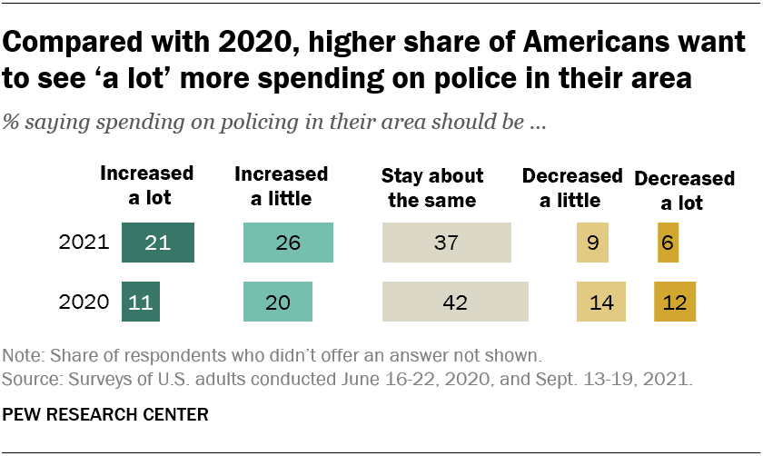
The Pew article Growing share of Americans say they want more spending on police in their area by Kim Parker and Kiley Hurst (10/26/2021) compares police spending polls from June 2020 and Sept 2021. The overall summary is in the graph copied here. There are other charts including a breakdown by race, ethnicity, age, and political leaning. For example,
Among Democrats, Black (38%) and Hispanic (39%) adults are more likely than White adults (32%) to say spending on police in their area should be increased. There is no significant difference across these racial and ethnic groups in the share of adults who say spending should be decreased.
Within the GOP, White and Hispanic adults differ in their views on this question: 64% of White Republicans say police spending in their area should be increased, compared with 53% of Hispanic Republicans.
Pew included a methodology section for both polls.
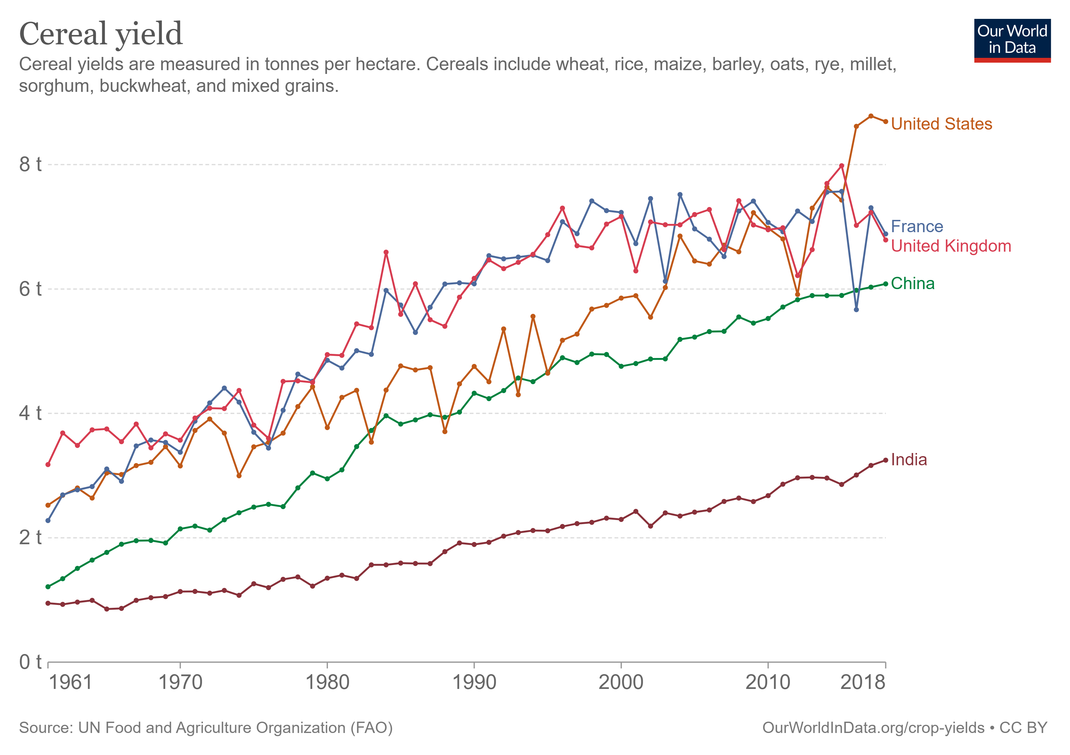
Our World in Data has, well, the data in their Crop Yields Data Explorer. For example, here is a chart of cereal yield for a few countries. With the crop yields data explorer you can select from most countries, different crops, and different measurements. In each case the data can be downloaded, as well as the chart.
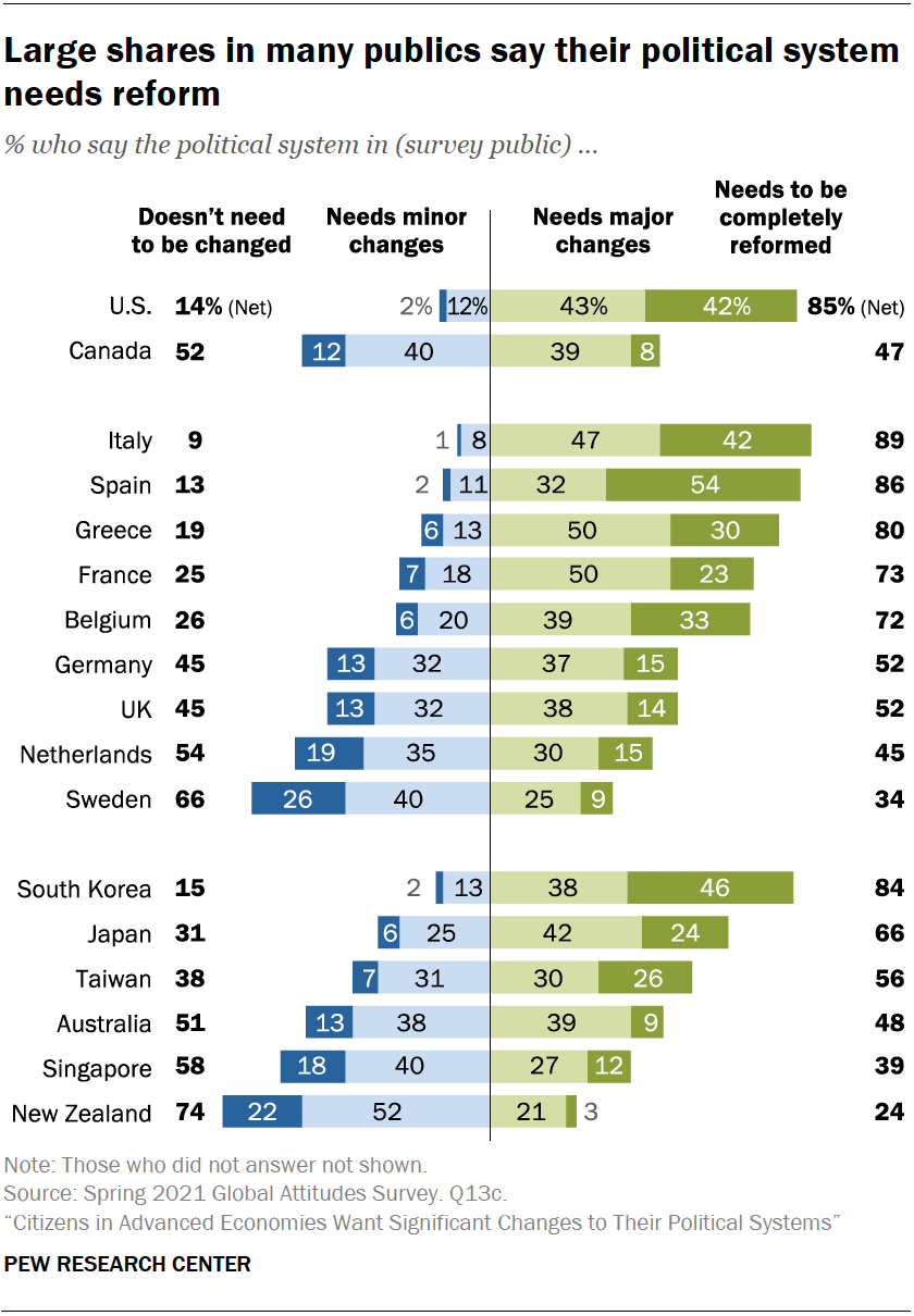
Across 17 advanced economies surveyed this spring by Pew Research Center, a median of 56% believe their political system needs major changes or needs to be completely reformed. Roughly two-thirds or more hold this view in Italy, Spain, the United States, South Korea, Greece, France, Belgium and Japan.
In the chart copied here, the U.S. is again near the top. In this case only Italy and Spain have a higher percentage saying they need change. There are over a dozen charts analyzing the issue of wanting political change in the article.
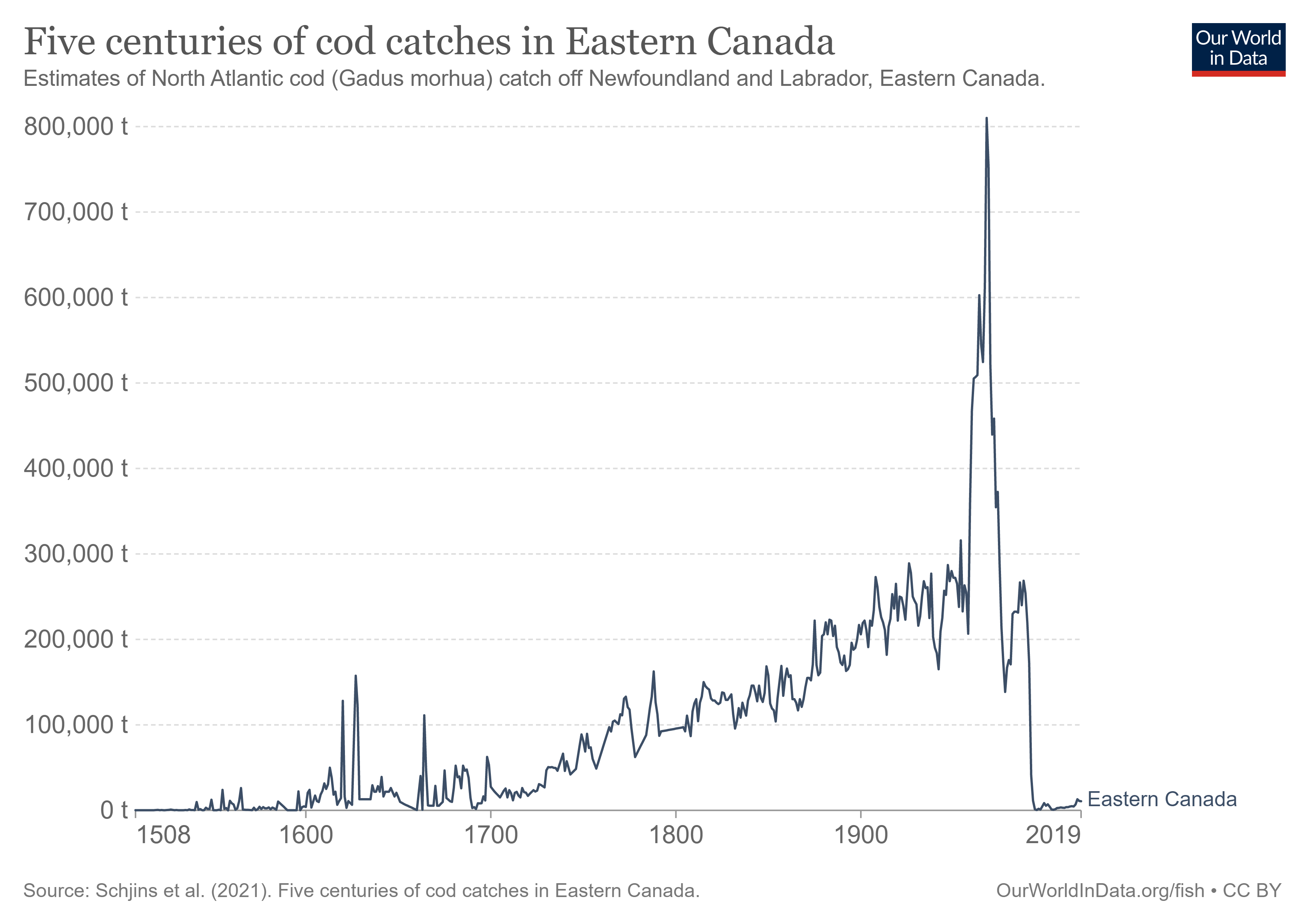
Our World in Data has an extensive post on Fish and Overfishing by Hannah Ritchie and Max Roser (first published Oct 2021). Here is one excerpt from this article:
In the chart here we see five centuries of cod catch in Eastern Canada.1 These fishing records date back to the year 1500. We see that fish catch started to increase from around 1700 through to the mid-20th-century. It peaked in 1968, before a collapse in fish stocks led to a dramatic decline. In fact, fisheries were forced to close 24 years later, in the early 1990s. Since then, stocks have not been able to recover due to the reopening of fisheries and their overexploitation afterwards.
You can download the data for this chart and more than a dozen others in the post.
The Pew report Diversity and Division in Advanced Economies by Laura Silver, Janell Fetterolf, and Aidan Connaughton (10/13/2021) has the U.S. is the top spot in a poll and not in a good way. The chart copied here from Pew has the U.S. at the top for conflict between political parties and even the second highest response from the U.S. would be third in the most common response.
Notably, however, in most societies racial and ethnic divisions are not seen as the most salient cleavage. Rather, in the majority of places surveyed, more people identify conflicts between people who support different political parties than conflicts between people with different ethnic or racial backgrounds. Political divisions are also seen as greater than the other two dimensions tested: between those with different religions and between urban and rural residents. (For more on the actual composition of each public surveyed on each of these dimensions, see Appendix A.)
The report has over 20 charts and rich context to discuss the quantitative results.
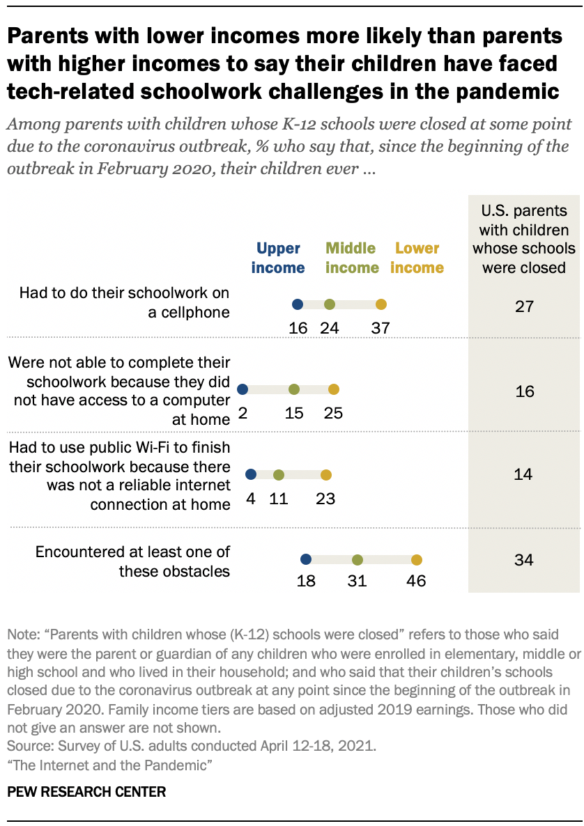
Parents with lower incomes whose children’s schools closed amid COVID-19 were more likely to say their children faced technology-related obstacles while learning from home. Nearly half of these parents (46%) said their child faced at least one of the three obstacles to learning asked about in the survey, compared with 31% of parents with midrange incomes and 18% of parents with higher incomes.
This technology divide isn’t new:
Even before the pandemic, Black teens and those living in lower-income households were more likely than other groups to report trouble completing homework assignments because they did not have reliable technology access. Nearly one-in-five teens ages 13 to 17 (17%) said they are often or sometimes unable to complete homework assignments because they do not have reliable access to a computer or internet connection, a 2018 Center survey of U.S. teens found.
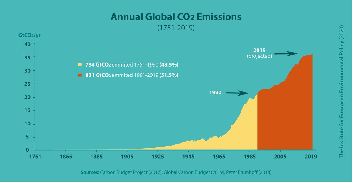
Slightly over half of all cumulative global CO2 emissions have taken place since 1990, the year of the first IPCC Assessment Report. The report re-confirmed anthropogenic climate change in a way that could not be ignored and led to the creation of the UNFCCC.
As a project you can do something similar comparing China and the U.S. using the U.S. and China CO2 Emissions projects under Calculus Projects.
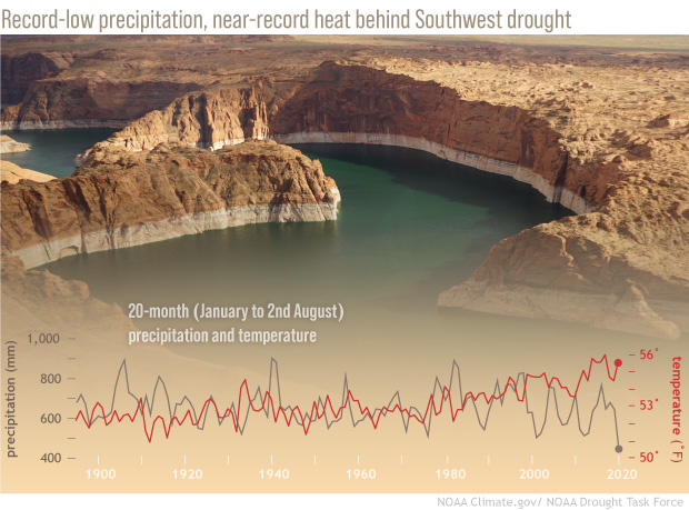
The team found that the record-low precipitation that kicked off the event could have been a fluke—just the rare bad luck of natural variability. But the drought would not have reached its current punishing intensity without the extremely high temperatures brought by human-caused global warming.
The key points:
The cumulative precipitation for the 20-month period was the lowest on record, dating back to 1895. That left almost the entire western half of the contiguous United States in some level of drought at the end of August.
and
Meanwhile, the average temperatures over the same 20-month period were near-record high. High temperatures make the atmosphere thirsty for moisture, which it draws vigorously out of the region’s soil, rivers, lakes—even the snowpack. This atmospheric demand, called a vapor pressure deficit (“VPD” for short), reached record highs during the current drought.
No relief in site:
As for when the current event will break, the task force warns that it’s unlikely to be this winter. Thanks in part to the expectation that La Niña will settle into the tropical Pacific by later this fall, odds are that winter precipitation across the Southwest will be below average once again. That means the drought will likely persist well into 2022, and perhaps longer, depending on how unfavorable the coming wet season is.
There is a link to the full report for those interested.
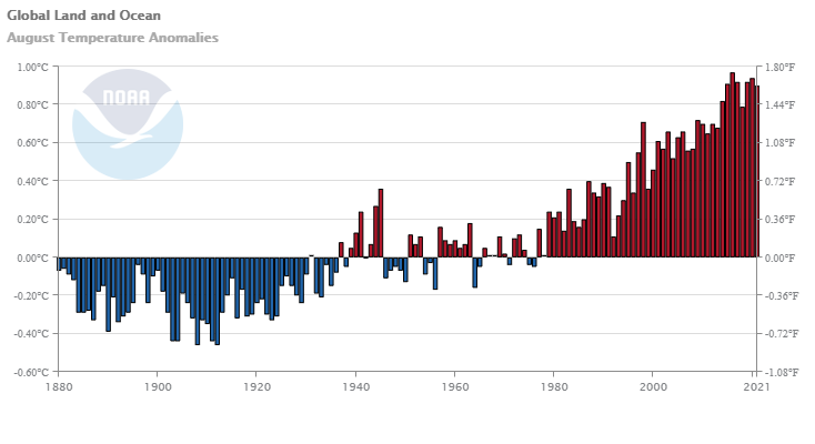
The August 2021 global surface temperature was 0.90°C (1.62°F) above the 20th century average of 15.6°C (60.1°F). This was the sixth warmest August on record. Nine of the 10 warmest Augusts have occurred since 2009. August of 1998 still ranks among the 10 warmest on record. August 2021 was also the 45th consecutive August and the 440th consecutive month with temperatures, at least nominally, above the 20th century average.
And for land only:
Averaged as a whole, the global land-only surface had a near-record high August temperature at 1.34°C (2.41°F) above average, which is only 0.04°C (0.07°F) less than the record-warm August set in 2016. This was mainly driven by the very warm land-only surface temperatures across the Northern Hemisphere, which had its warmest August on record at +1.44°C (+2.59°F). This value surpassed the previous record set in 2016 by 0.04°C (0.07°F).
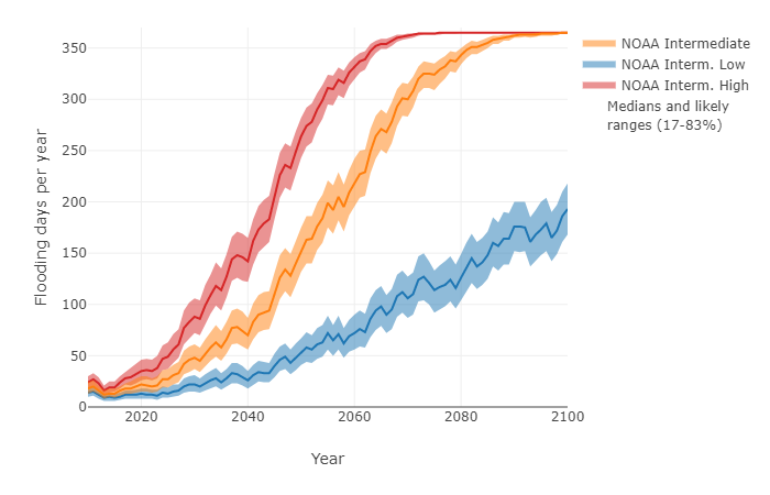
The graph below shows the number of days per year that sea level in Kings Point, NY is projected to exceed 60 cm above MHHW.
Sea level rise will increase the likelihood of tidal flooding. NASA has posted a tool, Flooding Days Projection Tool, to help understand how much tidal flooding may increase. There is a drop down menu for numerous locations in the U.S. For example, the graph here is for Kings Point, NY. Along with the value of the data there are calculus terms in the post:
These projections are based on unique, location-specific relationships between annual mean sea level, the top 1% of astronomical tides in each year, and annual counts of threshold exceedances.
An interesting and essential feature of these graphs is that the number of flooding days per year does not necessarily increase smoothly in time. In most cases, there are inflection points where the frequency of flooding days increases rapidly, which may be useful when establishing planning horizons. In many locations around the United States and its territories, there are sharp inflection points around the mid-2030s that are related to the interaction between accelerating sea level rise due to climate change and a long-term, 18.6-year cycle in the amplitude of astronomical tides.
And discussions of probabilistic modeling:
The purpose of this tool is to produce probablistic projections of flood frequency in the future that provide information about the full range of possibilities for a given year, including the potential for the occasional—yet inevitable—severe years. The projections leverage the predictability inherent in certain contributions (e.g., tidal amplitude and climate-change-induced sea level rise) and use statistical methods to account for everything else. The projections are probabilistic, because rather than producing a single, most-likely number of flooding days for a future year, these projections produce a range of plausible numbers with probabilities assigned to each possibility or range of possibilities.
All in all this is a great resources for math classrooms.
 The Pew article Growing share of Americans say they want more spending on police in their area by Kim Parker and Kiley Hurst (10/26/2021) compares police spending polls from June 2020 and Sept 2021. The overall summary is in the graph copied here. There are other charts including a breakdown by race, ethnicity, age, and political leaning. For example,