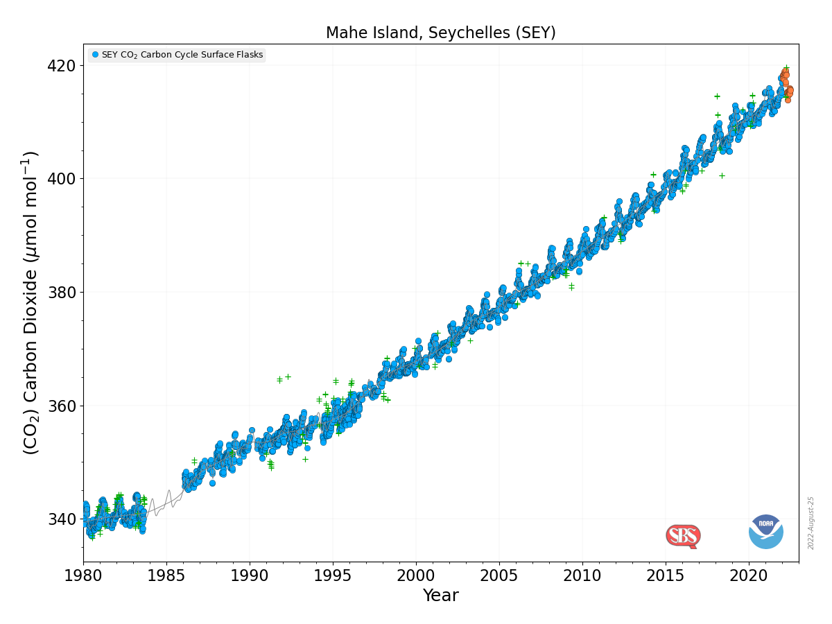
 Back to more serious data stuff today. Now, you may have been wondering where to get a visualization and the data for CO2 measurements collected on Mahe Island, Seychelles. All you have to do is start on NOAA’s Global Monitoring Laboratory where you will find a map with a bunch of dots around the world. Each dot represents a monitoring station. When you run the cursor over the data it tells you what data is collected at that location. Click the dot and then select what you’d like on the right sidebar. A new page will open for a few more choices. In the end you can get a graph, such as the one here, and a link to the data. Enjoy.
How hot was July 2022?
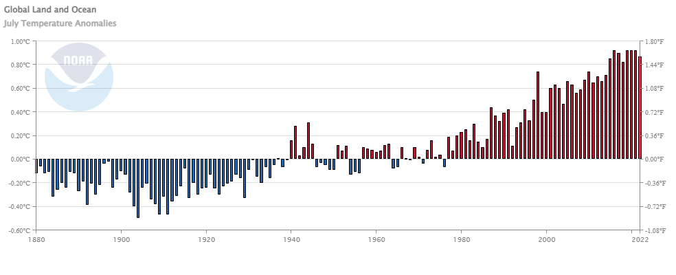 From NOAA’s July 2022 Global Climate Report:
The July 2022 global surface temperature departure was the sixth highest for July in the 143-year record at 0.87°C (1.57°F) above the 20th century average of 15.8°C (60.4°F). The five warmest Julys on record have all occurred since 2016. July 2022 also marked the 46th consecutive July and the 451st consecutive month with temperatures, at least nominally, above the 20th century average.
A few highlights:
Most of the contiguous U.S. had warmer-than-average temperatures in July, with several areas experiencing record-warm temperatures this month. July 2022 was the third-warmest July on record for the U.S.
Portugal had its warmest July on record, according to the Portuguese weather service. A station in Pinhão recorded a temperature of 47.0°C (116.6°F) on July 14, setting a new record for the warmest day in July for the country.
Spain had its warmest July on record, as well as its warmest month on record since at least 1961. 29 major weather stations had an average July temperature that was the highest of any month since the beginning of the record in 1961.
Time series data is available at a link near the top of the page.
How much has Western US snowpack changed?
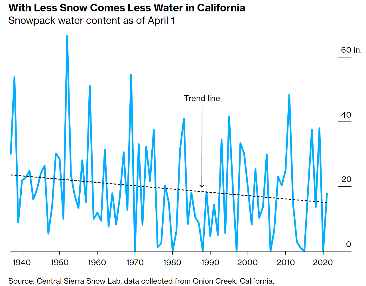 The Bloomberg article The End of Snow Threatens to Upend 76 Million American Lives by Baker et. el. (8/3/2022) has some excellent graphs, such as the one copied here, and overview of the water issues in the west.
The West’s mountain snowpacks have shrunk, on average, 23% between 1955 and 2022. By the end of the 21st century, California could lose as much as 79% of its peak snowpack by water volume.
This impacts all of the US:
The California Rice Commission says only about half of the 500,000 acres of rice typically planted in the state will be grown this year.
California alone accounts for a third of all vegetables grown in the US and two-thirds of the nation’s fruits and nuts.
The article includes a map of CA with charts of current reservoir levels as well as a couple of then and now photos. The data seems to come from the California Data Exchange Center.
Is the U.S. the number 1 carbon emitter per person?
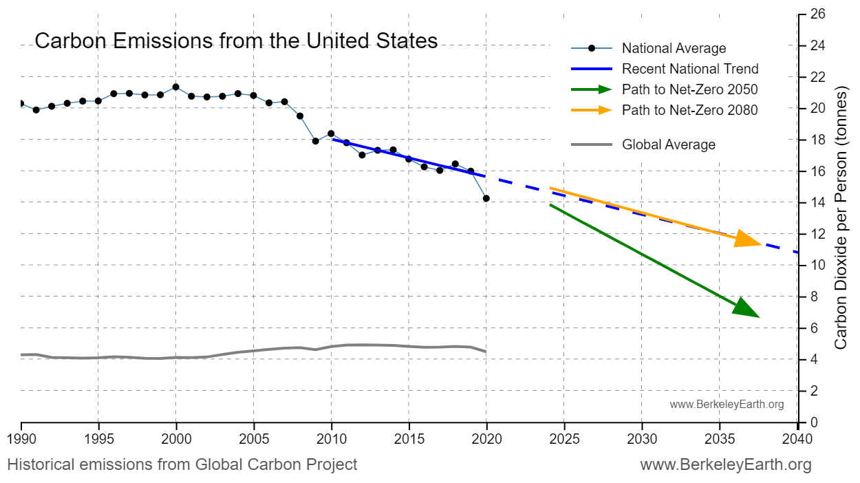
To answer the question Berkeley Earth has an interactive, What is your country’s carbon trend?, where you select a country and you get a table of information and a graph, such as the one copied here. The table of information provides such facts as the U.S. emits 14.2 tonnes per person per year, is the 14th highest, and is 3.2x the world average. On the other hand, the U.S. cumulative emissions (1850-2020) is 416,723 million tonnes and is the 1st highest. The nice part about the interactive is there is a link to the data on the graph.
The link is the same as the post from last Thursday, How much has your country warmed?, and this interactive is just a bit further down the page.
How much has your country warmed?
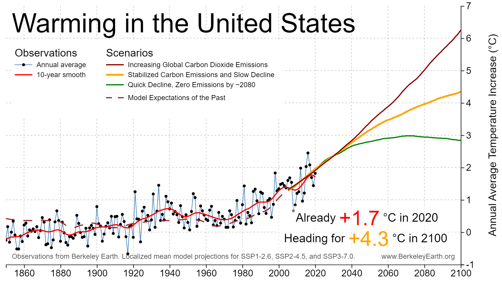
The Berkeley Earth page Actionable Climate Science for Policymakers has a Country-Level Warming Projections interactive graphic. Select a country and a graph, such as the one here for the U.S. appears. Click on the button below the graph, View More Details, and you will get extra text information and links to download the graph and the data.
As for the U.S. Berkeley Earth tells us the country has already warmed 1.7 deg C and headed for around 4.3 deg C by 2100,
How hot was the UK?
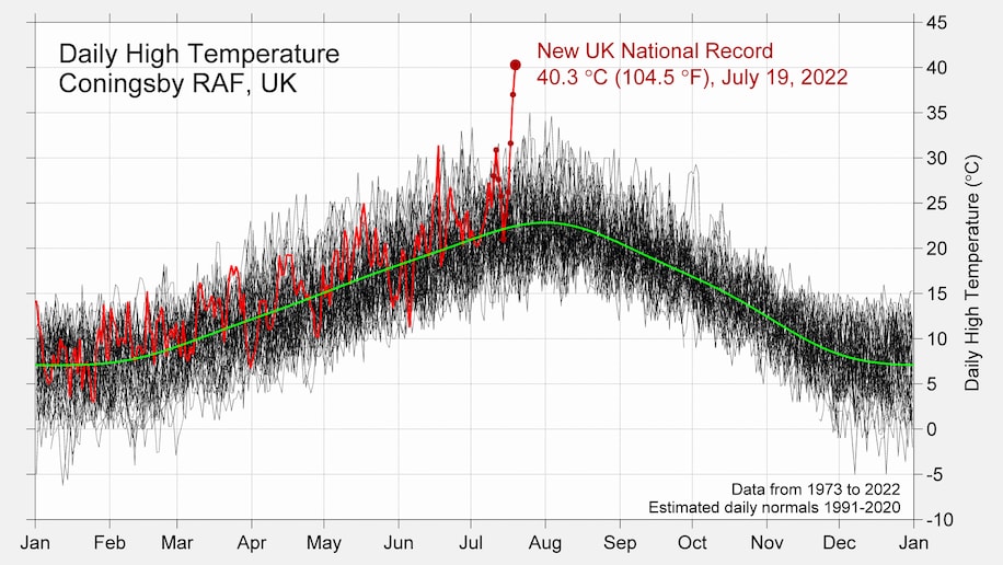
I’m sharing this Washington Post article, Britain’s freakish heat demolishes records. Here’s what happened, because they have inserted this excellent graphic from Robert Rhode of Berkeley Earth. The graph says it all, but if you prefer words:
The maximum temperature reached Tuesday in Coningsby, England — 130 miles north of London — was unlike anything the village had ever observed. It was an outlier in the truest sense: about 9 degrees Fahrenheit (5 degrees Celsius) above the previous highest temperature.
You’ll find a couple of similar images on the Berkeley Earth’s Temperature Updates page. They are just as startling. Consider what it would be like if where you live hit 9 degrees about the current record high.
How hot was June 2022?
 From NOAA’s June 2022 Global Climate Report:
The global surface temperature for June 2022 was the sixth-highest in the 143-year record at 0.87°C (1.57°F) above the 20th century average. This month was also 0.08°C (0.14°F) cooler than the warmest June on record set in 2019. The ten warmest Junes have all occurred since 2010. June 2022 also marked the 46th consecutive June and the 450th consecutive month with temperatures, at least nominally, above the 20th-century average.
Highlights:
The city of Isesaki, which is located in Japan’s Gunma prefecture, had a maximum temperature of 40.1°C (104.2°F) on June 25, 2022 — a new national maximum temperature record for June. This also marked the first time Japan had a maximum temperature of 40.0°C (104.0°F) in June and was only 1.0°C (1.8°F) cooler than the all-time record of 41.1°C (106.0°F).
Data available at the top of the page.
Which electricity generation uses the least land?
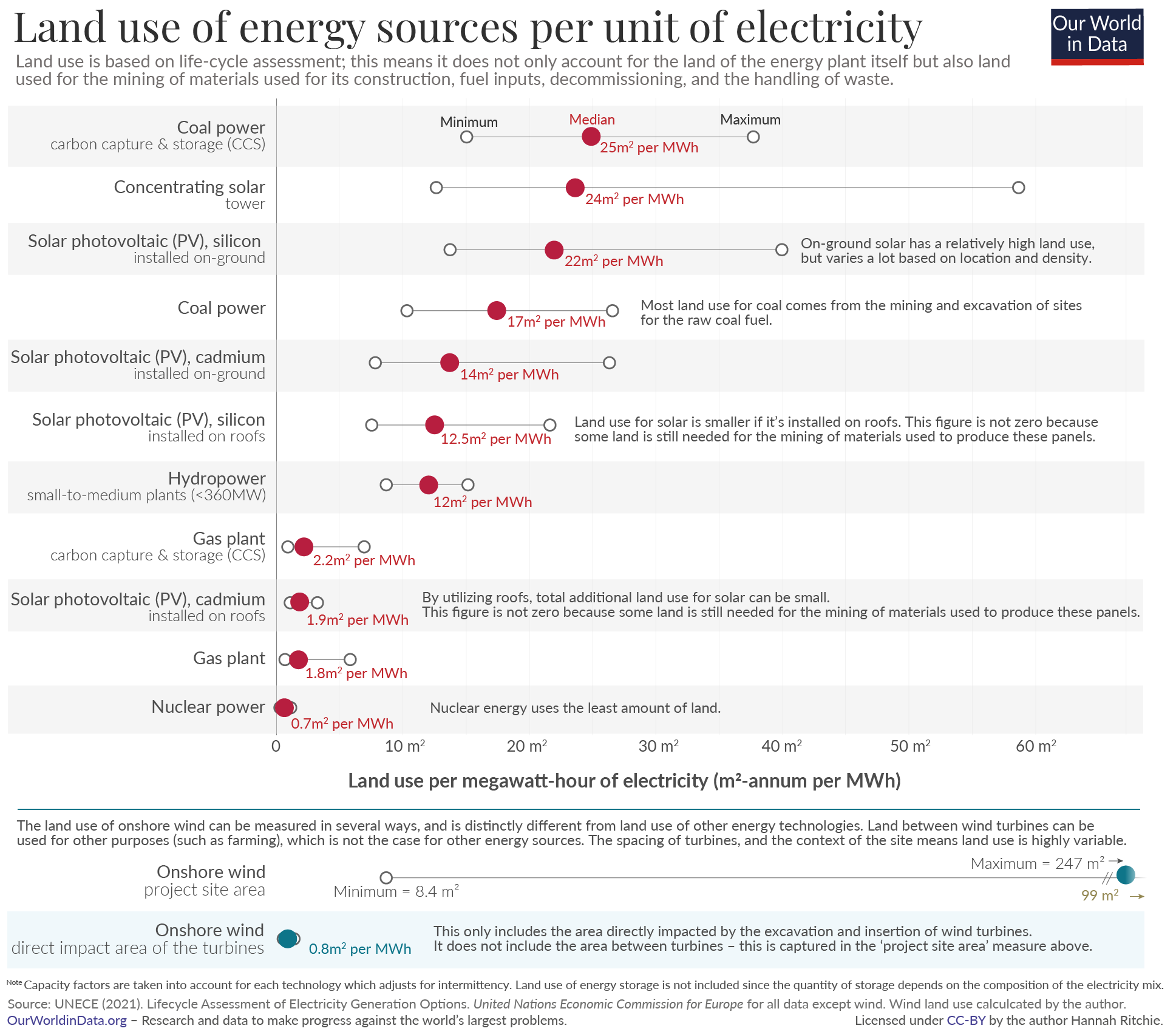 The Our World in Data article How does the land use of different electricity sources compare? by Hannah Ritchie (6/16/2022) looks to answer this question. Here is what they consider:
To capture the whole picture we compare these footprints based on life-cycle assessments. These cover the land use of the plant itself while in operation; the land used to mine the materials for its construction; mining for energy fuels, either used directly (i.e. the coal, oil, gas, or uranium used in supply chains) or indirectly (the energy inputs used to produce the materials); connections to the electricity grid; and land use to manage any waste that is produced.
The answer: Nuclear power.
At the bottom of the article there are links to other energy posts some of which have data.
How has the middle class changed?
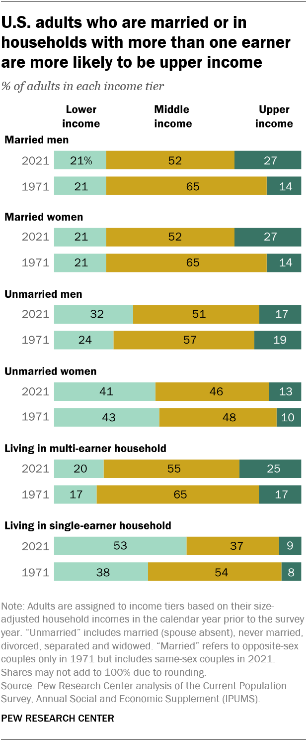 The Pew article How the American middle class has changed in the past five decades by Rakesh Kochhar and Stella Sechopoulos (4/20/2022) has seven facts about changes in the middle class. Overall though,
The share of adults who live in middle-class households fell from 61% in 1971 to 50% in 2021, according to a new Pew Research Center analysis of government data.
where middle class is defined as
In this analysis, “middle-income” adults in 2021 are those with an annual household income that was two-thirds to double the national median income in 2020, after incomes have been adjusted for household size, or about $52,000 to $156,000 annually in 2020 dollars for a household of three.
The chart here is from fact 4: Married adults and those in multi-earner households made more progress up the income ladder from 1971 to 2021 than their immediate counterparts.
Generally, partnered adults have better outcomes on a range of economic outcomes than the unpartnered. One reason is that marriage is increasingly linked to educational attainment, which bears fruit in terms of higher incomes.
The article includes a detailed methodology section.
How much has Lake Mead Dropped?
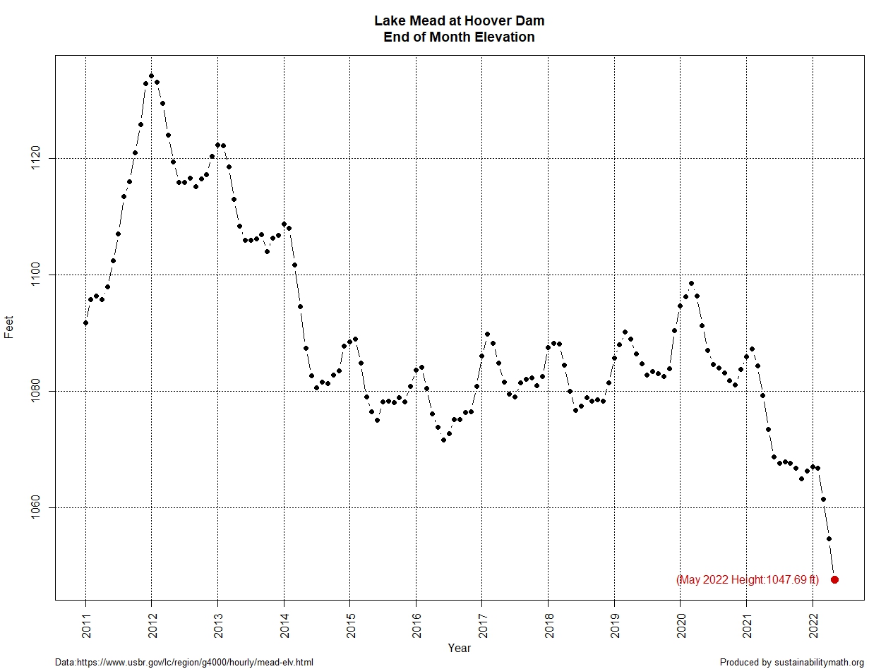
Lake Mead water levels continue to drop. At the end of May it was down to 1047.69 feet, which is a 13.8 foot drop since my post on April 25 with the end of March height. The west continues in drought according to the Drought Monitor.
What about electricity generation? From the Boulder City Review:
Hoover (Dam) would no longer be able to produce power at 950 feet of elevation,” she said. “We do not anticipate that happening.”
The graph here is from the data on the Lake Mead at Hoover Dam, End of Month Elevation (feet) page by the Bureau of Reclamation. The Sept Lake Mead post and the July Lake Mead post, which has a link to the R code for the graph.