U.S. net natural gas exports in February 2019 totaled 4.6 billion cubic feet per day (Bcf/d), marking 13 consecutive months in which U.S. natural gas exports exceeded imports. The United States exports natural gas by pipeline to both Canada and Mexico and increasingly exports liquefied natural gas (LNG) to several other countries.
Note the units, that is 4.6 billion cubic feet per day. The eia has links to the data.
In a related post How much coal does the U.S. export? this question was posed: If a country removes fossil fuels from the ground, how complicit are they in the CO2 emissions of those fuels even if they aren’t the ones burning it?
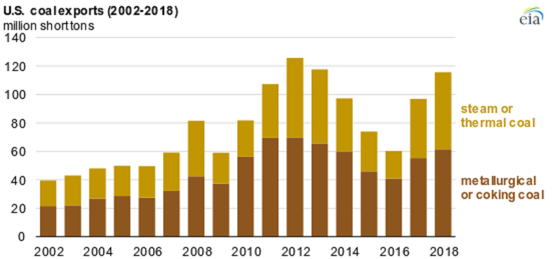
While U.S. coal consumption has generally declined since its 2008 peak, EIA expects that U.S. coal exports reached 116 million short tons (MMst) in 2018, the highest level in five years, based on foreign trade data collected by the U.S. Census Bureau. Exports of coal from the United States have increased since 2016 as international prices have made it more economic for U.S. producers to sell coal overseas.
While coal production in the U.S. has been on the decline (2014: 1,000,048,758 short tons; 2015: 896,940,563; 2016: 728,364,498; 2017:774,609,357 ) along with consumption, exports have been increasing. This raises philosophical questions. U.S. coal CO2 emissions have gone down due to burning less coal, but should U.S. CO2 emissions include U.S. coal burned in other countries? If a country removes fossil fuels from the ground, how complicit are they in the CO2 emissions of those fuels even if they aren’t the ones burning it?
The EIA article includes links to the data such as the Annual Coal Report page.
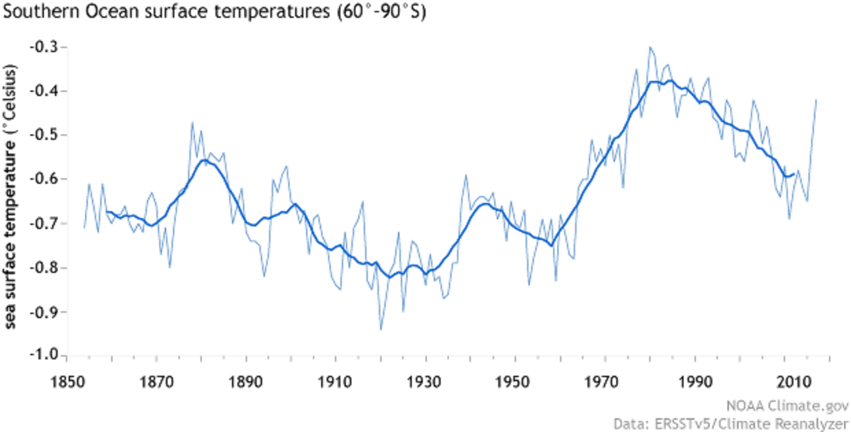
Monthly average sea surface temperatures in the Southern Ocean around Antarctica from 1850–2017, based on NOAA’s ERSSTv5 data set. Analysis by Climate Reanalyzer, University of Maine Climate Change Institute.
Thanks to thick ice, Antarctic elevation averages more than 6,000 feet (more than a mile above sea level). The very highest parts of the ice sheet, near the center of East Antarctica, rival the height of its tallest mountains, at nearly 13,500 feet.
Antarctica’s interior gets so little precipitation that it counts among the world’s driest deserts. Air masses reaching the high-elevation interior are usually stripped of moisture. The U.S. Antarctic Program reports that, continent-wide, Antarctica receives an average of roughly 2 inches of precipitation per year. (Phoenix, Arizona, gets about 7.5 inches of annual precipitation.)
Is Antarctica warming? It’s complicated:
The Intergovernmental Panel on Climate Change (IPCC) synthesis report published in 2014 found a warming trend over Antarctica, but expressed low confidence that the warming was caused by human activities. In the late twentieth century, the ozone hole and its effects on air circulation may have partly shielded the continent from the global warming influence of greenhouse gas emissions. Continued success in addressing the ozone hole, along with fossil fuel emissions, may cause Antarctic temperatures to rise more rapidly in future decades.
West of the Antarctic Peninsula, measurements dating back to the 1950s show a strong warming trend in the upper ocean: nearly 2.7°F. Meanwhile, waters of the Arctic Circumpolar Current (ACC), far below the surface, have warmed faster than the rest of the global ocean. Between depths of 1,000 and 3,000 feet, ACC temperatures rose by 0.11°F per decade between the 1960s and the 2000s. Between the 1980s and 2013, ACC temperatures at those depths rose by 0.16°F per decade.
What about ice melting?
In contrast with the Arctic—where climate change is amplified, and sea ice shows a clear declining trend over time—Antarctic sea ice does not show a significant overall trend in either the summer or the winter. One region, south and west of the Antarctic Peninsula, has shown a persistent decline, but this trend is small relative to the high variability of the other Antarctic sea ice regions. In 2015, sea ice experts concluded that the small gains in Antarctic sea ice in some seasons were not enough to cancel out Arctic losses, and so globally, sea ice was declining. That basic conclusion remains true in early 2019.
But what if all the ice on the continent melted?
If the entire Antarctic Ice Sheet were to melt at once, it would raise global sea level more than 180 feet. Outside of an epic natural disaster such as an asteroid slamming into Antarctica, that ice sheet isn’t going to melt entirely for centuries, but it will contribute to sea level rise over the next century. The question is: How much? The exact answer is elusive. The IPCC Fifth Assessment Report (AR5) states that the effect of Antarctic ice sheets on sea level rise over the coming century is a major unknown. Not only is the ice sheet melt rate challenging to measure precisely, but other events could accelerate sea level rise, and it’s hard to know when or even if those events will occur.
Read the article and get to know Antarctica. The is ample stats and QL classroom opportunities and graphs in the article.
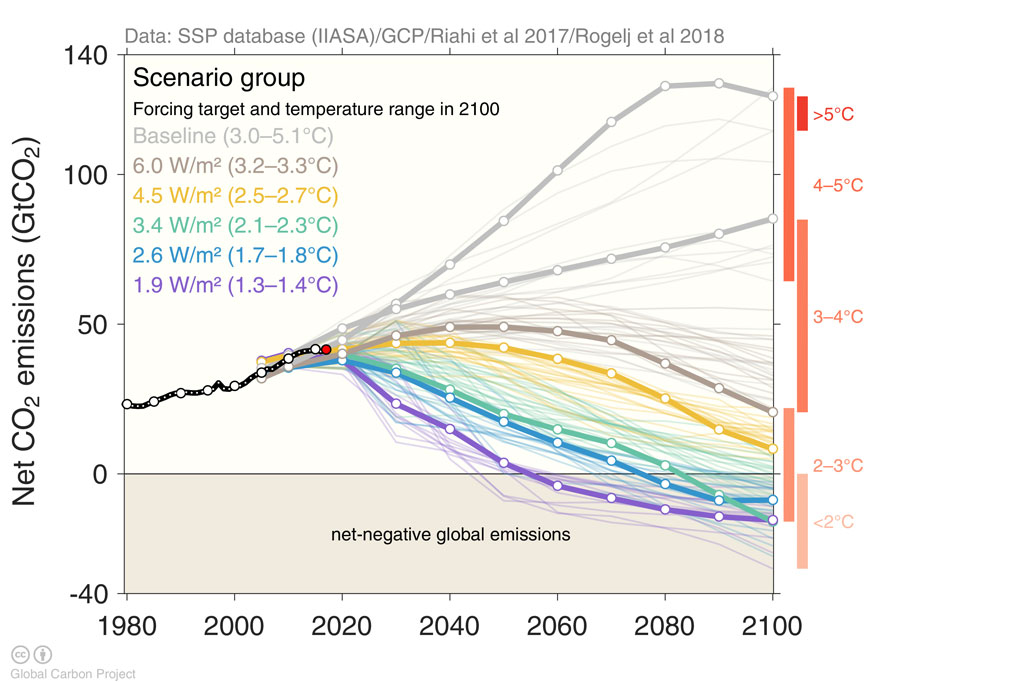
Global CO2 emissions (gigatonnes, GtCO2) for all IAM runs in the SSP database. SSP no-climate-policy baseline scenarios are shown grey, while various mitigation targets are shown in colour. Bold lines indicate the subset of scenarios chosen as a focus for running CMIP6 climate model simulations. Chart produced for Carbon Brief by Glen Peters and Robbie Andrews from the Global Carbon Project.
The SSPs feature multiple baseline worlds because underlying factors, such as population, technological, and economic growth, could lead to very different future emissions and warming outcomes, even without climate policy.
They include: a world of sustainability-focused growth and equality (SSP1); a “middle of the road” world where trends broadly follow their historical patterns (SSP2); a fragmented world of “resurgent nationalism” (SSP3); a world of ever-increasing inequality (SSP4); and a world of rapid and unconstrained growth in economic output and energy use (SSP5).
The graph copied here is the 5th in a series of 8 as the article explains the modeling process. The article is particularly useful for any course that discusses the modeling process. Most of the charts are interactive and there is also an animated graphic. There are links to data sources that requires setting up an (free) account.
A number of agencies have reported that 2018 was the fourth hottest year on record. The report from NASA GIS, 2018 Fourth Warmest Year in Continued Warming Trend, According to NASA, NOAA (2/6/19) includes a short video showing the warming of the planet while including other facts. The report also includes the animated graph, copied here, with temperature trends from five different agencies.
Global temperatures in 2018 were 1.5 degrees Fahrenheit (0.83 degrees Celsius) warmer than the 1951 to 1980 mean, according to scientists at NASA’s Goddard Institute for Space Studies (GISS) in New York. Globally, 2018’s temperatures rank behind those of 2016, 2017 and 2015. The past five years are, collectively, the warmest years in the modern record.
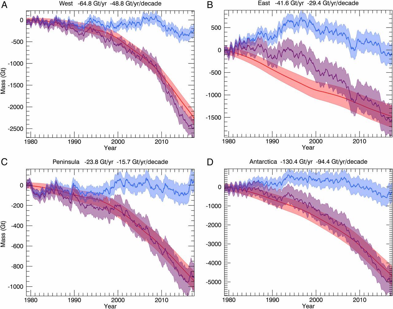
Time series of cumulative anomalies in SMB (blue), ice discharge (D, red), and total mass (M, purple) with error bars in billions of tons for (A) West Antarctica, (B) East Antarctica; (C) Antarctic Peninsula), and (D) Antarctica, with mean mass loss in billions of tons per year and an acceleration in billions of tons per year per decade for the time period 1979 to 2017.
The total mass loss from Antarctica increased from 40 ± 9 Gt/y in the 11-y time period 1979–1990 to 50 ± 14 Gt/y in 1989–2000, 166 ± 18 Gt/y in 1999–2009, and 252 ± 26 Gt/y in 2009–2017, that is, by a factor 6.
An interesting fact from the paper:
Antarctica contains an ice volume that translates into a sea-level equivalent (SLE) of 57.2 m.
In 2016 clinker contributed almost 2 billion tonnes of CO2, about 7% of the world total. What is clinker? The BBC article Climate change: The massive CO2 emitter you may not know about by Lucy Rodgers (12/17018) provides the answer. In short, clinker is the key ingredient in cement and the world produces a lot of cement (see graph).
If the cement industry were a country, it would be the third largest emitter in the world – behind China and the US. It contributes more CO2 than aviation fuel (2.5%) and is not far behind the global agriculture business (12%).
Clinker accounts for about 90% of the CO2 emissions related to concrete and so 90% of the 8% of world CO2 from cement is due to clinker. Historical data for world cement production can be found on the USGS page Historical Statistics for Mineral and Material Commodities in the United States. For the last couple of years see the Cement Statistics can Information page. The BBC article has another a couple of other nice graphs and a diagram with an explanation of how cement is made.
In 1985, the new NOAA report found, 16 percent of the Arctic was covered by the very oldest ice, more than four years old, at the height of winter. But by March, that number had dropped to under 1 percent. That’s a 95 percent decline.
At the same time, the youngest, first-year ice has gone from 55 percent of the pack in the 1980s to 77 percent, the report finds. (The remainder is ice that is two to three years old.)
The loss of sea ice creates a feedback loop:
There is a well-known feedback loop in the Arctic, caused by the reflectivity of ice and the darkness of the ocean. When the Arctic Ocean is covered by lighter, white ice, it reflects more sunlight back to space. But when there is less ice, more heat gets absorbed by the darker ocean — warming the planet further. That warmer ocean then inhibits the growth of future ice, which is why the process feeds upon itself.
and
Because of this, Arctic sea ice loss has already increased the warming of the planet as a whole. Ramanathan said the impact is equivalent to the warming effect of 250 billion tons of carbon dioxide emissions, or about six years of global emissions.
Ramanathan fears that entirely ice-free summers, if they began to occur regularly, could add another half- degree Celsius (0.9 degrees Fahrenheit) of warming on top of whatever else the planet has experienced by that time.
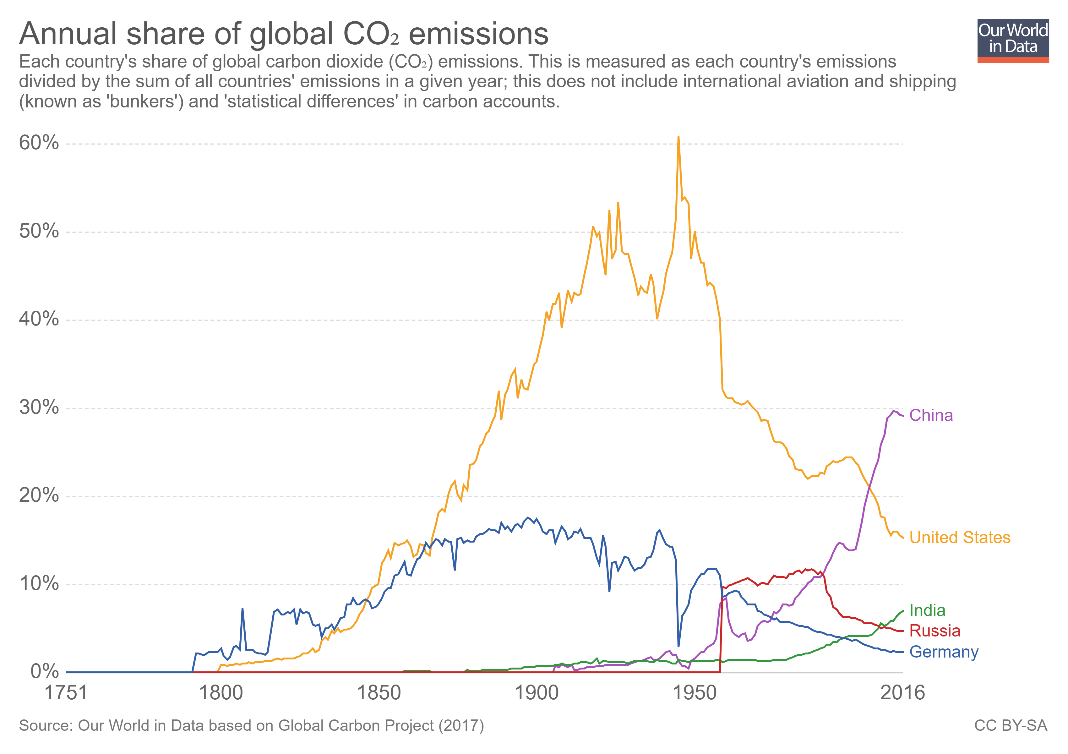
The country that emits the most CO2 depends on how it is measured. Our World in Data has a graph of annual share of CO2 emissions by country. By this measurement, a graph with the top 5 countries (China, U.S., India, Russia, & Germany) in 2016 was downloaded from Our World in Data. In this case, China has been the largest contributor of CO2 since 2005. In fact, in 2016 China emitted 10,295 million metric tons of CO2 compared to 5,240 million metric tons by the U.S. On the other hand, from EIA data, in 2016 each person in China emitted 7.3 tons of CO2 compared to a person in the U.S. at 16.2 tons. The EIA data dates back to 1980, and from 1980 to 2106 China emitted 177,547 million metric tones of CO2 compared to 197,176 for the U.S. Which is more important, per person, current, or total historical emissions? How does this create challenges in climate talks? Further analysis with other countries can be done with EIA data. Data can also be downloaded from the Our World in Data post. The Calculus Projects page has an example of using this data in a calculus class.