Tag Archives: climate change

How are blocking high, climate change, & hurricane Florence related?

Credit: Weather.com via Think Progress

The Think Progress article, Global warming ‘double whammy’ may be steering Florence into the Carolinas, says researcher by Joe Romm (9/12/2018) makes the connection.

The path of Florence has been extremely unusual. As Philip Klotzbach, an Atlantic hurricane expert, tweeted on Friday, “33 named storms (since 1851) have been within 100 miles of Florence’s current position. None of these storms made US landfall. The closest approach was Hurricane George (1950) — the highlighted track [in white].”

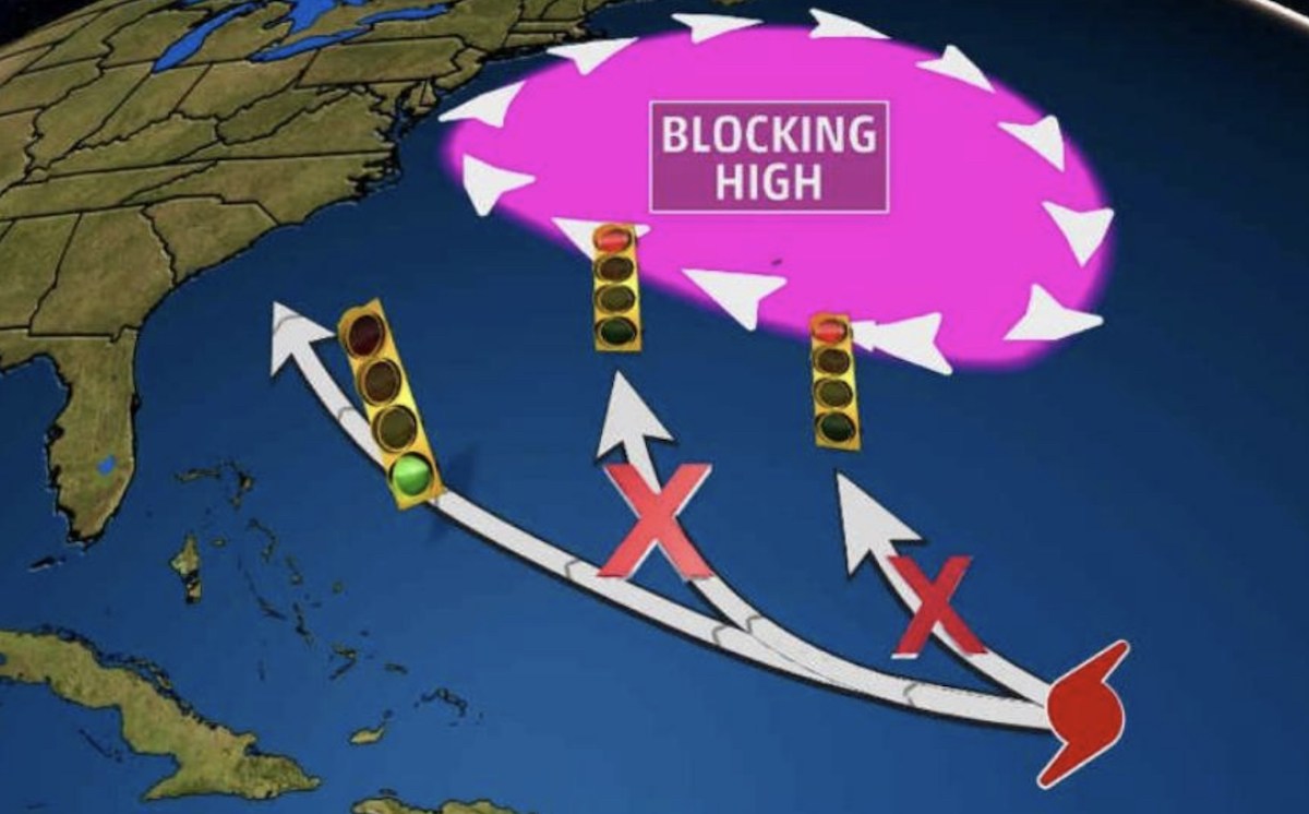
Florence, tragically, has made a beeline toward the Carolinas. And it clearly was steered away from the historical (or “climatological”) path by a major high-pressure system blocking its typical path — north and away from land.

Back in 2016 Francis published a study on the link between blocking highs and global warming. At the time, she told ThinkProgress: “Our new study does indeed add to the growing pile of evidence that amplified Arctic warming and sea-ice loss favor the formation of blocking high pressure features in the North Atlantic. These blocks can cause all sorts of trouble…”

There are more details in the well cited article. Sustainabilitymath posted about hurricanes last year, Are We Seeing More Hurricanes in the North Atlantic?, which inlcudes a link to hurricane data.

How many 90+ degree days will your hometown have in the future?

The New York Times interactive article How Much Hotter Is Your Hometown Than When You Were Born? By Nadja Popovich, Blacki Migliozzi, Rumsey Taylor, Josh Williams and Derek Watkins, allows the reader to input a birth year and hometown and provides a graph with historical 90+ degree days and predictions for the future. For example a person born in 1970 in NYC would get the graph copied here.  In 1970 the expectation was six 90+ degree days, today it is 11, and by 2050 it will be 24 with a likely range of 15 to 30.

THE NEW YORK AREA is likely to feel this extra heat even if countries take action to lower their emissions by the end of the century, according to an analysis conducted for The New York Times by the Climate Impact Lab, a group of climate scientists, economists and data analysts from the Rhodium Group, the University of Chicago, Rutgers University and the University of California, Berkeley. If countries continue emitting at historically high rates, the future could look even hotter.

The future projection shown here assumes countries will curb greenhouse gas emissions roughly in line with the world’s original Paris Agreement pledges (although most countries do not appear on track to meet those pledges).

There are related human health impacts:

Worldwide, high temperatures have been found to increase the risk of illness and death, especially among older people, infants and people with chronic medical conditions. Lower-income populations, which more often lack access to air conditioning and other adaptive technologies, are also more likely to suffer the impacts of extreme heat. In America, so are people of color.

The article has other graphs and quantitative information which can be used in  QL based course.

How has Arctic sea ice volume changed?

The Guardian article Arctic’s strongest sea ice breaks up for first time on record by Jonathan Watts (8/21/18) includes an animated graph of Arctic sea ice volume by year. We produce a similar graph using monthly average ice volume from PIOMAS (source cited for the data in the article).  The graph clearly displays the change of ice throughout the year and the loss of ice throughout the years.

Freakish Arctic temperatures have alarmed climate scientists since the beginning of the year. During the sunless winter, a heatwave raised concerns that the polar vortex may be eroding.

This includes the Gulf Stream, which is at its weakest level in 1,600 years due to melting Greenland ice and ocean warming. With lower circulation of water and air, weather systems tend to linger longer.

A dormant hot front has been blamed for record temperatures in Lapland and forest fires in Siberia, much of Scandinavia and elsewhere in the Arctic circle.

The data from PIOMA includes monthly and daily ice volumes.  The R script and csv file that produced the graph here can be downloaded.

How much has the High Plains (or Ogallala) aquifer declined?

Source: USGS

The USGS post High Plains Aquifer Groundwater Levels Continue to Decline (6/16/17) summarizes the results from the USGS report Water-Level and Recoverable Water in Storage Changes, High Plains Aquifer, Predevelopment to 2015 and 2013–15.

In 2015, total recoverable water in storage in the aquifer was about 2.91 billion acre-feet, which is an overall decline of about 273.2 million acre-feet, or 9 percent, since predevelopment. Average area-weighted water-level change in the aquifer was a decline of 15.8 feet from predevelopment to 2015 and a decline of 0.6 feet from 2013 to 2015.

A little geography:

The High Plains aquifer, also known as the Ogallala aquifer, underlies about 112 million acres, or 175,000 square miles, in parts of eight states, including: Colorado, Kansas, Nebraska, New Mexico, Oklahoma, South Dakota, Texas and Wyoming. The USGS, at the request of the U.S. Congress and in cooperation with numerous state, local, and federal entities, has published reports on water-level changes in the High Plains aquifer since 1988 in response to substantial water-level declines in large areas of the aquifer.

A more recent article in the Conversation, Farmers are drawing groundwater from the giant Ogallala Aquifer faster than nature replaces it by Char Miller (8/7/18) provides context around the loss of water in the Ogallala. 

In my view, Plains farmers cannot afford to continue pushing land and water resources beyond their limits – especially in light of climate change’s cumulative impact on the Central Plains. For example, a recent study posits that as droughts bake the land, lack of moisture in the soil actually spikes temperatures. And as the air heats up, it further desiccates the soil.

This vicious cycle will accelerate the rate of depletion. And once the Ogallala is emptied, it could take 6,000 years to recharge naturally. In the words of Brent Rogers, a director of Kansas Groundwater Management District 4, there are “too many straws in too small of a cup.”

The USGS post and the Conversation article are useful for a QL based course. The full USGS report has links to water-level data sources starting on page 7.

What do we know about nighttime minimum temperatures?

The recent article on Climate.gov Extreme overnight heat in California and the Great Basin in July 2018 by Rebecca Lindsey (8/8/18) provides an overview in context.

As the NCEI’s Deke Arndt has blogged about before, nighttime low temperatures are increasing faster than daytime high temperatures across most of the contiguous United States. For much of the West and Southwest, July’s record-breaking nighttime heat is a new highpoint in a long-term trend—one that has rapidly accelerated in recent decades. In California, average overnight low temperature in July rose by 0.3°F per decade over the historical record (1895-2018), but since 2000, the pace of warming has accelerated to 1.3°F per decade.

Here is an example of why this matters:

According to Tim Brown, director of NOAA’s Western Region Climate Center (WRCC), it’s a pattern that has serious consequences for wildfires and those who combat them. When temperatures cool off overnight, it’s not just a physical relief for firefighters who may be working in conditions that push the limits of human endurance; fire behavior itself relaxes as temperatures drop, winds grow calmer, and relative humidity rises.

The graph here for California July minimum temperature is from the article. A stats course can have students create a similar graph for their hometown. Go to  NOAA’s Local Climatological Data Map. Click on the wrench under Layers. Use the rectangle tool to select your local weather station. Check off the station and Add to Cart. Follow the direction from their being sure to select csv file. You will get an email link for the data within a day.  Note: You are limited in the size of the data to ten year periods. You will need to do this more than once to get the full data set available for your station.

The map here  shows statewide minimum temperature ranks for July 2018.  It is from NOAA’s National Temperature and Precipitation Maps page.  Under products select Statewide Minimum Temperature Ranks and choose the desired time period.  A map similar to the one in the article can be generated by selecting CONUS Gridded Minimum Temperature Ranks.

What are the recent Mauna Loa CO2 measurements?

NOAA: https://tinyurl.com/y9opmjxg

The  NOAA article Another Climate Milestone on Mauna Loa (6/7/18) provides an overview of CO2 measurement at the Mauna Loa site.  In particular,

Carbon dioxide levels measured at NOAA’s Mauna Loa Atmospheric Baseline Observatory averaged more than 410 parts per million in April and May, the highest monthly averages ever recorded, scientists from NOAA and Scripps Institution of Oceanography at the University of California San Diego announced today.

There is also this point:

From 2016 to 2017, the global COaverage increased by 2.3 ppm – the sixth consecutive year-over-year increase greater than 2 ppm. Prior to 2012, back-to-back increases of 2 ppm or greater had occurred only twice.

Why Mauna Loa?

The Mauna Loa observatory is ideally located for monitoring CO2 and other greenhouse gases in the atmosphere. Situated at more than 11,000 feet above sea level in the middle of the Pacific Ocean, the site gives researchers the opportunity to sample air that has been well-mixed during its passage across the Pacific and, thanks to its altitude, is minimally influenced by local vegetation or local pollution sources.

The article links directly to CO2 data sets and other resources.  The Calculus Projects page here has a Mauna Loa CO2 project and the Misc Materials page has the CO2 movie.

How hot has it been this week?

Simulation of maximum temperatures on July 3 from American (GFS) weather model at two meters above the ground. (University of Maine Climate Reanalyzer)

The Washington Post article, Red-hot planet: All-time heat records have been set all over the world during the past week by Jason Samenow (7/5/18), provides a nice overview of the record setting heat during this past week (map posted here copied from the article).  In North America:

Montreal recorded its highest temperature in recorded history, dating back 147 years, of 97.9 degrees (36.6 Celsius) on July 2. The city also posted its most extreme midnight combination of heat and humidity.

Ottawa posted its most extreme combination of heat and humidity on July 1.

In Europe:

Excessive heat torched the British Isles late last week. The stifling heat caused roads and roofs to buckle, the Weather Channel reported, and resulted in multiple all-time record highs:

In the Middle East:

As we reportedQuriyat, Oman, posted the world’s hottest low temperature ever recorded on June 28: 109 degrees (42.6 Celsius).

Maps of temperature anomalies can be created for various time periods from NASA’s GISS Surface Temperature Analysis page. June isn’t available yet but it will be before long.  Monthly Global Climate reports are available from NOAA. June isn’t available yet, but here are two highlight from May:

The contiguous U.S. May 2018 temperature was 2.89°C (5.2°F) above the 20th century average and the highest May temperature since national records began in 1895. This value exceeds the previous record set in 1934 by +0.4°C (+0.7°F).

Europe had its warmest May since continental records began in 1910 at +2.76°C (4.97°F), surpassing the previous record set in 2003 by +0.92°C (+1.66°F). May 2018 marks the first time in May that the continental temperature departure from average is 2.0°C (3.6°F) or higher.

How much are 30 year temperature averages increasing?

Changes in 30 year temperature averages depend on where you live, but Climate Central’s New Normal: Temperatures Are Trending Up Across U.S.  (3/16/18) has graphs for major cities across the U.S. The one here is for the U.S.

Normal temperatures, generally defined to be the 30-year average at a location, are trending up across most of the U.S. Since 1980, the average continental U.S. temperature has risen 1.4°F.

This is a change in the 30 year average so that the value for 2017 is the average from 1988-2017. In other words, the climate is changing.  A nice primer on the difference between weather and climate can be found at the NSIDC Climate vs Weather page:

Weather is the day-to-day state of the atmosphere, and its short-term variation in minutes to weeks. People generally think of weather as the combination of temperature, humidity, precipitation, cloudiness, visibility, and wind. We talk about changes in weather in terms of the near future: “How hot is it right now?” “What will it be like today?” and “Will we get a snowstorm this week?”

Climate is the weather of a place averaged over a period of time, often 30 years. Climate information includes the statistical weather information that tells us about the normal weather, as well as the range of weather extremes for a location.

The Climate Central post has a drop down menu and you can choose the graph for the city closest to you to see how much your climate has changed.  They don’t post the data that was used to create the graphs, but you can find the data for a location near you. Try starting with this NOAA map (look for a future post on using this portal for local data). This could be a great stats project for students.


How fast is Antarctica melting (and a quick calculus project)?

A recent NYT article, Antarctica Is Melting Three Times as Fast as a Decade Ago by Kendra Pierre-Louis (6/13/2018), states clearly that Antarctica is melting, well, three times faster than a decade ago, which is a rate of change statement. Rapid melting should cause some concern since:

Between 60 and 90 percent of the world’s fresh water is frozen in the ice sheets of Antarctica, a continent roughly the size of the United States and Mexico combined. If all that ice melted, it would be enough to raise the world’s sea levels by roughly 200 feet.

Any calculus student can roughly check the melting statement.  Antarctica ice data is available at NASA’s Vital Signs of the Planet Ice Sheets page. There you can download change in Antarctica ice sheet data since 2002. (Note: The NYT article has a graph going back to 1992, but ends in 2017 as does the NASA data.) A quick scatter plot and a regression line shows that the change is not linear and the data set is concave down. (The graph here is the NASA data and produces in R – the Calculus Projects page now has some R scripts for those interested.)  Now, a quadratic fit to the data followed by a derivative yields that in 2007 the Antarctica was losing 95 gigatonnes of ice per year and in 2017 it was 195.6 gigatonnes per year. Even with this quick simple method melting has more than doubled from 2007 to 2017. The NYT article states:

While that won’t happen overnight, Antarctica is indeed melting, and a study published Wednesday in the journal Nature shows that the melting is speeding up.

This is an excellent sentence to analyze from a calculus perspective. Given that the current trend in the data is not linear and at least about quadratic, then melting is going to increase each year.  On the other hand, maybe they are trying to suggest that melting is increasing more than expected under past trends, for example the fit to the data is more cubic than quadratic. In other words, is the derivative of ice loss linear or something else? If everyone knew calculus the changes in the rate of ice loss could be stated precisely.

How much are the oceans warming?

A year ago Climate Central posted the article Oceans Are Heating Up with a graph of sea surface temperature anomalies while providing context on issues of ocean warming:

 93 percent of the excess heat absorbed by the climate system goes into our oceans, creating major consequences. While more extreme storms and rising sea levels are some of the impacts of warmer oceans, rising CO2 levels and the resulting warmer oceans are impacting ocean health itself. The most well­ known effects are coral bleaching and ocean acidification, but an emerging issue is the decreasing oxygen levels in the warming waters.

The graph here is from NOAA’s Global Ocean Heat and Salt Content page. There you will find numerous updated graphs related to ocean heat content.  For related data go to NOAA’s Basin time series of heat content page to find about 50 time series on ocean heat.

For context on units, a person at rest typically generates about 60 joules of heat per minute while the graph here has y-axis units of 10^22 Joules.