NASA calls this a climate spiral. The visualization is well done, so watch it. The NASA page includes a link to the data used to make the visualization.
Where do I get a cool global temp poster?
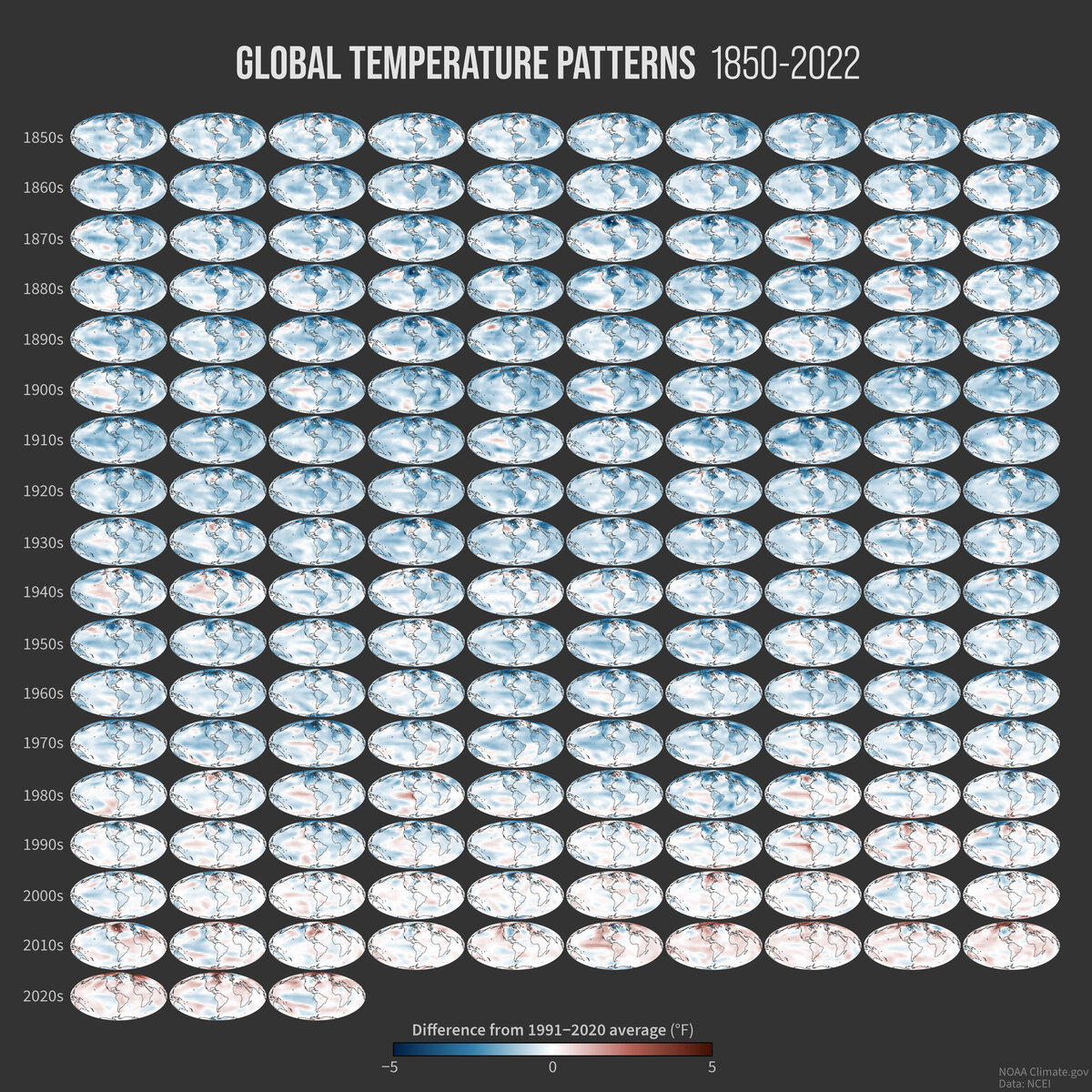
From the NOAA article A look at all 173 of NOAA’s new global temperature maps by Rebecca Lindsey (2/17/2023):
Last week, NOAA National Centers for Environmental Information released a major update to the agency’s global surface temperature dataset. The new product tracks temperatures back to 1850, adding 30 additional years to the historical record, and it has complete geographic coverage over data-sparse areas at the poles.
In honor of the new release, Climate.gov has made a poster-size image showing global temperature patterns for every year in the new data set.
Enjoy the poster and put it to good use.
How hot was Nov 2022?
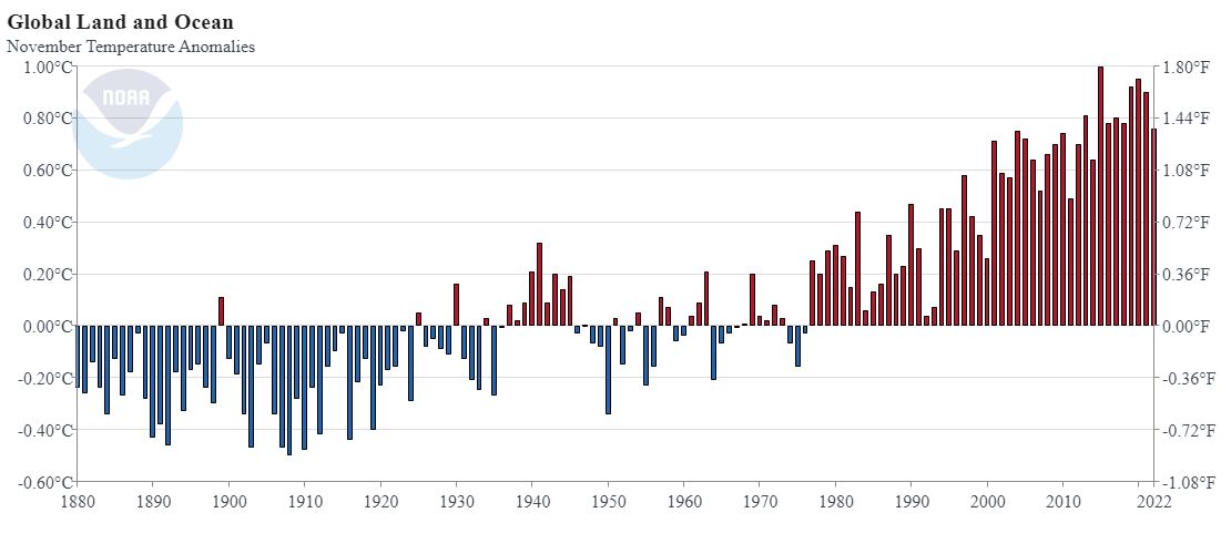 From NOAA’s November 2022 Global Climate Report:
The November 2022 global surface temperature departure was the ninth highest for November in the 143-year record at 0.76°C (1.37°F) above the 20th century average of 12.9°C (55.2°F). Despite ranking among the ten warmest Novembers on record, this November was the coolest November since 2014. November 2022 marked the 46th consecutive November and the 455th consecutive month with temperatures, at least nominally, above the 20th century average.
A few of highlights:
Europe tied 2000 for its third-warmest November on record.
The contiguous U.S. had a November that was 0.7°F cooler than average.
However, New Zealand recorded its warmest November on record according to its state meteorological agency. The warmest three Novembers in New Zealand have all occurred since 2019.
Time series data is available near the top of the page.
What are the IPCC sea level projections?
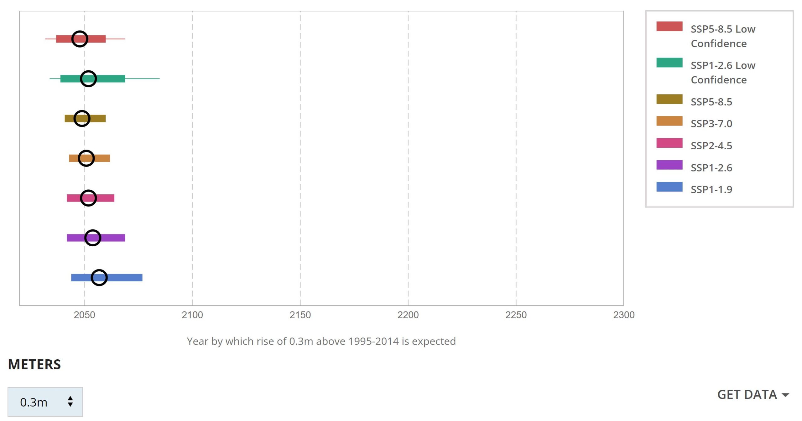 In a follow up to the last post, How much has sea level risen locally? (12/1/2022), we have the IPCC Sea Level Projection Tool. The NOAA sea level trends tool looks at the historic data and adds linear regression lines. The IPCC tool has projections based on the different IPCC scenarios. For example, when you first land on the page you will see blue dots on a map. A dot with a number means there are a cluster of dots nearby so zoom in. I went to the Miami beach dot. Click on the dot and then click full projections. This will bring you to a page with two interactive maps. The first is a curve of seal level change (relative to the 1995-2014 baseline) projected out to 2150. You can select one of the six IPCC scenarios.
The other graph, seen here, allows you to select an increase in sea level and provides estimates for when that will occur, with the black circle being the median year. The graph here is the data at which we see about one foot of sea level rise in Miami. In both graphs there is a link to download the data.
A related article from NASA, NASA Study: Rising Sea Level Could Exceed Estimates for U.S. Coasts by Sally Younger (11/15/2022) provides some interesting context such as:
The hazards of rising sea level are amplified by natural variabilities on Earth.
For instance, by the mid-2030s, every U.S. coast will experience more intense high-tide floods due to a wobble in the Moon’s orbit that occurs every 18.6 years. Hamlington said that this lunar cycle, in combination with rising sea level, is projected to worsen the impacts of high-tide flooding during the 2030s and 2040s.
How hot was Sept 2022?
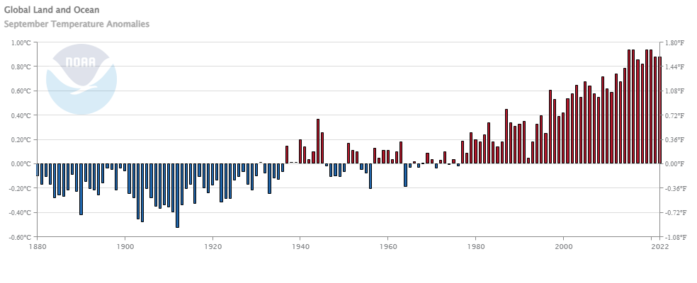 From NOAA’s September 2022 Global Climate Report:
The September 2022 global surface temperature departure tied September 2021 as the fifth highest for September in the 143-year record at 0.88°C (1.58°F) above the 20th century average of 15.0°C (59.0°F). The ten warmest Septembers on record have all occurred since 2012. September 2022 also marked the 46th consecutive September and the 453rd consecutive month with temperatures, at least nominally, above the 20th century average.
A few highlights:
North America had its warmest September on record, surpassing the previous record set in 2019 by 0.30°C (0.54°F). The Caribbean Islands region had its sixth-warmest September on record.
Hong Kong had an especially warm and sunny September, where the average temperature, mean maximum temperature, and mean minimum temperature were each the second highest on record for the month.
After an unusually cool summer, Greenland experienced record-breaking temperatures for September at multiple stations along the west coast, making for an exceptionally warm September. In Paamiut and Qaqortoq, this month’s average temperature exceeded any of the three previous summer temperature averages.
Times series data is available on the page.
Has Lake Mead Improved?

Lake Mead saw a slight uptick in August after hitting a new low again in July. The graph clearly shows that the wet season, if we can call it that, is roughly November through March. Unfortunately a good year doesn’t even get 20 feet dating back to 2012. Lake Mead needs a 2011 year. I’ll check back in a few months. Data is from the Lower Colorado River Operation. R code from the graph is linked on my July 2021 Lake Mead post.
How hot was Aug 2022?
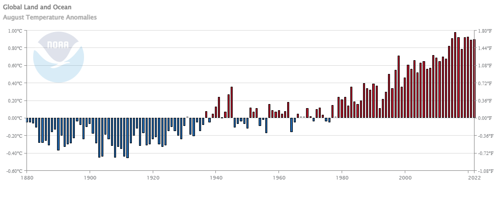 From NOAA’s August 20022 Global Climate Report:
The August 2022 global surface temperature departure was the sixth highest for August in the 143-year record at 0.90°C (1.62°F) above the 20th century average of 15.6°C (60.1°F). The ten warmest Augusts on record have all occurred since 2009. August 2022 also marked the 46th consecutive August and the 452nd consecutive month with temperatures, at least nominally, above the 20th century average.
Highlights:
The contiguous U.S. had its eighth-warmest August on record. For the second month in a row, the contiguous U.S. monthly average minimum temperature was record warm.
Spain had its second-warmest August on record after August 2003.
The Royal Meteorological Institute confirmed that Belgium had its warmest August since records began in 1833.
Time series data is available at the top of the page.
How hot was July 2022?
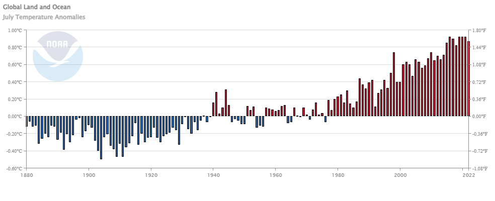 From NOAA’s July 2022 Global Climate Report:
The July 2022 global surface temperature departure was the sixth highest for July in the 143-year record at 0.87°C (1.57°F) above the 20th century average of 15.8°C (60.4°F). The five warmest Julys on record have all occurred since 2016. July 2022 also marked the 46th consecutive July and the 451st consecutive month with temperatures, at least nominally, above the 20th century average.
A few highlights:
Most of the contiguous U.S. had warmer-than-average temperatures in July, with several areas experiencing record-warm temperatures this month. July 2022 was the third-warmest July on record for the U.S.
Portugal had its warmest July on record, according to the Portuguese weather service. A station in Pinhão recorded a temperature of 47.0°C (116.6°F) on July 14, setting a new record for the warmest day in July for the country.
Spain had its warmest July on record, as well as its warmest month on record since at least 1961. 29 major weather stations had an average July temperature that was the highest of any month since the beginning of the record in 1961.
Time series data is available at a link near the top of the page.
How much has Western US snowpack changed?
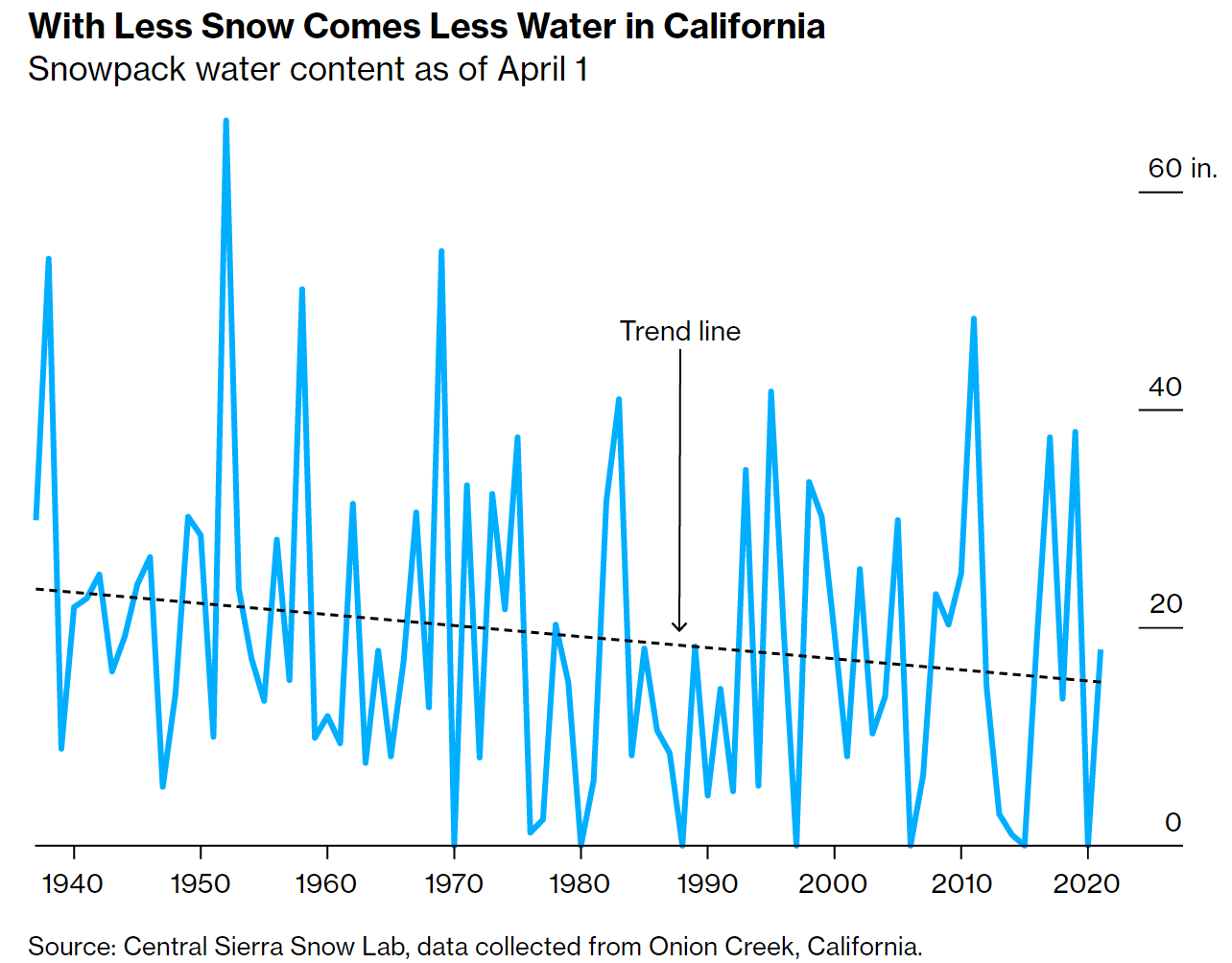 The Bloomberg article The End of Snow Threatens to Upend 76 Million American Lives by Baker et. el. (8/3/2022) has some excellent graphs, such as the one copied here, and overview of the water issues in the west.
The West’s mountain snowpacks have shrunk, on average, 23% between 1955 and 2022. By the end of the 21st century, California could lose as much as 79% of its peak snowpack by water volume.
This impacts all of the US:
The California Rice Commission says only about half of the 500,000 acres of rice typically planted in the state will be grown this year.
California alone accounts for a third of all vegetables grown in the US and two-thirds of the nation’s fruits and nuts.
The article includes a map of CA with charts of current reservoir levels as well as a couple of then and now photos. The data seems to come from the California Data Exchange Center.
How much has your country warmed?
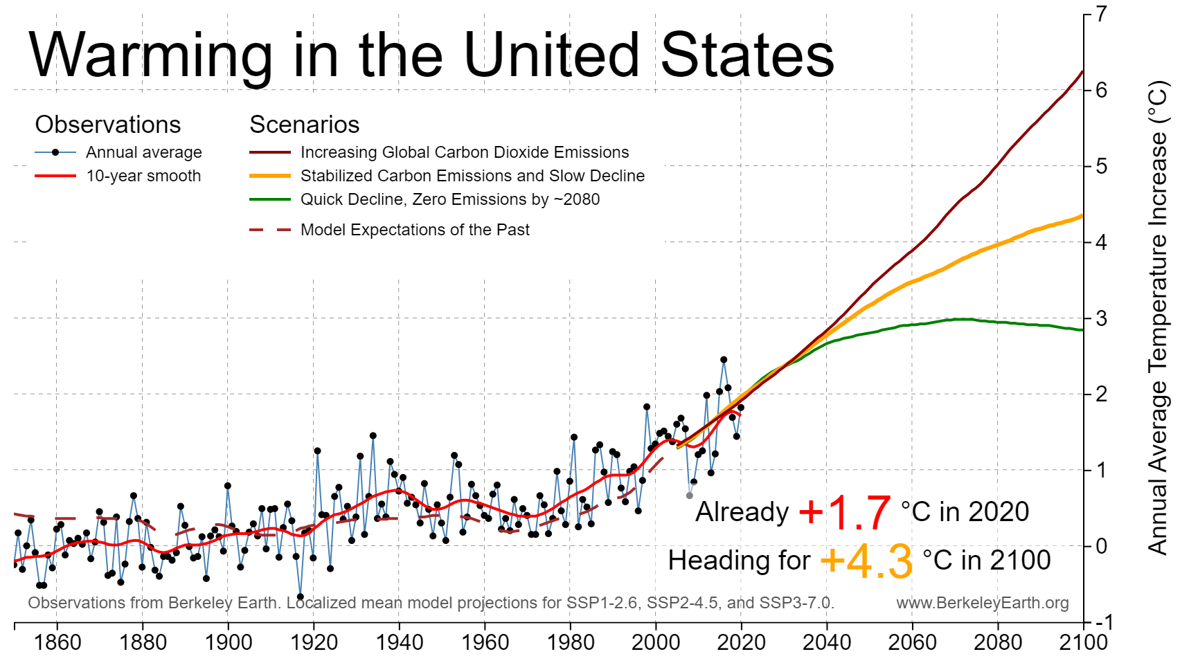
The Berkeley Earth page Actionable Climate Science for Policymakers has a Country-Level Warming Projections interactive graphic. Select a country and a graph, such as the one here for the U.S. appears. Click on the button below the graph, View More Details, and you will get extra text information and links to download the graph and the data.
As for the U.S. Berkeley Earth tells us the country has already warmed 1.7 deg C and headed for around 4.3 deg C by 2100,