Tag Archives: climate change

Are hurricanes getting stronger?

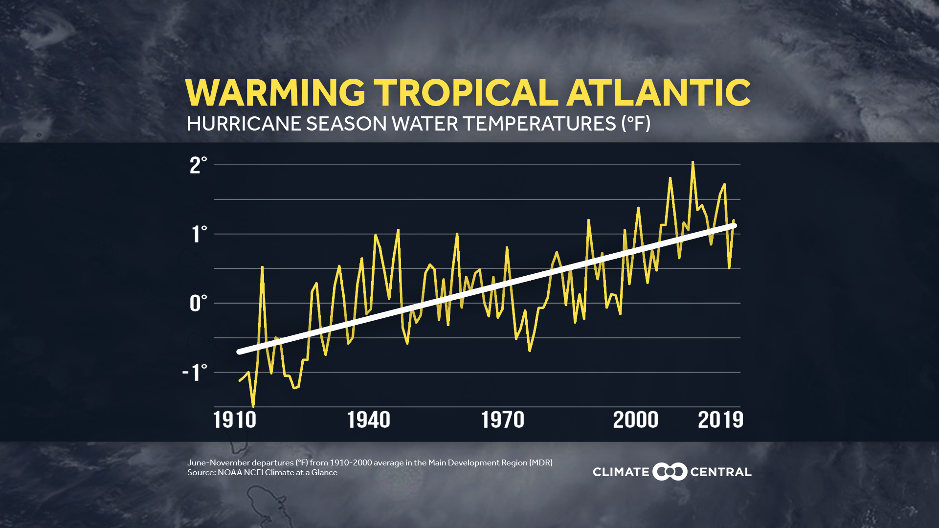
Climate Central provides some graphs and facts related to hurricanes in their article Stronger Hurricanes (9/23/2020).  The graph shows the trend in Atlantic water temperature and here are the related key concepts from the article:

Sea surface temperatures in the tropical Atlantic, known as the Main Development Region for tropical systems (depressions, storms, and hurricanes), have risen 1.85°F in the last century.

The likelihood of tropical cyclones (the term scientists broadly use to represent hurricanes, typhoons, etc) reaching Category 3 status has increased since 1979.

Warming water and air from climate change creates the potential for stronger hurricanes, with heavier rain and higher storm surge, increasing the risk of flooding when they make landfall.

There are two other graphs, further information, and citations of data sources along with methodolgy.

How hot was Aug 2020?

From the NOAA Global Climate Report – August 2020:

Averaged as a whole, the August 2020 global land and ocean surface temperature was 0.94°C (1.69°F) above average and the second highest August temperature since global records began in 1880. Only August 2016 was warmer with a temperature departure from average of +0.98°C (+1.76°F). The 10 warmest Augusts have all occurred since 1998; however, the five warmest Augusts have occurred since 2015. August 2020 also marked the 44th consecutive August and the 428th consecutive month with temperatures, at least nominally, above the 20th-century average.

The global land-only surface temperature for August 2020 was the third highest on record at 1.26°C (2.27°F) above average. Meanwhile, the global-ocean surface temperature tied with 2016 as the second highest in the 141-year record at 0.82°C (1.48°F) above average.

For the summer months:

The Northern Hemisphere had its warmest summer on record at 1.17°C (2.11°F) above average, surpassing the now second-warmest such period set in 2016 and again in 2019. The five warmest summers for the Northern Hemisphere have occurred since 2015.

The time series data is available at the links  above the Introduction. See Temperature Anomalies Time Series.

Where do we find CA wildfire data?

CAL FIRE provides information about current fires as well as historical data. The picture here is from their incidents page where users can choose current fires or select particular year. For active incidents the right side bar provides the status of current fires. The stats and events page has historical information such as the top 20 fires. There is also a page with historical acres burned by year, although currently updated to only 2018 which was a record year of just under 2,000,000 acres burned.

The climate.gov article Over a million acres burned in California in second half of August 2020 by Tom Di Liberto (8/26/2020) provides some context about CA wildfires and connection to climate change.


How hot was July 2020?

From NOAA’s Global Climate Report – July 2020:

The July 2020 global land and ocean surface temperature of 0.92°C (1.66°F) above the 20th century average tied with 2016 as the second highest July global temperature since records began in 1880. This value was only 0.01°C (0.02°F) shy of tying the record warm July of 2019.

The Northern Hemisphere land and ocean surface temperature was the highest in the 141-year record at 1.18°C (2.12°F) above average.

Regionally, the Caribbean region had its warmest July on record, with a temperature departure of 1.24°C (2.23°F) above average. This was 0.09°C (0.16°F) above the previous record set in 2016.

The summary includes links to the data.

How much has the Grand Plateau Glacier Changed?

1984
2019

NASA’s earth observatory post Grand Plateau Glacier provides a pair of aerial images of the glacier, copied here, from 1984 and 2019, both from Sept of the given year.

In the images, a moraine near the coastline acts like a dam, trapping meltwater and forming a proglacial lake. Also note the end moraine visible poking above the surface of the lake in the 2019 image. This mound was left behind by a lobe of the glacier front that appears in the 1984 image.

Over the past 35 years, the entire flow of the glacier system changed. In the 1984 image, many of the glacier’s branches flow toward the lake to the southwest; by 2019, retreat caused some branches to change course and flow toward the northwest. Notice the change in direction of the thin brown lines tracing the flow of the glacier’s branches. These are medial moraines: rocky debris from the sides of glaciers (lateral moraines) that have merged, causing the debris to be carried down the center of the combined glacier.

Retreat is not the only change; Grand Plateau is also visibly narrowing and thinning.

Larger images are available covering more area on the page. There is also an option to view the images together with a slider going over the image to change the year and, of course, more information about the changes in the glacier.

There is a link to other glacial image pairs on the Misc Materials page.

How hot was June 2020?

From NOAA’s Global Climate Report – June 2020:

Averaged as a whole, the global land and ocean surface temperature for June 2020 was 0.92°C (1.66°F) above the 20th century average of 15.5°C (59.9°F), tying with 2015 as the third highest June temperature departure from average in the 141-year record.

Nine of the 10 warmest Junes have occurred since 2010; the seven warmest Junes have occurred in the last seven years (2014–2020).

The June 2020 global land-only surface temperature was also the third highest for June at 1.29°C (2.32°F) above average. The global ocean-only surface temperature of 0.77°C (1.39°F) was also the third highest for June in the 141-year record.

The links in the quotes are to the related time series data.

How do I teach about climate change when I know so little?

If you would like to incorporate climate change in your math class, by say using the calculus or statistics project here, but you don’t feel like you know enough, then you need an overview for teachers. The Paleontological Research Institute has a teacher-friendly guide to climate change. The audience for the book, free in pdf form, is high school earth science  and environmental science teachers, but it also works as a primer for those looking to add climate issues to their math class. There are useful graph and tidbits, such as FAQ 11 in Chapter 12 (see the graph copied here):

A second method that uses real data in order to create a false impression is manipulation of the scale on a graph. As discussed in the “warming hiatus” question above (Question 6), showing data over a very short time frame can be misleading. Similarly, using a vertical scale to either magnify or suppress a trend can also be misleading. For example, the temperature data plotted on the two graphs in Figure 12.2 is exactly the same (the same data from Question 5), but the scale has been expanded in the right-hand graph to compress the data and make the temperature increase appear non-existent. This procedure has been used by some who deny the existence or significance of climate change
to give an impression of “no problem.”

Chapter 6 in the text provides information specific to different regions in the U.S., which helps provide local background related to climate. All in all an excellent resource, especially if you want to know the basics so that you are comfortable raising climate issues in a math classroom.

How hot was May 2020?

From the NOAA Global Climate Report – May 2020:

The global land and ocean surface temperature for May 2020 tied with 2016 as the highest in the 141-year record at 0.95°C (1.71°F) above the 20th century average of 14.8°C (58.6°F). The 10 warmest Mays have all occurred since 1998; however, the 2014–2020 Mays are the seven warmest in the 141-year record. May 2020 also marked the 44th consecutive May and the 425th consecutive month with temperatures, at least nominally, above the 20th century average.

The global land-only surface temperature for May 2020 was also the highest on record at 1.39°C (2.50°F) above the 20th century average of 11.1°C (52.0°F). This was 0.04°C (0.07°F) above the previous record set in 2012. The 10 highest May global land-only surface temperature departures have occurred since 2010.

The May 2020 global ocean-only surface temperature was near-record warm at 0.79°C (1.42°F) above average. This value was only 0.01°C (0.02°F) shy of tying the record warm May of 2016.

May time series data here. Climate.gov provides a summary of May 2020 in their post Was May 2020 warm and dry or cool and wet across the U.S.? It depends… by Rebecca Lindsey (6/9/2020)

What is our wet bulb temperature limit?

From the climate.gov article Brief periods of dangerous humid heat arrive decades early  by Alison Stevens (5/12/2020):

The paper authors used an index called “wet-bulb temperature” based on weather station temperature and humidity data. The reading, from a thermometer when covered in a wet cloth, is related to how muggy conditions feel. This map shows locations that experienced extreme heat and humidity levels briefly (hottest 0.1 percent of daily maximum wet-bulb temperatures) from 1979–2017. Darker colors show more severe combinations of heat and humidity. Some areas have already experienced conditions at or near humans’ survivability limit of 35°C (95°F).

Who’s close to the 95°F?

The authors identified over 7,000 past occurrences of wet-bulb temperatures above 88°F (31°C), over 250 above 91°F (33°C) around the world, and two stations that reported multiple daily-maximum wet-bulb temperatures above 95°F. These extremes occurred for 1–2 hours in parts of coastal southwest North America, South Asia, and the coastal Middle East.

The southeastern United States, especially along the Gulf of Mexico, had multiple incidences of wet-bulb temperatures at or above 88°F; specifically, in east Texas, Louisiana, Mississippi, Alabama, the Florida Panhandle, Arkansas, and North Carolina. Parts of India, Pakistan, northwestern Australia, the coast of the Red Sea, and areas along the Gulf of California in Mexico saw even higher extremes.

The article links to the original paper.

How many billion-dollar disasters?

The Climate.gov article 2010-2019: A landmark decade of U.S. billion-dollar weather and climate disasters by Adam B. Smith (1/8/2020) reports:

During 2019, the U.S. experienced a very active year of weather and climate disasters. In total, the U.S. was impacted by 14 separate billion-dollar disasters including: 3 major inland floods, 8 severe storms, 2 tropical cyclones (Dorian and Imelda), and 1 wildfire event. 2019 also marks the fifth consecutive year (2015-19) in which 10 or more separate billion-dollar disaster events have impacted the U.S.

Historical context:

In broader context, the total cost of U.S. billion-dollar disasters over the last 5 years (2015-2019) exceeds $525 billion, with a 5-year annual cost average of $106.3 billion (CPI-adjusted), both of which are records. The U.S. billion-dollar disaster damage costs over the last decade (2010-2019) were also historically large, exceeding $800 billion from 119 separate billion-dollar events. Moreover, the losses over the most recent 15 years (2005-2019) are $1.16 trillion in damage from 156 separate billion-dollar disaster events.

The article has other graphs and tables.  These events are tracked on NOAA’s Billion-dollar Weather and Climate Disasters: Overview page.