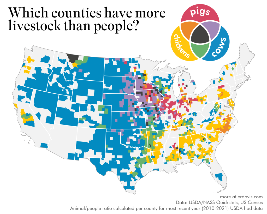
 Here is one of a fun set of maps from the post Where is there more livestock than people? by the Data Stuff blog. The article links to the USDA site used to obtain the data. There are 7 other maps which are fun. One of them is a map of counties with more goats than people. Find out where.
How hot was June 2022?
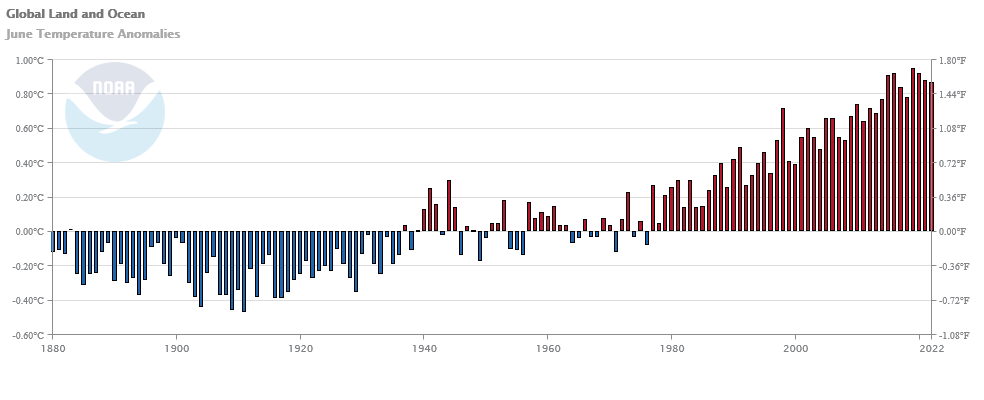 From NOAA’s June 2022 Global Climate Report:
The global surface temperature for June 2022 was the sixth-highest in the 143-year record at 0.87°C (1.57°F) above the 20th century average. This month was also 0.08°C (0.14°F) cooler than the warmest June on record set in 2019. The ten warmest Junes have all occurred since 2010. June 2022 also marked the 46th consecutive June and the 450th consecutive month with temperatures, at least nominally, above the 20th-century average.
Highlights:
The city of Isesaki, which is located in Japan’s Gunma prefecture, had a maximum temperature of 40.1°C (104.2°F) on June 25, 2022 — a new national maximum temperature record for June. This also marked the first time Japan had a maximum temperature of 40.0°C (104.0°F) in June and was only 1.0°C (1.8°F) cooler than the all-time record of 41.1°C (106.0°F).
Data available at the top of the page.
ENSO, Alaska, and correlation, what’s the connection?
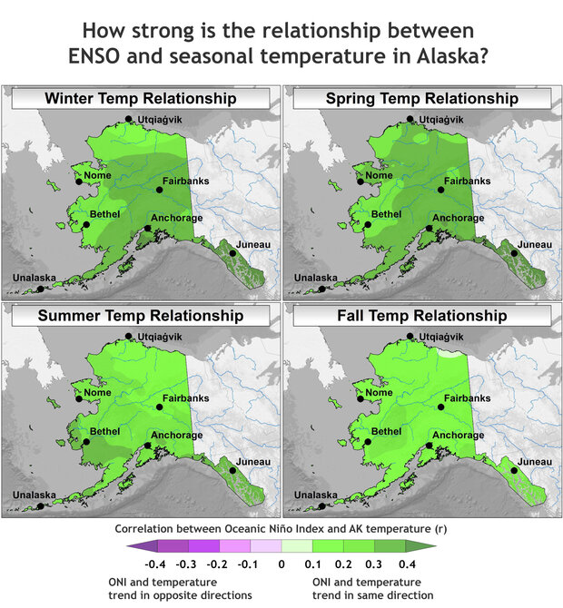 The climate.gov article Moose tracks through Alaska and ENSO by Brian Brettschneider (6/23/2022) is a great example of using statistics in a real world setting; in this case the Pearson correlation. The graph copied here is interesting but the footnote may be even more so:
This statistical analysis uses the Pearson correlation of a linear regression, which measures how well two variables (like ENSO and Alaskan temperature) remain in sync. Correlation values range from -1 (completely out of sync) to +1 (completely in sync). Also, because Alaska’s temperatures have such a strong warming trend, the anomaly for each year was compared against a trailing 30-year average (or climatology). This mostly, but not entirely, removes the trend. We are interested in removing the climate trend in these maps because we are interested in isolating the ENSO signal (which does not include climate change signals).
Quick summary of the results:
The winter and spring seasons have the greatest connection between ENSO (as measured by the Oceanic Niño Index) and departures from average air temperature, and the correlation is positive. This means that El Niño tends to bring above-average temperatures; it also means La Niña is linked with below-average temperatures. Areas adjacent to and closer to the North Pacific Ocean tend to have a stronger connection with ENSO than areas inland. In the summer, the relationship weakens quite a bit (as indicated by the lighter shading) and is mostly nonexistent by fall.
The Oceanic Niño Index links to a data set. There are a few other maps in the article and a couple more footnotes.
How much has Lake Mead Dropped?
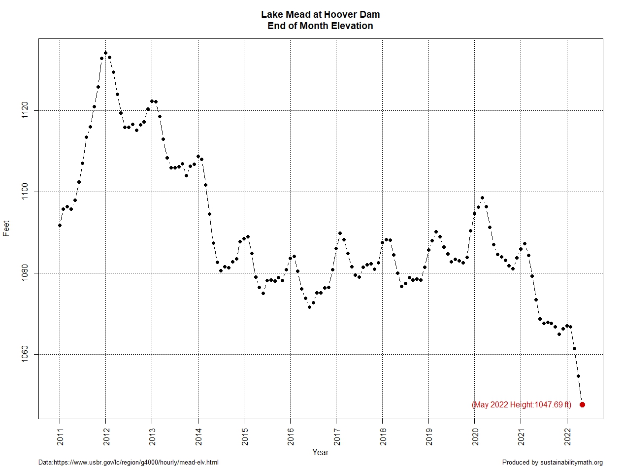
Lake Mead water levels continue to drop. At the end of May it was down to 1047.69 feet, which is a 13.8 foot drop since my post on April 25 with the end of March height. The west continues in drought according to the Drought Monitor.
What about electricity generation? From the Boulder City Review:
Hoover (Dam) would no longer be able to produce power at 950 feet of elevation,” she said. “We do not anticipate that happening.”
The graph here is from the data on the Lake Mead at Hoover Dam, End of Month Elevation (feet) page by the Bureau of Reclamation. The Sept Lake Mead post and the July Lake Mead post, which has a link to the R code for the graph.
How has maternal mortality rates changed?
 The chart here is from the National Center for Health Statistics paper Maternal Mortality Rates in the United States, 2020 by Donna L. Hoyert (2/23/2022). A definition:
A maternal death is defined by the World Health Organization as, “the death of a woman while pregnant or within 42 days of termination of pregnancy, irrespective of the duration and the site of the pregnancy, from any cause related to or aggravated by the pregnancy or its management, but not from accidental or incidental causes” (1). Maternal mortality rates, which are the number of maternal deaths per 100,000 live births, are shown in this report by age group and race and Hispanic origin.
Kevin Drum comments on this in his post The maternal mortality rate has skyrocketed over the past three years. A few quotes:
And the maternal mortality rate for everyone has nearly tripled since the late ’90s. Meanwhile, in Europe, the maternal mortality rate has been steadily dropping and is now about one-third the US rate.
What explains the differences by race according to Drum:
And we’re still in the dark about why Black women suffer such an astonishingly high rate of maternal mortality. As I said three years ago:
Poverty, education level, drinking, smoking, and genetic causes don’t seem to explain the black-white difference in maternal mortality. The timing of prenatal care doesn’t explain it. Medically, the cause of the difference appears to be related to the circulatory system, which is sensitive to stress. This makes the toxic stress hypothesis intuitively appealing, but it has little rigorous evidence supporting it. There’s some modest evidence that wider use of doulas could reduce both infant and maternal mortality, but no evidence that it would reduce the black-white gap.
Low income is weakly associated with higher maternal mortality rates, but it explains very little. The allostatic stress theory is appealing but probably wrong. And racism doesn’t seem to play much of a role either.
The CDC article has links to data.
How hot was May 2022?
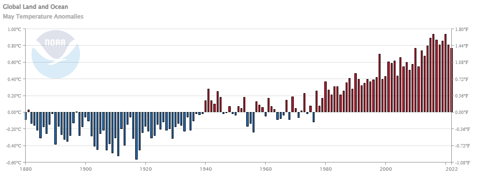 From NOAA’s May 200 Global Climate Report:
The May global surface temperature was 1.39°F (0.77°C) above the 20th-century average of 58.6°F (14.8°C). This ranks as the ninth-warmest May in the 143-year record, 0.30°F (0.17°C) cooler than the warmest May months (2016 and 2020). It was the coolest May since 2013, but it still marked the 46th consecutive May and the 449th consecutive month with temperatures, at least nominally, above the 20th-century average. The ten warmest May months have all occurred from 2010 to present.
Some highlights for May 2022:
There are several top-10 ranks to note for May 2022. In particular, it was the eighth-warmest May for the global ocean, the eighth-warmest for the Northern Hemisphere as a whole, the eighth-warmest for Europe (associated with a heatwave in southwestern Europe), and the sixth-warmest for Asia (associated with above-average temperatures in western Siberia).
Time series data is available at a link near the top of the page.
What are Earth Minute Videos?
NASA has a number of whiteboard animations called Earth Minute Videos:
NASA isn’t all about interplanetary exploration; in fact, the agency spends much of its time studying our home planet. This fun whiteboard animation series explains Earth science to the science-curious.
The videos themselves don’t have much math but each video has a link underneath to more info. For example, the Greenland video here includes a link to Ice Sheets info which has data.
How much do we trust our government?
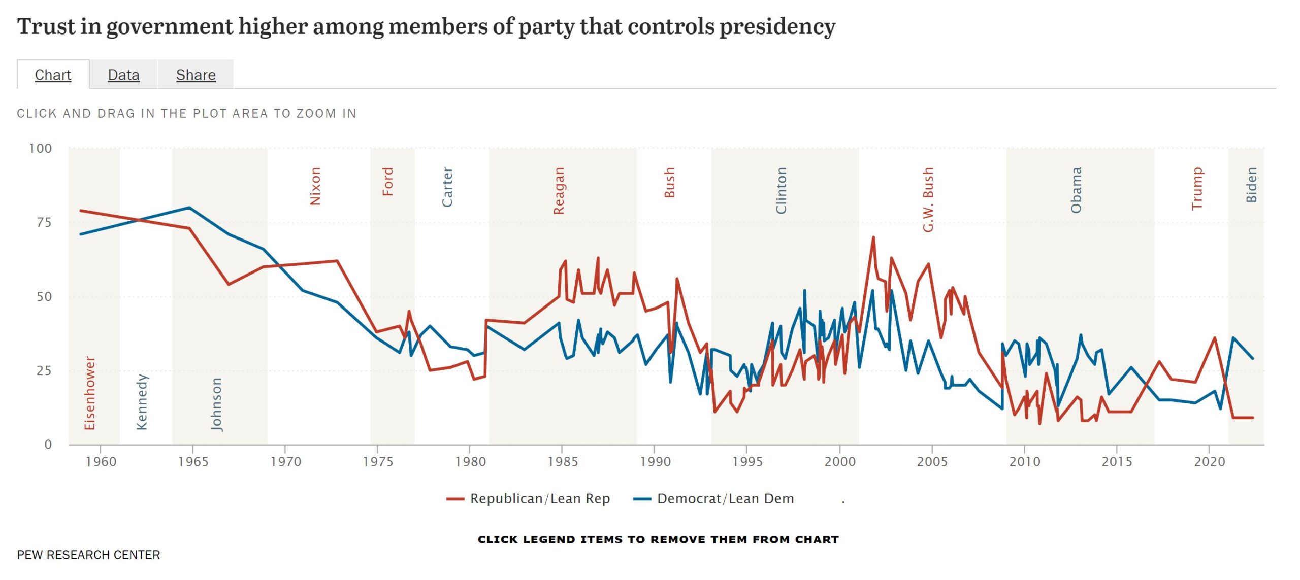
Pew has a feature, Public Trust in Government: 1958-2022 (6/6/2022), with three interactive graphs answering this question. In general,
When the National Election Study began asking about trust in government in 1958, about three-quarters of Americans trusted the federal government to do the right thing almost always or most of the time. Trust in government began eroding during the 1960s, amid the escalation of the Vietnam War, and the decline continued in the 1970s with the Watergate scandal and worsening economic struggles. Confidence in government recovered in the mid-1980s before falling again in the mid-1990s. But as the economy grew in the late 1990s, so too did confidence in government. Public trust reached a three-decade high shortly after the 9/11 terrorist attacks, but declined quickly thereafter. Since 2007, the shares saying they can trust the government always or most of the time has not surpassed 30%.
The one graph copied here also makes it obvious how opinions by political leaning shift on cue when a president of the other party is elected. Each graph in the article has a link to the data.
Which regions use the most AC?

From the eia article Nearly 90% of U.S. household used air conditioning in 2020 by Ross Beall and Bill McNary (5/31/2022):
In 2020, the Midwest Census Region and South Census Region had the highest percentages of households using AC, at 92% and 93%, respectively. The lowest percentage of households using AC was 73% in the West Census Region; this census region includes households in several climate areas, such as the marine climate region along the Pacific Coast, where residential AC use was 49%.
The article cites the Residential Energy Consumption Survey, which is a nice data source.
Have we passed peak agricultural land?
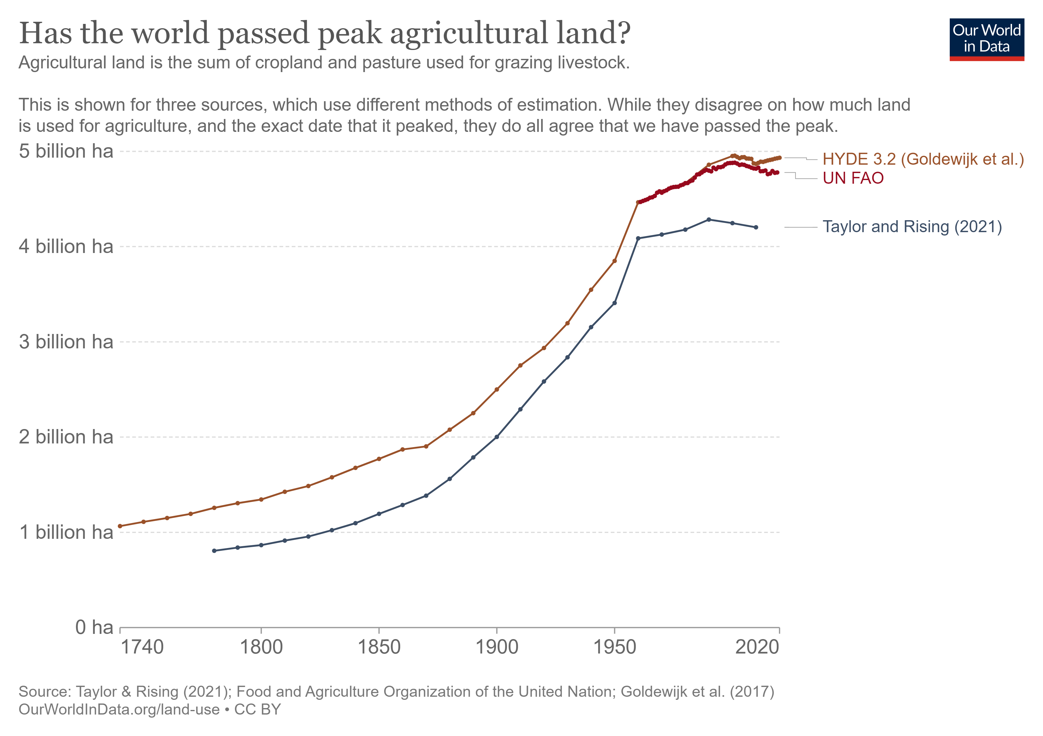 The chart here is from the Our World in Data article After millennia of agricultural expansion, the world has passed ‘peak agricultural land’ by Hannah Ritchie (5/30/2022). Interestingly
Despite this reduction in agricultural land, the world has continued to produce more food. This is true of both crops and livestock.5
We see this decoupling in the chart that presents the UN FAO’s data. It shows that global agricultural land – the green line – has peaked while agricultural production – the brown line – has continued to increase strongly, even after this peak.6
When we break each agricultural component out individually, or look at it in physical rather than monetary units, we find the same trend: a continued increase in output. You can explore this data for any crop or animal product in our Global Food Explorer.
We should note:
The third, as I mentioned earlier, is that global croplands are still expanding. We see this in the chart. Other sources suggest that this rate of increase might be even faster.11 The World Resources Institute looks at this research in more detail here.
The article has three graphs and the data for each can be downloaded.