Tag Archives: income

What is the most recent PIP (poverty and inequity platform) update?

The World Bank article March 2023 global poverty update from the World Bank: the challenge of estimating poverty in the pandemic (3/29/2023) reports on poverty updates:

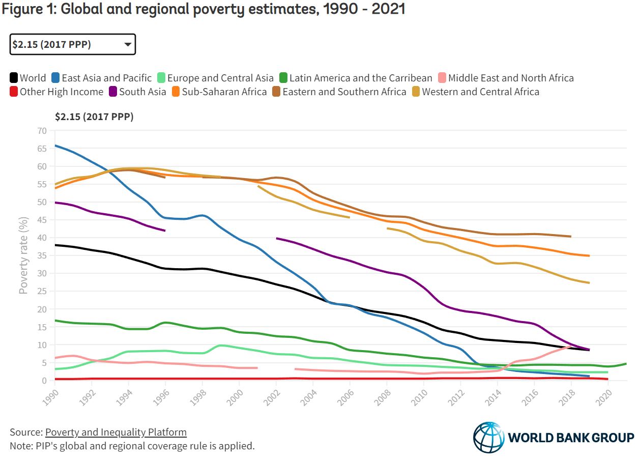
Global poverty estimates were updated today on the Poverty and Inequality Platform (PIP). This update includes new regional poverty aggregates in 2020 and 2021 for Latin America and the Caribbean, and in 2020 for Europe and Central Asia, and the group of advanced countries. These are the regions for which we now have sufficient survey data available during the COVID-19 pandemic. In total, 113 new country-years have been added, bringing the total number of surveys to more than 2,100.

The summary with calculus terms:

It is still the case that global poverty has been falling since the 1990s, and at a slower rate since 2014 (World Bank 2022). Extreme poverty has been falling in all regions, except the Middle East and North Africa due to conflict and fragility (World Bank 2020). Roughly 60% of the world’s extreme poor in 2019 lived in Sub-Saharan Africa alone, while 81% of the global poor at the poverty line of $3.6.

The PIP itself is a page worth exploring. It doesn’t look like much but if you start clicking you’ll find there is much to discover. Try the calculator on the bottom right of the graph or trying clicking a country.

Whose top 1% does best?

How we answer this questions depends on what we mean by best and the comparison group. For today we’ll look at the share of income by the top 1% and compare mostly western Europe countries. The graph here is from the world income database. It is good to be in the top 1% in the U.S. where they take home home 19% of the countries income in 2021. China is next at 14%. Note that this is a statement of the share of income and not what the income is.

The link will take you to the page where the graph is from. There is also a map colored by ranges of income by the top 1% and if you click on the country in the map it is added to the time series. The U.S. just missed the top color of 19-31% (I’m assuming it starts at greater than 19). Try to guess the countries in the top category and which one is tops at 31%. There is also a link to download the data, as well as other indicators to choose from.

What is the CEO-to-worker compensation ratio?

The Economic Policy Institute article CEO pay has skyrocketed 1,460% since 1978 by Josh Bivens and Jori Kandra (10/2/2022) include the chart here. Definitions first:

The realized measure of compensation includes the value of stock options as realized (i.e., exercised), capturing the change from when the options were granted to when the CEO invokes the options, usually after the stock price has risen and the options values have increased.

The granted measure of compensation values stock options and restricted stock awards by their “fair value” when granted. (Compustat estimates of the fair value of options and stock awards as granted are determined using the Black-Scholes model.)

CEO’s are doing better than the mere top 0.1%:

Over the last three decades, compensation grew far faster for CEOs than it did for other very highly paid workers (the top 0.1%, or those earning more than 99.9% of wage earners). CEO compensation in 2020 (the latest year for which data on top wage earners are available) was 6.88 times as high as wages of the top 0.1% of wage earners, a ratio 3.7 points greater than the 3.18-to-1 average CEO-to-top-0.1% ratio over the 1947–1979 period.

One outlier (he has the money to buy twitter I guess):

In 2021, Elon Musk (CEO of Tesla Motors) exercised $23.5 billion worth of stock options that would have expired in 2022. Under our “realized” methodology, this would have made his pay almost 1,000 times that of the average large-company CEO. Including him in our sample would have resulted in an increase of CEO pay in 2021 relative to 2020 of over 300% (the “average” for the sample would have been just under $100 million).

Because inclusion of this extreme outlier would have made this year’s numbers incomparable with previous years’ numbers, we opted to exclude Tesla and Musk from our sample entirely.

The article is excellent not just because of all the other graphs and access to data but they thoroughly explain their methodology.


How has the middle class changed?

The Pew article How the American middle class has changed in the past five decades by Rakesh Kochhar and Stella Sechopoulos (4/20/2022) has seven facts about changes in the middle class. Overall  though,

The share of adults who live in middle-class households fell from 61% in 1971 to 50% in 2021, according to a new Pew Research Center analysis of government data.

where middle class is defined as

In this analysis, “middle-income” adults in 2021 are those with an annual household income that was two-thirds to double the national median income in 2020, after incomes have been adjusted for household size, or about $52,000 to $156,000 annually in 2020 dollars for a household of three.

The chart here is from fact 4: Married adults and those in multi-earner households made more progress up the income ladder from 1971 to 2021 than their immediate counterparts.

Generally, partnered adults have better outcomes on a range of economic outcomes than the unpartnered. One reason is that marriage is increasingly linked to educational attainment, which bears fruit in terms of higher incomes.

The article includes a detailed methodology section.


Do men always earn more than women?

The Pew article, Young women are out-earning young men in several U.S. cities by Richard Fry (3/28/2022) provides the graph copied here.

Overall, about 16% of all young women who are working full time, year-round live in the 22 metros where women are at or above wage parity with men.

There are four metro areas where young women make 110% or more of what young men make: Wenatchee, WA; Morgantown WV; Barnstable Town, MA; and Gainesville, FL.

From a regional perspective, metropolitan areas in the Midwest tend to have wider gender wage gaps among young workers. Young women working full time, year-round in Midwestern metros earn about 90% of their male counterparts. In other regions, by comparison, young women earn 94% or more of what young men earn.

The article doesn’t talk about the types of jobs or why disparities exist but they do note:

Labor economists examine earnings disparities among full-time, year-round workers in order to control for differences in part-time employment between men and women as well as attachment to the labor market. However, even among full-time, year-round workers, men and women devote different amounts of time to work. Men under 30 usually work 44 hours per week, on average, compared with 42 hours among young women.

There is a link to a Google sheet with the data for 250 U.S. metro areas at the bottom of the article.

How much did wage inequality change in 2020?

The EPI article Wage inequality continued to increase in 2020 by Lawrence Mishel and Jori Kandra (12/13/2021) provides the graph copied here. As for the share of the overall pot:

This disparity in wage growth reflects a sharp long-term rise in the share of total wages earned by those at the very top: the top 1.0% earned 13.8% of all wages in 2020, up from 7.3% in 1979. That marks the second highest share of earnings for the top 1.0% since the earliest year, 1937, when data became available (matching the tech bubble share of 13.8% in 2000 and below the share of 14.1% in 2007). The share of wages for the bottom 90% fell from 69.8% in 1979 to just 60.2% in 2020.

The article also has two tables of data that could be useful in stats or QL course.

How did COVID impact K-12 learning based in income?

The Pew article What we know about online learning and homework gap amid the pandemic by Katherine Schaeffer (10/1/2021) has this to say:

Parents with lower incomes whose children’s schools closed amid COVID-19 were more likely to say their children faced technology-related obstacles while learning from home. Nearly half of these parents (46%) said their child faced at least one of the three obstacles to learning asked about in the survey, compared with 31% of parents with midrange incomes and 18% of parents with higher incomes.

This technology divide isn’t new:

Even before the pandemic, Black teens and those living in lower-income households were more likely than other groups to report trouble completing homework assignments because they did not have reliable technology access. Nearly one-in-five teens ages 13 to 17 (17%) said they are often or sometimes unable to complete homework assignments because they do not have reliable access to a computer or internet connection, a 2018 Center survey of U.S. teens found.

There are four other charts in the article.

How did CEOs do during the pandemic?

Did CEOs take a pay hit like many workers did during the pandemic? The article CEO pay has skyrocketed 1,322% since 1978 by Lawrence Mishel and Jori Kandra (8/10/2021) suggests CEOs did just fine last year. Their chart shows that realized CEO compensation grew during 2020 compared to the average worker.

Details on the metric:

We focus on the average compensation of CEOs at the 350 largest publicly owned U.S. firms (i.e., firms that sell stock on the open market) by revenue. Our source of data is the S&P ExecuComp database for the years 1992 to 2020 and survey data published by the Wall Street Journal for selected years back to 1965. We maintain the sample size of 350 firms each year when using the ExecuComp data.

The realized measure of compensation includes the value of stock options as realized (i.e., exercised), capturing the change from when the options were granted to when the CEO invokes the options, usually after the stock price has risen and the options values have increased. The realized compensation measure also values stock awards at their value when vested (usually three years after being granted), capturing any change in the stock price as well as additional stock awards provided as part of a performance award.

The granted measure of compensation values stock options and restricted stock awards by their “fair value” when granted (Compustat estimates of the fair value of options and stock awards as granted determined using the Black Scholes model).

Well maybe CEO pay just went down less than worker pay and that is why the ratio went up. In table 1, realized pay for 2019 is $20,351,000 with 2020 projected as $24,194,00. There are other graphs in the article and data available for download.

What is the distribution of global income?

The Our World in Data article How much economic growth is necessary to reduce global poverty by Max Roser (2/15/2021) includes the graph copied here. Note that all countries incomes are adjusted for price differences so it is fair comparison from county to country. It is easy to forget how much wealthier the U.S. is compared to almost all other countries.

The reason why such substantial economic growth is necessary for reducing global poverty is that the average income in many countries in the world is very low: 82% of the world population live in countries where the mean income is less than $20 per day.

There are three other graphs in the article, which is suitable for a QL based course. There isn’t data associated with these particular graphs but there are links at the top of the article with related economic data.

Why did wages grow in 2020?

The EPI article, Wages grew in 2020 because the bottom fell out of the low-wage labor market, by Elise Gould and Jori Kandra (2/24/2021) provides insights into changes in the labor market this past year. Key find:

Wages grew largely because more than 80% of the 9.6 million net jobs lost in 2020 were jobs held by wage earners in the bottom 25% of the wage distribution. The exit of 7.9 million low-wage workers from the workforce, coupled with the addition of 1.5 million jobs in the top half of the wage distribution, skewed average wages upward.

There are seven graphs or tables in the article with the associated data. The last two graphs are of the same type as the one copied here but for the 2000 and 2008 recessions, respectively.