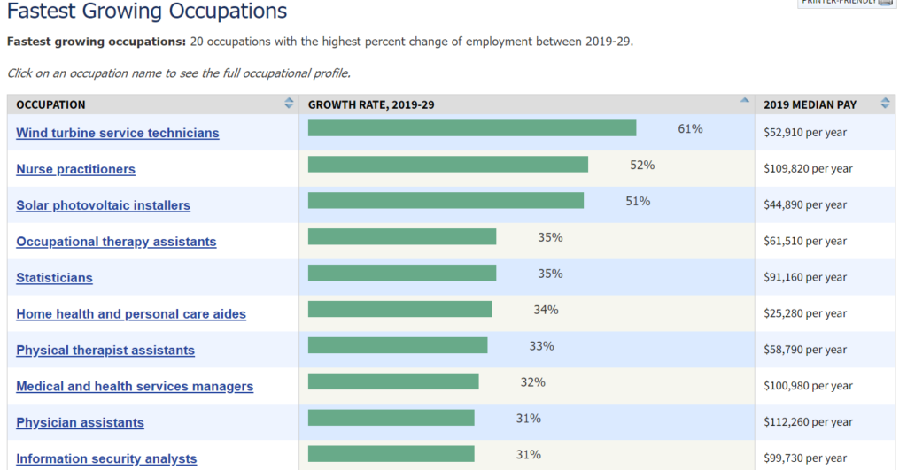
The U.S. Bureau of Labor Statistics posts the chart (partially) copied here and last updated Sept 2020. An initial look at the graph and we see that the top 5 each have a median pay higher than the median pay in the U.S. (about $35k), but this is based on growth rate. On the other hand, if we look at the number of jobs the top 5 here are predicted to create, Table 1.3 from the BLS, we get 152.2 thousand jobs. The sixth job on this list, home health and personal care aides, has a below median pay but is predicted to create 1,159.5 thousand jobs. There are 30 jobs listed in table 1.3 and home health and personal care aides represents about 45% of predicted new jobs created on this table. One can download the data in table 1.3 in an xlsx file.
How are the top 0.1% doing?
 The EPI article Wages for the top1% skyrocketed 160% since 1979 while the share of wages for the bottom 90% shrunk by Lawrence Mishel and Jori Kandra (12/1/2020) reports:
As Figure A shows, the top 1.0% of earners are now paid 160.3% more than they were in 1979. Even more impressive is that those in the top 0.1% had more than double that wage growth, up 345.2% since 1979 (Table 1). In contrast, wages for the bottom 90% grew only 26.0% in that time.
The top 0.1% go off the chart. There are two other tables of data nd the data for the chart copied here is available.
Who earned the most in the 3rd quarter of 2020?
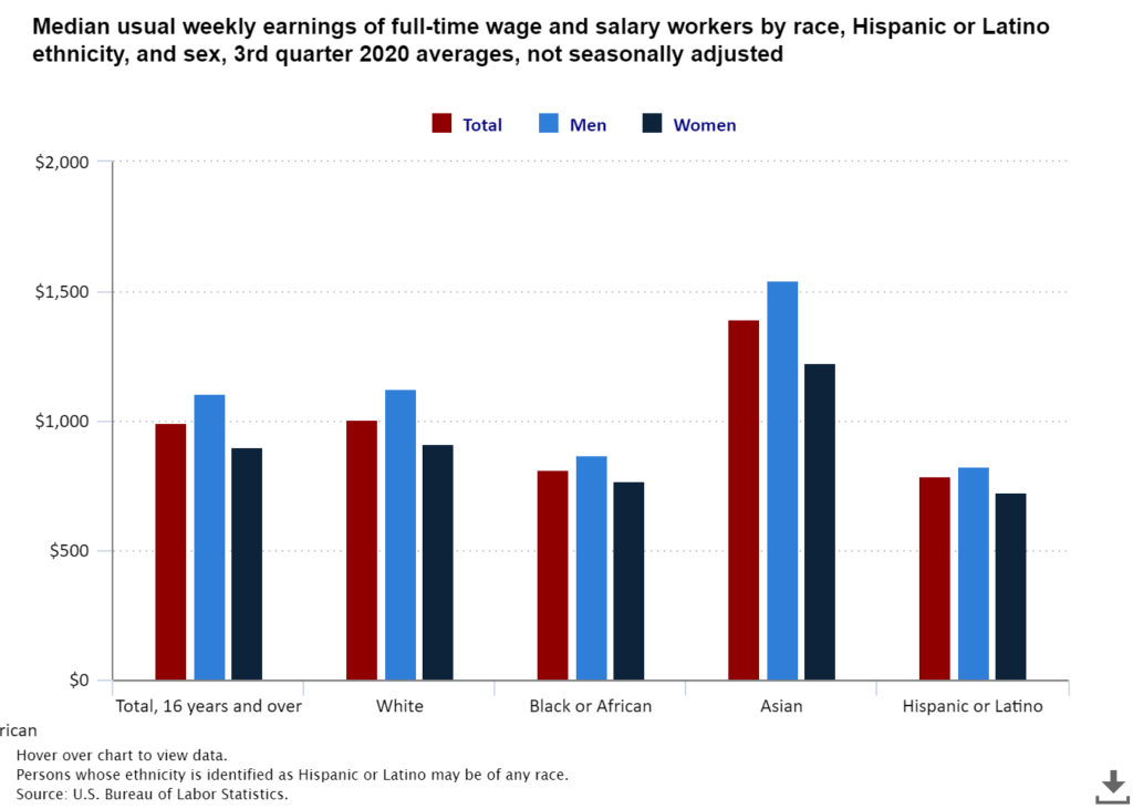
The U.S. Bureau of Labor Statistics has a Graphics for Economic News Releases page. The graph copied here is median usual weekly earnings of full-time wage and salary workers. Most of the patters are not a surprise, such as men earning more than women. What may be new here is that Asian women ($1224) out earned White men ($1122). Asian men out earned all others at $1542. The page includes seven other charts with the data.
What is median household income by race and ethnicity?
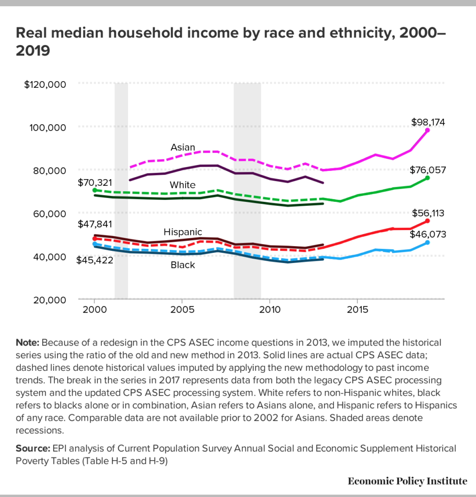 The EPI article Racial disparities in income and poverty remain largely unchanged amid strong income growth in 2019 by Valerie Wilson (9/16/2020) reports the data from the Census Bureau on income and poverty in the graph copied here.
…real median household income increased 10.6% among Asian households (from $88,774 to $98,174), 8.5% among Black households (from $42,447 to $46,073), 7.1% among Hispanic households (from $52,382 to $56,113), and 5.7% among non-Hispanic white households (from $71,922 to $76,057), …
There is a second graph on poverty rates and data is included for both graphs, as well as a link to the original Census Bureau data.
Is the racial wealth gap evenly distributed by class?
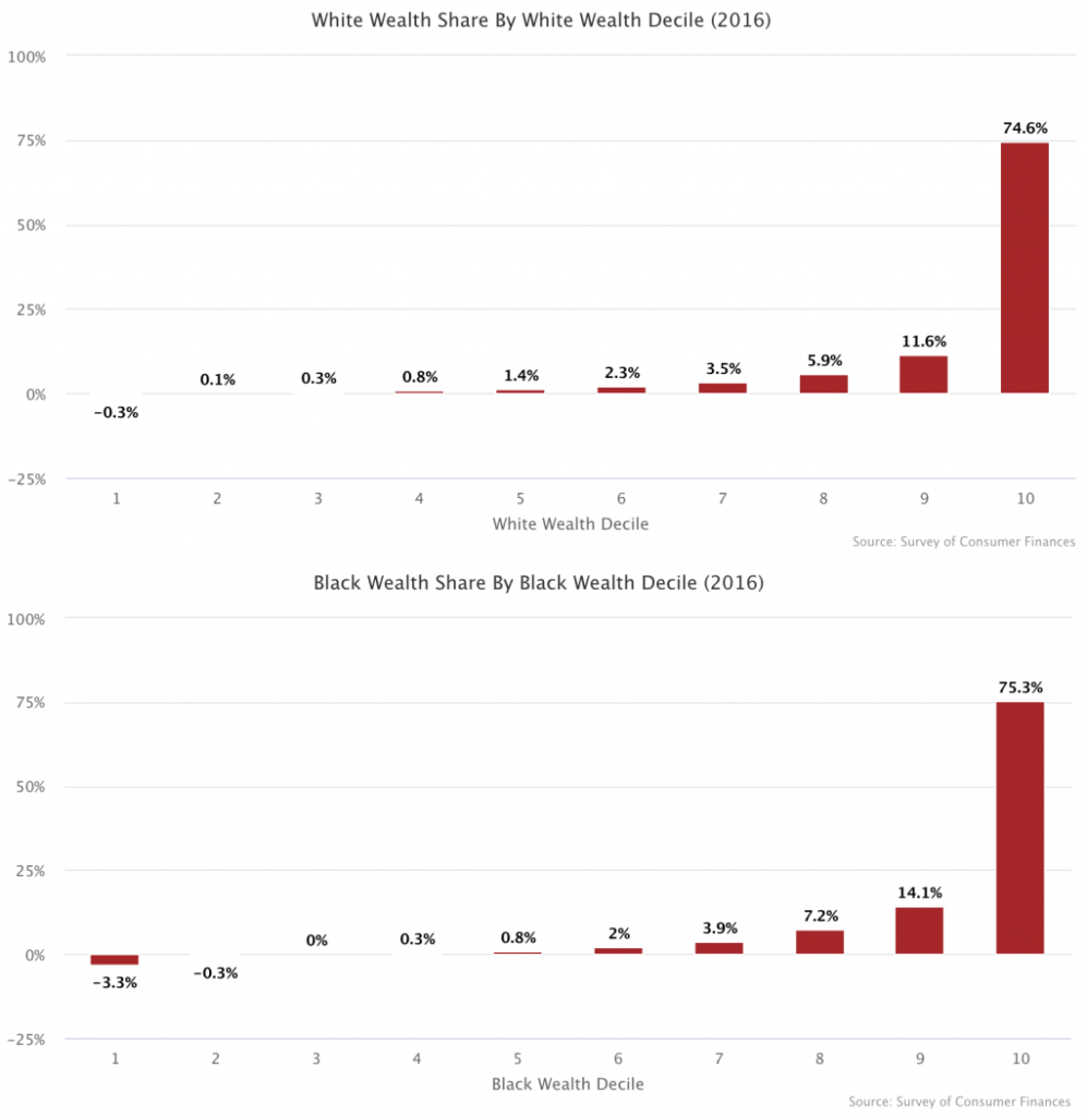 The article The Racial Wealth Gap is About the Upper Classes by Matt Bruenig (6/29/2020) on the People’s Policy Project explains. First the racial wealth gap is large:
If you take the net worth of all white households and divide it by the number of white households, you get $900,600. If you do the same thing for black households, you get $140,000. The difference between these figures — $770,600 — is the best representation of the overall racial wealth gap.
The graphs here from the article show that the wealth in both groups is largely concentrated in the top 10%.
What this means is that the overall racial wealth disparity is being driven almost entirely by the disparity between the wealthiest 10 percent of white people and the wealthiest 10 percent of black people.
Overall,
This means that even after you have completely closed the racial wealth gap between the bottom 90 percent of each race, 77.5 percent of the overall racial wealth gap still remains, which is to say that the disparity between the top deciles in each race drives over three-fourths of the racial wealth gap.
Further,
What this shows is that 97 percent of the overall racial wealth gap is driven by households above the median of each racial group.
What is in the Income and Poverty 2018 report?
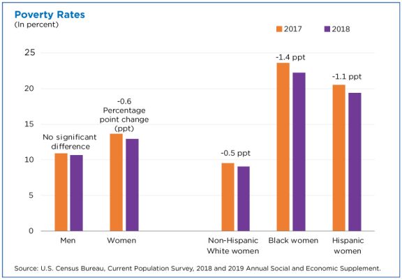
The U.S. Census Bureau report Income and Poverty in the United States: 2018 by Jessica Semega, Melissa Kollar, John Creamer, and Abinash Mohanty (9/10/19) is now available. A few highlights can be found in the post Pay is Up. Poverty is Down. How Women are Making Strides by Jessica Semega (9/10/19). For example, the graph copied here is poverty rates for 2917 and 2018 for men, women, and by race for women. In terms of households:
Median incomes of married-couple households and those with male householders did not change from 2017.
In 2018, the poverty rate for families with a female householder was 24.9%, higher than that for married-couple families (4.7%) and families with a male householder (12.7%).
However, the poverty rate for families with a female householder declined from the previous year, at 26.2% in 2017.
The full report contains 20 pages of charts and summaries related to income and poverty by numerous categories. The other 50 or so pages are data tables that are also available in excel files (see links on right sidebar of the report page). There is ample data here for use in courses.
How different is weekly pay of women and men by race?
The BLS report, Highlights of women’s earning in 2017 has four charts with data about women’s earnings and occupation. The chart copied her compares men and women by race.
Asian women and men earned more than their White, Black, and Hispanic counterparts in 2017. Among women, Whites ($795) earned 88 percent as much as Asians ($903); Blacks ($657) earned 73 percent; and Hispanics ($603) earned 67 percent. Among men, these earnings differences were even larger: White men ($971) earned 80 percent as much as Asian men ($1,207); Black men ($710) earned 59 percent as much; and Hispanic men ($690), 57 percent. (See chart 3 and table 1.)
Note:
The earnings comparisons in this report are on a broad level and do not control for many factors that can be important in explaining earnings differences, such as job skills and responsibilities, work experience, and specialization.
The BLS is an excellent source for data.
How are CEOs doing?
 The EPI article, CEO compensation has grown 940% since 1978 by Lawrence Mishel and Julia Wolfe (8/14/2019), summarizes CEO compensation. Selected Key findings:
Using the stock-options-realized measure, we find that the average compensation for CEOs of the 350 largest U.S. firms was $17.2 million in 2018. Compensation dipped 0.5% in 2018 following a 7.6% gain in 2017.
The fact that CEO compensation has grown far faster than the pay of the top 0.1% of wage earners indicates that CEO compensation growth does not simply reflect a competitive race for skills (the “market for talent”) that also increased the value of highly paid professionals: Rather, the growing differential between CEOs and top 0.1% earners suggests the growth of substantial economic rents in CEO compensation (income not related to a corresponding growth of productivity). CEO compensation appears to reflect not greater productivity of executives but the power of CEOs to extract concessions. Consequently, if CEOs earned less or were taxed more, there would be no adverse impact on the economy’s output or on employment.
Over the last three decades, CEO compensation increased more relative to the pay of other very-high-wage earners than did the wages of college graduates relative to the wages of high school graduates. This finding indicates that the escalation of CEO pay does not simply reflect a more general rise in the returns to education.
There are six tables/graphs in the article and the data is available for download.
How has the federal minimum wage changed?
The EPI article Congress has never let the federal minimum wage erode for this long by David Cooper (6/17/19) provides the graph here.
June 16th marks the longest period in history without an increase in the federal minimum wage. The last time Congress passed an increase was in May 2007, when it legislated that the minimum wage be raised to $7.25 per hour on July 24, 2009. Since the minimum wage was first established in 1938, Congress has never let it go unchanged for so long.
To get the data for this graph visit The FRED Blog The value(s) of the minimum wage. At the bottom of the page they provide direction on how to recreate the chart with FRED data. Knowing how to do this is valuable and should be incorporated into any statistics or QL course.
How will raising the federal minimum wage impact workers?
The EPI article, Raising the federal minimum wage to $15 by 2024 would life pay for nearly 40 million workers, by David Cooper (2/5/19) covers their analysis of raising the minimum wage. Their graph here shows the gap between the minimum wage and median wage over time. The report is lengthy and detailed. A few quick highlights:
Raising the minimum wage to $15 by 2024 would undo the erosion of the value of the real minimum wage that began primarily in the 1980s. In fact, by 2021, for the first time in over 50 years, the federal minimum wage would exceed its historical inflation-adjusted high point, set in 1968.
All told, raising the minimum wage to $15 by 2024 would directly or indirectly lift wages for 39.7 million workers, 26.6 percent of the wage-earning workforce.
Indexing the minimum wage to the median wage would ensure that low-wage workers share in broad improvements in U.S. living standards and would prevent future growth in inequality between low- and middle-wage workers.
The article has over 20 graphs/charts/tables and each one has the associated data. The report does include “a discussion of the research on the likely effects such a raise would have on businesses, employment, and low-wage workers’ welfare.”
