Tag Archives: maps

How’s your air?

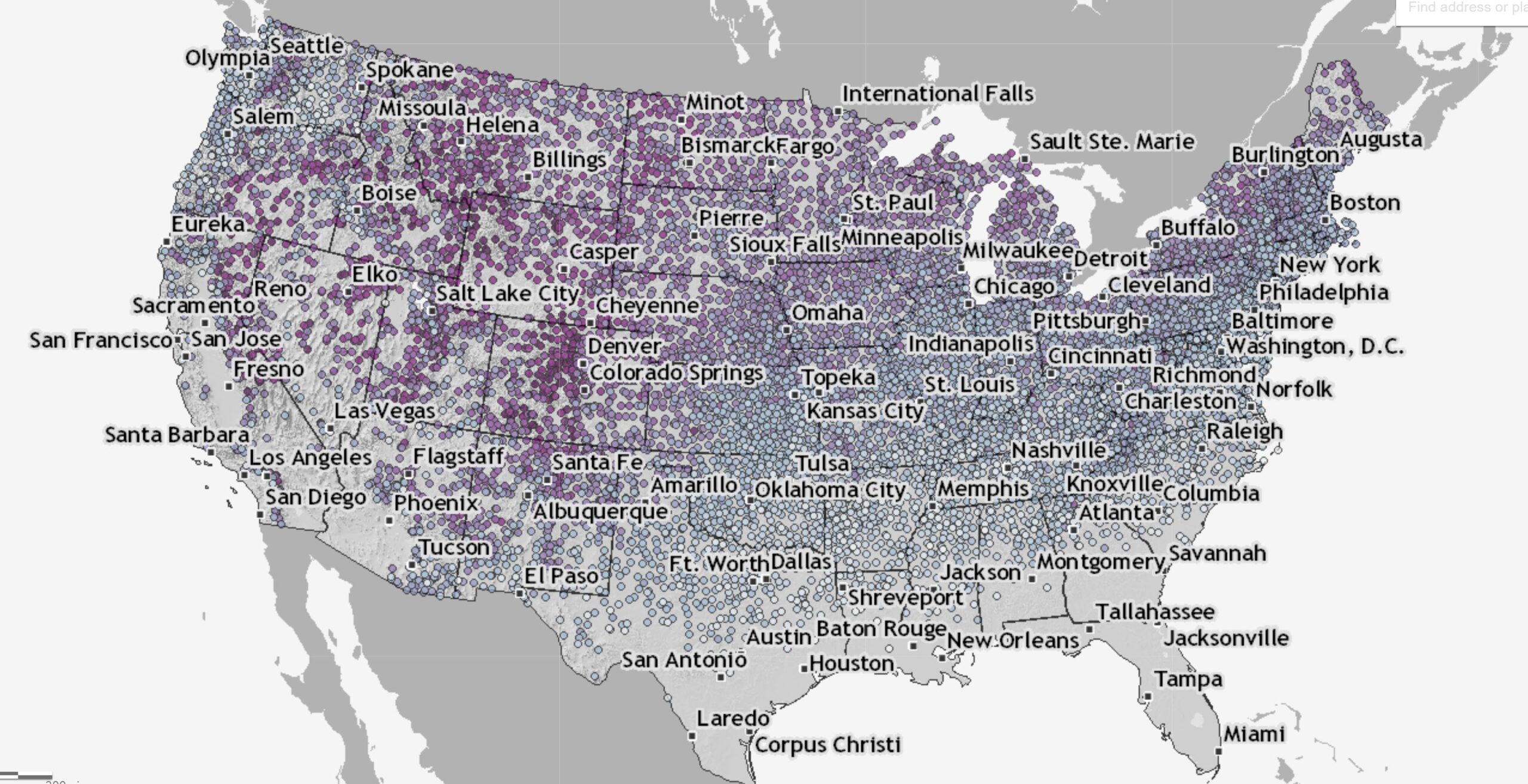
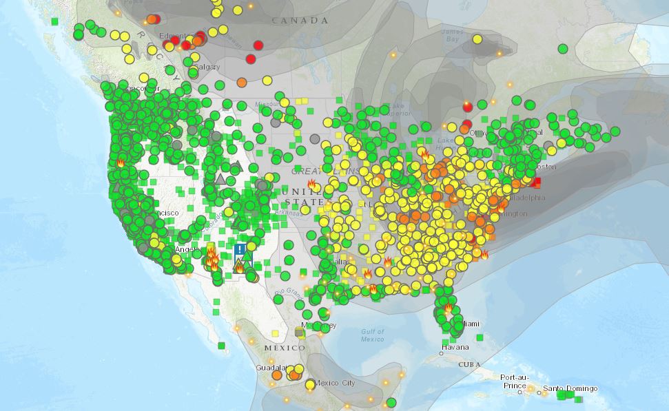
If you would like to know if you should breathe the air go to the Fire and Smoke Map. You see an image like the one here. Find you location on the map. Click the dot to get a pop up window with extra information including an interactive time series chart of air quality for the last week. About the site:

The AirNow Fire and Smoke Map provides information that you can use to help protect your health from wildfire smoke. Use this map to see:

– Current particle pollution air quality information for your location;
– Fire locations and smoke plumes;
– Smoke Forecast Outlooks, where available; and,
– Recommendations for actions to take to protect yourself from smoke. These recommendations were developed by EPA scientists who are experts in air quality and health.

The Map is a collaborative effort between the U.S. Forest Service (USFS)-led Interagency Wildland Fire Air Quality Response Program and the U.S. Environmental Protection Agency (EPA).

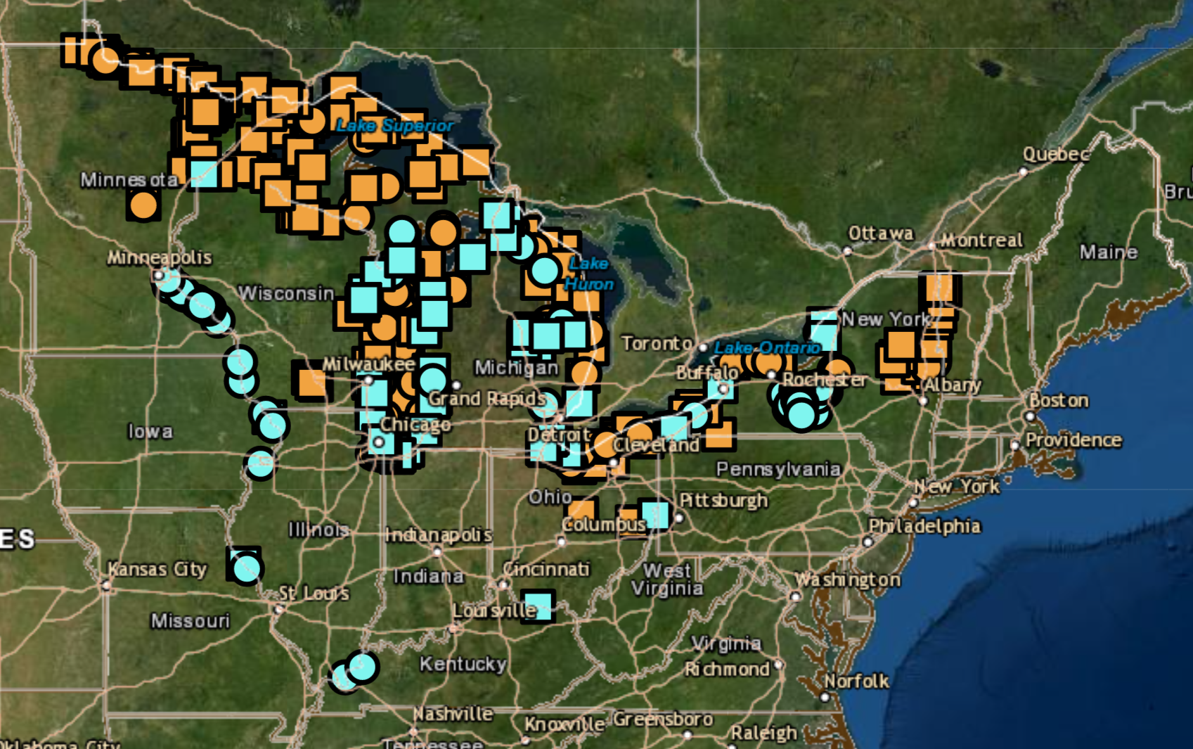
For an interacative map of fires and smoke movement see firesmoke.ca.

Should you bet on a white Christmas?

The answer to the question depends on where you live, which will dictate the odds of snow on the ground on Dec 25.  If you aren’t sure then take a look at the map on the NOAA’s climate.gov article Interactive map: Are you dreaming of a white Christmas? by Rebecca Lindsey and Susan Osborne (12/6/2022).

The interactive map on the page allows you to zoom in on a dot and get information about the chance of at least an inch of snow on the ground on Dec 25.  Here in Ithaca we have a 51% chance of at least an inch of snow on the ground. The page includes links to other maps and at the bottom there are links to other snow related resources. There is a link to download a spreadsheet of the data which includes the state and location name, along with elevation and the chance of snow. Is there relationship between elevation and snow on Dec 25? This seems like a stats project in the making.


ENSO, Alaska, and correlation, what’s the connection?

The climate.gov article Moose tracks through Alaska and ENSO  by Brian Brettschneider (6/23/2022) is a great example of using statistics in a real world setting; in this case the Pearson correlation. The graph copied here is interesting but the footnote may be even more so:

This statistical analysis uses the Pearson correlation of a linear regression, which measures how well two variables (like ENSO and Alaskan temperature) remain in sync. Correlation values range from -1 (completely out of sync) to +1 (completely in sync). Also, because Alaska’s temperatures have such a strong warming trend, the anomaly for each year was compared against a trailing 30-year average (or climatology). This mostly, but not entirely, removes the trend. We are interested in removing the climate trend in these maps because we are interested in isolating the ENSO signal (which does not include climate change signals).

Quick summary of the results:

The winter and spring seasons have the greatest connection between ENSO (as measured by the Oceanic Niño Index) and departures from average air temperature, and the correlation is positive. This means that El Niño tends to bring above-average temperatures; it also means La Niña is linked with below-average temperatures. Areas adjacent to and closer to the North Pacific Ocean tend to have a stronger connection with ENSO than areas inland. In the summer, the relationship weakens quite a bit (as indicated by the lighter shading) and is mostly nonexistent by fall.

The Oceanic Niño Index links to a data set. There are a few other maps in the article and a couple more footnotes.


Are we done with snow for the year?

If you check the Climate.gov page Interactive map: Latest snow on record for thousands of U.S. weather stations by Tom Di Liberto (updated 3/30/2022) you can find the date of the last snowfall on record at a weather station near you. On the map:

This interactive map shows the latest day for which measurable snow (accumulations of greater than 0.1 inches) was recorded for thousands of U.S. weather stations during their period of operation (up through April 11, 2018.) Purple colors reflect latest-snowfall dates that occurred later in the year, while bluer shades reflect earlier dates for the last snow of the year.

On one of the patterns in the map:

The interesting wrinkle is that the change in date of the latest final snow of the season does not follow a strictly east to west line across the country, even to the east of the Rockies, as it would if latitude were the only influence. Instead, it appears to occur on a diagonal across the Great Plains and into the Midwest. Why is that? Well the answer lies both to the south (the Gulf of Mexico) and the north (Canada).

As the calendar moves into spring, warmer air from closer to tropics and over the Gulf of Mexico begins to moderate temperatures enough over the southeast to make it difficult for temperatures to be cold enough for snow. Meanwhile, cold air that resides in the interior of Canada can still funnel south, bounded on one side by the Rocky Mountains, allowing for the occasional late spring snowfall, even as far south as higher elevations in New Mexico.

There are no direct data sources but the map is interesting.

Do men always earn more than women?

The Pew article, Young women are out-earning young men in several U.S. cities by Richard Fry (3/28/2022) provides the graph copied here.

Overall, about 16% of all young women who are working full time, year-round live in the 22 metros where women are at or above wage parity with men.

There are four metro areas where young women make 110% or more of what young men make: Wenatchee, WA; Morgantown WV; Barnstable Town, MA; and Gainesville, FL.

From a regional perspective, metropolitan areas in the Midwest tend to have wider gender wage gaps among young workers. Young women working full time, year-round in Midwestern metros earn about 90% of their male counterparts. In other regions, by comparison, young women earn 94% or more of what young men earn.

The article doesn’t talk about the types of jobs or why disparities exist but they do note:

Labor economists examine earnings disparities among full-time, year-round workers in order to control for differences in part-time employment between men and women as well as attachment to the labor market. However, even among full-time, year-round workers, men and women devote different amounts of time to work. Men under 30 usually work 44 hours per week, on average, compared with 42 hours among young women.

There is a link to a Google sheet with the data for 250 U.S. metro areas at the bottom of the article.

When is your last freeze date?

Climate.gov has an interactive map in their article Interactive map: average date of last spring freeze across the United States by Rebecca Lindsey (3/21/2022). A picture of the map is posted here. You can zoom in on a location and click a dot to get and exact data for the day the chance of freeze drops below 50%.

Places where this milestone is reached before the first day of spring in mid-March appear in shades of purple, while places where it comes after that are colored in shades of green. Clearly, from the amount of green, the odds of freezing air temperature remain above 50 percent until after the solar start of spring in most of the Lower 48. As you’d expect, the farther north or higher in elevation you go, the later in the season (darker greens) this day generally arrives.

At the bottom of there is a link to Annual/Seasonal Normals and how to get data for this graph and for other cutoff percentages.

Where is the center of the U.S population?

Before we get to where the center of the U.S. population is maybe we should say what it is. From the U.S. Census Bureau’s article The “Hart” of the Nation’s population: Hartville, Missouri (pop. 594) (11/165/2021):

Every decade since the first census in 1790, the Census Bureau has used data from each decennial census to calculate the center of population — the point where the country would balance perfectly on a flat map if everyone had the same weight of one.

In addition to a national center of population, the Census Bureau also calculates centers of population for each state, county, census tract and census block group. Coordinates for each of these locations can be found on the Centers of Population webpage.

The map here shows the center and how it has moved since 1790. This is near the bottom of the article and it is interactive in that users can choose individual states. The link in the quote will take users to a page with lat and lon for the mean and median centers of each state.

How do we explore invasive aquatic species in the Great Lakes basin?

The Great Lakes Aquatic Nonindigenous Species Information System (GLANSIS) is

designed to to be a “one-stop shop” for information about non-native species in the Great Lakes. GLANSIS hosts regional data about identification, ecology, distribution, environmental and socioeconomic impacts, management, and control of nonindigenous species throughout the Great Lakes basin, along with bibliographic material, risk assessments, and other resources.

If you click on Map Explorer you can make the map here which shows the distribution of Bythotrephes longimanus (Spiny Waterflea – orange) and Echinogammarus ischnus (scud – blue). One nice thing about the Map Explorer is you can easily download a csv file of the data which includes lat long  coordinates (use it in your favorite GIS software). There are also dates so the data can be used as a time series.  Using the GLANSIS Map Explorer by El Lower, Austin Bartos, and Rochelle Stuttevant (8/11/2021) provides an nice intro to the site.

How much of the West is in drought?

Over 99% of the West has been in drought for the month of July and 4/6/2021 was the last time it was below 90%. Roughly 25% has been in exceptional drought since May. Over 60 million people (about 20% of the U.S. population) are estimated in the drought areas in the West. The definition of exceptional drought:

  • Exceptional and widespread crop/pasture losses

  • Shortages of water in reservoirs, streams, and wells creating water emergencies

The U.S. Drought Monitor has data for download including time series and GIS files.