Tag Archives: QL

By party, what are the biggest difference in top concerns?

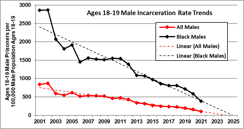
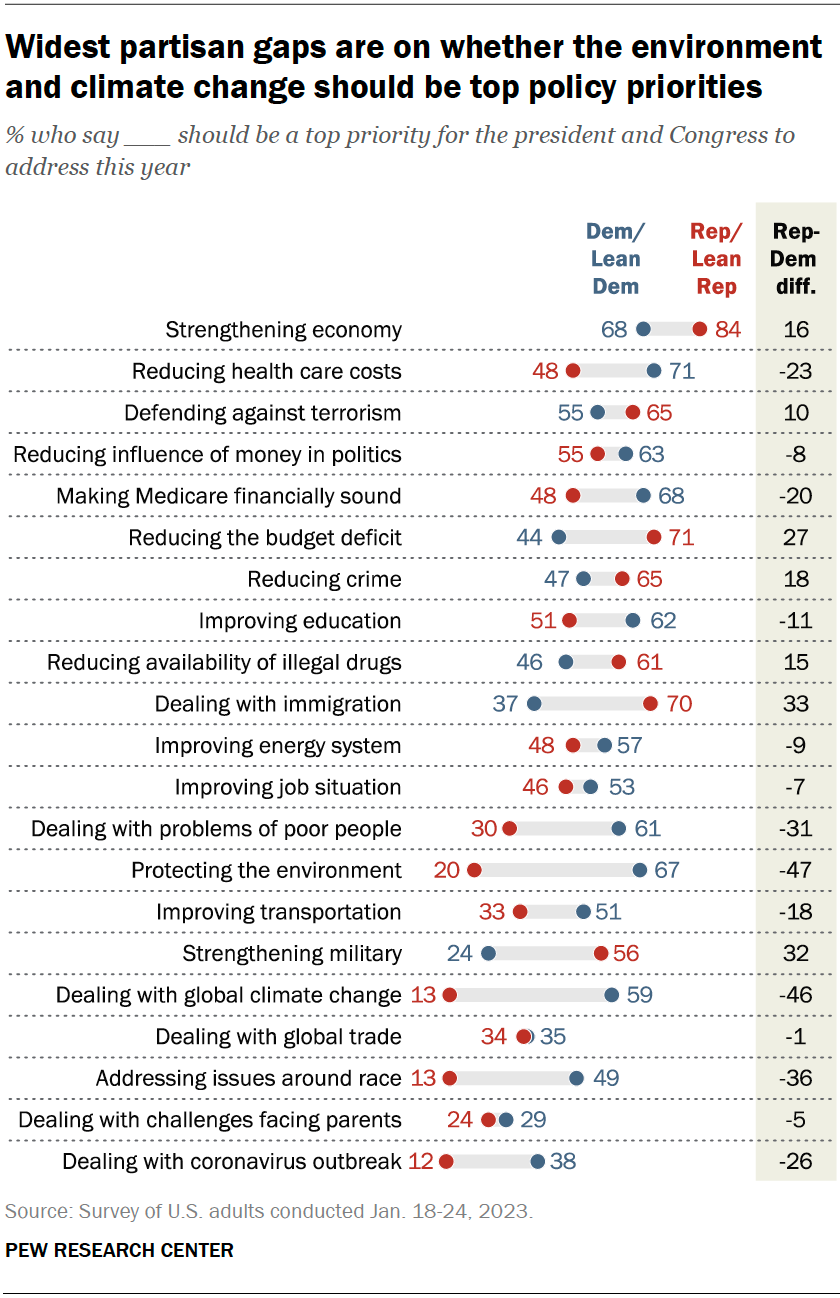
The pew article Economy Remains the Public’s Top Policy Priority; COVID-19 Concerns Decline Again (2/6/23)  provides the graph here.  The three biggest gaps:

The largest gaps between Republicans and Democrats are on protecting the environment and dealing with global climate change. Two-thirds of Democrats say environmental protection should be a top priority, compared with 20% of Republicans. Similarly, 59% of Democrats say this about climate change versus just 13% of Republicans.

Democrats also are much more likely than Republicans to prioritize addressing issues around race (49% top priority among Democrats vs. 13% among Republicans)

One might expect that the biggest gaps would come in categories where one group is very positive and the other not and it does for the top category of protecting the environment (67-20). Interesting though the third biggest gap on issues around race does not even get a majority on the top group (Dems at 49%). What about the smallest gap where the low group is still above 50%?  Reducing the influence of money in politics (55-63).

There are other breakdowns in the article including by race and by age. Great quantitative literacy article. There is also a methodology

How have incarceration rates changed?

Rick Nevin has an excellent post, Update: Continuing trend toward zero youth incarceration (1/18/2023), that summarizes trends in incarceration rates.  There are five interesting graphs, but the one here might surprise folks the most.  There has been steady decrease in the gap between Black male incarceration rates and the overall male incarceration rates. Some quotes:

It is remarkable – and exasperating – that the debate over crime and incarceration almost entirely ignores divergent trends by age. Youth crime and incarceration are vanishing as arrest and incarceration rates are still increasing for adults over 50. The only crime theory that explains this divergence is the impact of birth year trends in preschool lead exposure.

The steeper decline in Black incarceration rates since 2001 reflects the fact that Black children recorded steeper blood lead declines associated with slum clearance over the 1960s and city air lead declines since the early-1970s (explained here).

I don’t think it is widely known that youth incarceration rates have been decreasing while over 50 have been increasing.

It is especially exasperating that criminal justice reform advocates ignore incarceration trends by age. Those trends should inform incarceration reduction strategies, to have the greatest impact and to generate the least resistance from “tough-on-crime” advocates.

We do not have a “mass incarceration” problem for youths. Not anymore. Reductions in preschool lead exposure have caused massive declines in youth crime and incarceration. We do still have mass incarceration for adults over 50, and it’s getting worse.

There are links to the data in the first sentence. Check out my lead crime project in the Statistics Projects section.

Which state grew the fastest in 2022?

You probably looked at the graph already and know the answer, Florida. The graph is from the Census Bureau article New Florida Estimates Show Nation’s Third-Largest State Reaching Historic Milestone by Marc Perry, Luke Rogers and Kristie Wilder (12/22/2022). This leaves us with more questions than answers, which we’ll get to. First,

After decades of rapid population increase, Florida now is the nation’s fastest-growing state for the first time since 1957, according to the U.S. Census Bureau’s Vintage 2022 population estimates released today.

Florida’s population increased by 1.9% to 22,244,823 between 2021 and 2022, surpassing Idaho, the previous year’s fastest-growing state.

Florida wins by percent but did Florida add the most population?

Increasing by 470,708 people since July 2021, Texas was the largest-gaining state in the nation, reaching a total population of 30,029,572. By crossing the 30-million-population threshold this past year, Texas joins California as the only states with a resident population above 30 million. Growth in Texas last year was fueled by gains from all three components: net domestic migration (230,961), net international migration (118,614), and natural increase (118,159).

Florida was the fastest-growing state in 2022, with an annual population increase of 1.9%, resulting in a total resident population of 22,244,823.

If Florida grew by 1.9% and was the fastest, what was the U.S. growth?

After a historically low rate of change between 2020 and 2021, the U.S. resident population increased by 0.4%, or 1,256,003, to 333,287,557 in 2022, according to the U.S. Census Bureau’s Vintage 2022 national and state population estimates and components of change released today.

The last two quotes are from the Census Bureau press release Growth in U.S. Population Shows Early Indication of Recovery Amid COVID-19 Pandemic (12/22/2022). Plenty of QL uses for these articles and you can follow the link in the last quote for data.

How much do your legos cost?

The cost of legos vary around the globe and the article The Countries that Pay the Most and Least for Lego by Jess Peace.

But LEGO also tells a tiny tale about world economics. The price of LEGO differs depending on the country where you shop. In fact, TheToyZone found a 744% difference between the average price of LEGO in the most and least expensive markets.

We researched the prices of eight popular LEGO sets in marketplaces across roughly 200 countries where new LEGO sets are sold and totaled up the average price for each territory. Then we converted our findings to US dollars and ranked the final figures to uncover the countries that pay more for their LEGO.

There are a bunch of graphics like the one copied here and you can zoom in to read all the prices. One has to appreciate the graphics and there is good QL info in the article.

I’m going to officially take a couple of weeks off. I passed 500 post this year and I’ve only missed a few of my biweekly posts. I’ll be back in 2023.

What should we know about oil markets?

The World Bank blog post Oil prices remain volatile amid demand pessimism and constrained supply  by Peter Nagle and Kaltrina Temaj (12/16/2022) is a overview of the oil market. There are seven graphs but one, U.S. strategic reserves, caught my attention and is copied here.

The United States and other OECD countries have released large amounts of oil from their strategic reserves, equal to about 1mb/d since March.  These releases have sharply reduced the level of strategic reserves—for example, the U.S. Strategic Petroleum Reserve (SPR) is currently at its lowest level since 1984—reducing available buffers in the event of future disruptions to supply. Conversely, the U.S. administration has announced it intends to start to refill the SPR at a price of about $70/bbl, potentially putting a floor under prices.

One other fact of interest:

OPEC+ members agreed to cut their production target by 2 million barrels per day starting in November 2022 and lasting through end-2023.  The actual reduction in production in November was much smaller than that (around 0.5 mb/d), largely because many members were already producing well below their target due to operational issues and capacity constraints. Indeed, even after the reduction in the production target, the group’s actual production was still short by 1.7mb/d. Spare production among the group remains low by historical standards, at around 3.5 mb/d or 3.5 percent of global oil demand.

Ample quantitative information in the article along with rates for calculus. There aren’t links to data but the sources are cited and shouldn’t be too hard to find.

How much natural gas does the industrial sector use?

The eia post Natural gas consumption in the industrial sector has grown slowly in recent years by Mike Kopalek (12/12/2022) provides the graph copied here. What may be more interesting is what all this natural gas is used for. A few highlights:

Natural gas used to produce fertilizer is one of the largest chemical feedstocks.

Methanol (CH3OH), a natural gas-derived substance that’s widely used as a precursor for chemical derivatives, is another one of the largest chemical feedstock uses for natural gas. In recent years, the United States added significant methanol production capacity, particularly in Texas and Louisiana.

Crude oil refineries are an important natural gas consumer as well, accounting for about 14% of all industrial natural gas consumption in 2021.

Read the article for the details. There are links to the data source.

How much have food prices increased?

The World Bank Data Blog provides information on food prices in the article Food prices eased but risks remain elevated by John Baffes & Kaltrina Temaj (11/21/2022)

The World Bank’s Food Price Index declined 12% in the third quarter of 2022 (q/q) after reaching an all-time high in April. The index remains almost 20% higher than a year ago.  In domestic currency terms, however, food prices remain elevated due to currency deprecations. Food prices are expected to fall 5% in 2023 before stabilizing in 2024. Despite the expected declines, most food prices will remain high by historical norms. The forecasts are also subjected to numerous risks.

The article has total of 7 graphs, most of them are interactive, and interesting information:

Supply disruptions, increasing production costs, and appreciation of the U.S. dollar have exerted upward pressure on domestic food price inflation in most countries.  Food price inflation in South Asia averaged 20% in the first three quarters of 2022 (y/y); the average for most other regions was 14%. The exception was the East Asia and the Pacific region where food price inflation averaged just 6%, in part due to stable rice prices, a key staple in the region.

There are links to the data but it may take some work to get it. This is a rich QL article. For example, a good assignment is use the graph to verify the percentages in the first quote above.


Who views violent crime as voting issue?

In the past I’ve posted about pew surveys presenting very split opinions by the D and the R teams. Today we have an interesting one within the D team in the Pew article Violent crime is a key midterm voting issue, but what does the data say? by John  Gramlich (10/31/2022). Key quote:

Differences by race are especially pronounced among Democratic registered voters. While 82% of Black Democratic voters say violent crime is very important to their vote this year, only a third of White Democratic voters say the same.

There are a couple of graphs in the article and plenty of quantitative information. What is particularly nice is the discussion about views on violent crime and some disconnects. The article does a great job of discussion possible reasons for this disconnect.


Which political side is losing more?

According to the pew article Growing share of Americans say their side in politics has been losing more often than winning by Ted Van Green (10/3/2022) overall 72% feel their side is losing more. There are, of course, differences by party:

 Today, about eight-in-ten Republicans and Republican-leaning independents (81%) say they feel that their side is losing more often than winning politically, up from 74% who said this in 2021. In February 2020, with President Donald Trump in the White House, just 29% of Republicans said their side was losing more often than winning, while 69% said it was mostly winning.

This makes some sense. When you control the presidency you are winning more. Yet,

Still, two-thirds of Democrats and Democratic leaners (66%) say their side is losing more than winning, up from 60% in 2021.

In early 2020, and at earlier points in Trump’s presidency, much larger majorities of Democrats said they felt like their side was losing more than winning. For example, 80% of Democrats said this in February 2020.

Controlling the white house doesn’t seem to be helping the Dems. How sustainable is a society if majorities always think they are losing?

As always, pew has a methodology section which can be used in a stats class.


Are wildlife populations improving?

According to the Our World in Data article Wild mammals are making a comeback in Europe thanks to conservation efforts by Hannah Ritchie (9/27/2022) many mammal populations have increased as the chart shows.  The Eurasian beaver is thrilled:

The Eurasian beaver has made the most remarkable recovery. It’s estimated to have increased 167-fold, on average. There were likely only a few thousand beavers left in Europe in first half of the 20th century. Today there are more than 1.2 million.

Obtaining these estimate is a challenge and interesting:

For example, the result for Eurasian beavers is based on studies of 98 different populations. The grey wolf is based on 86 studies. For the Iberian lynx, high-quality time series were only available for 7 populations.

This means, for example, that the value of 16,705% for the Eurasian beaver means that there was, on average, a 16,705% increase in the numbers of beavers in each of the 98 populations that were included in this study. This does not mean that there was a 16,705% increase in all populations. Nor can we say that there was this level of increase for Eurasian beavers as a whole because we do not know the change in unmonitored populations, and the number of beavers in different populations will be different.

From a QL perspective it would be nice if the available data included the starting population size. It is also worth noting.

There are more than 250 European mammal species, so the ones that we covered here represent just 10% of the continent’s mammals. The fact that these species are doing well does not mean that all species are.

This article seems like it could be the basis for many projects.