Tag Archives: QL

Which party can speak more freely?

The Pew article Republicans continue to see a national political climate more comfortable for Democrats than for GOP by Bradley Jones (12/8/2021) is another example of the disconnect in the U.S.

When Republicans take stock of the national climate for political discourse, they see a much more hospitable environment for Democrats than for members of their own party. About six-in-ten Republicans and Republican-leaning independents in the United States (63%) think that “Democrats in this country are very comfortable to freely and openly express their political views,” but only about two-in-ten (19%) think Republicans around the nation experience that same level of comfort.

Responses from Dems go the other way but aren’t as extreme. Pew provides the questions asked and the methodology.

Where is the center of the U.S population?

Before we get to where the center of the U.S. population is maybe we should say what it is. From the U.S. Census Bureau’s article The “Hart” of the Nation’s population: Hartville, Missouri (pop. 594) (11/165/2021):

Every decade since the first census in 1790, the Census Bureau has used data from each decennial census to calculate the center of population — the point where the country would balance perfectly on a flat map if everyone had the same weight of one.

In addition to a national center of population, the Census Bureau also calculates centers of population for each state, county, census tract and census block group. Coordinates for each of these locations can be found on the Centers of Population webpage.

The map here shows the center and how it has moved since 1790. This is near the bottom of the article and it is interactive in that users can choose individual states. The link in the quote will take users to a page with lat and lon for the mean and median centers of each state.

Has much has poverty decreased?

The Our World in Data article Extreme poverty: how far have we come, how far do we still have to go by Max Roser (11/22/2021) provides numerous graphs that quantify changes in poverty. The most general graph is copied here. This one is for the world but users can select specific countries instead of the world to produce a related graph.

The overall conclusion is summed up well by their summary:

Two centuries ago the majority of the world population was extremely poor. Back then it was widely believed that widespread poverty was inevitable. But this turned out to be wrong. Economic growth is possible and poverty can decline. The world has made immense progress against extreme poverty.

But even after two centuries of progress, extreme poverty is still the reality for every tenth person in the world. This is what the ‘international poverty line’ highlights – this metric plays an important (and successful) role in focusing the world’s attention on these very poorest people in the world.

The poorest people today live in countries which have achieved no growth. This stagnation of the world’s poorest economies is one of the largest problems of our time. Unless this changes millions of people will continue to live in extreme poverty.


There are some distribution type graphs that could be useful for statistics classes and most of the graph have an option to download the data.

Why are more women completing college than men?

The Pew article What’s behind the growing gap between men and women in college completion? by Kim Parker (11/8/2021) notes:

Men are more likely than women to point to factors that have more to do with personal choice. Roughly a third (34%) of men without a bachelor’s degree say a major reason they didn’t complete college is that they just didn’t want to. Only one-in-four women say the same. Non-college-educated men are also more likely than their female counterparts to say a major reason they don’t have a four-year degree is that they didn’t need more education for the job or career they wanted (26% of men say this vs. 20% of women).

Women (44%) are more likely than men (39%) to say not being able to afford college is a major reason they don’t have a bachelor’s degree. Men and women are about equally likely to say needing to work to help support their family was a major impediment.

Also worth noting:

The reasons people give for not completing college also differ across racial and ethnic groups. Among those without a bachelor’s degree, Hispanic adults (52%) are more likely than those who are White (39%) or Black (41%) to say a major reason they didn’t graduate from a four-year college is that they couldn’t afford it.

There is information about the questions and methodology.

When and how will climate change impact crops?

The NASA article Global Climate Change Impact on Crops Expected Within 10 Years, NASA Study Finds by Ellen Gray (11/2/2021) provides an answer:

Climate change may affect the production of maize (corn) and wheat as early as 2030 under a high greenhouse gas emissions scenario, according to a new NASA study published in the journal, Nature Food. Maize crop yields are projected to decline 24%, while wheat could potentially see growth of about 17%.

What is one mechanism for the decline?

Higher temperatures also affect the length of growing seasons and accelerate crop maturity.

“You can think of plants as collecting sunlight over the course of the growing season,” said Ruane. “They’re collecting that energy and then putting it into the plant and the grain. So, if you rush through your growth stages, by the end of the season, you just haven’t collected as much energy.” As a result, the plant produces less total grain than it would with a longer development period. “By growing faster, your yield actually goes down.”

The article includes a nice 2 minute video. For grain harvest data see the World Grain tile on the Statistics Projects page.

What are the U.S. opinions on police funding?

The Pew article Growing share of Americans say they want more spending on police in their area by Kim Parker and Kiley Hurst (10/26/2021) compares police spending polls from June 2020 and Sept 2021. The overall summary is in the graph copied here. There are other charts including a breakdown by race, ethnicity, age, and political leaning. For example,

Among Democrats, Black (38%) and Hispanic (39%) adults are more likely than White adults (32%) to say spending on police in their area should be increased. There is no significant difference across these racial and ethnic groups in the share of adults who say spending should be decreased.

Within the GOP, White and Hispanic adults differ in their views on this question: 64% of White Republicans say police spending in their area should be increased, compared with 53% of Hispanic Republicans.

Pew included a methodology section for both polls.

How divided is the U.S.?

The Pew report Diversity and Division in Advanced Economies by Laura Silver, Janell Fetterolf, and Aidan Connaughton (10/13/2021) has the U.S. is the top spot in a poll and not in a good way.  The chart copied here from Pew has the U.S. at the top for conflict between political parties and even the second highest response from the U.S. would be third in the most common response.

Notably, however, in most societies racial and ethnic divisions are not seen as the most salient cleavage. Rather, in the majority of places surveyed, more people identify conflicts between people who support different political parties than conflicts between people with different ethnic or racial backgrounds. Political divisions are also seen as greater than the other two dimensions tested: between those with different religions and between urban and rural residents. (For more on the actual composition of each public surveyed on each of these dimensions, see Appendix A.)

The report has over 20 charts and rich context to discuss the quantitative results.

What is the Groundswell report?

From the world bank:

This sequel to the Groundswell report includes projections and analysis of internal climate migration for three new regions: East Asia and the Pacific, North Africa, and Eastern Europe and Central Asia. Qualitative analyses of climate-related mobility in countries of the Mashreq and in Small Island Developing States (SIDS) are also provided. This new report builds on the scenario-based modeling approach of the previous Groundswell report from 2018, which covered Sub-Saharan Africa, South Asia, and Latin America. The two reports’ combined findings provide, for the first time, a global picture of the potential scale of internal climate migration across the six regions, allowing for a better understanding of how slow-onset climate change impacts, population dynamics, and development contexts shape mobility trends.

Key projection:

Over 216 million people could move within their countries by 2050 across six regions,

The report discusses their modeling (there is more than this) :

Both Groundswell reports use the same modeling approach, which allows for direct comparison of results and for aggregation to derive the global figure for internal climate migration. They take a scenario-based approach and implement a modified form of a gravity model to isolate the projected portion of future changes in spatial population distribution that can be attributed to slow-onset climate factors up to 2050. The Spotlight discusses the key innovations and scope of the modeling approach.

Quiz question for a class: Is the 216 million people a lot or a little?


What are the latest climate projections?

The IPCC sixth assessment report was just released. The graph here is from the summary for policymakers.  The 42 page summary could be used as part of a sustainability or QL type course as there are plenty of graphs.  Page 15 starts the discussion on the different scenarios, which is an opportunity to talk about modeling and assumptions. For a sense of the long term consequences:

In the longer term, sea level is committed to rise for centuries to millennia due to continuing deep ocean warming and ice sheet melt, and will remain elevated for thousands of years (high confidence). Over the next 2000 years, global mean sea level will rise by about 2 to 3 m if warming is limited to 1.5°C, 2 to 6 m if limited to 2°C and 19 to 22 m with 5°C of warming, and it will continue to rise over subsequent millennia (low confidence). Projections of multi-millennial global mean sea level rise are consistent with reconstructed levels during past warm climate periods: likely 5–10 m higher than today around 125,000 years ago, when global temperatures were very likely 0.5°C–1.5°C higher than 1850–1900; and very likely 5–25 m higher roughly 3 million years ago, when global temperatures were 2.5°C–4°C higher (medium confidence).

How dry is Arizona?

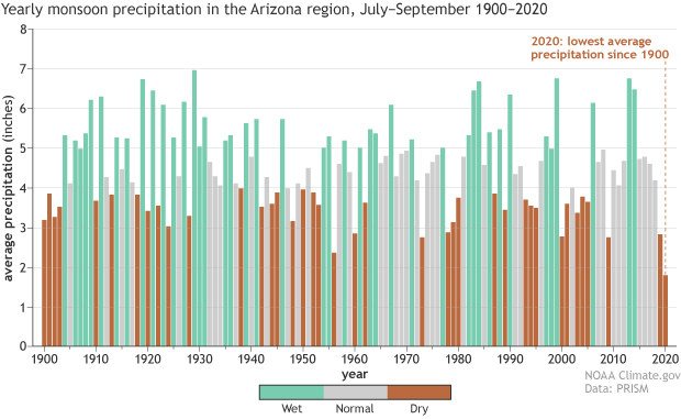
From the climate.gov article Western Drought 2021 Spotlight: Arizona by Tom Di Liberto (7/29/2021):

Looking back even farther by using a drought indicator known as the Standardized Precipitation Index, the current drought in Arizona is also the worst on record back to the late 1800s. Going back even farther than THAT by using tree rings across the Southwest as stand-ins for soil moisture, the current drought over the entire region is one of a handful of the worst droughts in the last 1200 years. Other especially bad droughts occurred in the late 1500s and late 1200s (known as the Great Drought). Basically, this is a long-winded way of saying the current drought in Arizona and the Southwest is bad no matter if you look back 10 years, 100 years, or 1,000 years.

The graph copied here shows that it has been 6 years since a wet year with 2020 precipitation the lowest since 1900. And, of course:

According to the Climate Science Special Report, temperatures across the Southwest have increased by 1.61 degrees Fahrenheit since the first half of the 20th century. These increases in temperature contribute to aridification in the Southwest by increasing evapotranspiration, lowering soil moisture, reducing snow cover and impacting snowmelt.

Looking to the future, temperatures in the Southwest are projected to increase by the end of the century by around 5 degrees Fahrenheit if carbon dioxide emissions follow a lower path and up to 9 degrees if emissions follow a much higher path. Increasing temperatures can make soils even drier, amplifying drought.

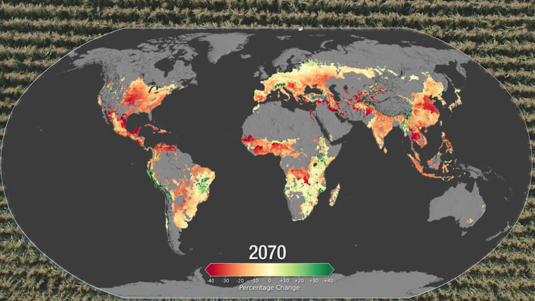
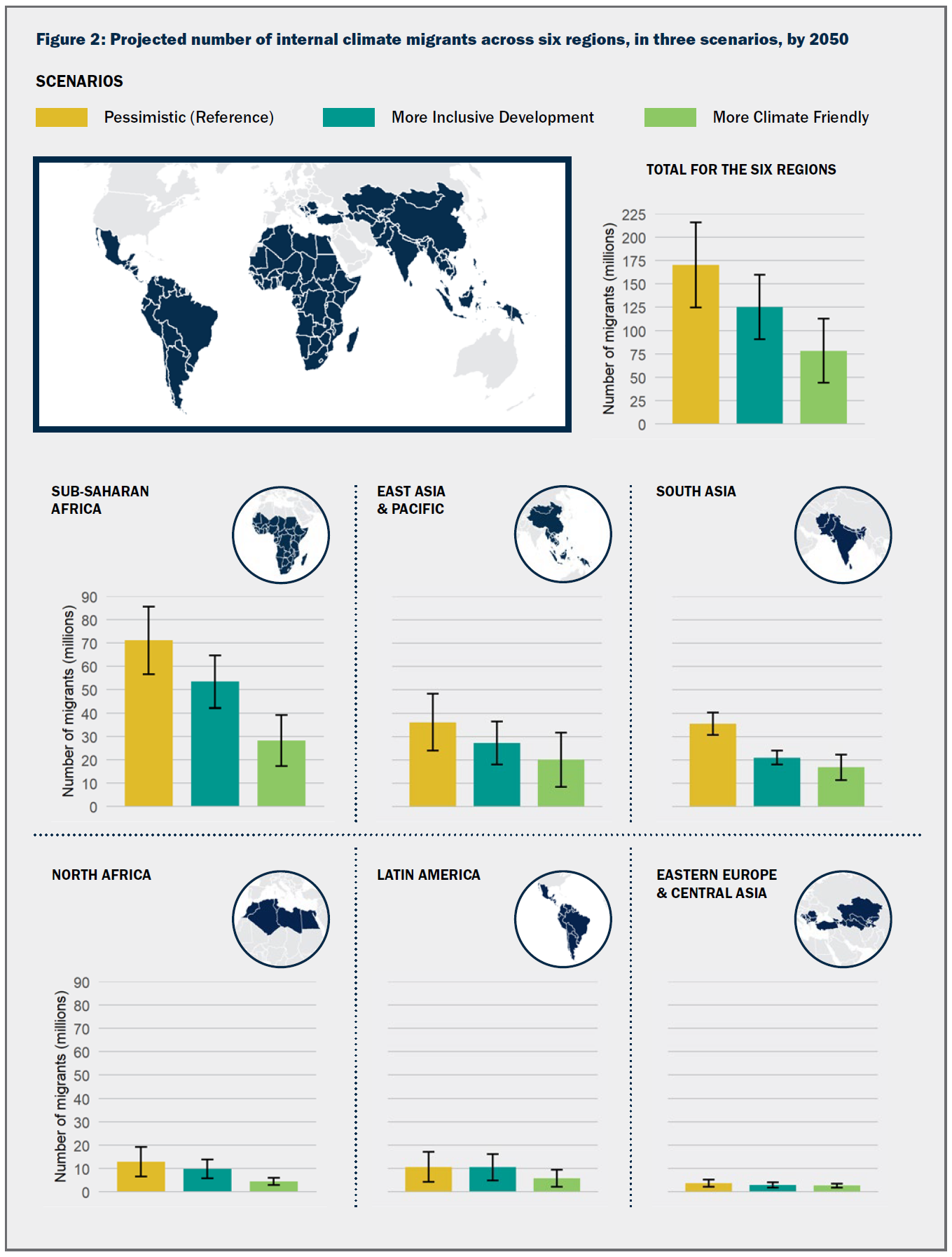
There are other graph in the article but no direct links to data. Still, there is good information and plenty of material for a QL course.
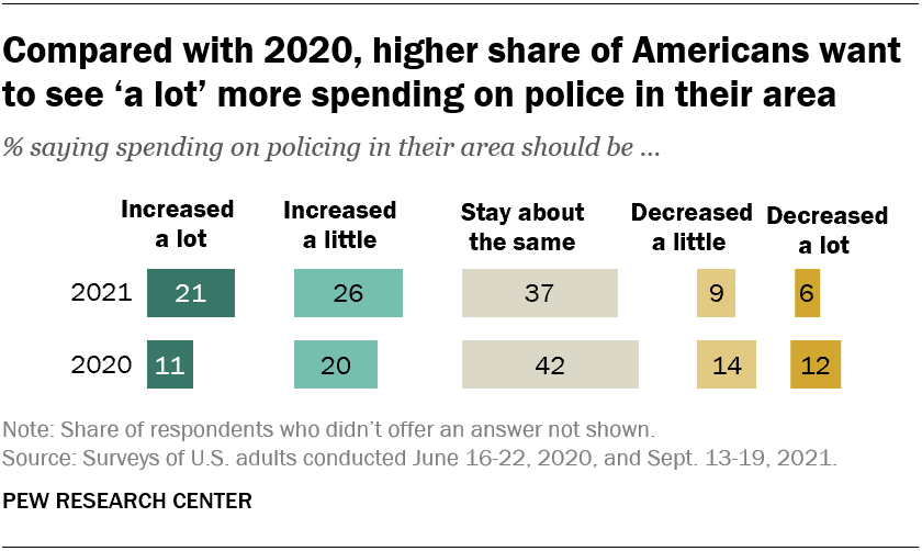
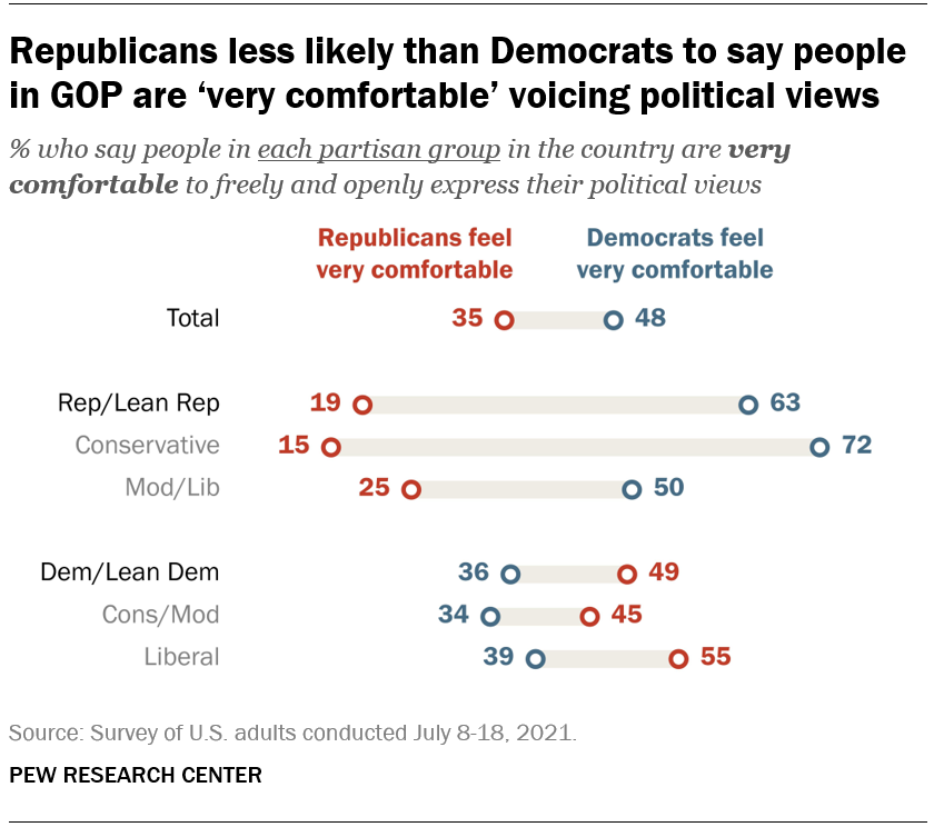