Tag Archives: QL

Urban/Rural Red/Blue?

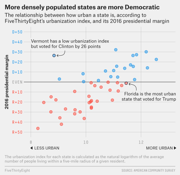
FiveThirtyEight has the interesting graph copied here from their article How Urban or Rural is Your State? And What Does That Mean For The 2020 Election? by Nathaniel Rakich (4/14/2020). How did they measure urbanization?

Essentially, we calculated the average number of people living within a five-mile radius of every census tract and took the natural logarithm to create an “urbanization index,” or a calculation of how urban or rural a given area is.

The article has a table of data that goes with the graph and they look at the 2020 election if urbanization dictated the outcome.

What is a gigatonne of ice?

The picture here is a snapshot from an animation by NASA in the article Visualizing the Quantities of Climate Change – Ice Sheet Loss in Greenland and Antarctica by Matt Conlen (3/9/2020) that shows a gigatonne of ice. A gigatonne isn’t much since

Satellite data show that Greenland and Antarctica are losing mass at a rate of 283 gigatonnes per year and 145 gigatonnes per year, respectively.

There are three animations one for 1 gigatonne, 5,000 gigatonnes (about the amount lost from the polar ice caps from 2002-2017), and 49,000 gigatones (estimate of the amount lost in the 20th century). Each animation also has an associated math box for the related calculation.

Who has the highest Gini of G7 countries?

The Pew article 6 facts about economic inequality in the U.S. by Katherine Schaeffer (2/7/2020) provides the chart copied here (2017 data). One of the other facts mentioned in the article:

In 1989, the richest 5% of families had 114 times as much wealth as families in the second quintile (one tier above the lowest), at the median $2.3 million compared with $20,300. By 2016, the top 5% held 248 times as much wealth at the median. (The median wealth of the poorest 20% is either zero or negative in most years we examined.)

There are 6 (surprise) charts and the data is cited. Great QL article.

What are people’s view of C-19?

The Pew article Worries About Coronavirus Surge, as Most Americans Expect a Recession – or Worse (3/26/2020) reports the results from a survey related to COVID-19. Most of it is not too surprising:

There is broad public agreement that the nation is confronting a crisis. Two-thirds of Americans – including majorities in all major demographic and partisan groups – say COVID-19 is a “significant crisis.”

But, then there is the graphic copied here. Ok, the partisan split on the news media and the President aren’t that surprising, while still quit stark. Interestingly, Dem/Lean Dem rank the top four categories consistently lower than Rep/Lean Rep. The CDC gets 10 percentage points lower and ordinary people 8 percentage points lower.

There are numerous charts of survey responses and the article has a methodology section with data.

What does it mean to “flatten the curve”?

The New York Times article How Much Worse the Coronavirus Could Get, in Charts by Nicholas Kristof and  Stuart A. Thompson (3/13/2020) has a great interactive set of graphs that illustrate the importance of flattening the curve. The graphs start with the one copied here.

What’s at stake in this coronavirus pandemic? How many Americans can become infected? How many might die?

The answers depend on the actions we take — and, crucially, on when we take them. Working with infectious disease epidemiologists, we developed this interactive tool that lets you see what may lie ahead in the United States and how much of a difference it could make if officials act quickly.

One of the interesting features is that the user can drag a bar which is the date interventions begin and see how the curve changes.

How is spring changing?

Climate Central has put together their 2020 Spring Package (2/2/2020) with information and a selection of city graphs. For example

Analyzing average spring temperatures since 1970, the top increases occurred in the Southwestwhere spring is the fastest warming season. Reno, Nev. topped the list with an increase of 7.2°F, followed by Las Vegas, Nev. (6.4°F), El Paso, Texas (5.8°F), and Tucson (5.8°F). In general, 81% (197) of the 242 cities analyzed warmed by at least 1°F over the past fifty years. 

There are four different graph selections for spring: Average Temperature, Days Above Normal, Last Freeze, and a National Map. For the first three you can select from various cities. For example, I chose the graph for last freeze for Duluth, MN, which shows that on average the last freeze is occurring almost two weeks sooner.

The graphs are set up for easy download but there isn’t corresponding data. A previous post How much have fall nighttime temperatures risen? provides details on how to obtain this type of data.

Isn’t the sun causing global warming?

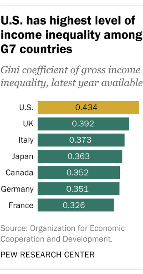
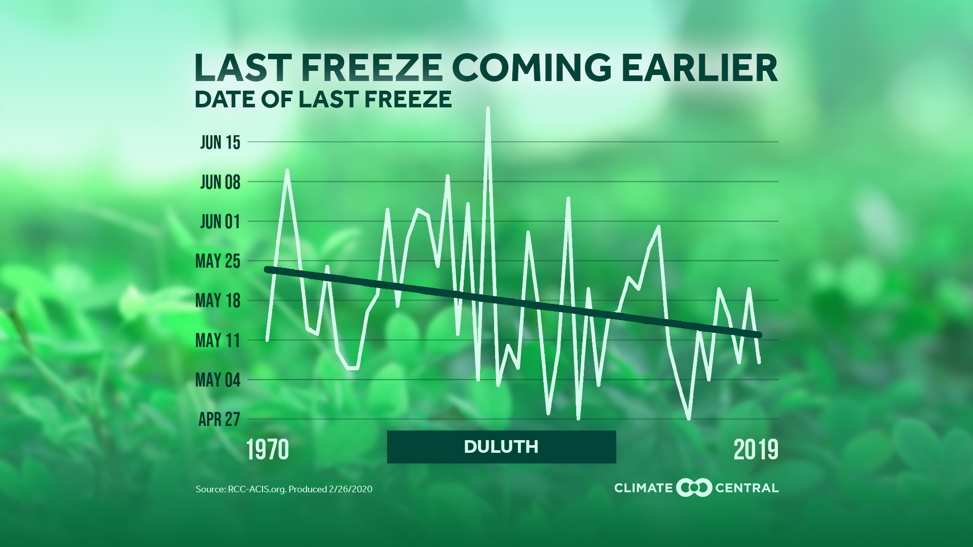
No, as can be easily seen by the graphic here copied from the NASA article There is No Impending ‘Mini Ice Age’ (2/13/2020). At the same time we won’t be seeing an ice age anytime soon:

This is called a “Grand Solar Minimum,” and the last time this happened, it coincided with a period called the “Little Ice Age” (a period of extremely low solar activity from approximately AD 1650 to 1715 in the Northern Hemisphere, when a combination of cooling from volcanic aerosols and low solar activity produced lower surface temperatures).

Even if a Grand Solar Minimum were to last a century, global temperatures would continue to warm. Because more factors than just variations in the Sun’s output change global temperatures on Earth, the most dominant of those today being the warming coming from human-induced greenhouse gas emissions.

The article has another time series of solar irradiance with a source.

Who is in high-poverty schools?

The EPI article Schools are still segregated, and black children are paying a price by Emma García (2/12/2020) provides an overview of inequities in secondary schools. Figure B in the article is copied here and speaks clearly to issues of inequality by race. There is also a political perspective that the percentages hide. According to Table 2 on the Census Bureau page School Enrollment in the United States: October 2018 – Detailed tables, there were 1,214,00 13 and 14 year old black students and 6,058,000 white students. (Note 13 and 14 years of age is approximately 8th grade and the Census Bureau is 2018 data while the EPI graph here is 2017. ) What this means is that there are 1,214,000*0.724=878,936 black eighth graders in high-poverty schools and 6,058,000*0.313=1,896,154 white eighth graders in high-poverty schools, or over twice as many white student in high-poverty schools.

The EPI article has a total of four graphs with available data.

How do U.S. adults view the economy?

The Pew report  Views of Nation’s Economy Remain Positive, Sharply Divided by Partisanship (2/7/2020) provides the answer:

Currently, 81% of Republicans and Republican-leaning independents say the economy is excellent or good. These views have changed only modestly over the past two years. But between November 2016 (just before Trump’s victory in the presidential election) and March 2017 the share of Republicans with a positive view of the economy approximately doubled, from 18% to 37%. And by November 2018, they had doubled again, to 75%.

By contrast, Democrats’ assessments of economic conditions have changed only modestly since before Trump took office. Currently, 39% of Democrats and Democratic leaners say conditions are excellent or good. In November 2016, 46% had a positive impression of the economy.

The graph here is one of five in the report. The methodology section has more details and could be used in a statistics course.


How has child mortality changed?

The article in Nature, Mapping 123 million neonatal, infant, and child deaths between 2000 and 2017, by Burstein et. el (10/16/2019), provides a detailed analysis of under 5 child mortality (U5mr).

The goal of mortality-reduction efforts is ultimately to prevent premature deaths, and not just to reduce mortality rates. Across the countries studied here, there were 3.5 million (41%) fewer deaths of children under 5 in 2017 than in 2000 (5.0 million compared to 8.5 million). At the national level, the largest number of child deaths in 2017 occurred in India (1.04 (0.98–1.10) million), Nigeria (0.79 (0.65–0.96) million), Pakistan (0.34 (0.27–0.41) million) and the Democratic Republic of the Congo (0.25 (0.21–0.31) million) (Fig. 3a).

The main article has four figure, but the supplementary materials contain another ~50 graphs, many of them spatial.