Tag Archives: QL

How effective is gerrymandering?

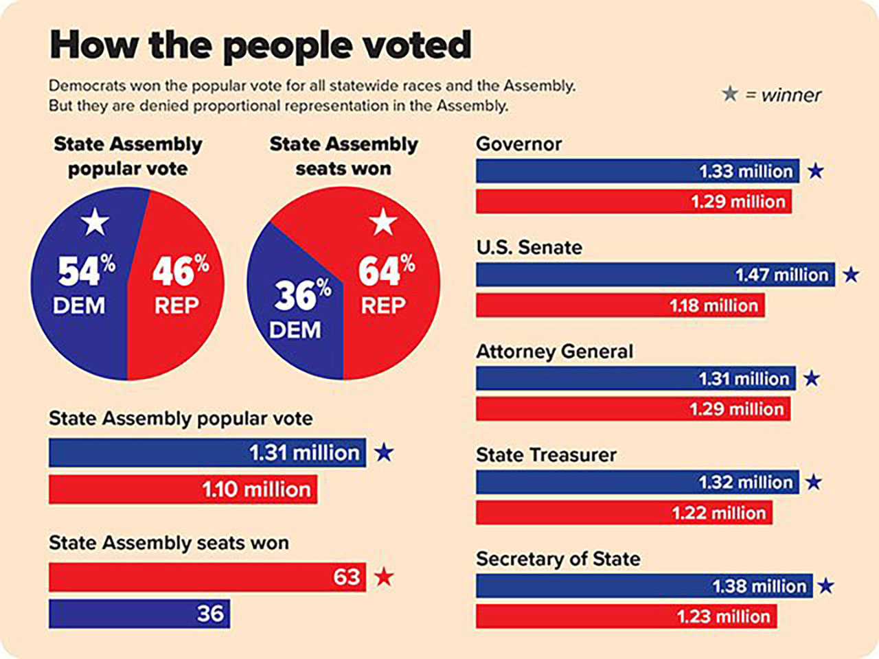
The article in Isthmus No contest – Dems sweep statewide offices in midterms but remain underrepresented in Assembly by Dylan Brogan (11/15/18) presents the graphic copied here. In short the dems won all races in terms of the popular vote but control only 36 of the 99 seats in the assembly.

“The biggest obstacle remains gerrymandering. There are only a handful of districts that are remotely competitive. That’s why a district court ruled the [legislative] maps unconstitutional and why we still have a case before that court,” says Hintz, referring to Gill v. Whitford which the U.S. Supreme Court sent back to the lower federal court for reargument. “Gerrymandering doesn’t just have an impact on the outcome. It has an impact on being able to recruit candidates. There aren’t a lot of people willing to run when they know they don’t have a shot.”

Three sources to learn more about the mathematics of gerrymandering: The Math Behind Gerrymandering and Wasted Votes by Patrick Honner (10/12/17), Countermanding Gerrymandering with a short podcast with Moon Duchin, and Detecting Gerrymandering with Mathematics by Lakshmi Chandrasekaran (8/2/18) .

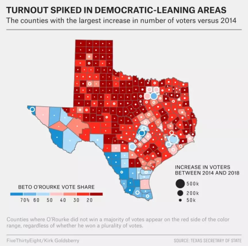
Our recent post How do you tell a story with data and maps – Beto vs Cruz? (11/15/18) notes how to obtain election data. The chart made here for WI can be done for other states as a stats project.

What are the predictions for antimicrobial resistance?

The OECD has resources related to antimicrobial resistance (AMR). A summary can be read in the article Stopping antimicrobial resistance would cost just USD 2 per person a year (7/11/18), which included the chart copied here.  The article is rich with quantitative information.

While resistance proportions for eight high-priority antibiotic-bacterium combinations increased from 14% in 2005 to 17% in 2015 across OECD countries, there were pronounced differences between countries. The average resistance proportions in Turkey, Korea and Greece (about 35%) were seven times higher than in Iceland, Netherlands and Norway, the countries with the lowest proportions (about 5%).

Resistance is already high and projected to grow even more rapidly in low and middle-income countries. In Brazil, Indonesia and Russia, for example, between 40% and 60% of infections are already resistant, compared to an average of 17% in OECD countries. In these countries, growth of AMR rates is forecast to be 4 to 7 times higher than in OECD countries between now and 2050.

The full report is available: Stemming the Superbug Tide Just A Few Dollars More. Two other pages have graphs. The Nov 11 post under the same title, Stemming the Superbug Tide Just A Few Dollars More, includes a map and two sets of graph with AMR trends by countries.  On another page, Trends in AMR prevalence rates 2005-2030, users can select up to eight specific bacteria resistance rates, such as Penicillin-resistant S. Pneumoniae prevalence rates, along with any country to create interactive charts of present and projected rates.  The data does not appear to be accessible, but the first article contains contact information at the bottom that might help in getting the data in these reports.

How do you tell a story with data and maps – Beto vs Cruz?

FiveThirtyEight has an excellent article on the 2018 senate race and the possible implications for future elections. The article, What Really Happened In Texas by Kirk Goldsberry (11/14/18) analyzes voting patterns by county and compares 2014 to 2018.  Their graph copied here is the fourth in a series of maps and mostly summarizes the previous maps.

Cruz won by 220,000 votes last week. But in Harris County alone, 500,000 more people voted in the 2018 midterms than had voted in 2014. In Dallas County, 300,000 more people voted than in the last midterms, and in Travis, Bexar and Tarrant counties, 200,000 more people voted.

Indeed, aside from some noteworthy increase in voter numbers in suburban Dallas, the biggest white circles on the map above tend to hover over Beto country. Meanwhile, the darkest red counties — the places that carried Cruz back to Washington — have exhibited very little, if any, change in the number of votes cast compared to 2014. Those areas may be staunchly red, but they’re also staunchly stagnant too. O’Rourke almost won in 2018 by taking roughly 60 percent of the vote in the big five counties. This map suggests that if Democrats can repeat that feat as these places continue to grow, that may be all they need to turn Texas blue.

The data for their analysis comes from the Texas Secretary of State election results.  The 2014 data is available by following the Historical Election Results (1992-current) link. The 2018 data is available through a link along the top. This is a stats project in the making (do this for you home state). The article can also  be used in a QL course.

How are U.S. CO2 emissions changing?

The recent EIA report Carbon dioxide emissions from the U.S. power sector have declined 28% since 2005 (10/29/18) provides the graphic (copied here) showing the changes of the source of electricity generation and corresponding changes in CO2 emissions from 2005 to 2017.

Electricity related CO2 emissions declined but not all sectors decreased. The EIA report U.S. Energy-Related Carbon Dioxide Emissions, 2017 (9/25/18) provides a detailed analysis of U.S. CO2 emissions.  Figure 4 (copied here) from the report shows that transportation related CO2 emissions have grown, although they haven’t reached pre 2008 levels. This report contains 11 graph and 2 tables with downloadable data.

Overall U.S. CO2 emissions have declined in the last three years (see figure 1 in the second report), but unfortunately according to the IEA after little change from 2014-2016:

Global energy-related CO2 emissions grew by 1.4% in 2017, reaching a historic high of 32.5 gigatonnes, a resumption of growth after three years of global emissions remaining flat.

Further, according to the Quartz article Instead of falling, global emissions are set to rise in 2018 by Akshat Rathi (10/8/18)

“When I look at the first nine months of data, I expect in 2018 carbon emissions will increase once again. This is definitely worrying news for our climate goals,” Fatih Birol, executive director of the IEA, told the Guardian. “We need to see a steep decline in emissions. We are not seeing even flat emissions.”

Glen Peters of the Center for International Climate Research says he agrees with Birol’s assessment. Emissions from both China and the US, the world’s two largest emitters, are up in the first nine months of the year. The reason is likely tied to strong economic growth, according to Peters.


Who votes?

The Pew Research Center article U.S. trails most developed countries in voter turnout by Drew Desilver (5/21/18) provides a summary of voting percentages by country in the chart copied here (data available). In terms of the percent of eligible voters, the U.S. is near the bottom with 56% voting n 2016, although once registered the turnout is 87%. This is the second largest spread of the percent voting between eligible voters and registered voters.  In the U.S., if you want to keep someone from voting, keep them from registering.

A more detailed look at voting by county is available  in the Washington Post article The geography of voting — and not voting by 

The Post article has other maps and details that can be used in a QL course. The Pew article contains data that can be used in a stats class. Go vote tomorrow!

How do we take the temperature of the oceans?

APO is atmospheric potential oxygen.

The recent BBC article Climate change: Oceans ‘soaking up more heat than estimated’  b

The key element is the fact that as waters get warmer they release more carbon dioxide and oxygen into the air.

“When the ocean warms, the amount of these gases that the ocean is able to hold goes down,” said Dr Resplandy.

“So what we measured was the amount lost by the oceans, and then we can calculate how much warming we need to explain that change in gases.”

The image here is copied from the original article in Nature, Quantification of ocean heat uptake from changes in atmospheric O2 and COcomposition by Resplandy et. el (10/31/18) . The abstract to the paper provides a nice summary:

The ocean is the main source of thermal inertia in the climate system1. During recent decades, ocean heat uptake has been quantified by using hydrographic temperature measurements and data from the Argo float program, which expanded its coverage after 20072,3. However, these estimates all use the same imperfect ocean dataset and share additional uncertainties resulting from sparse coverage, especially before 20074,5. Here we provide an independent estimate by using measurements of atmospheric oxygen (O2) and carbon dioxide (CO2)—levels of which increase as the ocean warms and releases gases—as a whole-ocean thermometer. We show that the ocean gained 1.33 ± 0.20  × 1022 joules of heat per year between 1991 and 2016, equivalent to a planetary energy imbalance of 0.83 ± 0.11 watts per square metre of Earth’s surface. We also find that the ocean-warming effect that led to the outgassing of O2 and CO2 can be isolated from the direct effects of anthropogenic emissions and CO2 sinks. Our result—which relies on high-precision O2 measurements dating back to 19916—suggests that ocean warming is at the high end of previous estimates, with implications for policy-relevant measurements of the Earth response to climate change, such as climate sensitivity to greenhouse gases7 and the thermal component of sea-level rise8.

The paper has other interesting graphs that could be used in a QL based class. For a calculus class, the graph here is an example of the use of the Δx notation in the “real world”.

Will this be an warmer El Niño winter?

The NOAA Climate.gov article Another mild winter? NOAA’s 2018-19 winter outlook by Mike Halpert (10/22/18) discusses the likelihood of El Niño this winter and the impact on temperatures.  The discussion of prediction and probabilities can be used in QL and stats courses:

I again remind readers (if this seems repetitive, well, it is) that these forecasts are provided in terms of probabilities (% chance) for below, near, or above average outcomes with the maps showing only the most likely outcome (1).  Because the probabilities on these and all CPC outlook maps are less than 100%, there is no guarantee you will see temperature or precipitation departures from normal that match the color on the map.  As we’ve explained in earlier blog posts, even when one outcome is more likely than another, there is still always a chance that a less favored outcome will occur.  And in fact, for the forecasts to be reliable (a critical part of a probabilistic forecast), less likely outcomes MUST happen from time to time.

There is also interesting material regarding weak, moderate, and strong  El Niño events and the graph (copied here) which shows the historic impact of different strength events.

This lack of consistency reflects that a weaker El Niño does not exert a strong push (or forcing) on the U.S.  If we have a stronger El Niño, the big push from the vigorous tropical heating sets off a cascade of global impacts, including changes in the strength and position of the jet stream that affects U.S. weather, which tends to dominate over other factors that could impact the outlook.  Because of an expected smaller push from El Niño, however, other climate patterns are more likely to play a larger role in shaping the upcoming winter.  These patterns, like the Arctic Oscillation and the Madden-Julian Oscillation, can have a profound impact on the character of the winter, but are quite challenging to predict months in advance.

Go to the article if you’d like to see the prediction for this year, but first try providing your own probabilistic estimates for next year. There is similar graph and discussion regarding precipitation.

How are climatic zones changing?

The Yale Environment 360 article Redrawing the Map: How the World’s Climate Zones Are Shifting  by Nicola Jones (10/23/18)  provides animated maps, such as the one below, and quantitative statements about changing ecology including rates (great for a calculus class):

Lauren Parker and John Abatzoglou of the University of Idaho tracked what would happen to hardiness zones from 2041 to 2070 under future global warming scenarios, and found the lines will continue to march northward at a “climate velocity” of 13.3 miles per decade.

One study in northern Canada found that the permafrost around James Bay had retreated 80 miles north over 50 years. Studies of ground temperatures in boreholes have also revealed frightening rates of change, says Schafer. “What we’re seeing is 20 meters down, it’s increasing as high as 1-2 degrees C per decade,” he says. “In the permafrost world that’s a really rapid change. Extremely rapid.”

North America is seeing the opposite phenomenon: Its arable land is romping northward, expanding the wheat belt into higher and higher latitudes. Scientists project it could go from about 55 degrees north today to as much as 65 degrees North — the latitude of Fairbanks, Alaska — by 2050. That’s about 160 miles per decade.

The article includes potential ramifications of these changes along with other quantitative information.

Graphic: Hardiness zones in the U.S., which track average low temperatures in winter, have all shifted northward by half a zone warmer since 1990. SOURCE: UNITED STATES DEPARTMENT OF AGRICULTURE. GRAPHIC BY KATIE PEEK.

How much have fall nighttime temperatures risen?

According to the Climate Central post, Fall Nights Are Warming in Our Changing Climate (10/17/18), of 244 cities in the U.S., 83 percent have average fall low temperatures on the rise. For example, the graph here is for NYC. Why does this matter:

Warming fall nights mean more than just a delay in pulling out those comfortable sweaters and drinking hot apple cider. The lack of cool nights effectively lengthens the summer, as the first frost of the year also comes later. While warm-weather fans may celebrate, this also means that disease-carrying pests like mosquitoes and ticks will persist longer before dying off in the winter. Nationally, the long-term warming trend has lengthened the growing season by two weeks compared to the beginning of the 20th century. The allergy season is also getting longer, with ragweed pollens not disappearing until the first freeze of the fall.

The article has a drop down menu to select cities across the U.S. to see a graph similar to the one copied here for the selected city.  They don’t post the data that was used to create the graphs, but they do explain their data sources under methodology.

A statistics project could have students create this graph for their hometown.  One way to obtain the data was noted in our post, What do we know about nighttime minimum temperatures?: Go to  NOAA’s Local Climatological Data Map. Click on the wrench under Layers. Use the rectangle tool to select your local weather station. Check off the station and Add to Cart. Follow the direction from their being sure to select csv file. You will get an email link for the data within a day.  Note: You are limited in the size of the data to ten year periods. You will need to do this more than once to get the full data set available for your station.

Who misses school the most?

The EPI article,  Student absenteeism – Who misses school and how missing school matters for performance by Emma García and Elaine Weiss (9/25/18) provides a detailed account of absenteeism based on race and gender.  For example, their chart here is the percent of students that missed three or more days in the month prior to the 2015 NAEP mathematics assessment. There are noticeable differences. For instance, the percentage of Black, White, and Asian (non ELL) that missed three or more days in the month is 23%, 18.3%, and 8.8% respectively.

Why does this matter?

In general, the more frequently children missed school, the worse their performance. Relative to students who didn’t miss any school, those who missed some school (1–2 school days) accrued, on average, an educationally small, though statistically significant, disadvantage of about 0.10 standard deviations (SD) in math scores (Figure D and Appendix Table 1, first row). Students who missed more school experienced much larger declines in performance. Those who missed 3–4 days or 5–10 days scored, respectively, 0.29 and 0.39 standard deviations below students who missed no school. As expected, the harm to performance was much greater for students who were absent half or more of the month. Students who missed more than 10 days of school scored nearly two-thirds (0.64) of a standard deviation below students who did not miss any school. All of the gaps are statistically significant, and together they identify a structural source of academic disadvantage.

These results “… identify the distinct association between absenteeism and performance, net of other factors that are known to influence performance?”  The article has 12 graphs or charts, with data available for each, including one that reports p-values.