Tag Archives: social justice

How are CEOs doing?

The EPI article, CEO compensation has grown 940% since 1978 by Lawrence Mishel and Julia Wolfe (8/14/2019), summarizes CEO compensation.  Selected Key findings:

Using the stock-options-realized measure, we find that the average compensation for CEOs of the 350 largest U.S. firms was $17.2 million in 2018. Compensation dipped 0.5% in 2018 following a 7.6% gain in 2017.

The fact that CEO compensation has grown far faster than the pay of the top 0.1% of wage earners indicates that CEO compensation growth does not simply reflect a competitive race for skills (the “market for talent”) that also increased the value of highly paid professionals: Rather, the growing differential between CEOs and top 0.1% earners suggests the growth of substantial economic rents in CEO compensation (income not related to a corresponding growth of productivity). CEO compensation appears to reflect not greater productivity of executives but the power of CEOs to extract concessions. Consequently, if CEOs earned less or were taxed more, there would be no adverse impact on the economy’s output or on employment.

Over the last three decades, CEO compensation increased more relative to the pay of other very-high-wage earners than did the wages of college graduates relative to the wages of high school graduates. This finding indicates that the escalation of CEO pay does not simply reflect a more general rise in the returns to education.

There are six tables/graphs in the article and the data is available for download.

How easy is it to understand mass incarceration?

The details of mass incarceration is complicated, but the Prison Policy Initiative report Mass Incarceration: The Whole Pie 2019 by Wendy Sawyer and Peter Wagner (3/19/19) provides an extensive look at the data. The report has over 20 graphs and links to data. A few excerpts:

The American criminal justice system holds almost 2.3 million people in 1,719 state prisons, 109 federal prisons, 1,772 juvenile correctional facilities, 3,163 local jails, and 80 Indian Country jails as well as in military prisons, immigration detention facilities, civil commitment centers, state psychiatric hospitals, and prisons in the U.S. territories.

Every year, over 600,000 people enter prison gates, but people go to jail 10.6 million times each year. Jail churn is particularly high because most people in jails have not been convicted.

People in prison and jail are disproportionately poor compared to the overall U.S. population. The criminal justice system punishes poverty, beginning with the high price of money bail: The median felony bail bond amount ($10,000) is the equivalent of 8 months’ income for the typical detained defendant. As a result, people with low incomes are more likely to face the harms of pretrial detention. Poverty is not only a predictor of incarceration; it is also frequently the outcome, as a criminal record and time spent in prison destroys wealth, creates debt, and decimates job opportunities.

It’s no surprise that people of color — who face much greater rates of poverty — are dramatically over represented in the nation’s prisons and jails. These racial disparities are particularly stark for Black Americans, who make up 40% of the incarcerated population despite representing only 13% of U.S residents. The same is true for women, whose incarceration rates have for decades risen faster than men’s, and who are often behind bars because of financial obstacles such as an inability to pay bail.

Read the whole report for considerably more information and data.

What percent of congress are immigrants or children of immigrants and what part of the country do they represent?

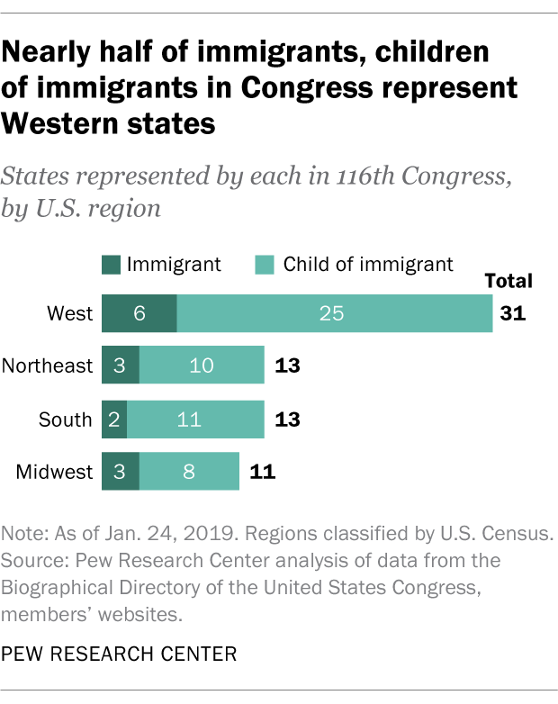
The PEW article In 116th Congress, at least 13% of lawmakers are immigrants or the children of immigrants by A.W. Geiger (1/24/19) provides an overview of the immigrant status of congress. The chart copied here show that the West has a greater number of immigrant or child of immigrant lawmaker.

While at least 13% of voting members in Congress are immigrants or children of immigrants, relatively few of these are foreign born: 13 in the House, and just one – Sen. Mazie Hirono, D-Hawaii – in the Senate. These 14 immigrant lawmakers represent just 3% of all voting members in both chambers, a slight uptick from recent Congresses but substantially below the foreign-born share of Congresses many decades ago. (For example, about 10% of members in the first and much smaller Congress of 1789-91 were foreign born. About a century later, in the 50th Congress of 1887-89, 8% of members were born abroad, according to a previous analysis.) The current share of foreign-born lawmakers in Congress is also far below the foreign-born share of the United States as a whole, which was 13.5% as of 2016.

The article includes a time series of the percent of foreign-born members in congress dating back to 1789. There is also a chart tracking were the immigrant or children of immigrant congress members are from.

Collectively, 74% of immigrants and children of immigrants in Congress have origins in countries in Europe, Latin America or Asia.

Much smaller shares claim heritage in countries in the Middle East, North America and sub-Saharan Africa – each below 10%.

How has the federal minimum wage changed?

The EPI article Congress has never let the federal minimum wage erode for this long by David Cooper (6/17/19) provides the graph here.

June 16th marks the longest period in history without an increase in the federal minimum wage. The last time Congress passed an increase was in May 2007, when it legislated that the minimum wage be raised to $7.25 per hour on July 24, 2009. Since the minimum wage was first established in 1938, Congress has never let it go unchanged for so long.

To get the data for this graph visit The FRED Blog The value(s) of the minimum wage. At the bottom of the page they provide direction on how to recreate the chart with FRED data. Knowing how to do this is valuable and should be incorporated into any statistics or QL course.

What are the economic prospect for 2019 high school grads?

EPI has its annual report on the prospects for 2019 high school grads.  Class of 2019 High school edition by Elise Gould, Julia Wolfe, and Zane  Mokhiber (6/6/19) has 17 key findings and 11 graphs with data.  For example, their graph here (figure I) gives hourly wages in 2018 dollars for high school graduates not enrolled in further schooling.  As compared to 2000 wages for men as well as Black high school graduates are lower; all other groups have gone up. In fact, Hispanics make more than all other groups, including White graduates.

A few other highlights from the key findings:

Asian Americans/Pacific Islanders are significantly more likely to have begun on the college path at this age than any other racial/ethnic group.

Young black high school graduates are roughly twice as likely to be unemployed as their white and AAPI peers.

Average wages for young high school graduates recently surpassed their 2007 level, but remain just below their 2000 level, representing two lost decades of wage growth.

Black students (that go on to college) take on a disproportionate amount of debt, in part because their families generally accumulate less wealth than white families.

The entire report is worth reading.

Related post: What are the prospects for high school grads?

Where do we buy our food?

How you answer the question of where do you buy your food probably says a lot about your socioeconomic status. The chart here is from the Business Insider article Here’s where Americans are buying their groceries by Hayley Peterson (6/21/17).  Note that CVS, Walgreens, Dollar Tree, and Dollar General each outsell Whole Foods, for example. Why does this matter? The recent Guardian article Fears grow over ‘food swamps’ as drugstores outsell major grocers by Gabrielle Cannon (6/4/19) provides context.

Shelf-stable options tend to be highly processed and high in fat, sodium and sugar. Where they are the easiest option available, communities experience higher rates of chronic illness, like diabetes, heart disease and cancer.

“Highly processed food makes you sick,” says William McCarthy, an adjunct professor of public health at UCLA. “CVS and other pharmacies make money selling highly processed, long shelf-life foods, because it is all convenient.” But, he says, his research has shown that it’s not just about having more healthy options.

Interestingly,

In a 2016 study, researchers stocked corner stores in “food swamps” across East Los Angeles with affordable produce, hoping to test whether food retail interventions could be successful. They weren’t. While perceptions of the stores and community accessibility changed, patrons continued to purchase processed food instead of the fresh stuff.

Grocery sales data is available for 2018 (estimated) from the Winsight Grocery Business article WGB, Kantar Reveal ‘The Power 20’ Retailers by Meg major and Jon Springer (7/17/2018). They estimate CVS as fourth in grocery sales with Dollar General and Dollar Tree at 12 and 17, respectively. The Guardian article links to a couple of studies with statistical information suitable for a stats course.


Are there correlations between one or more deceased parents and race, gender, or socio-economic status?

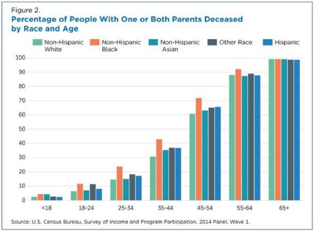
The Census Bureau report Parental Mortality is Linked to a Variety of Socio-economic and Demographic Factors by Zachary Scherer (5/6/19) provides charts of deceased parent(s) by sex, race (chart copied here), and socio-economic status.

For example, among those ages 45 to 49, 26% have lost their mother, while 45% have lost their father. Along these same lines, 7 in 10 of those ages 60 to 64 have a deceased mother, while about 87% have lost their father.

For example, among those ages 35 to 44, 43% of those living below the FPL have lost one or both parents, compared to 28% for those living in households with an income-to-poverty ratio of at least 400% of the FPL.

Parental loss, which varies by race and socio-economic status, is often accompanied by psychological and material consequences. These statistics demonstrate the way these new SIPP data can help assess how socio-economic and demographic characteristics are associated with parental mortality in the United States.

There are two other charts and a link to the SIPP data source.


How has the U.S. ranking in the world press freedom index changed since 2018?

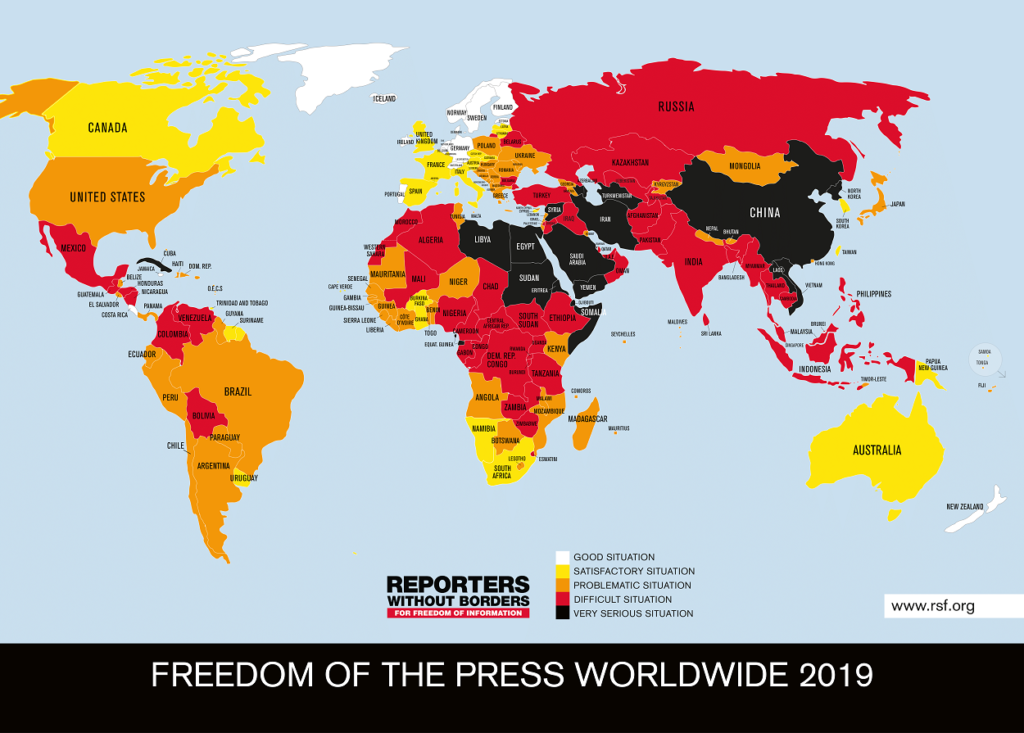
Reporters without Borders releases a world press freedom index each year. The U.S. dropped three spots to 48 out of 180 countries and is considered a “problematic situation.”

The RSF Index, which evaluates the state of journalism in 180 countries and territories every year, shows that an intense climate of fear has been triggered — one that is prejudicial to a safe reporting environment. The hostility towards journalists expressed by political leaders in many countries has incited increasingly serious and frequent acts of violence that have fueled an unprecedented level of fear and danger for journalists.

If the political debate slides surreptitiously or openly towards a civil war-style atmosphere, in which journalists are treated as scapegoats, then democracy is in great danger,” RSF secretary-general Christophe Deloire said. “Halting this cycle of fear and intimidation is a matter of the utmost urgency for all people of good will who value the freedoms acquired in the course of history.

The site includes the downloadable 2019 data, an interactive map, and the main article also has a couple of graphs.

Related post: Where does the U.S. rank on the world press freedom index?

Opioid prescription, grandparents raising grandchildren, a connection?

The Census Bureau report States With High Opioid Prescribing Rates Have Higher Rates of Grandparents Responsible for Grandchildren by Lydia Anderson (4/22/19) draws a connection:

In the wake of the opioid epidemic that was declared a public health crisis in 2017, there has been increasing concern about what happens to the children of parents with substance abuse disorders who may be unable to care for their children.

New Census Bureau research shows that grandparents may sometimes step in to care for these children.

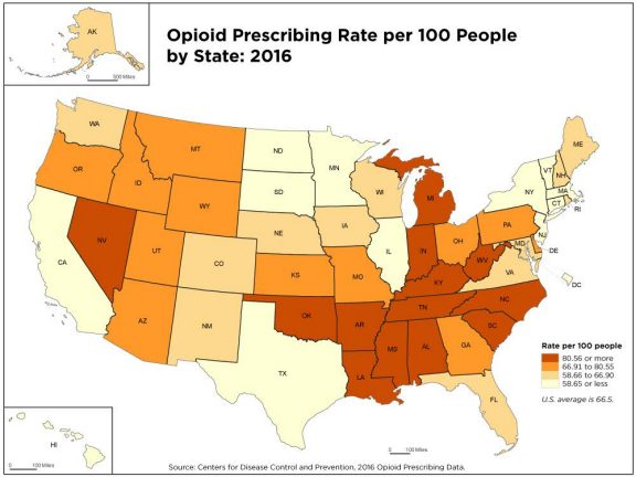
According to the report the states with the highest opioid prescription rates are Alabama (121 per 100 residents), Arkansas (114.6), Tennessee (107.5), Mississippi (105.6) and Louisiana (98.1). These states represent four of the top 5 states where the percentage of the population age 30 and over are raising grandchildren.  The article has a companion map to the map of opioid prescription rates copied here with rates of grandparents raising grandchildren.  There are also links to the data.

How will raising the federal minimum wage impact workers?

The EPI article, Raising the federal minimum wage to $15 by 2024 would life pay for nearly 40 million workers, by David Cooper (2/5/19) covers their analysis of raising the minimum wage.  Their graph here shows the gap between the minimum wage and median wage over time. The report is lengthy and detailed. A few quick highlights:

Raising the minimum wage to $15 by 2024 would undo the erosion of the value of the real minimum wage that began primarily in the 1980s. In fact, by 2021, for the first time in over 50 years, the federal minimum wage would exceed its historical inflation-adjusted high point, set in 1968.

All told, raising the minimum wage to $15 by 2024 would directly or indirectly lift wages for 39.7 million workers, 26.6 percent of the wage-earning workforce.

Indexing the minimum wage to the median wage would ensure that low-wage workers share in broad improvements in U.S. living standards and would prevent future growth in inequality between low- and middle-wage workers.

The article has over 20 graphs/charts/tables and each one has the associated data.  The report does include “a discussion of the research on the likely effects such a raise would have on businesses, employment, and low-wage workers’ welfare.”