Tag Archives: social justice

How do we humanize data?

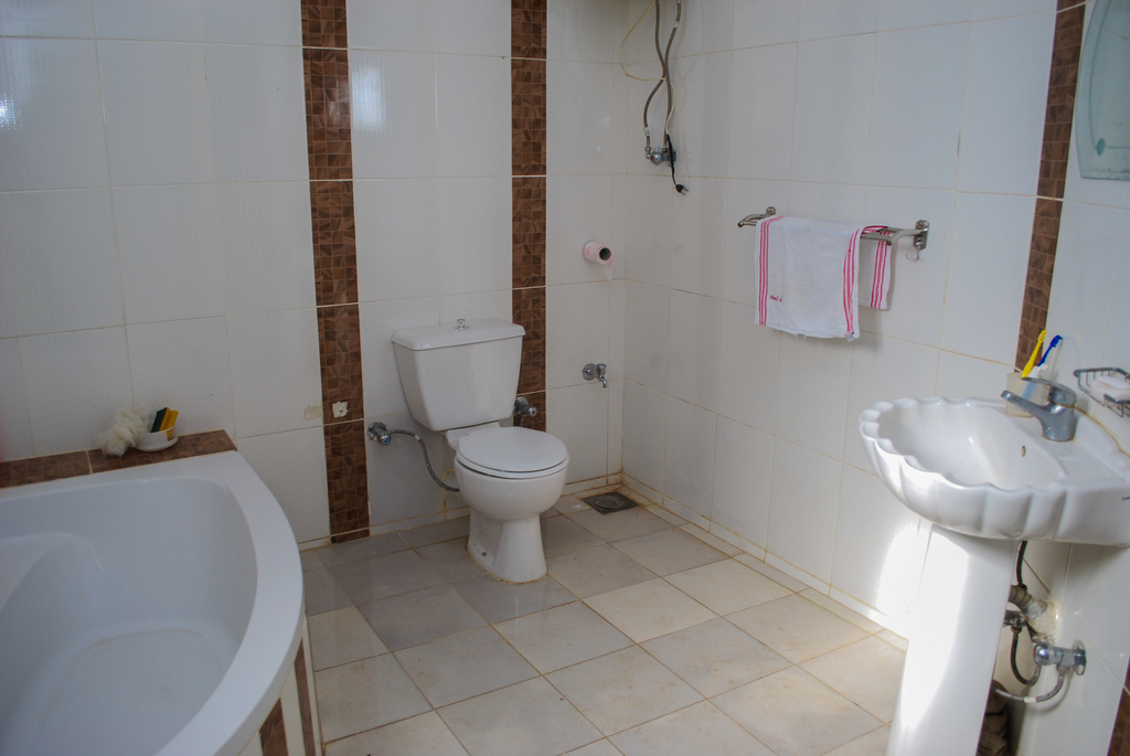
When comparing countries or even within countries, we can talk about GDP, Gini coefficients, poverty rates, etc., but sometimes (all the time?) it is hard to know what this really means for people. If a picture is worth a 1000 words then Dollar Street has 30,000,000 words as they “visited 264 families in 50 countries and collected 30,000 photos” resulting in an excellent example of humanizing data.

The pictures here represent the bathroom for a family in India earning $4621 per month and for a family in Egypt earning $775 per month (which is which?).  Dollar Street has large sets  of pictures like this from around the work for over 100 different categories such as armchairs, beds, computers, earrings,  floors, hands, ovens, and plates.  Difference can be explored by picture within countries or the world. These sets of pictures provide both a sense of what poverty is really like around the world, while at the same time there are much more similarities than one might expect even with seemingly large gaps in income. Take the time to visit Dollar Street.

What are the differences in the college aspirations of teens?

Pew reports results of a detailed survey in their article Most U.S. Teens See Anxiety and Depression as a Major Problem Among Their Peers — For boys and girls, day-to-day experiences and future aspirations vary in key ways by Juliana Menasce Horowitz and Nikki Graf (2/20/19). Here, we highlight college aspirations:

Girls are more likely than boys to say they plan to attend a four-year college (68% vs. 51%, respectively), and they’re also more likely to say they worry a lot about getting into the school of their choice (37% vs. 26%). Current patterns in college enrollment among 18- to 20-year-olds who are no longer in high school reflect these gender dynamics. In 2017, 64% of women in this age group who were no longer in high school were enrolled in college (including two- and four-year colleges), compared with 55% of their male counterparts.

There are also differences by parental education and economic class:

Among teens with at least one parent with a bachelor’s degree or higher, as well as those in households with annual incomes of $75,000 or more, about seven-in-ten say they plan to attend a four-year college after high school. By comparison, about half of teens whose parents don’t have a bachelor’s degree or with household incomes below $75,000 say the same.

The article has a number of other charts and a detailed methodology section (perfect for a stats  course).


How much money do parents spend on children?

Parental Financial Investments in Children per Quarter by Household Income Percentile Rank (2014 dollars).


The graph here from the American Sociological Review paper Income inequality and Class Divides in Parental Investments by Schneider, Hastigs, and LaBriola (5/21/18) summarizes changes in spending on children by income.

The past 40 years have witnessed historic increases in income inequality in the United States (Piketty and Saez 2003). Over the same period, existing class divides—by household income and by parents’ educational attainment—in how much money parents spend on children and how much time parents spend in childcare have widened considerably (Altintas 2016Kornrich and Furstenberg 2013Ramey and Ramey 2010). These increasingly evident class divides in parental investments of time and money spark concern, because parental investment is an important factor in the intergenerational perpetuation of advantage (Downey, von Hippel, and Broh 2004Potter and Roksa 2013Waldfogel and Washbrook 2011). If affluent families are increasingly able to transmit their advantages to children, that bodes poorly for an open opportunity structure.

Of course,

We would expect rising income inequality to increase class gaps in parental financial investments in children mechanically if rising income inequality simply means the affluent have more to spend. But, rising income inequality might also widen class gaps in investments in children if it reshapes parents’ preferences for these practices differentially by class.

It is also possible that income inequality is not related to class gaps in parental investment. Indeed, recent work suggests a narrowing of gaps in early achievement by family income, and a narrowing or arrested divergence in some gaps in parenting practices, even as income inequality has continued to rise, raising questions about this often assumed empirical relationship (Kalil et al. 2016Reardon 2011Reardon and Portilla 2016).

We empirically investigate these questions.

The paper has interesting charts and data, and worth reading for their conclusions. Also, the supplemental materials include some mathematical modeling.

What’s new at sustainabilitymath.org?

The first two interactive graph have been posted at sustainabilitymath.org.  They can be found at the new Interactive Graphs page. The two graph represent mean and median wages by race and gender with regression lines from 1973 to 2017 (data from EPI).  Check them out because they are interesting and both could be used in a QL or stats course.

How many women have been in congress?

The Pew article, A record number of women will be serving in the new Congress by Drew Desliver (12/18/18) provides an historical overview and the chart copied here of women in congress.

When the 116th Congress convenes next month, women will make up nearly a quarter of its voting membership – the highest percentage in U.S. history, and a considerable increase from where things stood not too long ago.

A record 102 women will serve in the incoming House of Representatives, comprising 23.4% of the chamber’s voting members. More than a third of those women (35) won their seats for the first time in last month’s midterms.

The differences by party are notable. For instance, the most Republican women in the House of Representative was 25 in 2017-2019 and down to  13 this year.  On the other hand, there have been more than 25  Democrat women in the House since the 1993-1995 congress. As a percentage of each party’s delegation, women have never exceeded more than 10% of Republican House members. From 109th through 112th congress (2005-2013) women made up 9.9% of Republican House members. This is down to 6.5% (13 women) this year. On the other hand, women have been generally increasing as a percentage of Democrat House members since the 101st congress (1989-1991) and stand at 38% (89 women) this year.  Wikipedia posts this data in a table, which comes from a Congressional Research Service report.

Related post: World Development Indicators: Proportion of seats held by women in national parliaments (3/2/17)

What are the top charts of 2018?

EPI puts forth its top twelve charts of 2018 in the post Top charts of 2018 Twelve charts that show how policy could reduce inequality—but is making it worse instead (12/20/2018). For example,  chart 10 (copied here) compares 11 economic and social indicators between white and African american families from 1968 to 2018.

Not nearly far enough. The chart shows that, while African Americans are in many ways better off in absolute terms than they were in 1968, they are still disadvantaged in important ways relative to whites. African Americans today are much better educated than they were in 1968—but young African Americans are still half as likely as young whites to have a college degree. Black college graduation rates have doubled—but black workers still earn only 82.5 cents for every dollar earned by white workers. And—as consequences of decades of discrimination—African American families continue to lag far behind white families in homeownership rates and household wealth. The data reinforce that our nation still has a long way to go in a quest for economic and racial justice.

There are 11 other economic related charts. Each chart has a link to data and can  be downloaded.

How effective is gerrymandering?

The article in Isthmus No contest – Dems sweep statewide offices in midterms but remain underrepresented in Assembly by Dylan Brogan (11/15/18) presents the graphic copied here. In short the dems won all races in terms of the popular vote but control only 36 of the 99 seats in the assembly.

“The biggest obstacle remains gerrymandering. There are only a handful of districts that are remotely competitive. That’s why a district court ruled the [legislative] maps unconstitutional and why we still have a case before that court,” says Hintz, referring to Gill v. Whitford which the U.S. Supreme Court sent back to the lower federal court for reargument. “Gerrymandering doesn’t just have an impact on the outcome. It has an impact on being able to recruit candidates. There aren’t a lot of people willing to run when they know they don’t have a shot.”

Three sources to learn more about the mathematics of gerrymandering: The Math Behind Gerrymandering and Wasted Votes by Patrick Honner (10/12/17), Countermanding Gerrymandering with a short podcast with Moon Duchin, and Detecting Gerrymandering with Mathematics by Lakshmi Chandrasekaran (8/2/18) .

Our recent post How do you tell a story with data and maps – Beto vs Cruz? (11/15/18) notes how to obtain election data. The chart made here for WI can be done for other states as a stats project.

What are the predictions for antimicrobial resistance?

The OECD has resources related to antimicrobial resistance (AMR). A summary can be read in the article Stopping antimicrobial resistance would cost just USD 2 per person a year (7/11/18), which included the chart copied here.  The article is rich with quantitative information.

While resistance proportions for eight high-priority antibiotic-bacterium combinations increased from 14% in 2005 to 17% in 2015 across OECD countries, there were pronounced differences between countries. The average resistance proportions in Turkey, Korea and Greece (about 35%) were seven times higher than in Iceland, Netherlands and Norway, the countries with the lowest proportions (about 5%).

Resistance is already high and projected to grow even more rapidly in low and middle-income countries. In Brazil, Indonesia and Russia, for example, between 40% and 60% of infections are already resistant, compared to an average of 17% in OECD countries. In these countries, growth of AMR rates is forecast to be 4 to 7 times higher than in OECD countries between now and 2050.

The full report is available: Stemming the Superbug Tide Just A Few Dollars More. Two other pages have graphs. The Nov 11 post under the same title, Stemming the Superbug Tide Just A Few Dollars More, includes a map and two sets of graph with AMR trends by countries.  On another page, Trends in AMR prevalence rates 2005-2030, users can select up to eight specific bacteria resistance rates, such as Penicillin-resistant S. Pneumoniae prevalence rates, along with any country to create interactive charts of present and projected rates.  The data does not appear to be accessible, but the first article contains contact information at the bottom that might help in getting the data in these reports.

How does the digital divide impact secondary education for different groups?

The Pew Research Center article Nearly one-in-five teens can’t always finish their homework because of the digital divide by Monica Anderson and Andrew Perrin (10/26/18) provides insights on how lacking access to the internet impacts the ability to complete homework.  Their chart (copied here) gives the percent of school-age children by race and income without high-speed internet.  A second chart provides the results of survey about how this impacts homework. In particular,

One-quarter of black teens say they are at least sometimes unable to complete their homework due to a lack of digital access, including 13% who say this happens to them often. Just 4% of white teens and 6% of Hispanic teens say this often happens to them. (There were not enough Asian respondents in this survey sample to be broken out into a separate analysis.)

The article includes a link at the bottom for results and methodology. This includes sample sizes making this article particularly useful for statistics courses.

Who votes?

The Pew Research Center article U.S. trails most developed countries in voter turnout by Drew Desilver (5/21/18) provides a summary of voting percentages by country in the chart copied here (data available). In terms of the percent of eligible voters, the U.S. is near the bottom with 56% voting n 2016, although once registered the turnout is 87%. This is the second largest spread of the percent voting between eligible voters and registered voters.  In the U.S., if you want to keep someone from voting, keep them from registering.

A more detailed look at voting by county is available  in the Washington Post article The geography of voting — and not voting by 

The Post article has other maps and details that can be used in a QL course. The Pew article contains data that can be used in a stats class. Go vote tomorrow!