Tag Archives: social justice

Who perceives our economic system as fair or not fair?

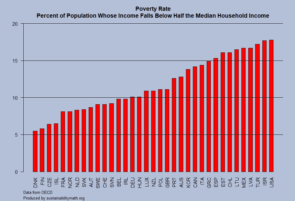
The Pew Research Center’s article Partisans are divided over the fairness of the U.S. economy – and why people are rich or poor by Amina Dunn (10/4/18) provides interesting results about perceptions of our economic system.

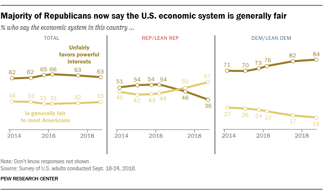
Around six-in-ten U.S. adults (63%) say the nation’s economic system unfairly favors powerful interests, compared with a third (33%) who say it is generally fair to most Americans, according to a new Pew Research Center survey. While overall views on this question are little changed in recent years, the partisan divide has grown.

For the first time since the Center first asked the question in 2014, a clear majority of Republicans and Republican-leaning independents (57%) now say the economic system is generally fair to most Americans. As recently as the spring of 2016, a 54% majority of Republicans took the view that the economic system unfairly favors powerful interests.

And while wide majorities of Democrats and Democratic leaners have long said that the U.S. economic system unfairly favors powerful interests, the share who say this has increased since 2016 – from 76% then to 84% today.

What is the pay gap between black women and white men?

EPI has the answer in the post Separate is still unequalHow patterns of occupational segregation impact pay for black women by Madison Matthews and Valerie Wilson (8/6/2018).

On average, in 2017, black women workers were paid only 66 cents on the dollar relative to non-Hispanic white men, even after controlling for education, years of experience, and geographic location. A previous blog post dispels many of the myths behind why this pay gap exists, including the idea that the gap would be closed by black women getting more education or choosing higher paying jobs. In fact, black women earn less than white men at every level of education and even when they work in the same occupation. But even if changing jobs were an effective way to close the pay gap black women face—and it isn’t—more than half would need to change jobs in order to achieve occupational equity.

Along with the graph copied here, there is a time series from 2000 to 2016 of the Duncan Segregation Index:

the “Duncan Segregation Index” (DSI) for black women and white men, overall and by education, based on individual occupation data from the American Community Survey (ACS). This is a common measure of occupational segregation, which, in this case identifies what percentage of working black women (or white men) would need to change jobs in order for black women and white men to be fully integrated across occupations.

Data is available for both graphs.

What percent of doctors are female?

OECD has the answer in their post Women make up most of the health sector workers but they are under-represented in high-skilled jobs (3/2017) along with a nice graphic.

The current overall health workforce is mostly composed of women. Nonetheless, female health workers remain underrepresented in highly skilled occupations, such as in surgery. As of 2015, just under half of all doctors are women across OECD countries on average. The variation across countries is significant: in Japan and Korea only around 20% of doctors are women, in Latvia and Estonia this proportion is over 70%.

It is worth noting that the U.S. is well below the OECD average with only 34.1% of its doctors female in 2015, although the current posted data set has the U.S. at 35.06% for 2015 (35.52% for 2016).

Time series data for OECD countries is available at the OECD.stat Health Care Resources page. Data for the U.S. dates back to 1993 (19.59%) through 2016.  For this specific data set click physicians by age and gender on the left side bar.  Within the chart click variable, measure, and year, to change the scope of the data in the spreadsheet. The data can be downloaded in multiple formats.

How much vacation time do workers get?

Statista put together a chart (copied here) of vacation time for 12 countries selected from OECD data  (see table PF2.3.A) of 42 countries in the post Vacation: Americans Get A Raw Deal by Niall McCarthy (8/8/18). Of the 42 countries listed the U.S. is the only one with a statutory minimum days of paid leave of 0. In fact, only 9 countries have a statutory minimum below 20 days.  The medium number of public holidays is 11, while the U.S. has 10. Four countries tie with the maximum of 15 public holidays.  The statista article notes:

The U.S. remains the only advanced economy that doesn’t guarantee paid vacation. Even though some companies are generous and provide their employees with up to 15 days of paid leave annually, almost one in four private sector workers does not receive any paid vacation, according to the Center for Economic and Policy Research.

How many people are there and how many can the earth support?

The article in The Conversation 7.5 billion and counting: How many humans can the Earth support? by Andrew D. Hwang (7/9/18) provides some details.  The graph here, copied from the article provides population number and future estimates. 

For real populations, doubling time is not constant. Humans reached 1 billion around 1800, a doubling time of about 300 years; 2 billion in 1927, a doubling time of 127 years; and 4 billion in 1974, a doubling time of 47 years.

On the other hand, world numbers are projected to reach 8 billion around 2023, a doubling time of 49 years, and barring the unforeseen, expected to level off around 10 to 12 billion by 2100.

The article provides a link to download the data and discusses key points related to inequality. For example,

Wealthy countries consume out of proportion to their populations. As a fiscal analogy, we live as if our savings account balance were steady income.

According to the Worldwatch Institute, an environmental think tank, the Earth has 1.9 hectares of land per person for growing food and textiles for clothing, supplying wood and absorbing waste. The average American uses about 9.7 hectares.

These data alone suggest the Earth can support at most one-fifth of the present population, 1.5 billion people, at an American standard of living.

This article is useful for QL and Stats classes, as well as anyone that would like to use population data and/or discuss carrying capacity.

What are the prospects for high school grads?

The EPI article Class of 2018 High school edition by Elise Gould, Zane Mokhiber, & Julia Wolfe (6/14/18) provides a thorough review.  Figure I from the report, copied here, shows 2000 and 2018 wages for high school grads not enrolled in further schooling by race and gender.

In 2018, young workers with a high school diploma have an average hourly wage of $11.85, which translates to annual earnings of around $24,600 for a full-time, full-year worker. This overall average masks important differences in wages by gender and race.

The report has 11 graphs each with data that can be downloaded along with the graph.  A few points from the article:

  • Only 32% of 18-64 have a four year degree or more while 10.5% haven’t graduated high school. (see figure A)
  • The percent of high school grads (18-21) that are employed and not enrolled has increased from 26% in 2010 to 31% in 2018. (see figure c)
  • Over much of the last three decades, wage growth for young high school graduates has been essentially flat. (see figure H)

The first paragraph of their conclusion:

While there may be many reasons someone might choose to enter the labor force after high school rather than attend college, college should at least be a viable option; a person’s economic resources should not be the determining factor in whether they get to go to college. But, as things stand, the prospect of staggering debt may discourage students from less wealthy families from enrolling in further education or prevent them from completing a degree.

What is the poverty rate in OECD countries?

The OECD (Organisation for Economic Co-operation and Development) defines poverty as an income below half the median household income. The chart here was created using the most recent year of data from the OECD poverty rate page .  The U.S. leads the pack with a rate of 17.8%, with Israel right behind at 17.7%. At the bottom are Denmark and Finland with rates of 5.5% and 5.8% respectively.  It is important to note, as the OECD does,

However, two countries with the same poverty rates may differ in terms of the relative income-level of the poor.

The data is available for more than OECD countries on their page and there is an interactive graph, but the graph can’t be dowloaded. The data and R script that created the graph here are available: csv file, R script.

Citation for data:OECD (2018), Poverty rate (indicator). doi: 10.1787/0fe1315d-en (Accessed on 11 July 2018)

What is the story of suicides in the U.S.?

The article in the Conversation, Why is suicide on the rise in the US – but falling in most of Europe? by Steven Stack (6/28/18), tries to get at the story. The first chart (copied here), clearly shows that the suicide rate rose from 199-2015 overall and considerably more for the 45-54 age group (stats regression problem here).  There is a second chart showing changes in suicide rates in Western European countries:

However, suicide rates in other developed nations have generally fallen. According to the World Health Organization, suicide rates fell in 12 of 13 Western European between 2000 and 2012. Generally, this drop was 20 percent or more. For example, in Austria the suicide rate dropped from 16.4 to 11.5, or a decline of 29.7 percent.

The obvious question is why?

There has been little systematic research explaining the rise in American suicide compared to declining European rates. In my view as a researcher who studies the social risk of suicide, two social factors have contributed: the weakening of the social safety net and increasing income inequality.

The article has two more charts showing that the U.S. is low on Social Welfare Expenditures as a percent of GDP and is high on inequality. In all instances the data is available for download and there are links to the original sources.

What economic impacts does some college education have on men?

The article in the Conversation 22 percent of men without college don’t have jobs. Here’s why they’re being left behind. by Erin Wolcott (6/7/2018) makes two points:

But the unemployment rate doesn’t tell the full story because it only includes people actively looking for work. People who report not having looked for work in the previous four weeks are completely left out of this number. The employment rate, which is the share who are actually employed, captures the full picture.

And the numbers are stark. Back in the 1950s, there was no education-based gap in employment. About 90 percent of men aged 25-54 – regardless of whether they went to college – were employed.

The Great Recession was particularly painful for men without any college. By 2010, only 74 percent had a job, compared with 87 percent of those with a year or more of college.

By 2016, from the graph here copied from the article, the gap was 90% vs 78%. For the second point:

The gap extends to the wages of those who actually had jobs as well. As recently as 1980, real hourly wages for the two groups were nearly identical at about US$13. In 2015, men with at least a little college saw their wages soar 65 percent to over $22 an hour. Meanwhile, pay for those who never attended plunged by almost half to less than $8.

The article has another graph for wages. Both graphs are interactive and contain links to download the data. Read the article.

What are the symptoms of inequality?

The Guardian article, Trump’s ‘cruel’ measures pushing US inequality to dangerous level – UN warns by Ed Pilkington (6/1/18) lists some symptoms two of which are:

Americans now live shorter and sicker lives than citizens of other rich democracies;

The US incarceration rate remains the highest in the world;

The article lacks some data, which we provide here. It is true that incarceration rates in the U.S. are shockingly the highest in the world, see the chart here from the Prison Policy Initiative’s States of Incarceration: The Global Context 2018. But, this isn’t much different than in 2016 as compared to Prison Policy Initiative’s States of Incarceration: The Global Context 2016 report. Both PPI pages have links to the data sets at the bottom as well as other graphs.

As for U.S. life expectancy Our World in Data has an interactive life expectancy graph.  The last year for this graph is 2015, but by that time the U.S. already had a lower life expectancy than other wealthy countries. This graph allows us to choose other countries, has a map version, and a link to download the data.

In short, the symptoms of inequality stated in the Guardian article are not new (at least the two we focused on here), although they may be getting worse. The article is worth wording as well as the PPI report. Also explore the Our World in Data life expectancy graph. There is data and context to connect all this to stats or QL courses.