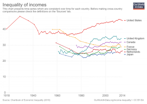
 Our World in Data has an interactive chart that compares income inequality with gini coefficients. For example the chart here has the United States, United Kingdom, France, Germany, Netherlands, and Japan (you can select other countries too). Of these six countries the U.S. has greater income inequality than the other five. It has also grown considerably since the mid 1970s. As always with Our World in Data, you can download the data set so it can be used in statistics courses. You can also download graphs, such as the one here.
Is America’s nutritional divide due to food deserts?
 In a recent article by Richard Florida, It’s Not the Food Deserts: It’s the Inequality, the case is made that food deserts aren’t the real problem.
Instead of within cities, the biggest geographic differences in the way Americans eat occur across regions. The map above plots the geography of healthy versus unhealthy eating across America’s 3,500-plus counties. Dark red indicates a lower health index based on grocery purchases, while light yellow represents a higher health index. While there is some variation within cities and metro areas, by far the biggest and most obvious differences are across broad regions of the country.
Ultimately, the fundamental difference in America’s food and nutrition has more to do with class than location. More than 90 percent of the difference in Americans’ nutritional inequality is the product of socioeconomic class, according to the study. And it’s not just that higher-income Americans have more money to spend on food. In fact, the cost of healthy food is not as prohibitively high as people tend to think. While healthy food costs a little bit more than unhealthy food, most of that is driven by the cost of fresh produce.
The article has useful graphs and summary statistics and can be used in QL or statistics based course.
What do you know about historical unemployment by race?
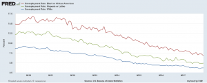 The data, from the U.S. Bureau of Labor Statistics, and a graph by FRED can enlighten you. FRED has Black, Hispanic, and White unemployment data since 1973. Here we downloaded the graph since the end of the 2008 recession. At its peak (about March 2010) Black unemployment (16.8%) was about twice that of White (8.9%), while Hispanic unemployment was about 50% greater at 12.9%. Currently, Dec 1017, the spread isn’t as bad but the relationships still exists with unemployment rates at 6.8% (Black), 4.9% (Hispanic), and 3.7% (White). The FRED graph is interactive and you can download the data.
What is the lead-crime hypothesis?
 Kevin Drum provides an overview and update of the hypothesis in his detailed post An Updated Lead-Crime Roundup for 2018. In short,
The lead-crime hypothesis is pretty simple: lead poisoning degrades the development of childhood brains in ways that increase aggression, reduce impulse control, and impair the executive functions that allow people to understand the consequences of their actions. Because of this, infants who are exposed to high levels of lead are more likely to commit violent crimes later in life.
He notes further down in the article that
It’s important to emphasize that the lead-crime hypothesis doesn’t claim that lead is solely responsible for crime. It primarily explains only one thing: the huge rise in crime of the 70s and 80s and the equally huge—and completely unexpected—decline in crime of the 90s and aughts. The lead-crime hypothesis is the answer to the question mark in the stylized chart below:
The post has useful graphs for QL based courses, provides an overview of the hypothesis, and the Statistics Projects section of this blog has lead-crime data for projects.
How has adult death rates changed by U.S. state?
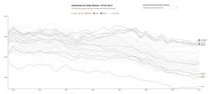 The PRB (Population Reference Bureau) post, Declines in Adult Death Rates Lag in the U.S. South, answers the question with interactive graphs.
Adult death rates in many southern states are 30 percent or 40 percent higher than in states with the lowest death rates. The growing geographic disparity means that adults (ages 55+) in the worst-off southern states can expect to die three to four years earlier, on average, than their counterparts in states with the lowest death rates.
The graphs show death rates by state and state rankings for both females and males, from 1980 to 2015. There is a clear trend.
In 2015, all of the states with the highest female death rates (ages 55+) were located in the South. In 1980, by comparison, the five states with the highest female death rates included Louisiana, New Jersey, New York, Ohio, and Pennsylvania.
The set of graphs are perfect for a QL course. The data, cited in the post, is from the CDC which could make for a regression based statistics project.
How has the black/white earnings gap changed over time?
 Kevin Drum has the answer with his post Black Incomes Have Fallen Further Behind Whites for the Entire 21st Century.
Black men have made essentially no progress in the past four decades, while black women have fallen considerably further behind. Since 2000, both both men and women have fallen further behind their white counterparts.
There are two other graphs and he notes:
Black households made income and wealth gains up through about 2000, but since then have gone backwards. Any way you look at this, the gap between blacks and whites has gotten worse throughout the entire 21st century. Anyone who doesn’t understand why the African-American community has seemingly become more despairing of racial progress lately should take a look at this.
The data for the graph here comes from FRED. If you haven’t used FRED it is an excellent resource. To get you started with FRED by comparing black vs white earnings (not separated by gender) go here and then click on edit graph. Add the series LEU0252883700Q under customize data. Then under formula type a/b. You should get the graph below. You can then download the data and graph.

What do you know about the top 1%?
The Chicago Booth post, Never mind the 1 percent Let’s talk about the 0.01 percent, provides an insightful summary of income distribution at the top.
Mankiw noted that the 1 percent’s share of total income, excluding capital gains, rose from about 8 percent in 1973 to 17 percent in 2010, the latest figures available at the time. “Even more striking is the share earned by the top 0.01 percent. . . . This group’s share of total income rose from 0.5 percent in 1973 to 3.3 percent in 2010. These numbers are not easily ignored. Indeed, they in no small part motivated the Occupy movement, and they have led to calls from policymakers on the left to make the tax code more progressive.”
There is detailed exposition on who makes up the top and how they got there. For instance,
Technology, from the internet to media such as ESPN and Bloomberg terminals, has given elite athletes, entertainers, entrepreneurs, and financiers the ability to profit on a much larger, global scale, making the fruits of their labor more valuable than what previous superstars, such as, say, Pelé or Babe Ruth, brought in. Ruth’s peak salary of $80,000 would be worth about $1.1 million in 2016 dollars, around one-thirtieth of the $33 million the highest-paid Major League Baseball player, pitcher Clayton Kershaw of the Los Angeles Dodgers, made in salary alone in 2016.
And hedge-fund managers make multiples more than top athletes and entertainers. James Simons of Renaissance Technologies and Ray Dalio of Bridgewater Associates each made more than $1 billion in 2016, even though, as Institutional Investor’s Alpha reported, the top-25 hedge-fund earners took in the least as a group since 2005, largely because of the industry’s overall poor investment performance.
This is an excellent article about income and how it is distributed, with a number of graphs suitable for QL based courses.
What would minimum wage be if it grew with productivity?
 According to the 3rd chart of EPI’s Top Charts of 2017, U.S. minimum wage would be $19.33 per hour if it grew at the same rate as productivity. If it simply grew at the rate of average workers it would be $11.62 per hour.
The expectation that the minimum wage rise in step with broader trends in the economy would not have been unreasonable for previous generations—that was the trend throughout the 1950s and 1960s. Today’s minimum wage workers have been harmed both by the failure to raise the minimum wage in step with pay for typical workers and by the huge and growing gap between these nonsupervisory wages and economy-wide productivity. The Raise the Wage Act of 2017 would raise the federal minimum wage to $15 by 2024. Such a raise would certainly bring the pay of minimum wage workers closer to providing a decent quality of life, even though it would still fall short of what the economy could have delivered for low-wage workers over the past 50 years.
All twelve of EPI’s Top Charts of 2017 include data and you can download the chart.
Is there a wealth gap due to discrimination?
 The EPI provides evidence for yes in the 6th of their top charts of 2017, The racial wealth gap is the clearest legacy of past discrimination in housing markets. Their chart shows the differences for mean and median household wealth for black and white households. They key is housing:
Besides facing discrimination in employment and wages, black families historically have been shut out of the most important wealth-building market: housing. Overall, home equity makes up about two-thirds of all wealth for the typical household. In short, for median families, the racial wealth gap is overwhelmingly a housing wealth gap. And this housing wealth gap is no accident; it is the outcome of intentional policies at all levels of government, in particular housing policies that prevented blacks from acquiring land, created redlining and restrictive covenants, and encouraged lending discrimination. These policies created and reinforced the racial wealth gap we are still struggling to address.
You can download the data and graph for all of EPI’s top charts of 2017.
What is the pay gap between Hispanic women vs white non-Hispanic men?
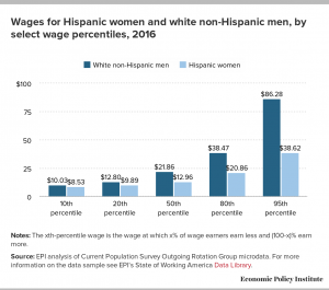 The Economic Policy Institute has the answer with their post Latina workers have to work 10 months into 2017 to be paid the same as white non-Hispanic men in 2016. They compare not only wages by percentile (graph here), but also compare by occupation and education.
Much of these differences are grounded in the presence of occupational segregation. Latina workers are far more likely to be found in certain low-wage professions than white men are (and less common in high-wage professions). But, even in professions with more Latina workers, they still are paid less on average than their white male colleagues.
As Hispanic women increase their educational attainment, their pay gap with white men actually increases. The largest dollar gap (more than $17 an hour), occurs for workers with more than a college degree.
The EPI post includes downloadable graphs (such as the one here) as well as the data.