Tag Archives: statistics

Which political side is losing more?

According to the pew article Growing share of Americans say their side in politics has been losing more often than winning by Ted Van Green (10/3/2022) overall 72% feel their side is losing more. There are, of course, differences by party:

 Today, about eight-in-ten Republicans and Republican-leaning independents (81%) say they feel that their side is losing more often than winning politically, up from 74% who said this in 2021. In February 2020, with President Donald Trump in the White House, just 29% of Republicans said their side was losing more often than winning, while 69% said it was mostly winning.

This makes some sense. When you control the presidency you are winning more. Yet,

Still, two-thirds of Democrats and Democratic leaners (66%) say their side is losing more than winning, up from 60% in 2021.

In early 2020, and at earlier points in Trump’s presidency, much larger majorities of Democrats said they felt like their side was losing more than winning. For example, 80% of Democrats said this in February 2020.

Controlling the white house doesn’t seem to be helping the Dems. How sustainable is a society if majorities always think they are losing?

As always, pew has a methodology section which can be used in a stats class.


ENSO, Alaska, and correlation, what’s the connection?

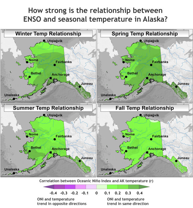
The climate.gov article Moose tracks through Alaska and ENSO  by Brian Brettschneider (6/23/2022) is a great example of using statistics in a real world setting; in this case the Pearson correlation. The graph copied here is interesting but the footnote may be even more so:

This statistical analysis uses the Pearson correlation of a linear regression, which measures how well two variables (like ENSO and Alaskan temperature) remain in sync. Correlation values range from -1 (completely out of sync) to +1 (completely in sync). Also, because Alaska’s temperatures have such a strong warming trend, the anomaly for each year was compared against a trailing 30-year average (or climatology). This mostly, but not entirely, removes the trend. We are interested in removing the climate trend in these maps because we are interested in isolating the ENSO signal (which does not include climate change signals).

Quick summary of the results:

The winter and spring seasons have the greatest connection between ENSO (as measured by the Oceanic Niño Index) and departures from average air temperature, and the correlation is positive. This means that El Niño tends to bring above-average temperatures; it also means La Niña is linked with below-average temperatures. Areas adjacent to and closer to the North Pacific Ocean tend to have a stronger connection with ENSO than areas inland. In the summer, the relationship weakens quite a bit (as indicated by the lighter shading) and is mostly nonexistent by fall.

The Oceanic Niño Index links to a data set. There are a few other maps in the article and a couple more footnotes.


How do vaccination rate differ?

The Pew article Increasing Public Criticism, Confusion Over COVID-19 Response in U.S. by Alec Tyson and Cary Funk (2/9/2022) has the graph copied here, which seems unrelated to the title but is interesting. I’ll leave you to decide what is surprising and what isn’t. Further:

Some demographic differences in vaccination status are more pronounced within one partisan group than another. For instance, 80% of Republicans ages 65 and older say they have received a COVID-19 vaccine, compared with far fewer Republicans 18 to 29 (52%). There is a much more modest gap between the shares of Democrats 65 and older and those 18 to 29 who say they’ve received a vaccine (94% vs. 88%). See the Appendix for more details on vaccination status within partisan groups.

This all seems like good data for statistical tests. There are more  graphs, a methodology section, and more data.

How effective are COVID-19 vaccines?

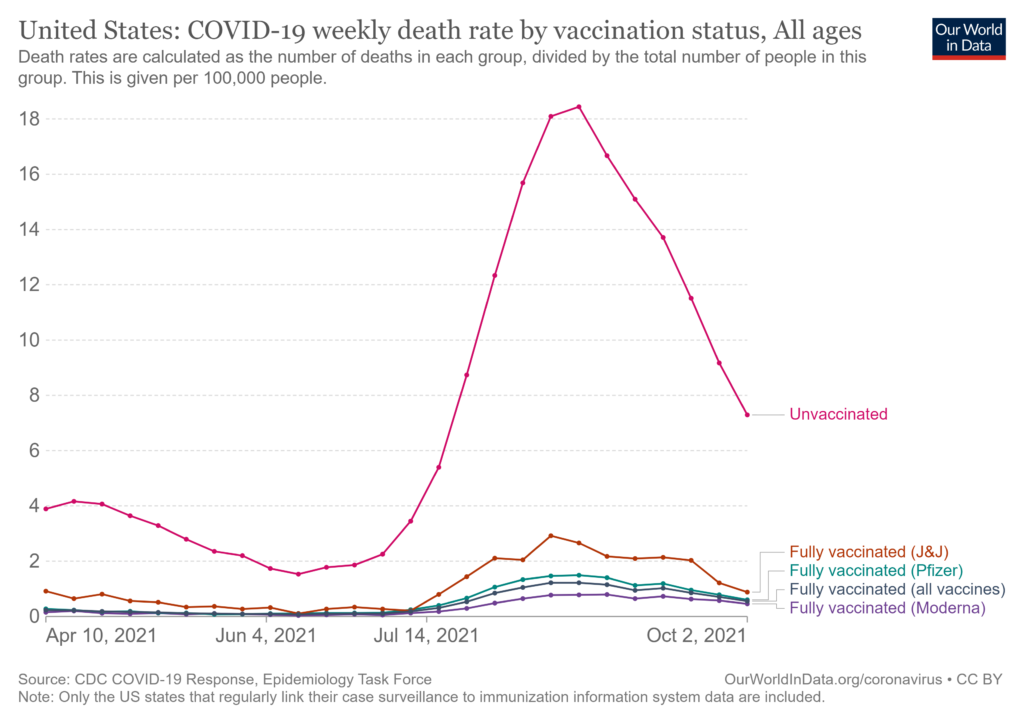
The Our World in Data article How do death rates from COVID-19 differ between people who are vaccinated and those who are not? by Edouard Mathieu and Max Roser  (11/23/2021) provide the answer. For example, their graph here is the death rate by vaccination status. The weakly death rate for Oct 2 for the unvaccinated group is about 15 times more than the vaccinated group. Even this is a little misleading. One of the options for these interactive graphs is to select the age group. The 80+ age group has weakly death rates of 6.51% and 38.28% for vaccinated and unvaccinated. There are also charts for England and Chile. For each chart the data is available. This would be good data for comparing groups in stats.

One other plus is the article starts of with an explanation, with graphics, about why it is misleading to report the percent of vaccination status of those that died. Good quantitative literacy and stats reading.

What are the U.S. opinions on police funding?

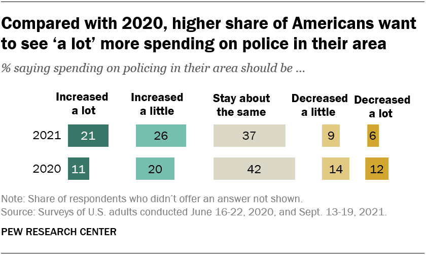
The Pew article Growing share of Americans say they want more spending on police in their area by Kim Parker and Kiley Hurst (10/26/2021) compares police spending polls from June 2020 and Sept 2021. The overall summary is in the graph copied here. There are other charts including a breakdown by race, ethnicity, age, and political leaning. For example,

Among Democrats, Black (38%) and Hispanic (39%) adults are more likely than White adults (32%) to say spending on police in their area should be increased. There is no significant difference across these racial and ethnic groups in the share of adults who say spending should be decreased.

Within the GOP, White and Hispanic adults differ in their views on this question: 64% of White Republicans say police spending in their area should be increased, compared with 53% of Hispanic Republicans.

Pew included a methodology section for both polls.

How does climate impact Arctic communities?

The graph here is from the paper Co-production of knowledge reveals loss of Indigenous hunting opportunities in the face of accelerating Arctic climate change in Environmental Research by Donna D W Houser, et. el. (8/24/2021). From the discussion:

Overall, our analyses indicate that the ugruk harvesting season for Qikiqtaġruŋmiut hunters is being compressed by the shorter spring ice breakup period. Indeed, if we summarize across our time-series from 2003 to 2019, Kotzebue Sound now clears of sea ice ∼22 d earlier (figure S3) and is the primary factor contributing to a shrinking ugruk hunting season.

A new Indigenous-led study documents how ice loss is changing seal hunts by Yereth Rosen (9/6/2021) is non-technical summary of the paper and when an article has a rate in it we can use it in calculus:

From 2003 to 2019, the seal hunting season diminished by about a day a year, with most of that change happening at the end of the season, according to the study, published in the journal Environmental Research Letters.

How do views on major institutions differ by political affiliation?

The Pew article Republicans increasingly critical of several major U.S. institutions, including big corporations and banks by Ted Van Green (8/20/2021) includes the chart copied here.  The charts show clearly that republicans are more critical than in 2019, but it would seem that gaps are more concerning.  Republicans are more critical of banks and corporations than two years ago but that puts them right around democrats.  In other instances viewpoints are diverging. The 76 to 34 positive viewpoint difference on college and universities seems concerning and from the article:

The survey finds that partisan differences extend to views of K-12 public schools: 77% of Democrats say they have a positive effect, compared with 42% of Republicans. A 57% majority of Republicans, including nearly two-thirds of conservative Republicans (65%), say public elementary and secondary schools have a negative effect.

Discussion of the data as well as the reporting of the data and ramifications of the results would seem to fit into many a course. Pew has a methodology section and the data.


Is voting a right or a privilege?

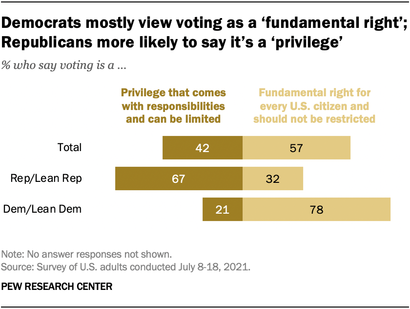
The answer to the question is correlated with party affiliation as Pew reports in their article Wide partisan divide on whether voting is a fundamental right or a privilege with responsibilities by Vianney Gomez and Carroll Doherty (7/22/2021) as their chart here shows.

Democrats and Democratic-leaning independents overwhelmingly say voting is a fundamental right that should not be restricted in any way – 78% hold this view, while fewer than a quarter (21%) say it is a privilege. Two-thirds of Republicans and Republican leaners say voting is a privilege that can be limited if requirements are not met, compared with about half as many (32%) who say it is a fundamental right.

On another question we have this:

Nearly all Americans (94%) – including 95% of both Republicans and Democrats – say it is important that people who are legally qualified to vote are able to cast a ballot, with 82% saying it is very important.

This makes me wonder if there is a different interpretation to “can be limited.”  There are three other charts and links to the questions used and the methodology. All great for a stats course.

How much debt do students have by race?

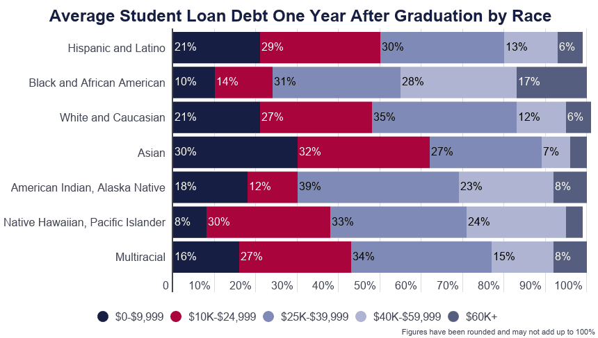
The EducationalData.org post Student Loan Debt by Race by Melanie Hanson (6/9/21) has three excellent graphs such as the one copied here. It may not be surprising that Asians have the least debt given Asians have the highest income, but Hispanic and Latino debt is almost identical to White and Caucasian debt yet their income is typically closer to the Black and African American community.  From a statistical standpoint the first bullet in the highlights

Black and African American college graduates owe an average of $25,000 more in student loan debt than White college graduates.

is a bit misleading. Given the skewness of the data (the 17% in the top category for Black and African American) one should also report a median difference, which looks to be closer to around $10,000. Interestingly, in all cases the median debt is below the $39,000, which is manageable college debt in most cases. The question that comes to mind is how much lower would this be if median income increased at the same pace as the stock market or top 1%?

The article has sources but no easily downloadable data set.


How big is the ideological divide in the U.S.?

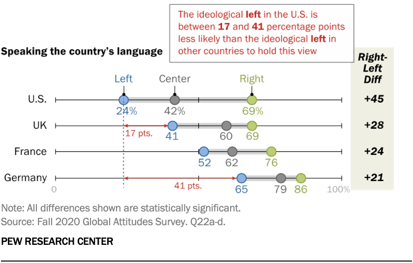
Percent who say that speaking the country’s language is important to being part of (the country).

Pew answers the question in their article Ideological divisions over cultural issues are far wider in the U.S. than in the UK, France and Germany by Laura Silver (5/5/2021). In summary (bold added by me):

Across 11 questions on cultural subjects ranging from nationalism to political correctness, the gap between the ideological left and right in the United States – or liberals and conservatives, in the common U.S. parlance – is significantly wider than the ideological gaps found in the European countries surveyed. In some cases, this is because America’s conservatives are outliers. In other cases, it’s because America’s liberals are outliers. In still other cases, both the right and left in the U.S. hold more extreme positions than their European counterparts, resulting in ideological gaps that are more than twice the size of those seen in the UK, Germany or France.

There are a total of eight charts like the one here, plus links to the survey questions and methodology. So, how divided can a country be and still function?