ENSO, Alaska, and correlation, what’s the connection?

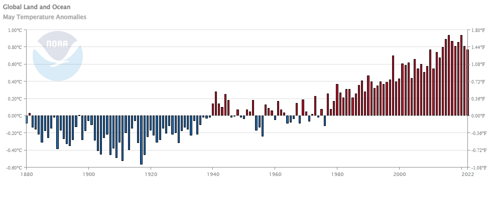
The climate.gov article Moose tracks through Alaska and ENSO  by Brian Brettschneider (6/23/2022) is a great example of using statistics in a real world setting; in this case the Pearson correlation. The graph copied here is interesting but the footnote may be even more so:

This statistical analysis uses the Pearson correlation of a linear regression, which measures how well two variables (like ENSO and Alaskan temperature) remain in sync. Correlation values range from -1 (completely out of sync) to +1 (completely in sync). Also, because Alaska’s temperatures have such a strong warming trend, the anomaly for each year was compared against a trailing 30-year average (or climatology). This mostly, but not entirely, removes the trend. We are interested in removing the climate trend in these maps because we are interested in isolating the ENSO signal (which does not include climate change signals).

Quick summary of the results:

The winter and spring seasons have the greatest connection between ENSO (as measured by the Oceanic Niño Index) and departures from average air temperature, and the correlation is positive. This means that El Niño tends to bring above-average temperatures; it also means La Niña is linked with below-average temperatures. Areas adjacent to and closer to the North Pacific Ocean tend to have a stronger connection with ENSO than areas inland. In the summer, the relationship weakens quite a bit (as indicated by the lighter shading) and is mostly nonexistent by fall.

The Oceanic Niño Index links to a data set. There are a few other maps in the article and a couple more footnotes.


Which electricity generation uses the least land?

The Our World in Data article How does the land use of different electricity sources compare? by Hannah Ritchie (6/16/2022) looks to answer this question. Here is what they consider:

To capture the whole picture we compare these footprints based on life-cycle assessments. These cover the land use of the plant itself while in operation; the land used to mine the materials for its construction; mining for energy fuels, either used directly (i.e. the coal, oil, gas, or uranium used in supply chains) or indirectly (the energy inputs used to produce the materials); connections to the electricity grid; and land use to manage any waste that is produced.

The answer: Nuclear power.

At the bottom of the article there are links to other energy posts some of which have data.


How has the middle class changed?

The Pew article How the American middle class has changed in the past five decades by Rakesh Kochhar and Stella Sechopoulos (4/20/2022) has seven facts about changes in the middle class. Overall  though,

The share of adults who live in middle-class households fell from 61% in 1971 to 50% in 2021, according to a new Pew Research Center analysis of government data.

where middle class is defined as

In this analysis, “middle-income” adults in 2021 are those with an annual household income that was two-thirds to double the national median income in 2020, after incomes have been adjusted for household size, or about $52,000 to $156,000 annually in 2020 dollars for a household of three.

The chart here is from fact 4: Married adults and those in multi-earner households made more progress up the income ladder from 1971 to 2021 than their immediate counterparts.

Generally, partnered adults have better outcomes on a range of economic outcomes than the unpartnered. One reason is that marriage is increasingly linked to educational attainment, which bears fruit in terms of higher incomes.

The article includes a detailed methodology section.


How much has Lake Mead Dropped?

Lake Mead water levels continue to drop. At the end of May it was down to 1047.69 feet, which is a 13.8 foot drop since my post on April 25 with the end of March height. The west continues in drought according to the Drought Monitor.

What about electricity generation? From the Boulder City Review:

Hoover (Dam) would no longer be able to produce power at 950 feet of elevation,” she said. “We do not anticipate that happening.”

The graph here is from the data on the Lake Mead at Hoover Dam, End of Month Elevation (feet) page by the Bureau of Reclamation. The Sept Lake Mead post and the July Lake Mead post, which has a link to the R code for the graph.

How has maternal mortality rates changed?

The chart here is from the National Center for Health Statistics paper Maternal Mortality Rates in the United States, 2020 by Donna L. Hoyert (2/23/2022). A definition:

A maternal death is defined by the World Health Organization as, “the death of a woman while pregnant or within 42 days of termination of pregnancy, irrespective of the duration and the site of the pregnancy, from any cause related to or aggravated by the pregnancy or its management, but not from accidental or incidental causes” (1). Maternal mortality rates, which are the number of maternal deaths per 100,000 live births, are shown in this report by age group and race and Hispanic origin.

Kevin Drum comments on this in his post The maternal mortality rate has skyrocketed over the past three years. A few quotes:

And the maternal mortality rate for everyone has nearly tripled since the late ’90s. Meanwhile, in Europe, the maternal mortality rate has been steadily dropping and is now about one-third the US rate.

What explains the differences by race according to Drum:

And we’re still in the dark about why Black women suffer such an astonishingly high rate of maternal mortality. As I said three years ago:

Poverty, education level, drinking, smoking, and genetic causes don’t seem to explain the black-white difference in maternal mortality. The timing of prenatal care doesn’t explain it. Medically, the cause of the difference appears to be related to the circulatory system, which is sensitive to stress. This makes the toxic stress hypothesis intuitively appealing, but it has little rigorous evidence supporting it. There’s some modest evidence that wider use of doulas could reduce both infant and maternal mortality, but no evidence that it would reduce the black-white gap.

Low income is weakly associated with higher maternal mortality rates, but it explains very little. The allostatic stress theory is appealing but probably wrong. And racism doesn’t seem to play much of a role either.

The CDC article has links to data.

What is the relationship between the sun and climate change?

The climate.gov article Climate Change: Incoming Sunlight by Rebecca Lindsey (9/1/2009 – an oldie but a goodie) gives a comprehensive overview of what we know about the energy from the Sun. A few highlights from an article worth reading:

A comprehensive review of published scientific research by the Intergovernmental Panel on Climate Change concluded that, averaged over the solar cycle, the best estimate of the Sun’s brightness change between the pre-industrial period and the present (2019) is 0.06 Watts per square meter. That increase could be responsible for about 0.01 degrees Celsius—around 1 percent—of the warming the planet has experienced over the industrial era (0.95–1.2 degrees Celsius in 2011–2020 versus 1850–1900).

Additional experiments have compared the impacts of grand solar minimums of different strengths with different emissions paths. For example, for a future in which greenhouse gases follow an intermediate pathway (RCP 6.0), one experiment found that a relatively weak Grand Solar Minimum, during which total solar irradiance dropped by 1.3 Watts per square meters for 5 decades in the middle of this century, could reduce global warming by 10%. To reach a 20% reduction in global warming, the Grand Solar Minimum would have to be very strong: sunlight at the top of the atmosphere would need to drop by nearly 6 Watts per square meter. A drop that large would significantly exceed what our current understanding of the Sun says is realistic.

Another study estimated that at pre-industrial carbon dioxide levels, summer insolation at 65° North need only dip 0.75 standard deviations below the mean—about 15 Watts per square meter—for summers to be too cool to melt all the winter snow, a low that Milankovitch cycles predict we will next hit about 50,000 years from now. At 400 parts per million, summer insolation would need to fall twice as much—a low we will next see 125,000 years from now. At carbon dioxide levels above 560 parts per million, the study predicted, no Milankovitch variation within the next half million years will be low enough to trigger an ice age.

There are a number of graphs and some links to data.

How can ocean temperature profiles connect to calculus?

Exploring Our Fluid Earth has some educational materials for science. For example, the page Compare-Contrast-Connect: Seasonal Variation in Ocean Temperature Vertical Profiles includes the graph copied here.  Some of these graph have inflection points which relate (I think) to thermoclines (transition between warmer surface water and colder deep water). There certainly seems to be a calculus connection here. For QL folks the graphs are a little tricky based on the y-axis and math folks would probably prefer the depth as the x-axis (why?). There are links on the right sidebar to other projects and information.

How hot was May 2022?

From NOAA’s May 200 Global Climate Report:

The May global surface temperature was 1.39°F (0.77°C) above the 20th-century average of 58.6°F (14.8°C). This ranks as the ninth-warmest May in the 143-year record, 0.30°F (0.17°C) cooler than the warmest May months (2016 and 2020). It was the coolest May since 2013, but it still marked the 46th consecutive May and the 449th consecutive month with temperatures, at least nominally, above the 20th-century average. The ten warmest May months have all occurred from 2010 to present.

Some highlights for May 2022:

There are several top-10 ranks to note for May 2022. In particular, it was the eighth-warmest May for the global ocean, the eighth-warmest for the Northern Hemisphere as a whole, the eighth-warmest for Europe (associated with a heatwave in southwestern Europe), and the sixth-warmest for Asia (associated with above-average temperatures in western Siberia).

Time series data is available at a link near the top of the page.


What are Earth Minute Videos?

NASA has a number of whiteboard animations called Earth Minute Videos:

NASA isn’t all about interplanetary exploration; in fact, the agency spends much of its time studying our home planet. This fun whiteboard animation series explains Earth science to the science-curious.

The videos themselves don’t have much math but each video has a link underneath to more info. For example, the Greenland video here includes a link to Ice Sheets info which has data.

How much do we trust our government?

Pew has a feature, Public Trust in Government: 1958-2022 (6/6/2022), with three interactive graphs answering this question. In general,

When the National Election Study began asking about trust in government in 1958, about three-quarters of Americans trusted the federal government to do the right thing almost always or most of the time. Trust in government began eroding during the 1960s, amid the escalation of the Vietnam War, and the decline continued in the 1970s with the Watergate scandal and worsening economic struggles. Confidence in government recovered in the mid-1980s before falling again in the mid-1990s. But as the economy grew in the late 1990s, so too did confidence in government. Public trust reached a three-decade high shortly after the 9/11 terrorist attacks, but declined quickly thereafter. Since 2007, the shares saying they can trust the government always or most of the time has not surpassed 30%.

The one graph copied here also makes it obvious how opinions by political leaning shift on cue when a president of the other party is elected. Each graph in the article has a link to the data.