What are the four most populated countries?

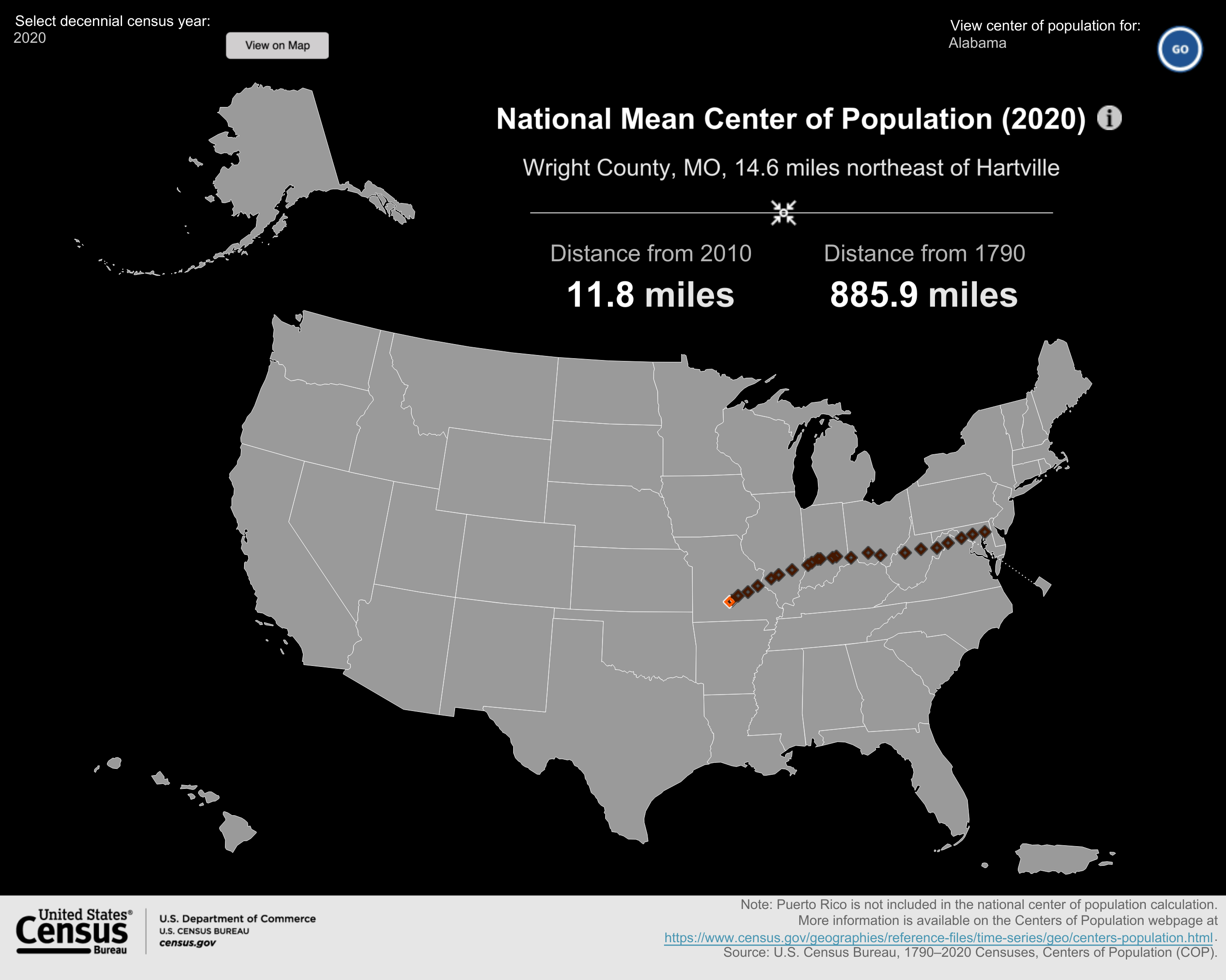
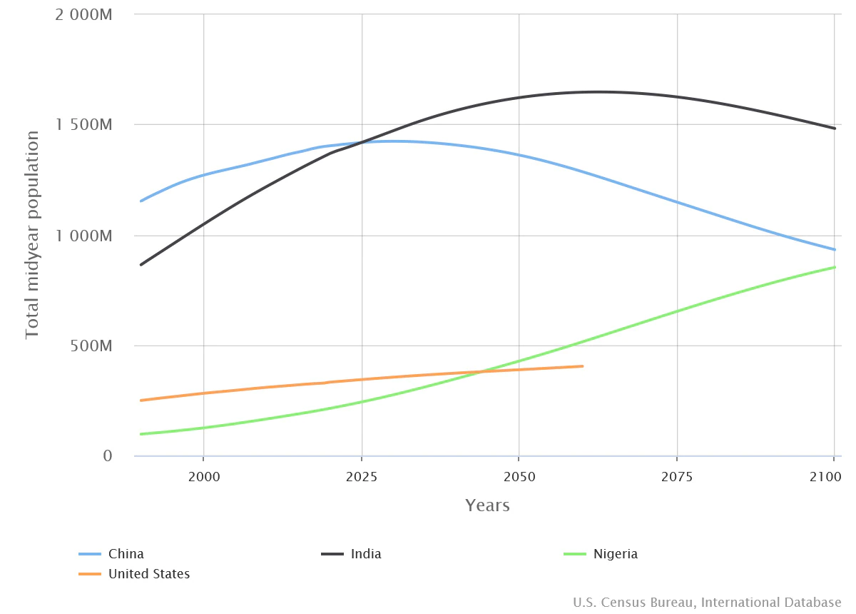
The U.S. Census Bureau post U.S. Population Estimated at 332,403,650 on Jan 1, 2022 by Derick Moore (12/30/2021) is a nice summary of the U.S. population.  At the bottom there is an interesting graph with, maybe, some surprises. The first is that India is expected to overtake China around 2025. Second is that Nigeria is expected to pull into third place in the 2040s.

How quickly is U.S. population growing?

In January 2022, the United States is expected to experience a birth every nine seconds and one death every 11 seconds. Meanwhile, net international migration is expected to add one person to the U.S. population every 130 seconds.

The combination of births, deaths and net international migration increases the U.S. population by one person every 40 seconds.

Plenty of QL info in the article and links to  various clocks, dashboards and data.

What is the Global Climate Dashboard?

Climate.gov has put together a dashboard: Global Climate Dashboard – Tracking climate change and natural variability over time. The dashboard has graphs and information for greenhouse gases, arctic sea ice carbon dioxide, mountain glaciers, ocean heat, sea level, spring snow, incoming sunlight, and surface temperature under climate change (there are others under Natural Variability). This provides a nice one stop shopping for time series graphs for these variables.

For example, copied here is the graph for incoming sunlight:

Averaged over the complete solar cycle, there’s been minimal long-term change in the Sun’s overall brightness since the start of the Industrial Revolution. Records of sunspots show increased solar activity during the first 7 decades of the 20th century, likely tied to the peak of the last 100-year Gleissberg Cycle. Following that peak around 1960, solar activity declined. In fact, activity during the most recent solar cycle is among the lowest in a century. Meanwhile, the rate of global warming has accelerated over the past few decades.

Each variable is linked to a page with detailed information about the given variable. There don’t appear to be direct links to data but there are plenty of graphs.

How much has the Ocean warmed?

Climate.gov provides an updated on ocean heat in the Climate Change: Ocean Heat Content article by Luann Dahlman and Rebecca Lindsey (updated 10/12/2021):

Averaged over Earth’s surface, the 1993–2020 heat-gain rates were 0.37–0.41 Watts per square meter for depths from 0–700 meters (down to 0.4 miles), depending on which research group’s analysis you consult. Meanwhile, heat gain rates were 0.15–0.31 Watts per square meter for depths of 700–2,000 meters (0.4–1.2 miles). For depths between 2000–6000 meters (1.2–3.7 miles), the estimated increase was 0.06 Watts per square meter for the period from June 1992 to July 2011. According to the State of the Climate 2019 report, “Summing the three layers (despite their slightly different time periods as given above), the full-depth ocean heat gain rate ranges from 0.58 to 0.78 W m-2 applied to Earth’s entire surface.”

The article has helpful short summaries on how heat moves and measuring ocean heat. They link to Global Ocean Heat and Salt Content: Seasonal, Yearly, and Pentadal Fields for the data.

What is Thwaites?

Thwaites is an important glacier. In fact, it is so important it gets in own set of webpages. From The International Thwaites Glacier Collaboration (ITGC):

The NERC and NSF partnership, called the International Thwaites Glacier Collaboration (ITGC), covers research across Thwaites Glacier and its adjacent ocean region; the glacier flows into Pine Island Bay, part of Amundsen Sea. ITGC is the largest joint UK-US project undertaken on the southern continent in 70 years.

Over the past 30 years, the amount of ice flowing out of this 120-kilometer-wide region has nearly doubled. Overall the glacier is the size of the island of Britain, or the state of Florida, and it straddles some of the deepest bedrock in the southern continent.

From a CIRES article The Threat from Thwaites: The Retreat of Antarctica’s Riskiest Glacier (12/12/2021):

“Thwaites is the widest glacier in the world,” said Ted Scambos, a senior research scientist at the Cooperative Institute for Research in Environmental Sciences (CIRES). “It’s doubled its outflow speed within the last 30 years, and the glacier in its entirety holds enough water to raise sea level by over two feet. And it could lead to even more sea-level rise, up to 10 feet, if it draws the surrounding glaciers with it.”

The CIRES article has interesting information about the dynamics at play. The ITGC pages includes some education resources and a data page with links to data in various types but one is a csv file.


How hot was Nov 2021?

From NOAA’s Global Climate Report – November 2021:

The global average temperature over the land and ocean surfaces for November 2021 was 0.91°C (1.64°F) above the 20th century average of 12.9°C (55.2°F), the fourth highest for November since global temperature records began in 1880. The 10 warmest Novembers have occurred since 2004.

Some highlights:

The Northern Hemisphere had its second warmest November on record with a temperature departure of +1.24°C (+2.23°F). This was 0.06°C (0.11°F) shy of tying the record set in November of 2020.

Africa had its warmest November on record, with a temperature departure of +1.61°C (+2.90°F). This value surpassed the now second warmest November set in 2019 by 0.05°C (0.09°F). The Caribbean region had a near-record warm November (tied with 2016), behind the record set in 2015.

Time series data near the top of the page.

How much did wage inequality change in 2020?

The EPI article Wage inequality continued to increase in 2020 by Lawrence Mishel and Jori Kandra (12/13/2021) provides the graph copied here. As for the share of the overall pot:

This disparity in wage growth reflects a sharp long-term rise in the share of total wages earned by those at the very top: the top 1.0% earned 13.8% of all wages in 2020, up from 7.3% in 1979. That marks the second highest share of earnings for the top 1.0% since the earliest year, 1937, when data became available (matching the tech bubble share of 13.8% in 2000 and below the share of 14.1% in 2007). The share of wages for the bottom 90% fell from 69.8% in 1979 to just 60.2% in 2020.

The article also has two tables of data that could be useful in stats or QL course.

Which party can speak more freely?

The Pew article Republicans continue to see a national political climate more comfortable for Democrats than for GOP by Bradley Jones (12/8/2021) is another example of the disconnect in the U.S.

When Republicans take stock of the national climate for political discourse, they see a much more hospitable environment for Democrats than for members of their own party. About six-in-ten Republicans and Republican-leaning independents in the United States (63%) think that “Democrats in this country are very comfortable to freely and openly express their political views,” but only about two-in-ten (19%) think Republicans around the nation experience that same level of comfort.

Responses from Dems go the other way but aren’t as extreme. Pew provides the questions asked and the methodology.

Where is the center of the U.S population?

Before we get to where the center of the U.S. population is maybe we should say what it is. From the U.S. Census Bureau’s article The “Hart” of the Nation’s population: Hartville, Missouri (pop. 594) (11/165/2021):

Every decade since the first census in 1790, the Census Bureau has used data from each decennial census to calculate the center of population — the point where the country would balance perfectly on a flat map if everyone had the same weight of one.

In addition to a national center of population, the Census Bureau also calculates centers of population for each state, county, census tract and census block group. Coordinates for each of these locations can be found on the Centers of Population webpage.

The map here shows the center and how it has moved since 1790. This is near the bottom of the article and it is interactive in that users can choose individual states. The link in the quote will take users to a page with lat and lon for the mean and median centers of each state.

What is NASA’s Eyes on the Earth?

From the Vital Sings of the Planet Article NASA’s Eyes on the Earth Puts the World at Your Fingertips (11/16/201):

NASA’s real-time 3D visualization tool Eyes on the Earth got a recent upgrade to include more datasets, putting the world at your fingertips. Using the tool, you can track the planet’s vital signs – everything from carbon dioxide and carbon monoxide to sea level and soil moisture levels – as well as follow the fleet of Earth satellites providing those measurements.

Take the time, click on the Eyes on the Earth link and play. I’m not sure how I could use this in a math class, yet, but it is real cool. The image here doesn’t do the visualization tool justice.