The eia post Fossil fuels account for the largest share of U.S. energy production and consumption by Bill Sanchez (9/14/2020) summarizes our energy production and consumption since 1950. From the graph copied here we see that even though we have increased renewable energy capacity they still make up a small percent of our total energy consumption. Some good news:
The share of U.S. total energy consumption that originated from fossil fuels has fallen from its peak of 94% in 1966 to 80% in 2019. The total amount of fossil fuels consumed in the United States has also fallen from its peak of 86 quads in 2007.
CAL FIRE provides information about current fires as well as historical data. The picture here is from their incidents page where users can choose current fires or select particular year. For active incidents the right side bar provides the status of current fires. The stats and events page has historical information such as the top 20 fires. There is also a page with historical acres burned by year, although currently updated to only 2018 which was a record year of just under 2,000,000 acres burned.
In addition, the new study found that during the 1970s, when dam construction was at its peak, sea level rise slowed to a crawl. Dams create reservoirs that can impound freshwater that would normally flow straight into the sea.
For example, in its recent flooding report, the National Oceanic and Atmospheric Administration (NOAA) noted a rapid increase in sea level rise-related flooding events along U.S. coasts over the last 20 years, and they are expected to grow in extent, frequency, and depth as sea levels continue to rise.
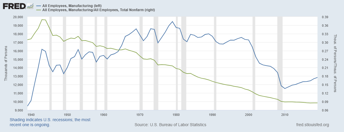
Elections seem to bring out various statements about manufacturing employment in the U.S. So, here is a review of manufacturing in the U.S. The graph here was created using FRED, which is a great resource for economic data. As a percent of all employees, manufacturing peaked in the early 1940s at 38% and has been declining ever since to now below 9%. As a total number of workers the peak was in 1979 at 19,428,00 people and bottomed out at the end of the great recession at 11,529,00 people. The numbers have recovered slightly to 12,839,00 people in 2019, but this is still shy of the 13,403,00 people in 2008 before the recession. Kevin Drum has a point on fact checking related to this in his post Fact of the Day: Manufacturing as a % of the Workforce, 1985-2020.
In the United States, natural gas consumed by electric power plants (power burn) set a daily record high of 47.2 billion cubic feet (Bcf) on Monday, July 27, according to S&P Global Platts estimates. Consequently, on the same day, natural gas-fired generation in the Lower 48 states also reached an all-time high of 316 gigawatts (GW) in the late afternoon, according to the U.S. Energy Information Administration’s (EIA) Hourly Electric Grid Monitor.
Before July 27, 2020, the record for U.S. natural gas power burn to generate electricity stood at 45.4 Bcf, and it was set on August 6, 2019. Natural gas power burn exceeded 45.4 Bcf per day on seven days in July 2020 and one day in August.
What else was used to generate electricity on July 27?
Of the electricity generated on July 27 in the Lower 48 states, natural gas held the largest share at 45%, followed by coal with a 24% share. Remaining shares included nuclear at 17%, renewable energy at 12%, and other sources at 3%.
There is other information, another graph, and links to data sources (check out the Hourly Electric Grid Monitor).
The United States Drought Monitor is your source for drought information. Starting with the main graph, copied here, you can select regions and then down to state levels. From the data tab you can select time series graphs, download tabular data by selected region, as well as obtain GIS files. Climate.gov has a Weekly Drought Map page that provides information about this resource.
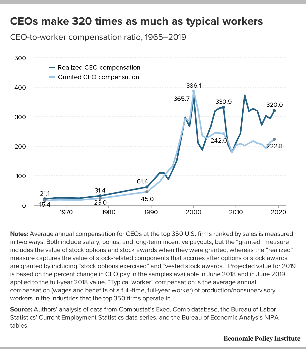
Over the last three decades, compensation grew far faster for CEOs than it did for other very highly paid workers (the top 0.1%, or those earning more than 99.9% of wage earners).
Even though CEO compensation grew much faster than the earnings of the top 0.1% of wage earners, that doesn’t mean the top 0.1% did not fare well. Quite the contrary. The inflation-adjusted annual earnings of the top 0.1% grew 337% from 1978 to 2018. CEO compensation, however, grew three times as fast!
Over the last three decades, CEO compensation increased more relative to the pay of other very-high-wage earners than did the wages of college graduates relative to the wages of high school graduates.
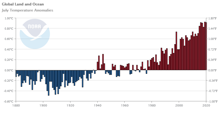
The July 2020 global land and ocean surface temperature of 0.92°C (1.66°F) above the 20th century average tied with 2016 as the second highest July global temperature since records began in 1880. This value was only 0.01°C (0.02°F) shy of tying the record warm July of 2019.
Regionally, the Caribbean region had its warmest July on record, with a temperature departure of 1.24°C (2.23°F) above average. This was 0.09°C (0.16°F) above the previous record set in 2016.
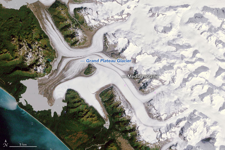
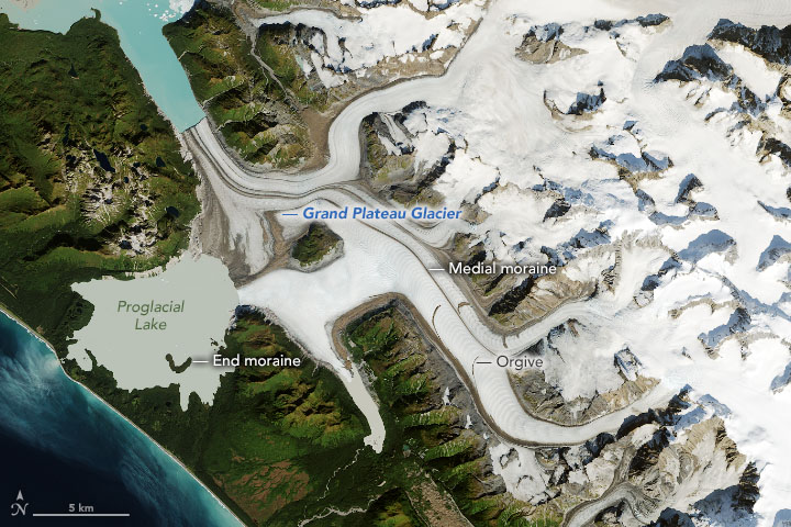
NASA’s earth observatory post Grand Plateau Glacier provides a pair of aerial images of the glacier, copied here, from 1984 and 2019, both from Sept of the given year.
In the images, a moraine near the coastline acts like a dam, trapping meltwater and forming a proglacial lake. Also note the end moraine visible poking above the surface of the lake in the 2019 image. This mound was left behind by a lobe of the glacier front that appears in the 1984 image.
Over the past 35 years, the entire flow of the glacier system changed. In the 1984 image, many of the glacier’s branches flow toward the lake to the southwest; by 2019, retreat caused some branches to change course and flow toward the northwest. Notice the change in direction of the thin brown lines tracing the flow of the glacier’s branches. These are medial moraines: rocky debris from the sides of glaciers (lateral moraines) that have merged, causing the debris to be carried down the center of the combined glacier.
Retreat is not the only change; Grand Plateau is also visibly narrowing and thinning.
Larger images are available covering more area on the page. There is also an option to view the images together with a slider going over the image to change the year and, of course, more information about the changes in the glacier.
By the end of 2018, the United States had 125 operational battery storage systems, providing a total of 869 MW of installed power capacity and 1,236 MWh of energy capacity.
There are two other graphs in the post including which regions have the most storage capacity (can you guess before you look?). There are also links to data.