 NOAA provides numerous resources for teachers including data sources, classroom materials, citizen scientists opportunities, and free posters (like the one copied here). A starting point to find these resources is the post Teachers: Get ready for the new school year with NOAA (8/5/19).
How closely linked are CO2 and Global Temperature?
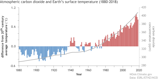 The Climate.gov article, If carbon dioxide hits a new high every year, why ins’t every year hotter than the last by Rebecca Lindsey (9/9/19), provides a primer on the carbon dioxide and global temperature link, along with the role of the oceans.
Thanks to the high heat capacity of water and the huge volume of the global oceans, Earth’s surface temperature resists rapid changes. Said another way, some of the excess heat that greenhouse gases force the Earth’s surface to absorb in any given year is hidden for a time by the ocean. This delayed reaction means rising greenhouse gas levels don’t immediately have their full impact on surface temperature. Still, when we step back and look at the big picture, it’s clear the two are tightly connected.
There are nice rate of change statements:
Atmospheric carbon dioxide levels rose by around 20 parts per million over the 7 decades from 1880–1950, while the temperature increased by an average of 0.04° C per decade.
Over the next 7 decades, however, carbon dioxide climbed nearly 100 ppm (5 times as fast!). . . . At the same time, the rate of warming averaged 0.14° C per decade.
There is another graph, a fun cartoon, and links to the data.
What is in the Income and Poverty 2018 report?
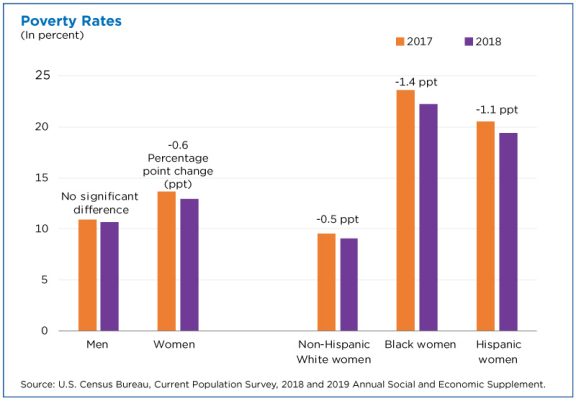
The U.S. Census Bureau report Income and Poverty in the United States: 2018 by Jessica Semega, Melissa Kollar, John Creamer, and Abinash Mohanty (9/10/19) is now available. A few highlights can be found in the post Pay is Up. Poverty is Down. How Women are Making Strides by Jessica Semega (9/10/19). For example, the graph copied here is poverty rates for 2917 and 2018 for men, women, and by race for women. In terms of households:
Median incomes of married-couple households and those with male householders did not change from 2017.
In 2018, the poverty rate for families with a female householder was 24.9%, higher than that for married-couple families (4.7%) and families with a male householder (12.7%).
However, the poverty rate for families with a female householder declined from the previous year, at 26.2% in 2017.
The full report contains 20 pages of charts and summaries related to income and poverty by numerous categories. The other 50 or so pages are data tables that are also available in excel files (see links on right sidebar of the report page). There is ample data here for use in courses.
Is the sun causing climate change?
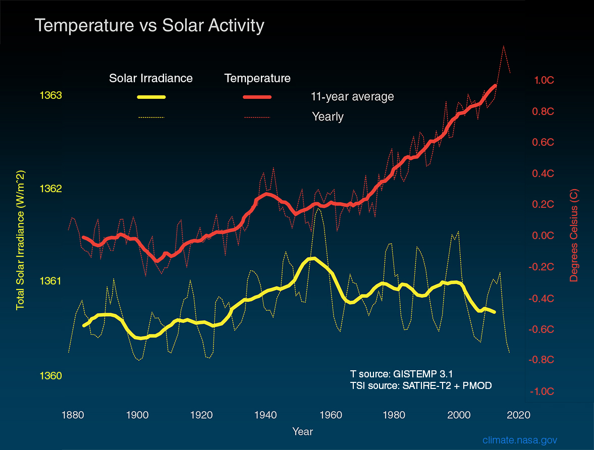
The NASA post, What is the Sun’s Role in Climate Change (9/6/19) make it clear that the sun isn’t to blame for climate change.
For more than 40 years, satellites have observed the Sun’s energy output, which has gone up or down by only .01 percent during that period. Since 1750, the warming driven by greenhouse gases coming from the human burning of fossil fuels is over 50 times greater than the slight extra warming coming from the Sun itself over that same time interval.
Even a grand minimum won’t help:
Several studies in recent years have looked at the effects that another grand minimum might have on global surface temperatures.2 These studies have suggested that while a grand minimum might cool the planet as much as 0.3 degrees C, this would, at best, slow down (but not reverse) human-caused global warming. There would be a small decline of energy reaching Earth, and just three years of current carbon dioxide concentration growth would make up for it. In addition, the grand minimum would be modest and temporary, with global temperatures quickly rebounding once the event concluded.
Where does NY state rank on energy consumption?
 The eia Beta site allows users to choose a state to obtain energy information for that state. When selecting a state users get data about energy consumption and production, along with other facts.
New York generates about one-third of its electricity from nuclear power plants, and the state includes nuclear power as a zero emissions resource that counts toward New York’s 2040 emissions reduction goals.
New York is the fifth-largest consumer of petroleum among the states, but, in part because almost three-tenths of state residents use public transit to commute to work (more than five times the U.S. average), New Yorkers consume less petroleum per capita than residents of any other state in the nation.
There is a tab for rankings. The graph copied here ranks states based on energy consumption per person. Only one other state, Rhode Island, has a lower energy consumption per capita than NY. Louisiana tops the ranking.
Is there a country where women smoke more than men?
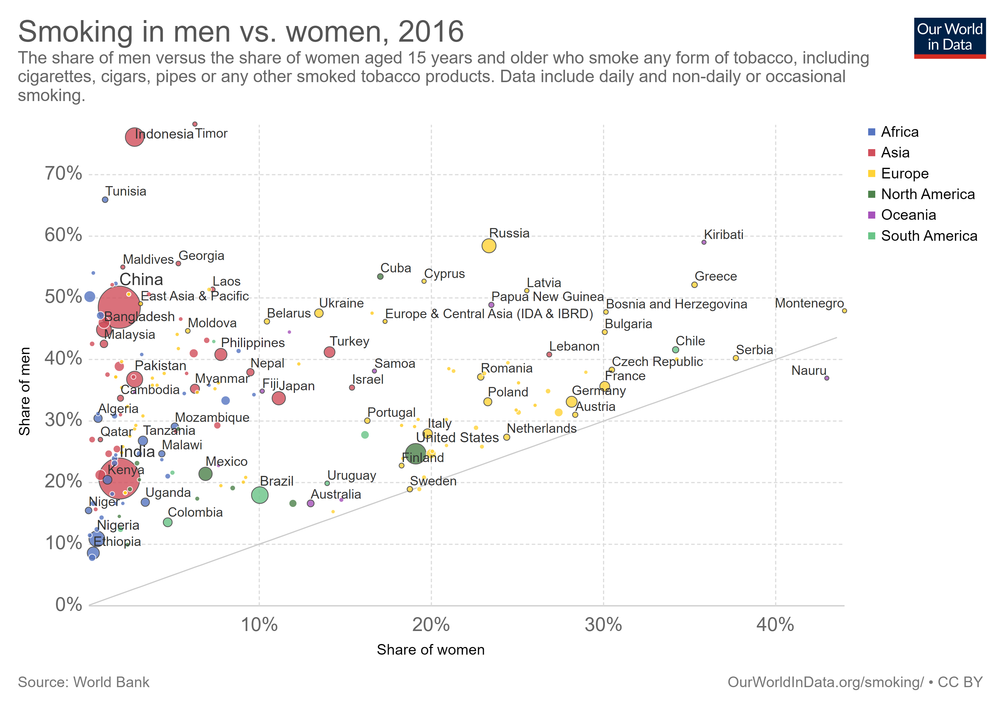 The Our World in Data page Smoking by max Roser and Hannah Ritchie has 19 graph, with data, related to smoking. In general, men smoke more than women except in Nauru (see graph copied here).
Every 5th adult in the world smokes tobacco. But there are large differences between men and women.
More than one-third (35%) of men in the world smoke. Just over 6% of women do. Here is the data for men; here for women.
We see that almost all countries lie above the grey line, meaning a higher share of men smoke. But there are a few exceptions: in the Pacific island-state of Nauru 43% of women smoke compared to 37% of men; and smoking rates in Denmark and Sweden show almost no sex difference.
How different is weekly pay of women and men by race?
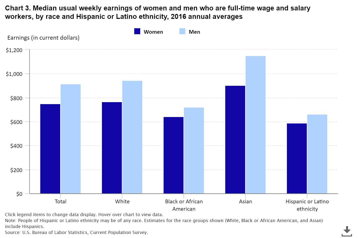
The BLS report, Highlights of women’s earning in 2017 has four charts with data about women’s earnings and occupation. The chart copied her compares men and women by race.
Asian women and men earned more than their White, Black, and Hispanic counterparts in 2017. Among women, Whites ($795) earned 88 percent as much as Asians ($903); Blacks ($657) earned 73 percent; and Hispanics ($603) earned 67 percent. Among men, these earnings differences were even larger: White men ($971) earned 80 percent as much as Asian men ($1,207); Black men ($710) earned 59 percent as much; and Hispanic men ($690), 57 percent. (See chart 3 and table 1.)
Note:
The earnings comparisons in this report are on a broad level and do not control for many factors that can be important in explaining earnings differences, such as job skills and responsibilities, work experience, and specialization.
The BLS is an excellent source for data.
How is wealth accumulated?
 The Census Bureau note, Many U.S. Households Do Not Have Biggest Contributors to Wealth: Home Equity and Retirement Accounts by Jonathan Eggleston and Donald Hays (8/27/19), highlights gaps in wealth by household type.
Wealth inequality between homeowners and renters is striking: Homeowners’ median net worth is 80 times larger than renters’ median net worth.
In 2015, 37% of households did not own a home and 47.1% of households did not have a retirement account. This gap in two key assets contributes to wealth inequality.
The chart here comes from the report linked to in the note, New Worth of Households: 2015. For the “typical” household the home accounts for almost 35% of wealth. Two other statistics from the note:
Non-Hispanic white and Asian householders had more household wealth than black and Hispanic householders. Non-Hispanic whites had a median household wealth of $139,300, compared with $12,780 for black householders and $19,990 for Hispanic householders. Asians had a median household wealth of $156,300, which is not statistically different from the estimate for non-Hispanic whites.
Higher education is associated with more wealth. Households in which the most educated member held a bachelor’s degree had a median wealth of $163,700, compared with $38,900 for households where the most educated member had a high school diploma.
The note links to Detailed Tables:2015 which provides extensive demographic information regarding wealth.
How are CEOs doing?
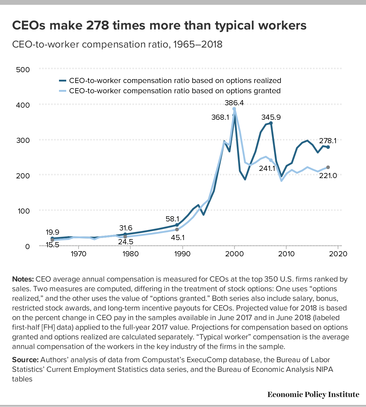 The EPI article, CEO compensation has grown 940% since 1978 by Lawrence Mishel and Julia Wolfe (8/14/2019), summarizes CEO compensation. Selected Key findings:
Using the stock-options-realized measure, we find that the average compensation for CEOs of the 350 largest U.S. firms was $17.2 million in 2018. Compensation dipped 0.5% in 2018 following a 7.6% gain in 2017.
The fact that CEO compensation has grown far faster than the pay of the top 0.1% of wage earners indicates that CEO compensation growth does not simply reflect a competitive race for skills (the “market for talent”) that also increased the value of highly paid professionals: Rather, the growing differential between CEOs and top 0.1% earners suggests the growth of substantial economic rents in CEO compensation (income not related to a corresponding growth of productivity). CEO compensation appears to reflect not greater productivity of executives but the power of CEOs to extract concessions. Consequently, if CEOs earned less or were taxed more, there would be no adverse impact on the economy’s output or on employment.
Over the last three decades, CEO compensation increased more relative to the pay of other very-high-wage earners than did the wages of college graduates relative to the wages of high school graduates. This finding indicates that the escalation of CEO pay does not simply reflect a more general rise in the returns to education.
There are six tables/graphs in the article and the data is available for download.
How much time do we spend on our phones?
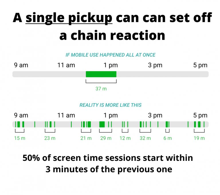 The RescueTime blog post Screen time stats 2019: Here’s how much you use your phone during the workday? by Jory MacKay (3/21/2019) provides data on phone use. Note that
Let’s start with the high-level stats. When we looked at the data of 11,000 users who actively use the RescueTime app, we found that most people, on average, spend 3 hours and 15 minutes on our phones.
So, the data comes from users of the RescueTime app and even though the sample size is large it is not a random sample. It is an interesting question if this sample of users is under users or over users of their phones. Still, the data is interesting.
And while a recent Deloitte survey found the average American checks their phone 47 times a day, our number was slightly higher. We found that, on average, users check their phones 58 times a day with 30 check-ins happening during working hours (9am–5pm).
Most people spend about 1 minute and 15 seconds on their phone each time they pick them up. This means we’re losing 37.5 minutes a day during working hours to our phones (at a minimum).
The graph copied here is a representation of what those 37.5 minutes may look like. Why does this matter?
Psychologists have found that even brief mental blocks created by shifting between tasks can cost as much as 40% of your productive time.
And when it comes to our phones especially, it’s not just the switches themselves that interrupt our day, but the expectation of being interrupted.
In fact, a recent study in the Journal of the Association for Consumer Researchfound that even the presence of a turned off smartphone lowered our cognitive performance. In other words, just having your phone around undercuts your ability to do good work.
There are more graphs in the article and plenty of quantitative information for a stats or QL course.