Rain, Rain, Go, Away. . .How wet has it been?

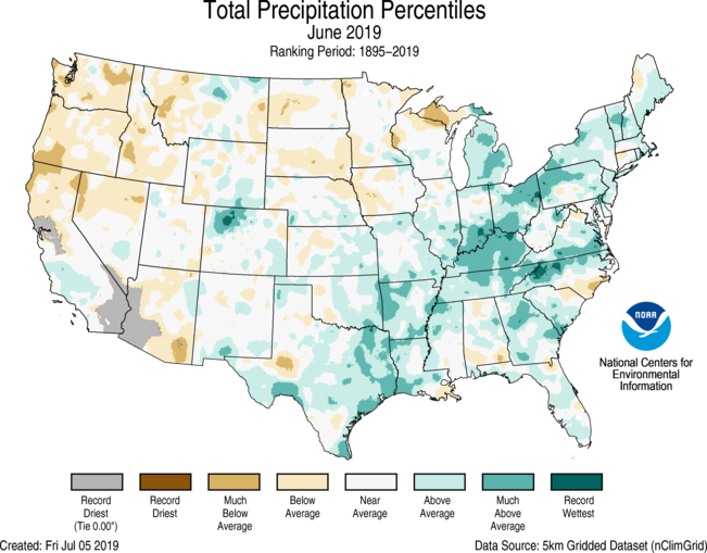
The NOAA post Assessing the U.S. Climate in June 2019 (7/9/2019) has a quick summary of precipitation. In short, the 12 month contiguous U.S. precipitation record has been broken for the last three months.

 Average precipitation across the contiguous U.S. for July 2018–June 2019 was 37.86 inches, 7.90 inches above average, and broke a record, exceeding the previous all-time 12-month period on record set at the end of May. The previous all-time 12-month record was 37.72 inches and occurred from June 2018–May 2019. Prior to that record, the all-time 12-month record was 36.31 during May 2018–April 2019. The previous July–June record was 35.11 inches and occurred from July 1982–June 1983.

Precipitation data can be obtained from the NOAA Climate at a glance page, where a csv file can be downloaded.


How much does a half a degree Celsius matter?

Human-induced warming reached approximately 1 degree Celsius (1.8 degrees Fahrenheit) above pre-industrial levels in 2017. At the present rate, global temperatures would reach 1.5 degrees Celsius (2.7 degrees Fahrenheit) around 2040. The green section of the diagram represents the range of uncertainty in how much global temperature would continue to rise before leveling off, assuming that reductions in carbon dioxide emissions were to begin immediately and reach zero by 2055. Credit: IPCC


In terms of climate change a half a degree Celsius matters a lot. NASA has a two part series A Degree of Concern: Why Global Temperatures Matter and Part 2: Selected Findings of the IPCC Special Report on Global Warming both by Alan Buis (6/19/2019). The two part series is visually well done and an excellent example of telling a story on the web (especially part I).

Higher temperature thresholds will adversely impact increasingly larger percentages of life on Earth, with significant variations by region, ecosystem and species. For some species, it literally means life or death.

“What we see isn’t good – impacts of climate change are in many cases larger in response to a half a degree (of warming) than we’d expected,” said Shindell, who was formerly a research scientist at NASA’s Goddard Institute for Space Studies in New York City. “We see faster acceleration of ice melting, greater increases in tropical storm damages, stronger effects on droughts and flooding, etc. As we calibrate our models to capture the observed responses or even simply extrapolate another half a degree, we see that it’s more important than we’d previously thought to avoid the extra warming between 1.5 and 2 degrees Celsius.”

Read both reports for details.  This two part series could be the basis for a QL course.

How has the federal minimum wage changed?

The EPI article Congress has never let the federal minimum wage erode for this long by David Cooper (6/17/19) provides the graph here.

June 16th marks the longest period in history without an increase in the federal minimum wage. The last time Congress passed an increase was in May 2007, when it legislated that the minimum wage be raised to $7.25 per hour on July 24, 2009. Since the minimum wage was first established in 1938, Congress has never let it go unchanged for so long.

To get the data for this graph visit The FRED Blog The value(s) of the minimum wage. At the bottom of the page they provide direction on how to recreate the chart with FRED data. Knowing how to do this is valuable and should be incorporated into any statistics or QL course.

Who gets injured by fireworks?

The U.S. Consumer Product Safety Commission has annual reports on fireworks. The 2018 report on the Fireworks Information Center page includes data on injuries. In 2018 64% of injuries were male. From 2003 to 2018 injury rates varied from a low of 2.8 per 100,000 to a high of 4.0 per 100,00. Some facts:

Males experienced an estimated 2.2 fireworks-related, emergency department-treated injuries per 100,000 individuals during the special study period. Females had 1.2 injuries per 100,000 people.

There is not a statistically significant trend detected in the fireworks-related injury estimates from 2003 to 2018.8.

When considering injury rates (number of injuries per 100,000 people), children and young adults had higher estimated rates of injury than the other age groups during the 2018 special study period. Children 10 to 14 years of age had the highest estimated injury rate at 5.2 per 100,000 population. This was followed by 3.1 injuries per 100,000 people from older teens 15 to 19 years of age, and 2.7 injuries per 100,000 people from children 5 to 9 years of age.

The report has a number of tables with data and the report could easily be used in a statistics or QL course.

How much is permafrost warming?

From Permafrost is warming at a global scale, Biskaborn et. el. in Nature Communications.

The Inside Climate news article Permafrost is Warming Around the World, Study Shows – That’s a Problem for Climate Change by Bob Berwyn (1/16/19) reports on the Nature Communications paper Permafrost is warming at a global scale by Boris K. Biskaborn et. el. (1/16/19). From the article:

Detailed data from a global network of permafrost test sites show that, on average, permafrost regions around the world—in the Arctic, Antarctic and the high mountains—warmed by a half degree Fahrenheit between 2007 and 2016.

The most dramatic warming was found in the Siberian Arctic, where temperatures in the deep permafrost increased by 1.6 degrees Fahrenheit.

Why does this matter? It creates a feedback loop:

By some estimates, the Arctic permafrost contains enough carbon to nearly double the amount of CO2 currently in the Earth’s atmosphere. A rapid meltdown would be disastrous because it could release a lot of CO2—in addition to methane, a powerful short-lived climate pollutant—to the atmosphere, where it would cause additional warming, said Ted Schuur, a permafrost expert at Northern Arizona University.

There are more graphs in the paper and a link to the data. The Guardian has a recent related article Scientists shocked by Arctic permafrost thawing 70 years sooner than predicted (6/18/19)

Related posts:
Melting Permafrost and a Feedback Loop
Methane Bubbles – A Feedback Loop
How are beavers creating a climate feedback loop?

How much is Europe warming?

European Environmental Agency


With Europe in the news with record heatwaves we turn to the European Environmental Agency to get a sense of changes in temperature in Europe.  The graph here from their page Heating and cooling degree days shows changes in heating degree days (HDD) and cooling degree days (CDD) weighted by population.

Figure 1 further illustrates that HDDs and CDDs did not show a clear trend in the period 1950–1980. (The declining trend for CDDs shown in Figure 1 (right panel) is highly sensitive to the choice of start year). Since the beginning of the 1980s, however, Europe has started experiencing a markedly declining overall trend in HDDs, and a markedly increasing trend in CDDs, which points to a general increase in cooling needs and a general decrease in heating needs.

Several model-based studies agree that the projected changes in temperature reduce the total energy demand in cold countries, such as Norway, whereas total energy demand increases in warm countries, such as Italy or Spain. The studies also agree that increases or decreases in total energy or electricity demand at the national level as a result of climate change alone will be below 5 % by the middle of the century [iv]. Although these changes are rather minor, adaptation needs can arise from their combination with socio-economic changes (e.g. increased availability of cooling systems) and from changes in peak energy demand.

There is an interactive version of the graph here with a table option for the data.

How do we keep track of Greenland surface melt extent?

The NSIDC has a Greenland Surface Melt Extent Interactive Chart. For the graph here we selected 2012, 2016, and 2019 (blue). There was an early peak this year on June 12, 2019. How is this data collected (from Greenland Ice Sheet Today – About the Data):

Near-real-time images are derived from gridded brightness temperatures (TBs) from the Defense Meteorological Satellite Program (DMSP) Special Sensor Microwave Imager/Sounder (SSMIS) passive microwave radiometer. The TBs are calculated for each 25 kilometer grid cell. An algorithm is applied to produce an estimate of melt or no melt present for each grid cell. The data, images, and graphs are produced daily.

The colored areas on the daily image map records those grid cells that indicate surface melt from the algorithm, as a binary determination (melt / no melt). The melt extent graph indicates what percent of the ice sheet area is mapped as having surface melt, again from the binary determination per grid cell, using the summed area of the melt grid cells divided by the total ice sheet area.

Learn more at the NSIDC Greenland Ice Sheet Today page.  The data that is used to create the graph here doesn’t appear to be easily accessible. If you are interested and email may do the trick.

A recent Guardian article, Photograph lays bare reality of melting Greenland sea ice by Alison Rourke and Fiona Harvey (6/17/19) has an excellent photo of sled dogs appearing to walk on water. The article provides some context related to Greenland and ice.

How big will the Gulf of Mexico hypoxic zone be this year?

Climate.gov reports on the prediction by NOAA for the Gulf of Mexico hypoxic zone in the artcle Wet spring linked to forecast for big Gulf of Mexico ‘dead zone’ this summer by Rebecca Lindsey (6/18/19).

Last week, NOAA issued its annual forecast, saying that the summer dead zone—an area near the sea floor where there is little or no dissolved oxygen—may be just shy of 8,000 square miles in 2019, nearly as large as the record-setting area that occurred in 2017. The ecological impacts of the Gulf dead zone spread through the economy.

The hypoxic or ‘dead’ zone:

This spring surge in runoff feeds an overgrowth of algae and other plant-like microbes (phytoplankton) that live in the coastal waters. The algae eventually die and sink to deeper layers of the Gulf, where they are decomposed by bacteria. Like human breathing, decomposition uses up oxygen. Under the right conditions, the bottom waters become severely depleted in oxygen, suffocating fish and other marine life that can’t escape.

Is this normal?

Sediment cores dug up from the ocean floor indicate that a large, yearly dead zone is not a natural phenomenon in the Gulf of Mexico. Microfossils in the sediment layers from the years 1700-1900 include species that cannot tolerate hypoxic (low oxygen) waters, which is a good sign that oxygen stress wasn’t a widespread problem before the twentieth century.

The article has other interesting maps but doesn’t provide the data in the graph. The data might be acquired with an email to LUMCON.  The original NOAA post, NOAA forecasts very large ‘dead zone’ for Gulf of Mexico (6/12/19) has links to their water monitoring stations.

Are hurricanes lingering near the coast longer?

The NASA research feature Tropical Cyclones are Stalling More by Kasha Patel (6/619) reports on hurricanes that stall for two days or more near U.S. coasts (graph copied here).

In a study published on June 3, 2019, scientists from NASA and the National Oceanic and Atmospheric Administration (NOAA) showed that North Atlantic hurricanes have been moving slower and meandering more from their average trajectory over the past seven decades. The result has been storms that stall more frequently and linger for longer periods of time near the coast, leading to more rainfall over confined locations.

A climate connection?

“There is some evidence that those large-scale wind patterns are slowing down in the tropics, where Atlantic storms usually start,” said Hall. “The storms are not being pushed as hard by the current that moves them along. That’s a climate change signal.”

One projected effect of climate change is that air masses will move more slowly around the world. As global temperatures rise, the Arctic is warming faster than the tropics—a phenomenon called Arctic amplification. As temperature differences between the tropics and high latitudes decrease over time, so will the difference in air pressure, leading to a reduction in winds.

The study linked to in the first quote has links to data and that study may be useful as classroom material.

What are the economic prospect for 2019 high school grads?

EPI has its annual report on the prospects for 2019 high school grads.  Class of 2019 High school edition by Elise Gould, Julia Wolfe, and Zane  Mokhiber (6/6/19) has 17 key findings and 11 graphs with data.  For example, their graph here (figure I) gives hourly wages in 2018 dollars for high school graduates not enrolled in further schooling.  As compared to 2000 wages for men as well as Black high school graduates are lower; all other groups have gone up. In fact, Hispanics make more than all other groups, including White graduates.

A few other highlights from the key findings:

Asian Americans/Pacific Islanders are significantly more likely to have begun on the college path at this age than any other racial/ethnic group.

Young black high school graduates are roughly twice as likely to be unemployed as their white and AAPI peers.

Average wages for young high school graduates recently surpassed their 2007 level, but remain just below their 2000 level, representing two lost decades of wage growth.

Black students (that go on to college) take on a disproportionate amount of debt, in part because their families generally accumulate less wealth than white families.

The entire report is worth reading.

Related post: What are the prospects for high school grads?