 One of the best ways to engage students in sustainability discussions is to use local information. NOAA has you covered with The Climate Explorer. You can type in your zip code and get historical and projected climate data. Today we highlight temperature. For example, the associated graph is the average annual maximum temperature for Tompkins County (home of this blog). The dark gray boxes are historical data. The blue and red lines are projections based on low and high emission scenarios. You can download the graph (just like we did here) and the data. There are numerous choices including average annual minimum temperatures, days above 95 degrees and days below 32 degrees. You can also select monthly or seasonal data. The site is phenomenal and there must be numerous courses that can take advantage of the graph and data.
The Human Impact of Climate Change – The Guna People
 This blog focuses on data, but we pause periodically to put the data into perspective. When educating about sustainability we want stories along with the data. The BBC provides such a story: The island people with a climate change escape plan. The Guna people live on small islands off Panama.
Most Guna communities live on the archipelago, and have done for centuries, after they were driven offshore by disease and venomous snakes. But now many believe that only a move back to the mainland can secure their future.
They have a plan, but completing the plan isn’t simple.
However, today work on the school and hospital has halted, as a result of a litany of contractual hiccups – and crucially, a failure to plan for adequate supplies of water and electricity. Work never began on the 300 houses.
Along with rising water there are other environmental issues.
“Coral reefs stop wave action. So when you remove the coral, even down to 3m in depth, you have no protection. This has created chaos for people,” says Dr Hector Guzman, a research scientist at the Smithsonian Tropical Institute in Panama City.
This is an excellent story with great photos. Take the time to read it.
Ocean Heat Content and Climate Change
 NOAA’s Climate Change: Ocean Heat Content page provides a summary of the role the Ocean plays in Climate Change.
Heat absorbed by the ocean is moved from one place to another, but it doesn’t disappear. The heat energy eventually re-enters the rest of the Earth system by melting ice shelves, evaporating water, or directly reheating the atmosphere. Thus, heat energy in the ocean can warm the planet for decades after it was absorbed. If the ocean absorbs more heat than it releases, its heat content increases. Knowing how much heat energy the ocean absorbs and releases is essential for understanding and modeling global climate.
The page is dated July 2015, but the interactive graph and the data, used to create the graph here, is up to date. Connected to this is NOAA’s Hurricanes form over tropical oceans, where warm water and air interact to create these storms.
Recent studies have shown a link between ocean surface temperatures and tropical storm intensity – warmer waters fuel more energetic storms.
Feeding the World
 Our World in Data’s article Yields vs. Land Use: How the Green Revolution enabled us to feed a growing population includes an excellent set of data. For example, thier data was used to produce the graph here, which includes the index relative to 1961 for land used for cereal (yellow), population (black), cereal yield (red), and cereal production (blue). Notice that as population has increased the land use for cereal production has remained flat, while cereal production has increased.
Most of our improvements in cereal production have arisen from improvements in yield. The average cereal yield has increased by 175 percent since 1961. Today, the world can produce almost three times as much cereal from a given area of land than it did in 1961. As we will explain below, this increase has been even more dramatic in particular regions.
Along with world data there is also regional data. Almost all of the data is useful for linear regression and the article itself has interactive graphs for a QL course. Note also that there is world grain data in the statistics projects section of this blog.
Who is Responsible for Unwanted Sexual Advances?
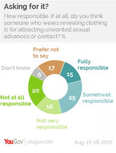 A recent YouGov article, Is anyone ever “asking for it?” Americans seem to think so, provides the pie chart to the left. According to the data, 40% of adults believe that a women wearing revealing clothing is fully or somewhat responsible for unwanted sexual advances. Along with that, another 17% prefer not to say and 6% don’t know. Maybe a better way of reporting the results is that only 36% of adults say that the person is not at all or not very responsible. There is other data in the article as well as a link to the full survey results. This data that is sure to generate a conversation in stats or QL course.
NOAA State Temperature Trend Charts
 Are you interested in historical temperature trends for your state? NOAA’s State Annual and Seasonal Time Series page has it for you. You can create graphs of annual average min and max temperatures as well as the annual mean temperature, for almost all states (Alaska and Hawaii aren’t listed) . This can be done for annual data or for each of the four seasons. The graphs are from 1805 to 2015. The graph hear is the annual mean temperature for New York State.
These charts present three color-coded time series. The gray line represents the annual (or seasonal) temperature value. The blue line shows the overall trend in a fashion that smoothes out the year-to-year variability in temperature. The light blue shaded area represents the 95% confidence interval for the trend. The smoothed temperature is constructed using a locally estimated scatterplot methodology known as LOESS.
There does not appear to be easy access to the data, but if you contact them (Contact link on the top bar) they may send it to you. Either way, the graphs include confident intervals, useful in stats, and can be used in QL courses. There is also an interactive U.S. temperature map.
How hot was July 2017?
 The headline from NASA’s Goddard Institute for Space Studies says almost all you need to know, July 2017 equaled record July 2016.
July 2017 was statistically tied with July 2016 as the warmest July in the 137 years of modern record-keeping, according to a monthly analysis of global temperatures by scientists at NASA’s Goddard Institute for Space Studies (GISS) in New York.
Last month (July) was about 0.83 degrees Celsius warmer than the mean July temperature of the 1951-1980 period. Only July 2016 showed a similarly high temperature (0.82 °C), all previous months of July were more than a tenth of a degree cooler.
But, the subtitle of NASA shocker: Last month was hottest July, and hottest month, on record says more
It’s the first time we’ve seen such a record month in the absence of an El Niño boost.
In other words, we are setting records without the help of El Niño. The map here, which you can create here, is interesting because the distribution of temperature anomalies is rather uniform (use in a stats class). You can get the data for the graph below from NOAA’s Climate at a Glance.
Climate Literacy Resource for Educators and Others
 GlobalChange.gov has a helpful resource page for educators, although it is useful for anyone who wants to learn more about global change. In particular, their 18 page (really only about 9 pages of text given the pictures) climate literacy guide will be valuable in helping educators understand key climate ideas so they are comfortable incorporating climate assignment into the classroom.
Climate Literacy: The Essential Principles of Climate Science is an interagency guide that provides a framework and essential principles for formal and informal education about climate change. It presents important information for individuals and communities to understand Earth’s climate, impacts of climate change, and approaches for adapting and mitigating change. Principles in the guide can serve as discussion starters or launching points for scientific inquiry. The guide can also serve educators who teach climate science as part of their science curricula.
The page contains links to other resources such as an energy literacy guide, a wildlife and wetlands toolkit, and climate change educational videos.
How strong is the relationship between women’s education and fertility?
 Our World in Data has an interactive graph of women’s educational attainment vs fertility, by country and colored by region, from 1950-2010. The correlation between the average years of education for women and the countries fertility rate is clear. A world bank article, Female Education and Childbearing: A Closer Look at the Data, from 2015 provides evidence that the relationship is causal.
Why does female education have a direct effect on fertility? The economic theory of fertility suggests an incentive effect: more educated women have higher opportunity costs of bearing children in terms of lost income. The household bargaining model suggests that more educated women are better able to support themselves and have more bargaining power, including on family size.
According to the ideation theory, more educated women may learn different ideas of desired family size through school, community, and exposure to global communication networks. Finally, more educated women know more about prenatal care and child health, and hence might have lower fertility because of greater confidence that their children will survive.
Of course, education isn’t the only factor contributing to fertility rates. Data is provided by Our World in Data, along with the graph. The data can be used for tests of correlation, regression, and one can compare by county and region for specific years.
Are Fish Shifting North?
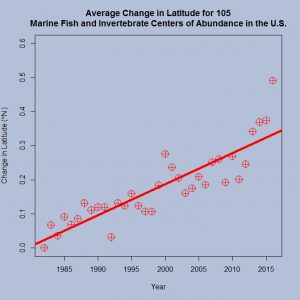
Ocean Adapt from Rutgers School of Environmental and Biological Sciences has online materials that allow you to explore changes in marine species distribution. For example, the graph here was produced from their National Data page. The graph represents the average change in latitude for 105 marine fish and invertebrate centers of abundance in the U.S. The data is particularly useful to use in a classroom because the residual plot is interesting.
The site also includes changes in depth as well as regional data where one can explore changes for specific marine species in a given region. Along with accessible data, the pages provide interactive graphs and a quick pdf guide on how to use the site.
NOTE: Sustainability Math now has a Twitter account, @SustMath, and Facebook page, Sustainability Math.