Climate Change – Impacts on People

Kivalina, an Alaskan village facing coastal erosion. Credit: ShoreZone/flickr

This blog looks to post materials that contain data in some form that can be used in classrooms whenever possible. But, we need to also recognize that climate change is already impacting people.  Climate Central’s post, Alaska Towns At Risk from Rising Seas Sound Alarm, provides us with this context.

According to the Army Corps of Engineers, 31 Alaskan communities face “imminent” existential threats from coastline erosion, flooding and other consequences of temperatures that are rising twice as quickly in the state as the global average. A handful — Kivalina, Newtok, Shishmaref and Shaktoolik — are considered in particularly perilous positions and will need to be moved.

Some of the reasons these towns need to be moved:

As the coastal buffer of sea ice retreats, towns are more vulnerable to storms and coastline erosion. Many key structures are built on permafrost, which is also melting, causing the buildings to subside or even crumple completely. And a succession of mild years — 2016 was nearly 6F warmer than the long-term average — is disrupting the patterns of wildlife in an environment where people rely upon the animals they catch for sustenance.

Climate Central’s post is worth reading. Recall our post that melting permafrost is part of a feedback loop.

What are Arctic Winter Warming Events?


From NASA’s Vital Signs of the Planet feature, Arctic winter warming events becoming more frequent, longer-lasting, we learn

Arctic winter warming events – winter days where temperatures peak above 14 degrees Fahrenheit (minus 10 degrees Celsius) – are a normal part of the climate over the ice-covered Arctic Ocean. But new research by an international team that includes NASA scientists finds these events are becoming more frequent and lasting longer than they did three decades ago.

and why does this matter?

Storms that bring warm air to the Arctic not only prevent new ice from forming, but can also break up ice cover that is already present, Graham said. He added that the snowfall from storms also insulates current ice from the cold atmosphere that returns to the Arctic after the cyclones, which can further reduce ice growth.

We know that reduced ice changes albedo, creating a feedback loop (see the Arctic Ice and Global Warming post). The NASA article is from the paper Increasing frequency and duration of Arctic winter warming events where the graph here originates (see supporting information pdf). The data is hard to track down but if you email the authors they may provide you the data used to create these graphs, especially if you mention you want to use it for a linear regression project in a class.

Graph or Video – Representations of Oklahoma (Induced?) Earthquakes

The graph here represents the number of earthquakes in Oklahoma per year. Another way to represent the same data is in the video below created by the USGS and worth a minute of your time.  You can decide which is a more powerful representation of the data. What is causing the increase of earthquakes?  Read what the USGS has to say about induced earthquakes.  From the myths and misconceptions page:

Fact 1: Fracking is NOT causing most of the induced earthquakes. Wastewater disposal is the primary cause of the recent increase in earthquakes in the central United States.

You can get earthquake data from the Earthquake Catalog. You can select regions and time periods. If you want Excel output then go to the Output Options at the bottom, although the maps are valuable too.

When Were Confederate Statues Built?

Kevin Drum’s post, The Real Story Behind All Those Confederate Statues, provides the associated chart about the timing of confederate monument and statue building.

This illustrates something that even a lot of liberals don’t always get. Most of these monuments were not erected after the Civil War. In fact, all the way to 1890 there were very few statues or monuments dedicated to Confederate leaders. Most of them were built much later.

This is an excellent example of how data and a good graphic helps tell an important story.

Yes, these monuments were put up to honor Confederate leaders. But the timing of the monument building makes it pretty clear what the real motivation was: to physically symbolize white terror against blacks. They were mostly built during times when Southern whites were engaged in vicious campaigns of subjugation against blacks, and during those campaigns the message sent by a statue of Robert E. Lee in front of a courthouse was loud and clear.

Drum’s post, worth a quick read, links to the Southern Poverty Law Center report that contains this and other data and excellent graphics for a QL course. It is worth recalling the first statement of sustainability on our Defining Sustainability Page:  The current state of people is not a morally acceptable endpoint of societal development.

CEOs Still Doing Fine

The EPI has detailed report on CEO pay, CEO pay remains high relative to the pay of typical workers and high-wage earners. The article includes data, such as the ratio of CEO-to-worker pay that was used to create the graph here. Although the ratio has decreased since its peak of 347.5 in 2007, it was still a healthy 270.5 in 2016, which is over 10 times the 20 it was in 1965.  From the report:

From 1978 to 2016, inflation-adjusted compensation, based on realized stock options, of the top CEOs increased 937 percent, a rise more than 70 percent greater than stock market growth and substantially greater than the painfully slow 11.2 percent growth in a typical worker’s annual compensation over the same period. CEO compensation, when measured using the value of stock options granted, grew more slowly from 1978 to 2016, rising 807 percent—a still-substantial increase relative to every benchmark available.

Over the last three decades, compensation, using realized stock options, for CEOs grew far faster than that of other highly paid workers, i.e., those earning more than 99.9 percent of wage earners. CEO compensation in 2015 (the latest year for data on top wage earners) was 5.33 times greater than wages of the top 0.1 percent of wage earners, a ratio 2.15 points higher than the 3.18 ratio that prevailed over the 1947–1979 period. This wage gain alone is equivalent to the wages of more than two very-high-wage earners.

As noted, the report which is worth reading, has data that can be used in the classroom and ample quantitative information for QL based classes.

Greenland Ice, Changing Albedo, and a Feedback Loop

The BBC reports: Sea Level Fears as Greenland Darkens. The article discusses a possible feedback loop where as temperatures warm algae growth may flourish, which darkens the surface and changes the albedo to increase melting.

One concern now is that rising temperatures will allow algae to flourish not only on the slopes of the narrow margins of the ice-sheet but also on the flat areas in the far larger interior where melting could happen on a much bigger scale.

We joined the latest phase of research in which scientists set up camp on the ice-sheet to gather accurate measurements of the “albedo” or the amount of solar radiation reflected by the surface.

White snow reflects up to 90% of solar radiation while dark patches of algae will only reflect about 35% or even as little as 1% in the blackest spots.

Other highlights from the article include:

Currently the Greenland ice sheet is adding up to 1mm a year to the rise in the global average level of the oceans.

It is the largest mass of ice in the northern hemisphere covering an area about seven times the size of the United Kingdom and reaching up to 3km (2 miles) in thickness.

This means that the average sea level would rise around the world by about seven metres, more than 20ft, if it all melted.

You can get Greenland Ice Data from NASA’s Vital Signs of the Planet page as noted in a past post.

How Big is the Pay Gap Between Black Women and White Men?

A recent article, Black women have to work 7 months into 2017 to be paid the same as white men in 2016, from the EPI answers this question. The article has pertinent comparisons.

Myth #2: Black women can educate themselves out of the pay gap.

The truth: Two-thirds of black women in the workforce have some postsecondary education, 29.4 percent have a bachelor’s degree or higher. Black women are paid less than white men at every level of education.

There are three tables/charts, such as the one here, with the data so it can be used in a classroom.  The EPI maintains a data that was highlighted in this blog’s post Data Spotlight: Employment and Wages by Race and Gender.

NOTE: Sustainability Math now has a Twitter account. Consider following @SustMath

No El Nino, Yet 2017 on Track to be 2nd-Hottest

Climate Central reports, At Midway Point 2017 Is 2nd-Hottest Year on Record, and notes in the first line that this is a surprise given it is not an El Nino year (graph here is by and links to NASA).

“Personally, I wasn’t expecting it to be as warm as it has been,” Ahira Sanchez-Lugo, a National Oceanic and Atmospheric Administration climate scientist, said in an email. “After the decline of the strong El Niño I was expecting the values to drop a bit and rank among the top five warmest years. This year has been extremely remarkable.”

According to NOAA we just had the second hottest June with the hottest three Junes occurring in the last three years. You can get the data for June since 1880 from NOAA here and details about June  from their Global Climate Report  – June 2017.

Life Expectancy by Health Expenditure with Comments on Differences by Race

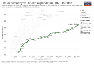
Our World in Data has an interactive graph of life expectancy by health expenditure for a number of countries, with downloadable data. The U.S. spends more money per person on health care, by far, than the other countries represented, without corresponding gains in life expectancy. At the same time, there are large differences in life expectancy by race in the U.S.  For example, the 2013 CDC National Vital Statistics Report life tables has life expectancy at birth for Non-Hispanic Black males of 71.9 years, which would be at the bottom of the chart.  Hispanic females are at the top in the U.S. with a life expectancy at birth of 84.2 years; a 12.3 year difference (data on page 3 here).  At the same time, the money spent on health care is also not likely to be equally distributed. The CDC is a source of life expectancy data and if you ask them they might have excel files. For an example of using life expectancy data, here is a 2012 paper Period Life Tables: A Resource for Quantitative Literacy published in Numeracy and freely available.

Where Do Carbon Emissions Go?

Where do carbon emissions go seems like an obvious question. Into the air of course. If so, then one would expect a near perfect linear relationship between emissions and atmospheric CO2.  The graph here has yearly carbon emissions in million tonnes per year (as reported by the Global Carbon Project)  vs atmospheric CO2 in ppm from Mauna Loa (see data in the calculus project page).  The graph may not be as linear as expected and, while maybe some of it is explained by issues of mixing in the atmosphere or the need for a lag, part of the answer is based on where the carbon goes after it has been emitted.  A recent NYT article, Carbon in the Atmosphere is Rising – Even as Emissions Stabilize, sheds some light on the issue:

Scientists have spent decades measuring what was happening to all of the carbon dioxide that was produced when people burned coal, oil and natural gas. They established that less than half of the gas was remaining in the atmosphere and warming the planet. The rest was being absorbed by the ocean and the land surface, in roughly equal amounts.

In essence, these natural sponges were doing humanity a huge service by disposing of much of its gaseous waste. But as emissions have risen higher and higher, it has been unclear how much longer the natural sponges will be able to keep up.

In fact, much of the carbon is absorbed in the ocean and land surface, and that will add variability to the relationship. The Global Carbon Project has this data available and it can be used by teachers. Go to their page and click on the global budget link for the data, which includes ocean and land sinks of carbon.  If you want the data that created the graph on this page go here.