Using The Materials
NOTE: Under Probability and Statistics, you can find more animation on my Briefed by Data website.
There are already various applets available for demonstrating mathematical ideas, so it is fair to ask, why more? First, it is now not hard to come across an animation of data in the media, which is often difficult to follow without some experience. These animations have been created with this in mind to provide students with experience reading quantitative information. Hopefully, these help with quantitative literacy. Second, the animations each have two versions. There is an HTML version that allows the user to control the animation with start, stop, forward, backward, and speed controls. This has the advantage of using the animations as an exercise, allowing assignments such as explaining or calculating something on a particular frame (there are frame numbers on the animations), as well as, comparing frames. The gif version has the advantage of portability, so, for example, they can be placed in PowerPoint slides. On the downside, they don't have the controls of the HTML version. Overall, these animations are created with the idea of being part of a lesson plan or homework assignment and less as a stand-alone means to learn material. Comments and suggestions are welcome.
NOTE: When you click on an HTML animation, it will be stopped. You will need to either click play or advance slide by slide with the arrows.
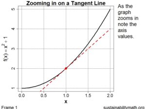
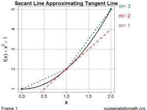
Calculus 1 Animations
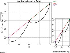
No Derivative
Statistics Animations
Increase Mean Increase Tail Probability
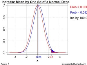 HTML or GIF
- This animation demonstrates how the tail probability increases drastically with a shift of the mean. A real world application of this is an increase in global mean temperature greatly increases the chances of "extreme" temperatures. For example, see this post from Yale Climate Change.
Increase Sd Increase Tail Probability
- HTML
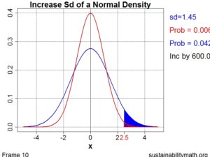 or GIF
 - This animation demonstrates how the tail probability increases drastically with an increase of the standard deviation. A real world application of this is an increase in global temperature variability greatly increases the chances of "extreme" temperatures. See Climate Communication and a more scientific article in Nature on increased variability in precipitation.
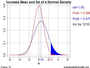
Increase Mean/Sd Increase Tail Prob
- HTML
 or GIF
 - The animation explores the increase in the tail probability if both the mean and the standard deviation are increased. In climate change we are seeing both an increase in the average temperature as well as the variation. See this post from Climate Communications.
 HTML1
HTML1
 HTML1
HTML1 HTML1
HTML1 HTML1
HTML1 HTML1
HTML1 HTML
HTML HTML0
HTML0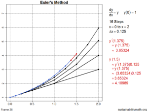 HTML1
HTML1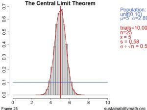
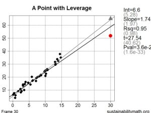 HTML
HTML