New York State School Year 2017-2018
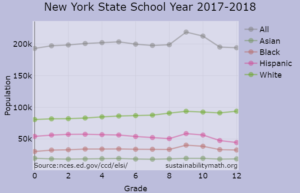 Data from the National Center for Education Statistics Elementary/Secondary Information System (ELSi). Note that this is population by grade for the 2017-2018 school year. Click on the graph for an interactive chart. The hover information includes percentages. Clicking on the legend elements hides the corresponding graph element.
CT, MA, NJ, PA School Year 2017-2018
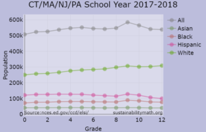 Data from the National Center for Education Statistics Elementary/Secondary Information System (ELSi). The population is the sum of CT, MA, NJ, & PA by grade for the 2017-2018 school year. Click on the graph for an interactive chart. The hover information includes percentages. Clicking on the legend elements hides the corresponding graph element.
Population by Age and Race in 2018
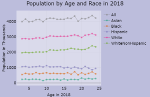 Data from the Census Bureau page School Enrollment in the United States: October 2018 - Detailed Tables. The data is collected from the excel files in Table 2. Note that this is population by age in October 2018. Click on the graph for an interactive chart. Clicking on the legend elements hides the corresponding graph element.
Arctic Sea Ice Extent
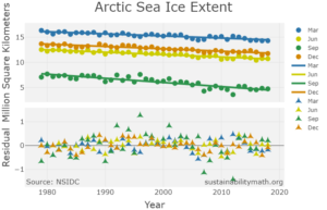 Data from NSIDC and available in Statistics Projects. The graph provides Arctic Sea Ice Extent for March (peak month), June, September (low month) and December, along with regression lines and residual plots. Click on the graph for an interactive chart. Clicking on the legend elements hides the corresponding graph element.
Median Wages by Race and Gender
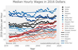 Data from EPI and available in Statistics Projects. Click on the graph for an interactive chart. Clicking on the legend elements hides the corresponding graph element.
Mean Wages by Race and Gender
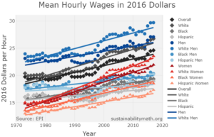 Data from EPI and available in Statistics Projects. Click on the graph for an interactive chart. Clicking on the legend elements hides the corresponding graph element.
Life Expectancy by Race and Gender
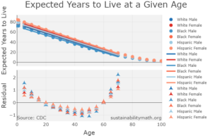 Data from the CDC (2015 data from 2018 report). Click on the graph for an interactive chart. Clicking on the legend elements hides the corresponding graph element. Consider compare data on hover as points are close to each other and hard to isolate. Regression lines are from age 5 to 70. Questions: What does the slope of the line mean in this context? Is there anything interesting in the residual plots? Related paper: Period Life Tables: A Resource for Quantitative Literacy by Pfaff and Seltzer.
Life Expectancy for Females and Males
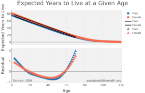 Data from the SSA (2015 data). Click on the graph for an interactive chart. Clicking on the legend elements hides the corresponding graph element. Consider using compare data on hover as points are close to each other and hard to isolate. Regression lines are from age 3 to 70. Questions: What does the slope of the line mean in this context? Is there anything interesting in the residual plots? Related paper: Period Life Tables: A Resource for Quantitative Literacy by Pfaff and Seltzer.