Arctic Ice Data
- Data: Excel File or CSV File (4/2023)
- R Script
- Project: The file contains average Arctic Ice Extent from 1979 to present by month. It is excellent data for linear regression assignments.
- Skills: Linear regression with meaningful residual plots.
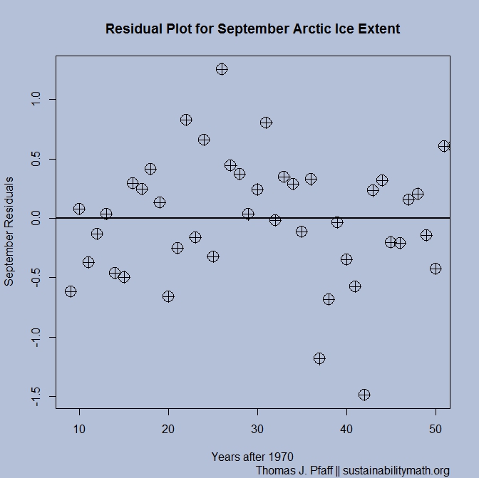
- Notes: March (winter peak month) and September (summer low month) are particularly interesting. The 95% confidence intervals for slopes nearly separate and may depending on the impact of the latest update. The residual plot for March suggests a line is acceptable but the plot for September suggest curvature (see graph). The difference is at least partly explained by a positive feedback loop due to changing albedo (fraction of solar energy reflected back into space).
- Learn more about albedo feedback loops at Windows to the Universe.
- Learn more about arctic ice at the National Snow and Ice Data Center.
Global Temperature Anomalies
- Data: Excel File or CSV File (4/2023)
- Project: Word
- R script
- Skills: Linear regression including (optional) confidence intervals for slopes.
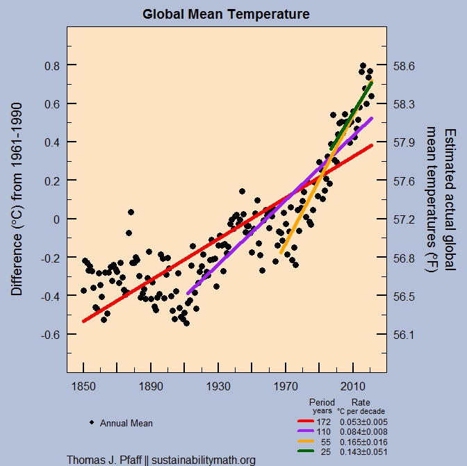
- Notes: This regression exercise is designed to either reproduce the IPCC graphic from 2007 here, which uses data from 1850-2000, or to update the graph with data through 2021 which is available in the excel file and seen in the graph here.
- Learn more about the impacts of climate change: IPCC 6th assessment report and the EPA Climate change page.
U.S. Oil Production
 Data: Excel File or CSV File (4/2023)
- Project: Word
- R script
- Skills: Interpreting Normal Curves
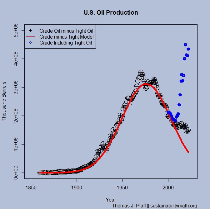
- Notes: Overall U.S. oil production doesn't fit a normal model, but this is largely due to the substantial increase in tight oil production. The excel file contains U.S. crude oil production and tight oil production since 2000. The normal model is fit to crude oil less tight oil data using solver in Excel. The Excel sheet itself is interesting as it is set up to fit the data knowing only what Hubbert knew (I think) as well as all the current data. One can change the total oil extracted value to see how the peak and fit doesn't change much. Of course, R can be used to do this but this project originated from a Math Horizons paper. If you are looking to challenge students a bit then have them do the normal model with R and compare to Excel. The R file has a hint for how to do this.
- Learn more about peak oil: See world oil production.
- Learn more about tight oil: Union of Concerned Scientist
Lead and Crime
- Data: Excel File or CSV File (historic data - no data updates)
- R Script
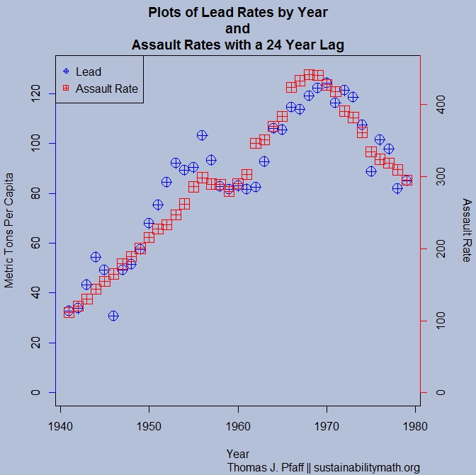
- Project: The file contains historic lead consumption from gasoline and crime rates for violent crimes, assault, rape, and robbery. It also includes unemployment rates. The data is excellent for linear regression with lags (noted in the file) as well as multiple regression (use lead and unemployment to predict crime).
- Notes: There is evidence of a linear correlation between lead and crime with a lag. There are plausible explanations for causation. See a summary by Kevin Drum Lead: America's Real Criminal Element
- Learn more about Lead and Crime: Rick Nevin (has peer reviewed publications on lead crime), Kevin Drum Race, Lead, and Juvenile Crime and Lead Crime Links. An updated lead-crime roundup for 2018 by Kevin Drum.
World Oil Production
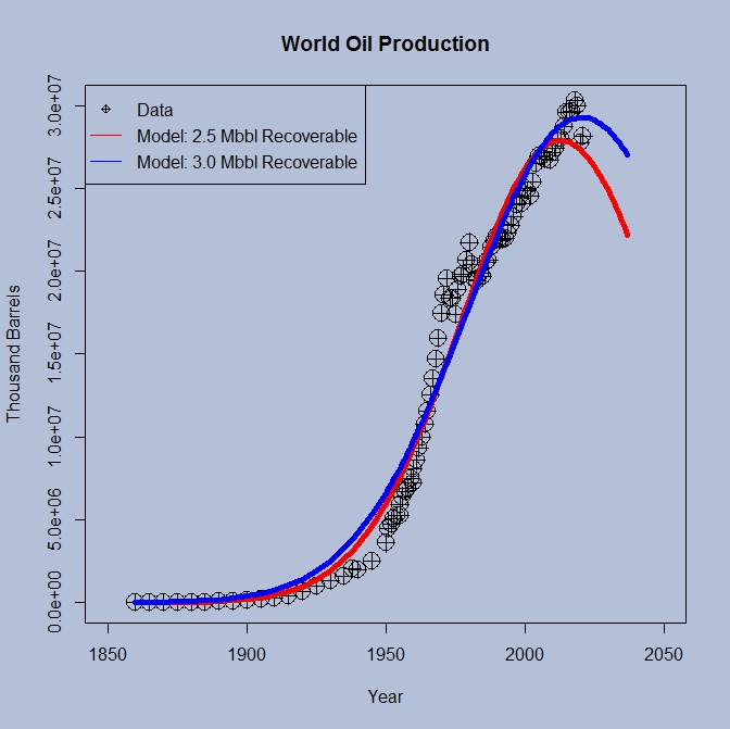
- Data: Excel File or CSV File (4/2023)
- Project: Word
- R Script
- Skills: Interpreting Normal Curves
- Notes: The excel file has the data and is set up to use solver to fit the normal curve. Of course, R can be used to do this but this project originated from a Math Horizons paper. If you are looking to challenge students a bit then have them do the normal model with R and compare to Excel. The R file has a hint for how to do this.
- Learn more about peak oil: What Hubbert Got Really Wrong About Oil in Forbes, ASPO, Hubbert Peak Theory from Wikipedia.
Mean vs Distribution, A Cold February in DC, and a Senator

- Project: Word
- Skills: Understanding the difference between a mean and a distribution.
- Sustainability Goals: Understanding that as the planet warms on average one can still have a location with below average temperatures.
- The graph here is from NASA Global Maps . You can create maps showing average surface temperature for different time periods up to the past month or two.
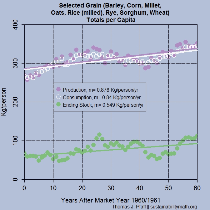
World Grain
- Data: Excel File or CSV File (4/2023)
- R Script
- Project Ideas: Which of the grains production and consumption time series are linear? Of those that are linear rank the fits. How closely do the rates of change of production and consumption for each grain match? Which grain has the fastest change in production and which for consumption? From 2020 to 2050, world population is expected to increase from about 7.8 billion to 9.7 billion, a 24% increase in population. Which grains are on target to increase in production by 24% by 2050?
- Skills: Linear regression.
- Notes: The data contains grain (barley, corn, millet, oats, rice, rye, sorghum, & wheat) production, consumption, and ending stocks, as well as totals and by per capita. Most of the production and consumption data is linear.
- Learn more about food: FAO news/blog.
Hourly Wage by Race and Gender
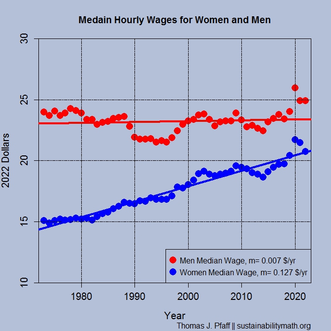
- Data: Excel File or CSV File (4/2023)
- R Script
- Project: The excel file contains a number of data sets suitable for linear regression. It contains median and mean hourly wages (in 2022 dollars) with categories of men and women by White, Black, and Hispanic.
- Skills: Linear regression.
- Notes: Data from EPI.
- Context: The EPI data does not include Asians. Asian women earn more than white males, BLS. The gender pay gap is complex here is one overview from the University of Minnesota: What Causes the Wage Gap? Age also matters and this Pew article notes that there are cities were women make more then men.