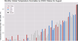
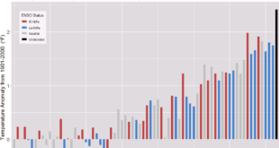
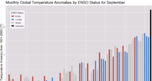
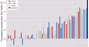
Currently, 2022 is the record minimum for Antarctic sea ice extent, but based on the graph here from the Charctic Interactive Sea Ice Graph from NSIDC 2023 seems primed to beat that record. The Charctic interactive Sea Ice Graph is a fun tool that lets users select years to graph. …
Read More »What are the IPCC sea level projections?
In a follow up to the last post, How much has sea level risen locally? (12/1/2022), we have the IPCC Sea Level Projection Tool. The NOAA sea level trends tool looks at the historic data and adds linear regression lines. The IPCC tool has projections based on the different IPCC …
Read More »How much has sea level risen locally?
If you’d like local trends of sea level rise then check out NOAA’s Sea Level Trends page. The sea level trends measured by tide gauges that are presented here are local relative sea level (RSL) trends as opposed to the global sea level trend. Tide gauge measurements are made with …
Read More »Does ENSO impact global temperature?
If you pay attention to my monthly global temperature updates you might get the impression that global warming has slowed or even stopped. One key variable here is the ENSO (El Niño – Southern Oscillation). The graph here is from NOAA’s Monthly Temperature Anomalies Versus El Niño | September 2022 …
Read More »What is Climate Mapping for Resilience and Adaptation?
From CMRA: Climate Mapping for Resilience and Adaptation (CMRA) integrates information from across the federal government to help people consider their local exposure to climate-related hazards. People working in community organizations or for local, Tribal, state, or Federal governments can use the site to help them develop equitable climate resilience …
Read More »How hot was Aug 2022?
From NOAA’s August 20022 Global Climate Report: The August 2022 global surface temperature departure was the sixth highest for August in the 143-year record at 0.90°C (1.62°F) above the 20th century average of 15.6°C (60.1°F). The ten warmest Augusts on record have all occurred since 2009. August 2022 also marked …
Read More »Where is the CO2 data?
Back to more serious data stuff today. Now, you may have been wondering where to get a visualization and the data for CO2 measurements collected on Mahe Island, Seychelles. All you have to do is start on NOAA’s Global Monitoring Laboratory where you will find a map with a bunch …
Read More »How hot was July 2022?
From NOAA’s July 2022 Global Climate Report: The July 2022 global surface temperature departure was the sixth highest for July in the 143-year record at 0.87°C (1.57°F) above the 20th century average of 15.8°C (60.4°F). The five warmest Julys on record have all occurred since 2016. July 2022 also marked …
Read More »Is the U.S. the number 1 carbon emitter per person?
To answer the question Berkeley Earth has an interactive, What is your country’s carbon trend?, where you select a country and you get a table of information and a graph, such as the one copied here. The table of information provides such facts as the U.S. emits 14.2 tonnes per …
Read More »How much has your country warmed?
The Berkeley Earth page Actionable Climate Science for Policymakers has a Country-Level Warming Projections interactive graphic. Select a country and a graph, such as the one here for the U.S. appears. Click on the button below the graph, View More Details, and you will get extra text information and links …
Read More »