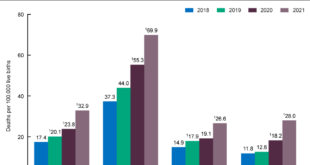
The PNAS paper Life expectancy in adulthood is falling for those without a BA degree, but as educational gaps have widened, racial gaps have narrowed by Anne Case and Angus Deaton (3/16/2021) provides an answer. From the abstract: We construct a time series, from 1990 to 2018, of a summary …
Read More »What is the connection between crime and lead?
Kevin Drum asks a good question in his post How Many Cops Does New York City Need? First note that violent crime has been dropping since around 1990 (see his graph copied here for examples). In particular for NYC: The per capita number of police officers increased by about 10 …
Read More »How does C-19 deaths compare to other causes of deaths in the U.S.?
Here is an excellent animated visualization of daily deaths of C-19 as compared to other leading causes of deaths in the U.S. This chart stops at April 14. According to Worldometers here are the number of daily deaths from April 15 through April 22: 2618, 2176, 2538, 1867, 1561, 1939, …
Read More »C-19, counts or per capita?
The media tends to focus on the number C-19 deaths in a country, but per capita provides a better understanding of the impact in a country. The Our World in Data page Coronavirus Disease (COVID-19) – Statistics and Research page has interactive graphs for per capita deaths. For example, currently …
Read More »Who posts C-19 data?
If you are looking for COVID-19 data there are two good resources. The first is the Our World in Data Cornonavirus page by Max Roser, Hannah Ritchie, and Esteban Ortiz-Ospina. They have a number of interactive graphs, such as the one copied here where you can select countries to view, …
Read More »What does it mean to “flatten the curve”?
The New York Times article How Much Worse the Coronavirus Could Get, in Charts by Nicholas Kristof and Stuart A. Thompson (3/13/2020) has a great interactive set of graphs that illustrate the importance of flattening the curve. The graphs start with the one copied here. What’s at stake in this …
Read More »How has child mortality changed?
The article in Nature, Mapping 123 million neonatal, infant, and child deaths between 2000 and 2017, by Burstein et. el (10/16/2019), provides a detailed analysis of under 5 child mortality (U5mr). The goal of mortality-reduction efforts is ultimately to prevent premature deaths, and not just to reduce mortality rates. Across …
Read More »What has improved (and not) between rich and poor countries?
The St. Louis Fed post, Healthier Countries, if Not Wealthier Countries by Guillaume Vandenbroucke (12/26/2019) notes The income gap between rich and poor countries doesn’t seem to be closing. In fact, it seems to be getting wider. However, the gaps between these groups of countries when it comes to health …
Read More »How is U.S. life expectancy changing?
The Economist’s daily chart Why are Americans’ lives getting shorter? (11/27/19) provides the graphic copied here. After climbing gradually over the past half century, life expectancy in America reached a plateau in 2010 and then fell for three consecutive years from 2015 to 2017, the latest for which data are …
Read More »What is the leading cause of child mortality?
The article by Our World in Data, Pneumonia – no child should die from a disease we can prevent, by Bernadeta Dadonaite (11/12/19) reports: Every 39 seconds a child dies from pneumonia. 5.4 million children under five years old died in 2017. Pneumonia was the cause of death of one-in-seven …
Read More »