Tag Archives: Education

What percent of college students are Hispanic?

The Census Bureau article Gains in Educational Attainment, Enrollment in All Hispanic Groups, Largest Among South American Population by Erik L. Hernandez and Kevin McElrath (5/10/2023) notes

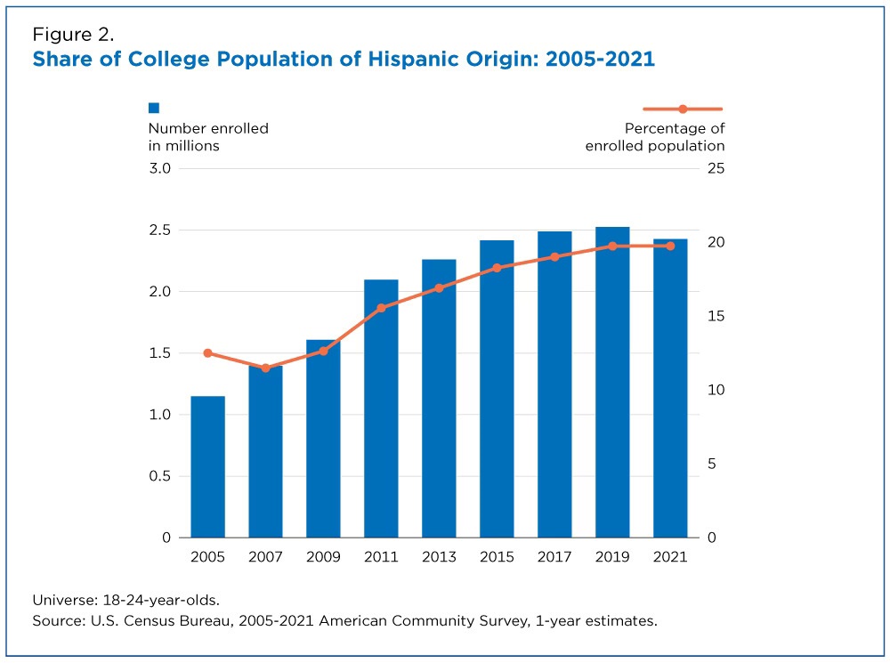
The number of Hispanic people ages 18 to 24 enrolled in college increased to 2.4 million in 2021, up from 1.2 million in 2005.

The share of all college students ages 18 to 24 who were Hispanic grew, too. The lowest share during the period (11.4%) was in 2006; by 2021 it had swelled to nearly 20%.

The article notes that in 2021 Hispanics made up 18.7% of the U.S. population, represented by the orange line in the graph. Does this mean that Hispanics are proportionally represented in college? Not necessarily so I’ll leave this as a research project. Hint: Proportions by age matter here.

There are three other graphs and reference to the data in the article.


What are the enrolled/employment trends of young adults?

The graph here is from the EPI article Class of 2023: Young adults are graduating into a strong labor market by Elise Gould, Jori Kandra, and Katehrine deCourcy (5/3/2023). They note:

Over the last 40 years, employment among young people has declined by about 7 percentage points while enrollment in school has increased by about 13 percentage points, as shown in Figure B.

These are true statements but do they accurately reflect the trends? Not really, but they clarify this a paragraph later:

Between 1986 and 2012, young people increased their enrollment in high school, college, or university by 19 percentage points from 36% to 55%. Enrollment softened a bit in 2013, then mostly held steady, softening slightly again in the pandemic. As of March 2023, 51.8% of young adults are enrolled in school.

The article is worth reading and there are three other graphs. All the graph have a data link.


What’s new from Tom?

This post is a bit of shameless self promotion, but since many of you that read this are in higher ed I thought you’d appreciate my post, Campuses Need Collaborative Decision-making More than Shared Governance, on the AAUP Academe blog. Feel free to click the link, leave a comment, and share with friends.  A highlight:

In “Exactly what is ‘Shared Governance’” Gary Olson offers, “The key to genuine shared governance is broad and unending communication. When various groups of people are kept in the loop and understand what developments are occurring within the university, and when they are invited to participate as true partners, the institution prospers.” I argue further that this is more than shared governance and that there are four key hierarchical leadership aspects that are needed to ensure this collaborative partnership: shared governance, transparency, openness, and collaboration.

Back to data and graphs on Thursday.


What is the relationship between COVID-19 deaths, education, and race/ethnicity?

The working paper, from the Harvard Center for Population and Development Studies, Intersectional inequalities in COVID-19 mortality by race/ethnicity and education in the United States, Jan 1, 2020-Jan 31, 2021 by J.T. Chen, et. el. (2/23/2021) contains the graph copied here.

It is interesting to note that within educational categories, Hispanic mortality rates were consistently lower than rates among Non-Hispanic Whites. This suggests that the overall increased mortality rates experienced by Hispanics is driven in large part by their overrepresentation in more disadvantaged education groups. Similarly, for the non-Hispanic Black population, their equivalent mortality rates to Non-Hispanic Whites in the two lowest educational strata, and their only slightly elevated risk in the higher educational strata suggests that it is the inequities in educational distribution that drive the overall higher crude rates among the non-Hispanic Black vs non-Hispanic White populations.

This provides evidence that COVID-19 deaths are connected to education more so than race/ethnicity. This, of course, isn’t causation, as education level is likely a marker for risk factors of COVID-19 such as health habits and employment.

This paper also supplies a nice example of Simpson’s paradox. Graph 1b provides mortality rates per 100,000 by race/ethnicity (157  Non-Hispanic White, 199 Non-Hispanic-Black, 171 Hispanic). By education category the Hispanic population had lower death rates than Non-Hispanic White, but in the aggregate it is the other way around.

What is the relationship between rates of suspension by race and free and reduced lunch?

Propublica’s article, Miseducation – Is There Racial Inequality at Your School? by  Lena V. Groeger, Annie Waldman and David Eads, (10/16/18), provides data by state on the percent of nonwhite students, the percent of students who get free/reduced-price lunch, high school graduation rate, the number of times White students are likely to be in an AP class as compared to Black students, and the number of times Black students are likely to be suspended as compared to White students. The comparison is also available for Hispanic students.

The graph here was created with their data and compares the percent of students on free and reduced lunch with the number of times Black students are likely to be suspended  compared to White students (state data isn’t available for HI, ID, MT, NH, NM, OR, UT, or WY).  The red lines uses all the data where as the blue line removes the outliers of DC and ND. The blue regression line has a p-value of 0.012 and R-squared of 0.15.  This suggests that wealthier states, as measured by free and reduced lunch programs, have a greater disparity is suspensions between black and white students. The impact of outliers is instructive here and there are other scatter plots worth graphing from the article. There are also statistics projects waiting to be created with this data.

The article also has an interactive map or racial disparities by districts, but the map can be misleading based on missing data from districts. Can you see how?  This makes the map itself useful for QL courses.  R Script that created this graph. Companion csv file.

Who misses school the most?

The EPI article,  Student absenteeism – Who misses school and how missing school matters for performance by Emma García and Elaine Weiss (9/25/18) provides a detailed account of absenteeism based on race and gender.  For example, their chart here is the percent of students that missed three or more days in the month prior to the 2015 NAEP mathematics assessment. There are noticeable differences. For instance, the percentage of Black, White, and Asian (non ELL) that missed three or more days in the month is 23%, 18.3%, and 8.8% respectively.

Why does this matter?

In general, the more frequently children missed school, the worse their performance. Relative to students who didn’t miss any school, those who missed some school (1–2 school days) accrued, on average, an educationally small, though statistically significant, disadvantage of about 0.10 standard deviations (SD) in math scores (Figure D and Appendix Table 1, first row). Students who missed more school experienced much larger declines in performance. Those who missed 3–4 days or 5–10 days scored, respectively, 0.29 and 0.39 standard deviations below students who missed no school. As expected, the harm to performance was much greater for students who were absent half or more of the month. Students who missed more than 10 days of school scored nearly two-thirds (0.64) of a standard deviation below students who did not miss any school. All of the gaps are statistically significant, and together they identify a structural source of academic disadvantage.

These results “… identify the distinct association between absenteeism and performance, net of other factors that are known to influence performance?”  The article has 12 graphs or charts, with data available for each, including one that reports p-values.

How much do countries spend on education?

The answer to the question depends on how it is measured.  The post  in statista, The Countries Spending the Most on Education by Martin Armstrong (9/12/2018) reports spending as a share of gross domestic product for primary, second and post-secondary non-tertiary education as well as tertiary education.  By this measure Norway spends the most. But, if the measure used is expenditure per student as a share of GDP per capita, the high spender is (south) Korea (Norway is fifth). Our graph here is a scatter plot of the two measures by country.

The data is from OECD.Stat. Go to Education and Training, Education at a Glance, Financial resources invested in education, Education finance indicators, and finally Expenditure per student as share of GDP per capita.  Under indicator at the top of the spreadsheet the measure can be changed.  Definitions of measures can be found in the OECD Handbook for Internationally Comparative Education Statistics (page 99).

Download the csv file and R-script used here.