Tag Archives: food

Have we passed peak agricultural land?

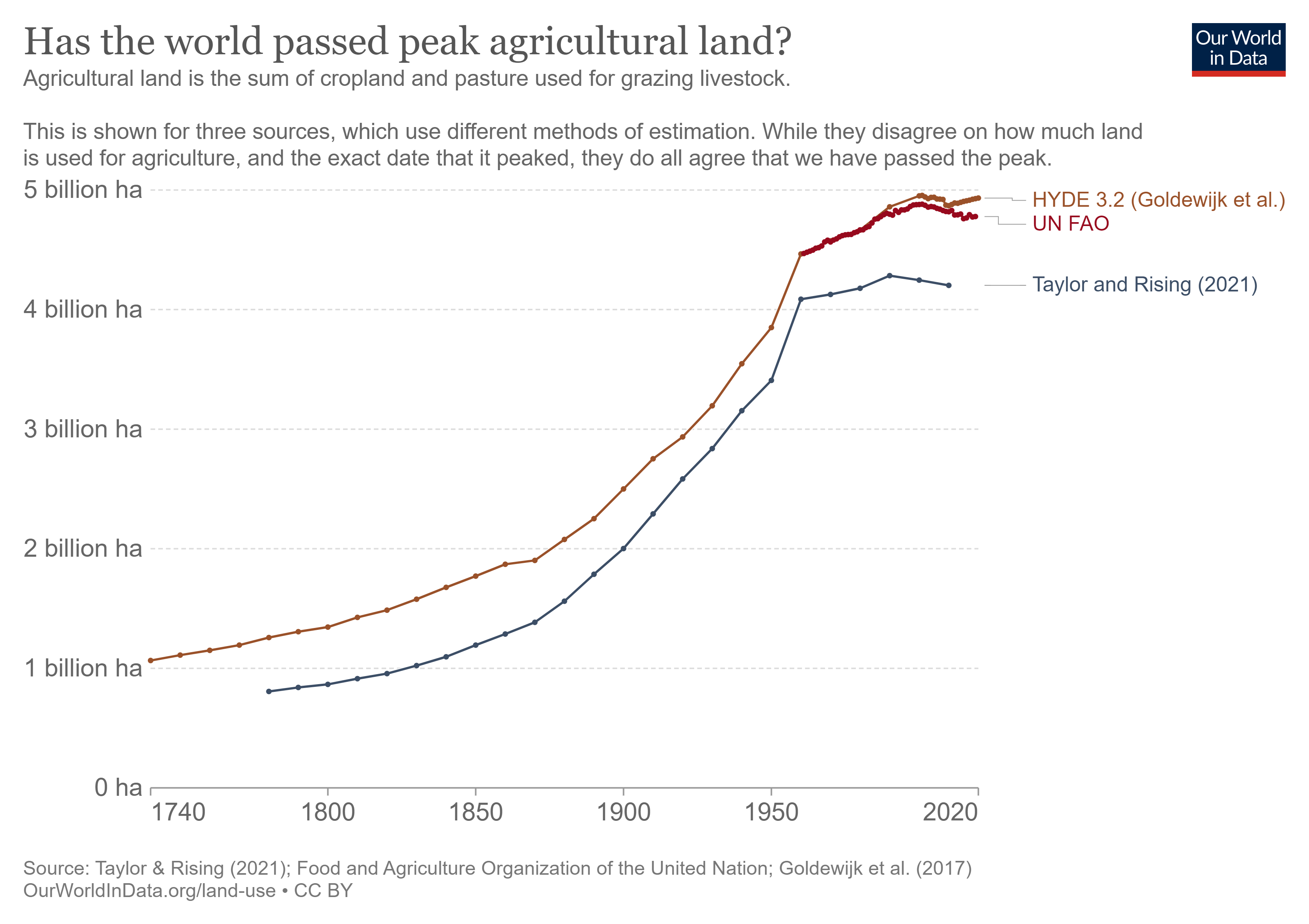
The chart here is from the Our World in Data article After millennia of agricultural expansion, the world has passed ‘peak agricultural land’ by Hannah Ritchie (5/30/2022).  Interestingly

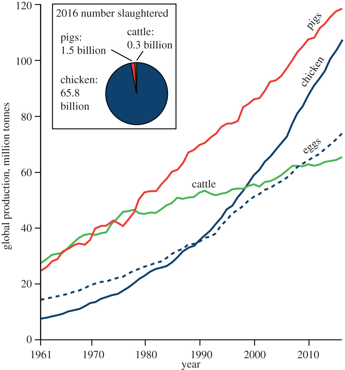
Despite this reduction in agricultural land, the world has continued to produce more food. This is true of both crops and livestock.

We see this decoupling in the chart that presents the UN FAO’s data. It shows that global agricultural land – the green line – has peaked while agricultural production – the brown line – has continued to increase strongly, even after this peak.

When we break each agricultural component out individually, or look at it in physical rather than monetary units, we find the same trend: a continued increase in output. You can explore this data for any crop or animal product in our Global Food Explorer.

We should note:

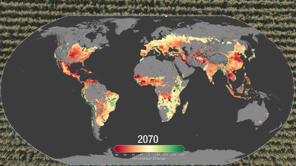
The third, as I mentioned earlier, is that global croplands are still expanding. We see this in the chart. Other sources suggest that this rate of increase might be even faster. The World Resources Institute looks at this research in more detail here.

The article has three graphs and the data for each can be downloaded.


When and how will climate change impact crops?

The NASA article Global Climate Change Impact on Crops Expected Within 10 Years, NASA Study Finds by Ellen Gray (11/2/2021) provides an answer:

Climate change may affect the production of maize (corn) and wheat as early as 2030 under a high greenhouse gas emissions scenario, according to a new NASA study published in the journal, Nature Food. Maize crop yields are projected to decline 24%, while wheat could potentially see growth of about 17%.

What is one mechanism for the decline?

Higher temperatures also affect the length of growing seasons and accelerate crop maturity.

“You can think of plants as collecting sunlight over the course of the growing season,” said Ruane. “They’re collecting that energy and then putting it into the plant and the grain. So, if you rush through your growth stages, by the end of the season, you just haven’t collected as much energy.” As a result, the plant produces less total grain than it would with a longer development period. “By growing faster, your yield actually goes down.”

The article includes a nice 2 minute video. For grain harvest data see the World Grain tile on the Statistics Projects page.

What have we done to the broiler chicken?

The Royal Society research article, The broiler chicken as a signal of human reconfigured biosphere by Carys E. Bennett et. el. (12/12/18) , provides the evidence of how human intervention has changed a species.

Breeding by natural selection has been modified by human-directed selection. While the size of the domesticated chicken in historical times was little different to the red jungle fowl (figure 3), domestic chicken bone morphology shows that selective breeding practices took place as early as the sixteenth century [53,54]. Chickens from the late twentieth century are markedly different in terms of size (figures 3 and 4), growth rate (figure 5) and body shape. The change in body mass and body shape has been visually documented by photographs of broiler breeds throughout ontogeny from 1957, 1978 and 2005 [14]. Broilers from a 1957 breed are between one-fourth and one-fifth of the body weight of broilers from a twenty-first century breed [13,14]. The modern broiler is a distinctive new morphotype with a relatively wide body shape, a low centre of gravity [13] and multiple osteo-pathologies. If left to live to maturity, broilers are unlikely to survive. In one study, increasing their slaughter age from five weeks to nine weeks resulted in a sevenfold increase in mortality rate [55]: the rapid growth of leg and breast muscle tissue leads to a relative decrease in the size of other organs such as the heart and lungs, which restricts their function and thus longevity [56]. Changes in the centre of gravity of the body, reduced pelvic limb muscle mass and increased pectoral muscle mass cause poor locomotion and frequent lameness [15]. Unlike most other neobiota, this new broiler morphotype is shaped by, and unable to live without, intensive human intervention.

The article includes a number of interesting charts including the one copied here and in reference to the figure they refer to a derivative:

Chicken-meat consumption is growing faster than any other meat type and is soon to outpace pork

Data used in the paper is available under Supplemental Material (left side bar).

How are climatic zones changing?

The Yale Environment 360 article Redrawing the Map: How the World’s Climate Zones Are Shifting  by Nicola Jones (10/23/18)  provides animated maps, such as the one below, and quantitative statements about changing ecology including rates (great for a calculus class):

Lauren Parker and John Abatzoglou of the University of Idaho tracked what would happen to hardiness zones from 2041 to 2070 under future global warming scenarios, and found the lines will continue to march northward at a “climate velocity” of 13.3 miles per decade.

One study in northern Canada found that the permafrost around James Bay had retreated 80 miles north over 50 years. Studies of ground temperatures in boreholes have also revealed frightening rates of change, says Schafer. “What we’re seeing is 20 meters down, it’s increasing as high as 1-2 degrees C per decade,” he says. “In the permafrost world that’s a really rapid change. Extremely rapid.”

North America is seeing the opposite phenomenon: Its arable land is romping northward, expanding the wheat belt into higher and higher latitudes. Scientists project it could go from about 55 degrees north today to as much as 65 degrees North — the latitude of Fairbanks, Alaska — by 2050. That’s about 160 miles per decade.

The article includes potential ramifications of these changes along with other quantitative information.

Graphic: Hardiness zones in the U.S., which track average low temperatures in winter, have all shifted northward by half a zone warmer since 1990. SOURCE: UNITED STATES DEPARTMENT OF AGRICULTURE. GRAPHIC BY KATIE PEEK.

What is the state of food security and nutrition in the world?

Read the FAO report How close are we to #ZeroHunger? The state of food security and nutrition in the world (2017) .  The online report has numerous chart that can be downloaded, such as the one here.

After steadily declining for over a decade, global hunger appears to be on the rise, affecting 11 percent of the global population.

In addition to an increase in the proportion of the world’s population that suffers from chronic hunger (prevalence of undernourishment), the number of undernourished people on the planet has also increased to 815 million, up from 777 million in 2015.

The report provides information on stunting, wasting, overweight children and adults, anemia, and breastfeeding. The data isn’t directly available on the web page, but some of it can be found in the full report.

How much land would the world need if everyone ate like the U.S.?

Our World in Data has the answer in their post, 50% of the world’s habitable land is used for agriculture. If we all ate like New Zealanders we would need 200% of habitable land, which is supplied in the chart. Simply put, the world all can’t eat like the U.S. The world can’t eat like the countries colored in orange but can with those colored in green. Why?

Livestock takes up nearly 80% of global agricultural land, yet produces less than 20% of the world’s supply of calories. This means that what we eat is more important than how much we eat in determining the amount of land required to produce our food.

There is an association between wealth and diet as can be seen in the chart below, but there are variations.

Nonetheless, there are still large differences in dietary land requirements between countries of a similar income-level. Why, for example, is the requirement for a New Zealander more than double that of a UK citizen, despite them having similar levels of prosperity?

As always Our World in Data includes the data for each of their charts and there are more than the two here. They also allow you to download the graphics which was done for this post.

Who eats more fast food the poor or wealthy?

Data helps us understand the world as it really is as opposed to what we think is true. The article Do poor people eat more junk food than wealthier American? uses the Bureau of Labor Statistics longitudinal data, accessible in the article, to answer the question.

Because it’s considered relatively inexpensive, there’s an assumption that poor people eat more fast food than other socioeconomic groups – which has convinced some local governments to try to limit their access.

Read the article to learn more and take advantage of the data sources for statistics or QL courses.