 From the Vital Sings of the Planet Article NASA’s Eyes on the Earth Puts the World at Your Fingertips (11/16/201):
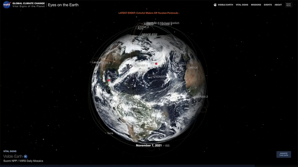
NASA’s real-time 3D visualization tool Eyes on the Earth got a recent upgrade to include more datasets, putting the world at your fingertips. Using the tool, you can track the planet’s vital signs – everything from carbon dioxide and carbon monoxide to sea level and soil moisture levels – as well as follow the fleet of Earth satellites providing those measurements.
Take the time, click on the Eyes on the Earth link and play. I’m not sure how I could use this in a math class, yet, but it is real cool. The image here doesn’t do the visualization tool justice.
