Tag Archives: CO2

What are the recent Mauna Loa CO2 measurements?

NOAA: https://tinyurl.com/y9opmjxg

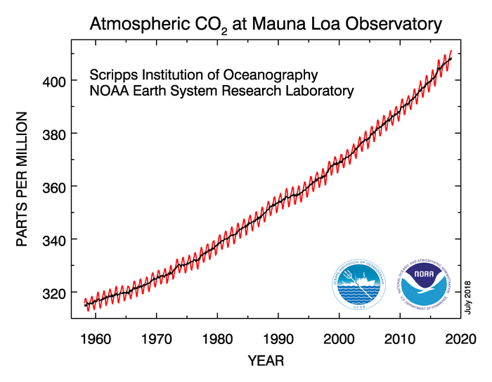
The  NOAA article Another Climate Milestone on Mauna Loa (6/7/18) provides an overview of CO2 measurement at the Mauna Loa site.  In particular,

Carbon dioxide levels measured at NOAA’s Mauna Loa Atmospheric Baseline Observatory averaged more than 410 parts per million in April and May, the highest monthly averages ever recorded, scientists from NOAA and Scripps Institution of Oceanography at the University of California San Diego announced today.

There is also this point:

From 2016 to 2017, the global COaverage increased by 2.3 ppm – the sixth consecutive year-over-year increase greater than 2 ppm. Prior to 2012, back-to-back increases of 2 ppm or greater had occurred only twice.

Why Mauna Loa?

The Mauna Loa observatory is ideally located for monitoring CO2 and other greenhouse gases in the atmosphere. Situated at more than 11,000 feet above sea level in the middle of the Pacific Ocean, the site gives researchers the opportunity to sample air that has been well-mixed during its passage across the Pacific and, thanks to its altitude, is minimally influenced by local vegetation or local pollution sources.

The article links directly to CO2 data sets and other resources.  The Calculus Projects page here has a Mauna Loa CO2 project and the Misc Materials page has the CO2 movie.

Which river basins have the most surface area covered by streams and rivers?

Also, why would we want to know this?  NASA’s Vital Signs of the Planet feature How wide are the world’s rivers?  by Adam Voiland (7/18/18) answers the questions.

Most scientists who study rivers rely on measures of discharge, the volume of water transported through a given cross-section of a river. Much less studied, though critically important, is a river’s total surface area, particularly for scientists trying to understand how carbon dioxide moves between rivers and the atmosphere.

The work has resulted in a  global database of river widths.  The map here, copied from the post, answers the main question:

The map below shows which river basins have the most surface area covered by streams and rivers. The Brahmaputra River in India and Bangladesh, the Amazon in Brazil, and the Lena in Russia are among the widest rivers—and the river networks with the largest surface areas.

Along with the river widths database the article also links to global network of stream gauges for river discharge data.


How much has growing season/allergy season increased in your town?

Climate Central has your answer with their post, Here’s How Frost-Free Season Affects Allergy Season (4/4/18). You will find a drop down menu to produce graphs like this one for Grand Rapids, which has seen as average increase of about 25 frost free days. On the downside,

 A study sampling 10 locations from Texas to Saskatoon, Canada indicated that pollen seasons lengthened between two to four weeks from 1995 to 2009, with the largest increases in the northernmost areas.

In addition, increasing atmospheric carbon dioxide enhances photosynthesis in plants, meaning that they produce more pollen.

They don’t provide the data, unfortunately, but they do provide a clear methodology so that you can create the data set for your city. You can get weather data from NOAA Climate Data Online. There is great potential here for student projects in statistics courses.

Which World Region Emits the Most CO2?

Our World in Data’s latest visualization is this graph of CO2 emissions by world region.  If you go to the page you will find the usual high quality interactive graph with data in a excel file.  You can read off the graph that in 2015 China emitted 10.23 Gt of CO2 while the U.S. emitted 5.1 Gt.  On the other hand, while China emitted about twice as much CO2 their population is about four times the size of the U.S.

Where Do Carbon Emissions Go?

Where do carbon emissions go seems like an obvious question. Into the air of course. If so, then one would expect a near perfect linear relationship between emissions and atmospheric CO2.  The graph here has yearly carbon emissions in million tonnes per year (as reported by the Global Carbon Project)  vs atmospheric CO2 in ppm from Mauna Loa (see data in the calculus project page).  The graph may not be as linear as expected and, while maybe some of it is explained by issues of mixing in the atmosphere or the need for a lag, part of the answer is based on where the carbon goes after it has been emitted.  A recent NYT article, Carbon in the Atmosphere is Rising – Even as Emissions Stabilize, sheds some light on the issue:

Scientists have spent decades measuring what was happening to all of the carbon dioxide that was produced when people burned coal, oil and natural gas. They established that less than half of the gas was remaining in the atmosphere and warming the planet. The rest was being absorbed by the ocean and the land surface, in roughly equal amounts.

In essence, these natural sponges were doing humanity a huge service by disposing of much of its gaseous waste. But as emissions have risen higher and higher, it has been unclear how much longer the natural sponges will be able to keep up.

In fact, much of the carbon is absorbed in the ocean and land surface, and that will add variability to the relationship. The Global Carbon Project has this data available and it can be used by teachers. Go to their page and click on the global budget link for the data, which includes ocean and land sinks of carbon.  If you want the data that created the graph on this page go here.

Atmospheric CO2 growth

According to the NOAA report Carbon dioxide levels rose at record pace for 2nd straight year (graph here from their report).

“The rate of CO2 growth over the last decade is 100 to 200 times faster than what the Earth experienced during the transition from the last Ice Age,” Tans said. “This is a real shock to the atmosphere.”

Globally averaged CO2 levels passed 400 ppm in 2015 — a 43-percent increase over pre-industrial levels. In February 2017, CO2 levels at Mauna Loa had already climbed to 406.42 ppm.

NOAA provides an interactive website with data: Trends in Atmospheric Carbon Dioxide. The calculus materials page here also has Mauna Loa CO2 data and a project.