Tag Archives: CO2

What’s new with the CO2 Data Explorer?

From Our World in Data’s post Data Update: We’ve just updated all of our global CO2 emissions data by Pablo Rosado, Hannah Ritchie, and Edouard Mathieu (11/11/2022):

There is one major update in this year’s carbon budget.

National emissions data was only available for CO2 emissions from fossil fuels and industrial processes (such as cement production). It did not include emissions from land use change.

This year’s update – for the first time – now includes land use estimates for countries, extending back to 1750.

The CO2 Data Explorer is a great tool.  Users can select countries, different emission types (cement is interesting), total or per capita, etc. The data can also be downloaded. Go explore.

How much has CO2 emissions increased?

The visual here is from the NASA feature How Much Carbon Dioxide Are We Emitting? by Matthew Conlen (7/15/2021) may help us all understand the change in CO2 emissions.

In 1900, almost 2 billion metric tons of CO2 were released due to fossil fuel usage. By 1960, that number had more than quadrupled to over 9 billion metric tons.

The latest data from the Carbon Dioxide Information Analysis Center shows that over 35 billion metric tons of CO2 were released in 2014. *

There is a link to CO2 data at the bottom of the article. If you’d like a graph this one is included on the page:

How did the pandemic impact CO2 and CH4?

The NOAA Research News article Despite pandemic shutdowns, carbon dioxide and methane surged in 2020 (4/7/2021) notes

The economic recession was estimated to have reduced carbon emissions by about 7 percent during 2020. Without the economic slowdown, the 2020 increase would have been the highest on record, according to Pieter Tans, senior scientist at NOAA’s Global Monitoring Laboratory. Since 2000, the global CO2 average has grown by 43.5 ppm, an increase of 12 percent.

And methane:

Analysis of samples from 2020 also showed a significant jump in the atmospheric burden of methane, which is far less abundant but 28 times more potent than CO2at trapping heat over a 100-year time frame. NOAA’s preliminary analysis showed the annual increase in atmospheric methane for 2020 was 14.7 parts per billion (ppb), which is the largest annual increase recorded since systematic measurements began in 1983.

There are two other graphs in the article and an abundance of quantitative information for a QL course.

Who produces the most air travel CO2 emissions?

The statista post The Worst Offenders For Air Travel Emissions by Niall McCarthy (10/22/2019) produced the chart here. The post notes

The 12 percent of Americans who make more than six round trips by air each year are actually responsible for two-thirds of all U.S. air travel and therefore two-thirds of all its emissions. Each of those travelers emits over 3 tons of CO2 per year and if everyone else in the world flew like them, global oil consumption would rise 150 percent while CO2 from fossil fuel use would go up 60 percent. As over half of the population does not generally fly, the U.S. ranks 11th in emissions per capita from flying.

The post references the icct report CO2 emission from commercial aviation, 2018. It notes

CO2 emissions from all commercial operations in 2018 totaled 918 million metric tons—2.4% of global CO2 emissions from fossil fuel use. Using aviation industry values, there has been a 32% increase in emissions over the past five years.

At the bottom of the icct report there is a link to spreadsheet data with air travel emissions data by country.


What’s the difference between consumption and production CO2 emissions?

The Our World in Data article How do CO2 emissions compare when adjusted for trade by Hannah Ritchie (10/7/2019) answers the question.

To calculate consumption-based emissions we need to track which goods are traded across the world, and whenever a good was imported we need to include all CO2 emissions that were emitted in the production of that good, and vice versa to subtract all CO2 emissions that were emitted in the production of goods that were exported.

Consumption-based emissions reflect the consumption and lifestyle choices of a country’s citizens.

The map copied here show consumption CO2 emissions per capita. As some countries consume more than they produce this this may be a more accurate way to compare CO2 emissions.

We see that the consumption-based emissions of the US are higher than production: In 2016 the two values were 5.7 billion versus 5.3 billion tonnes – a difference of 8%. This tells us that more CO2 is emitted in the production of the goods that Americans import than in those products Americans export.

The opposite is true for China: its consumption-based emissions are 14% lower than its production-based emissions. On a per capita basis, the respective measures are 6.9 and 6.2 tonnes per person in 2016. A difference, but smaller than what many expect.

The article has seven charts with data including time series data.

How important are clouds to our climate?

Lucy Reading-Ikkanda/Quanta Magazine


The Quanta Magazine article, A World Without Clouds A state-of-the-art supercomputer simulation indicates that a feedback loop between global warming and cloud loss can push Earth’s climate past a disastrous tipping point in as little as a century by Natalie Wolchover (2/25/19), reports on recent finding published in Nature Geoscience.

Clouds currently cover about two-thirds of the planet at any moment. But computer simulations of clouds have begun to suggest that as the Earth warms, clouds become scarcer. With fewer white surfaces reflecting sunlight back to space, the Earth gets even warmer, leading to more cloud loss. This feedback loop causes warming to spiral out of control.

The simulation revealed a tipping point: a level of warming at which stratocumulus clouds break up altogether. The disappearance occurs when the concentration of CO2 in the simulated atmosphere reaches 1,200 parts per million — a level that fossil fuel burning could push us past in about a century, under “business-as-usual” emissions scenarios. In the simulation, when the tipping point is breached, Earth’s temperature soars 8 degrees Celsius, in addition to the 4 degrees of warming or more caused by the CO2 directly.

There is evidence that this may have happened in the past:

More data points surfaced in China, then Europe, then all over. A picture emerged of a brief, cataclysmic hot spell 56 million years ago, now known as the Paleocene-Eocene Thermal Maximum (PETM). After heat-trapping carbon leaked into the sky from an unknown source, the planet, which was already several degrees Celsius hotter than it is today, gained an additional 6 degrees.

Related posts on feedback loops:
How are beavers creating a climate feedback loop?
Greenland Ice, Changing Albedo, and a Feedback Loop
Oceans as a Heat Sink: Possible Feedback Loop
A Feedback Loop: The Alaska Tundra
Methane Bubbles – A Feedback Loop

Clinker is responsible for how much of CO2 emissions?

In 2016 clinker contributed almost 2 billion tonnes of CO2, about 7% of the world total. What is clinker? The BBC article Climate change: The massive CO2 emitter you may not know about by 

Cement is the source of about 8% of the world’s carbon dioxide (CO2) emissions,according to think tank Chatham House.

If the cement industry were a country, it would be the third largest emitter in the world – behind China and the US. It contributes more CO2 than aviation fuel (2.5%) and is not far behind the global agriculture business (12%).

Clinker accounts for about 90% of the CO2 emissions related to concrete and so 90% of the 8% of world CO2 from cement is due to clinker.  Historical data for world cement production can be found on the USGS page  Historical Statistics for Mineral and Material Commodities in the United States. For the last couple of years see the Cement Statistics can Information page.  The BBC article has another a couple of other nice graphs and a diagram with an explanation of how cement is made.

Which country emits the most CO2?

The country that emits the most CO2 depends on how it is measured. Our World in Data has a graph of annual share of CO2 emissions by country. By this measurement, a graph with the top 5 countries (China, U.S., India, Russia, & Germany) in 2016 was downloaded from Our World in Data.  In this case, China has been the largest contributor of CO2 since 2005.  In fact, in 2016 China emitted 10,295 million metric tons of CO2 compared to 5,240 million metric tons by the U.S.  On the other hand, from EIA data, in 2016 each person in China emitted 7.3 tons of CO2 compared to a person in the U.S. at 16.2 tons.  The EIA data dates back to 1980, and from 1980 to 2106 China emitted 177,547 million metric tones of CO2 compared to 197,176 for the U.S.  Which is more important, per person, current, or total historical emissions?  How does this create challenges in climate talks? Further analysis with other countries can be done with EIA data. Data can also be downloaded from the Our World in Data post.  The Calculus Projects page has an example of using this data in a calculus class.

How are U.S. CO2 emissions changing?

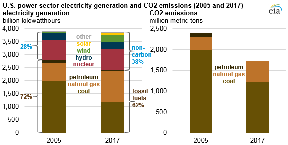
The recent EIA report Carbon dioxide emissions from the U.S. power sector have declined 28% since 2005 (10/29/18) provides the graphic (copied here) showing the changes of the source of electricity generation and corresponding changes in CO2 emissions from 2005 to 2017.

Electricity related CO2 emissions declined but not all sectors decreased. The EIA report U.S. Energy-Related Carbon Dioxide Emissions, 2017 (9/25/18) provides a detailed analysis of U.S. CO2 emissions.  Figure 4 (copied here) from the report shows that transportation related CO2 emissions have grown, although they haven’t reached pre 2008 levels. This report contains 11 graph and 2 tables with downloadable data.

Overall U.S. CO2 emissions have declined in the last three years (see figure 1 in the second report), but unfortunately according to the IEA after little change from 2014-2016:

Global energy-related CO2 emissions grew by 1.4% in 2017, reaching a historic high of 32.5 gigatonnes, a resumption of growth after three years of global emissions remaining flat.

Further, according to the Quartz article Instead of falling, global emissions are set to rise in 2018 by Akshat Rathi (10/8/18)

“When I look at the first nine months of data, I expect in 2018 carbon emissions will increase once again. This is definitely worrying news for our climate goals,” Fatih Birol, executive director of the IEA, told the Guardian. “We need to see a steep decline in emissions. We are not seeing even flat emissions.”

Glen Peters of the Center for International Climate Research says he agrees with Birol’s assessment. Emissions from both China and the US, the world’s two largest emitters, are up in the first nine months of the year. The reason is likely tied to strong economic growth, according to Peters.