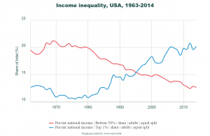
 If you are looking for data on wealth and income inequality visit the World Wealth and Income Database. You can create graphs and download the data. For example, the graph here is pre-tax share of income for the top 1% (20.2% in 2014) and bottom 50% (12.6% in 2014) of adults in the U.S. The trends since 1980 are roughly linear and so the data, which you can download in a number of formats, can be used for regression. Once you have the lines, they can be used in other places in the curriculum. Other categories exist including wealth instead of income and groups such as the top 10% or middle 40%.