Tag Archives: inequality

Whose top 1% does best?

How we answer this questions depends on what we mean by best and the comparison group. For today we’ll look at the share of income by the top 1% and compare mostly western Europe countries. The graph here is from the world income database. It is good to be in the top 1% in the U.S. where they take home home 19% of the countries income in 2021. China is next at 14%. Note that this is a statement of the share of income and not what the income is.

The link will take you to the page where the graph is from. There is also a map colored by ranges of income by the top 1% and if you click on the country in the map it is added to the time series. The U.S. just missed the top color of 19-31% (I’m assuming it starts at greater than 19). Try to guess the countries in the top category and which one is tops at 31%. There is also a link to download the data, as well as other indicators to choose from.

What is the CEO-to-worker compensation ratio?

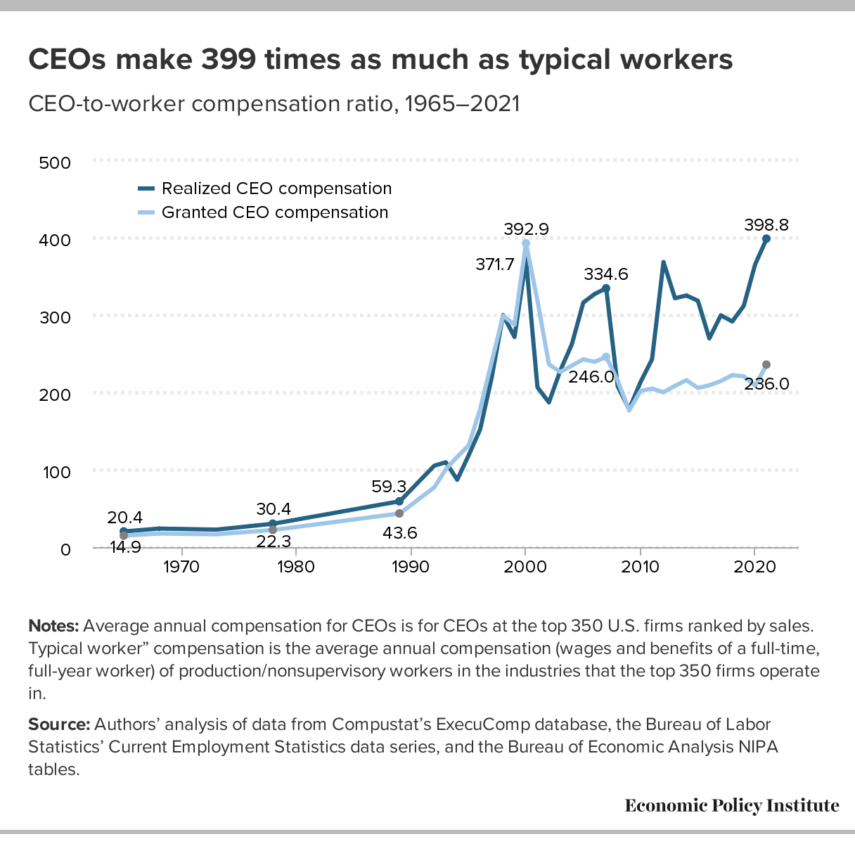
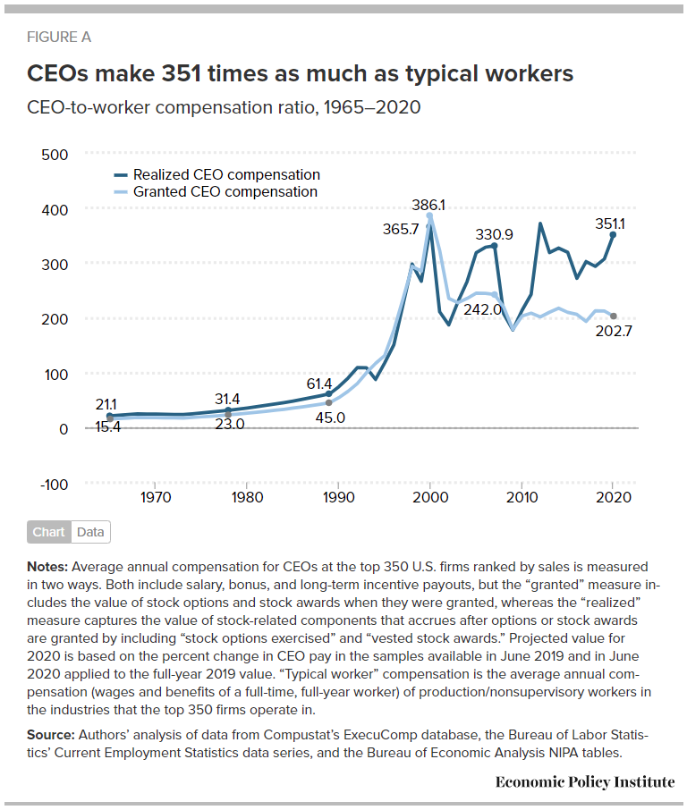
The Economic Policy Institute article CEO pay has skyrocketed 1,460% since 1978 by Josh Bivens and Jori Kandra (10/2/2022) include the chart here. Definitions first:

The realized measure of compensation includes the value of stock options as realized (i.e., exercised), capturing the change from when the options were granted to when the CEO invokes the options, usually after the stock price has risen and the options values have increased.

The granted measure of compensation values stock options and restricted stock awards by their “fair value” when granted. (Compustat estimates of the fair value of options and stock awards as granted are determined using the Black-Scholes model.)

CEO’s are doing better than the mere top 0.1%:

Over the last three decades, compensation grew far faster for CEOs than it did for other very highly paid workers (the top 0.1%, or those earning more than 99.9% of wage earners). CEO compensation in 2020 (the latest year for which data on top wage earners are available) was 6.88 times as high as wages of the top 0.1% of wage earners, a ratio 3.7 points greater than the 3.18-to-1 average CEO-to-top-0.1% ratio over the 1947–1979 period.

One outlier (he has the money to buy twitter I guess):

In 2021, Elon Musk (CEO of Tesla Motors) exercised $23.5 billion worth of stock options that would have expired in 2022. Under our “realized” methodology, this would have made his pay almost 1,000 times that of the average large-company CEO. Including him in our sample would have resulted in an increase of CEO pay in 2021 relative to 2020 of over 300% (the “average” for the sample would have been just under $100 million).

Because inclusion of this extreme outlier would have made this year’s numbers incomparable with previous years’ numbers, we opted to exclude Tesla and Musk from our sample entirely.

The article is excellent not just because of all the other graphs and access to data but they thoroughly explain their methodology.
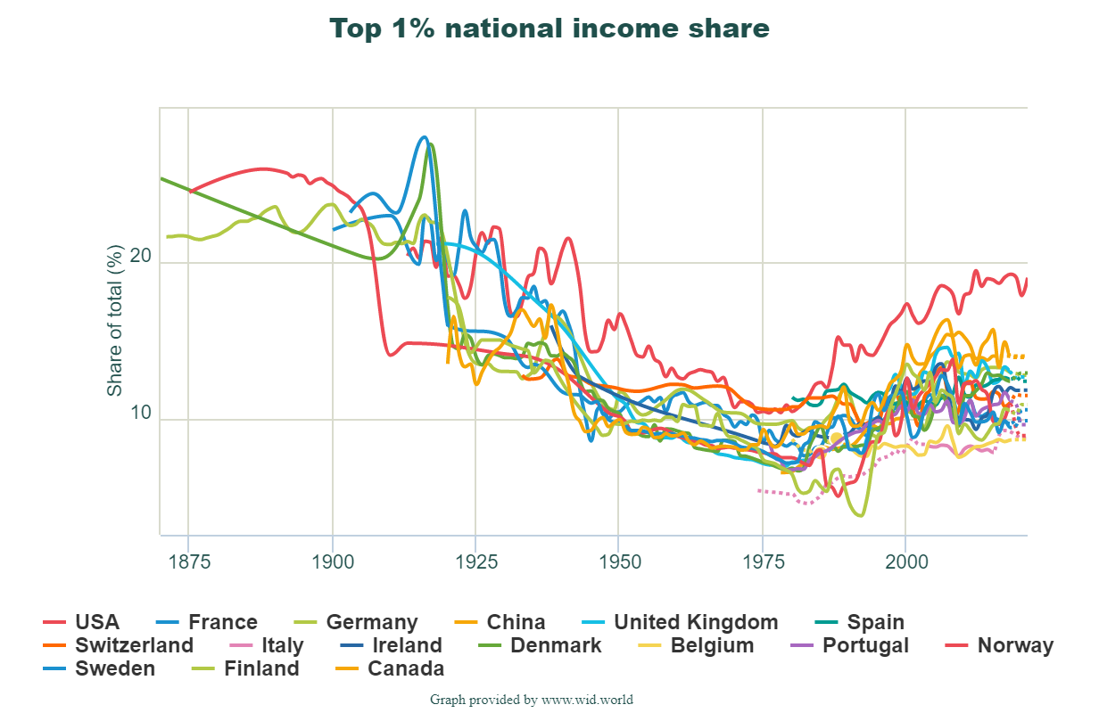
 

What is the connection between attending college and parental income?

The World Inequality Database  summarize the paper by Bonneau and Grobon in the article Unequal Access to Higher Education (2/7/2022).

In this paperCécile Bonneau and Sébastien Grobon provide new stylized facts on inequalities in access to higher education by parental income in France. At the bottom of the income distribution, 35% of individuals have access to higher education compared to 90% at the top of the distribution. This overall level of inequality is surprisingly close to that observed in the United States. The authors then document how these inequalities in access to higher education by parental income combine with inequalities related to parental occupation or degree. Finally, they assess the redistributivity of public spending on higher education, and present a new accounting method to take into account the tax contribution of parents in our redistributivity analysis.

The article lists 11 key findings such as:

Inequalities in access to higher education create large inequalities in public spending on higher education: Those in the bottom 30 percent of the income distribution receive between 7,000 and 8,000 euros of investment in higher education between the ages of 18 and 24, compared to about 27,000 euros –of which 18,000 euros correspond to public spending and 9,000 to private spending through tuitions paid by parents– for those in the top 10 percent of the income distribution (Figure 5a);

The paper (link in the first quote) has numerous graphs and the details of the modeling.

How much did wage inequality change in 2020?

The EPI article Wage inequality continued to increase in 2020 by Lawrence Mishel and Jori Kandra (12/13/2021) provides the graph copied here. As for the share of the overall pot:

This disparity in wage growth reflects a sharp long-term rise in the share of total wages earned by those at the very top: the top 1.0% earned 13.8% of all wages in 2020, up from 7.3% in 1979. That marks the second highest share of earnings for the top 1.0% since the earliest year, 1937, when data became available (matching the tech bubble share of 13.8% in 2000 and below the share of 14.1% in 2007). The share of wages for the bottom 90% fell from 69.8% in 1979 to just 60.2% in 2020.

The article also has two tables of data that could be useful in stats or QL course.

Has much has poverty decreased?

The Our World in Data article Extreme poverty: how far have we come, how far do we still have to go by Max Roser (11/22/2021) provides numerous graphs that quantify changes in poverty. The most general graph is copied here. This one is for the world but users can select specific countries instead of the world to produce a related graph.

The overall conclusion is summed up well by their summary:

Two centuries ago the majority of the world population was extremely poor. Back then it was widely believed that widespread poverty was inevitable. But this turned out to be wrong. Economic growth is possible and poverty can decline. The world has made immense progress against extreme poverty.

But even after two centuries of progress, extreme poverty is still the reality for every tenth person in the world. This is what the ‘international poverty line’ highlights – this metric plays an important (and successful) role in focusing the world’s attention on these very poorest people in the world.

The poorest people today live in countries which have achieved no growth. This stagnation of the world’s poorest economies is one of the largest problems of our time. Unless this changes millions of people will continue to live in extreme poverty.


There are some distribution type graphs that could be useful for statistics classes and most of the graph have an option to download the data.

Who is going to use more electricity in the home?

The eia article Use of electricity in houses to grow more quickly in developing economies by Courtney Sourmehi (11/5/2021) is a good example of the difference between totals and per capita.

Reference case, we project that residential buildings outside the Organization for Economic Cooperation and Development (OECD) will consume more electricity than all residential and commercial buildings combined in OECD countries by 2050. However, people in non-OECD countries will, on average, still consume less than half as much residential electricity as in OECD countries.

What is driving the increase use of electricity?

Population and household income are key drivers of residential electricity consumption. Over the next 30 years, we expect the populations in non-OECD countries to grow three times faster than the populations in OECD countries. As standards of living rise in non-OECD countries, as reflected in increases in household income, we also project increased demand for electricity to power new household electronic devices and appliances, such as air conditioners and electric cooking ranges. In OECD countries, electricity consumption will grow more slowly because of less population growth, gains in energy efficiency, and slower increases in household income.

There are links to sources in the article.

How did COVID impact K-12 learning based in income?

The Pew article What we know about online learning and homework gap amid the pandemic by Katherine Schaeffer (10/1/2021) has this to say:

Parents with lower incomes whose children’s schools closed amid COVID-19 were more likely to say their children faced technology-related obstacles while learning from home. Nearly half of these parents (46%) said their child faced at least one of the three obstacles to learning asked about in the survey, compared with 31% of parents with midrange incomes and 18% of parents with higher incomes.

This technology divide isn’t new:

Even before the pandemic, Black teens and those living in lower-income households were more likely than other groups to report trouble completing homework assignments because they did not have reliable technology access. Nearly one-in-five teens ages 13 to 17 (17%) said they are often or sometimes unable to complete homework assignments because they do not have reliable access to a computer or internet connection, a 2018 Center survey of U.S. teens found.

There are four other charts in the article.

How did CEOs do during the pandemic?

Did CEOs take a pay hit like many workers did during the pandemic? The article CEO pay has skyrocketed 1,322% since 1978 by Lawrence Mishel and Jori Kandra (8/10/2021) suggests CEOs did just fine last year. Their chart shows that realized CEO compensation grew during 2020 compared to the average worker.

Details on the metric:

We focus on the average compensation of CEOs at the 350 largest publicly owned U.S. firms (i.e., firms that sell stock on the open market) by revenue. Our source of data is the S&P ExecuComp database for the years 1992 to 2020 and survey data published by the Wall Street Journal for selected years back to 1965. We maintain the sample size of 350 firms each year when using the ExecuComp data.

The realized measure of compensation includes the value of stock options as realized (i.e., exercised), capturing the change from when the options were granted to when the CEO invokes the options, usually after the stock price has risen and the options values have increased. The realized compensation measure also values stock awards at their value when vested (usually three years after being granted), capturing any change in the stock price as well as additional stock awards provided as part of a performance award.

The granted measure of compensation values stock options and restricted stock awards by their “fair value” when granted (Compustat estimates of the fair value of options and stock awards as granted determined using the Black Scholes model).

Well maybe CEO pay just went down less than worker pay and that is why the ratio went up. In table 1, realized pay for 2019 is $20,351,000 with 2020 projected as $24,194,00. There are other graphs in the article and data available for download.

How much debt do students have by race?

The EducationalData.org post Student Loan Debt by Race by Melanie Hanson (6/9/21) has three excellent graphs such as the one copied here. It may not be surprising that Asians have the least debt given Asians have the highest income, but Hispanic and Latino debt is almost identical to White and Caucasian debt yet their income is typically closer to the Black and African American community.  From a statistical standpoint the first bullet in the highlights

Black and African American college graduates owe an average of $25,000 more in student loan debt than White college graduates.

is a bit misleading. Given the skewness of the data (the 17% in the top category for Black and African American) one should also report a median difference, which looks to be closer to around $10,000. Interestingly, in all cases the median debt is below the $39,000, which is manageable college debt in most cases. The question that comes to mind is how much lower would this be if median income increased at the same pace as the stock market or top 1%?

The article has sources but no easily downloadable data set.


Who has access to a smartphone or broadband?

The Pew article Mobile Technology and Home Broadband 2021 by Andrew Perrin (6/3/2021) summarizes the results of their smartphone and home broadband survey.

Smartphone ownership (85%) and home broadband subscriptions (77%) have increased among American adults since 2019 – from 81% and 73% respectively. Though modest, both increases are statistically significant and come at a time when a majority of Americans say the internet has been important to them personally. And 91% of adults report having at least one of these technologies.

There are differences between various groups (see their graph copied here):

The share of Americans with home broadband subscriptions has similarly grown since 2019 – from 73% of adults saying they have one in the previous survey to 77% today. There are more pronounced variations across some demographic groups, particularly in differences by annual household income and educational attainment. For example, 92% of adults in households earning $75,000 or more per year say they have broadband internet at home. But that share falls to 57% among those whose annual household income is below $30,000.

There are other graphs in the article and Pew provides a methodology section with access to data.